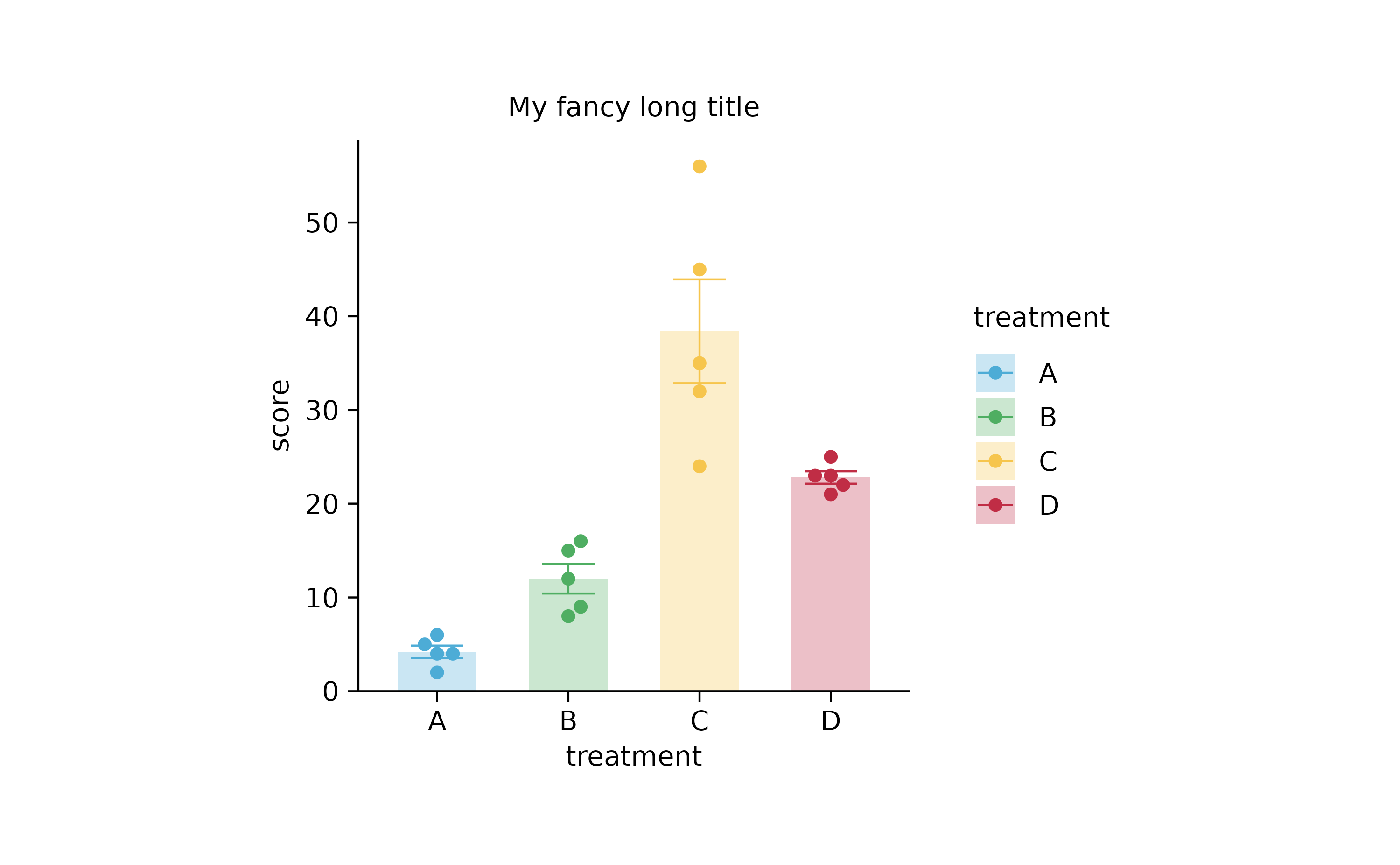
Design principles
tidyplotsaims at delivering ready-to-publish plots, eliminating cumbersome formatting tasks.tidyplotsuses the pipe%>%(instead of+likeggplot2) to build up plots. This way you can seamlessly pipe into and out of your plot. For example, coming from fram a data wrangeling pipeline you can generate a plot and directly pipe it intosave_plot(). You can also callsave_plot()orview_plot()in the middle of your pipeline to output intermediate results.tidyplotstries to reduce the complexity ofggplot2by choosing sensible defaults. However, you take more detailed control by via the...argument in each function. And if you need to add plainggplot2code, you can do this usingadd()function, which will preserve thetidyplotspipeline.All plots have absolute dimensions by default, defined in “mm”. These dimensions refer to the plotting area, not the entire plot, thus ensuring consistent lengths of
xanyyaxes. The dimension can be changed with thewidthandheightparameters, either when creating the plot withtidyplot()or later withadjust_plot_area_size(). If you want to restore theggplot2behavior that a plot automatically takes up all available space, setwidthandheighttoNA.tidyplotsallows to split plots into subplots by a variable of choice, similar toggplot2::facet_wrap(). However,split_plot()provides a more consistent look and allows to distribute subplots across multiple pages.colorandfillare always mapped to the same variable. However, you can still do one of the following: (1) reduce the opacity of fill using thealphaorsaturationarguments, (2) setcolororfillto a constant hex color within anadd_function, or (3) setcolororfilltoNAwithin anadd_function to to prevent it from being displayed.
Workflow
The data to be plotted needs to be tidy in the sense that (1) each variable must have its own column, (2) each observation must have its own row and (3) each value must have its own cell. To learn more about tidy data, have a look at the excellent book R for Data Science.
To create a plot, you start with the tidyplot()
function. Then you pipe through add_ functions,
adjust_ functions, theme_ functions and
remove_ functions, preferably in that order.
split_plot() must be last in this sequence and can only be
followed by save_plot().
Standing on the shoulders of giants
ggplot2 and the rest of the tidyverse by Hadley Wickham et al.
patchwork by Thomas Lin Pedersen
ggpubr by Alboukadel Kassambara
ggrastr by Evan Biederstedt
ggrepel by Kamil Slowikowski
Counts & Sums
library(ggplot2)
library(patchwork)

study %>%
  ggplot(aes(x = treatment, y = score, color = treatment, fill = treatment)) +
  stat_summary(fun = mean, geom = "bar", color = NA, width = 0.6, alpha = 0.3) +
  stat_summary(fun.data = mean_se, geom = "errorbar", linewidth = 0.25, width = 0.4) +
  geom_point(position = position_jitterdodge(jitter.width = 0.2)) +
  scale_y_continuous(expand = expansion(c(0, 0.1))) +
  theme_bw() +
      theme(
      panel.border = element_blank(),
      axis.line = element_line(linewidth = 0.25, colour = "black"),
      plot.margin = unit(c(0.5, 0.5, 0.5, 0.5), "mm"),
      plot.background = element_rect(fill = NA, colour = NA),
      legend.background = element_rect(fill = NA, colour = NA),
      legend.key = element_rect(fill = NA, colour = NA),
      strip.background = element_rect(fill = NA, colour = NA),
      panel.background = element_rect(fill = NA, colour = NA),
      panel.grid.major = element_blank(),
      panel.grid.minor = element_blank(),
      axis.ticks = element_line(colour = "black", linewidth = 0.25)
    ) +
  plot_layout(widths = unit(50, "mm"), heights = unit(50, "mm"))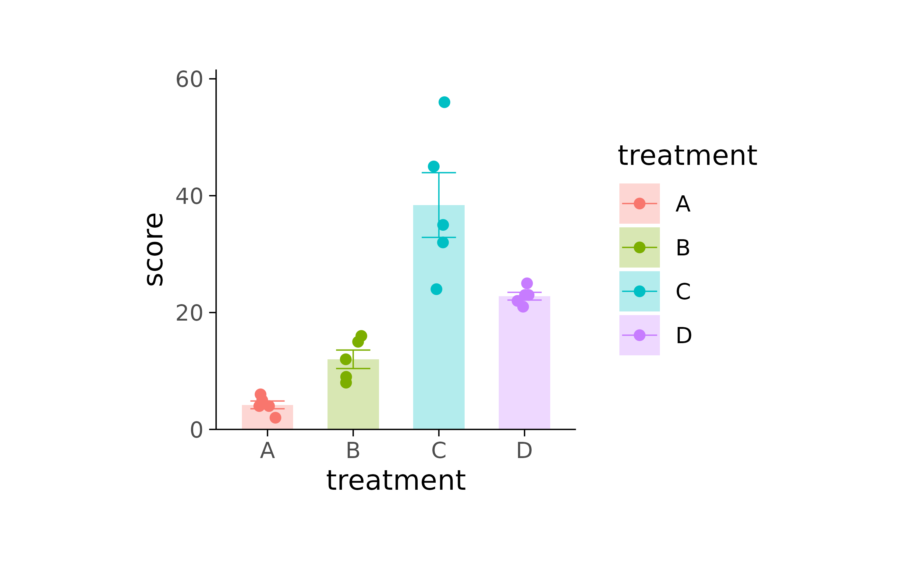
study %>%
  tidyplot(x = treatment, y = score, color = treatment) %>%
  add_mean_bar(alpha = 0.3) %>%
  add_error_bar() %>%
  add_data_points_jitter()
study %>%
  tidyplot(x = treatment, y = score, color = treatment) %>%
  add_mean_bar(alpha = 0.3) %>%
  add_error_bar() %>%
  add_data_points_beeswarm()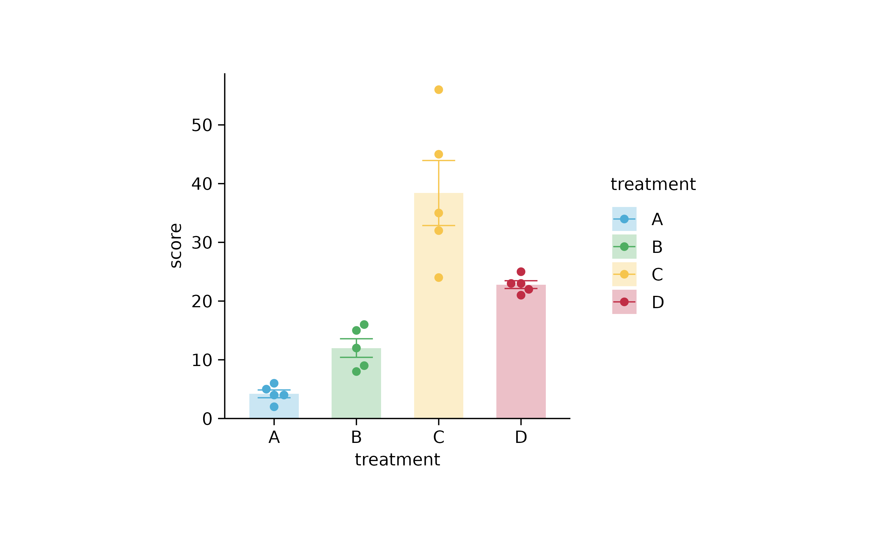
animals %>%
  tidyplot(family, size, color = family) %>%
  add_mean_bar(alpha = 0.3) %>%
  add_error_bar() %>%
  add_data_points() %>%
  sort_x_axis_labels(size) %>%
  adjust_colors(c("#B0B1B3",
    "#F18823",
    "#E23130",
    "#1D5D83"))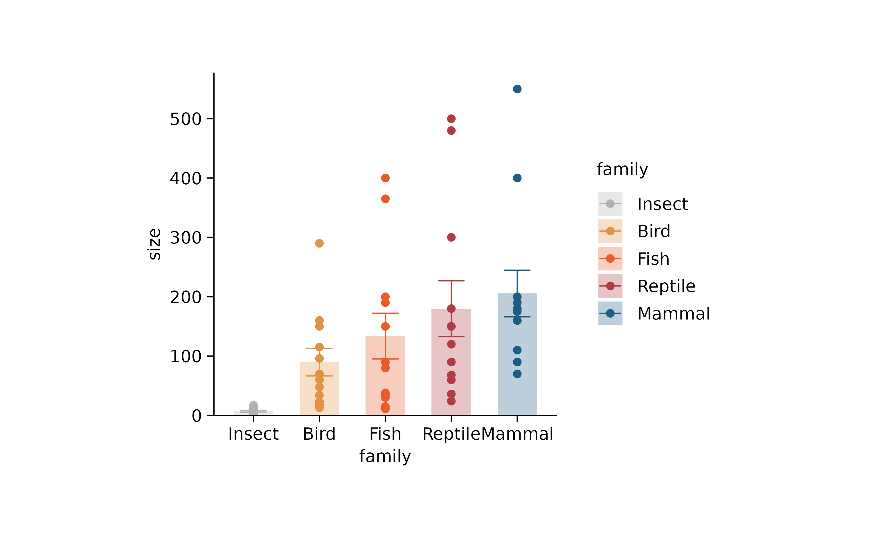
study %>%
  tidyplot(treatment, score, color = treatment) %>%
  add_range_bar() %>%
  add_data_points()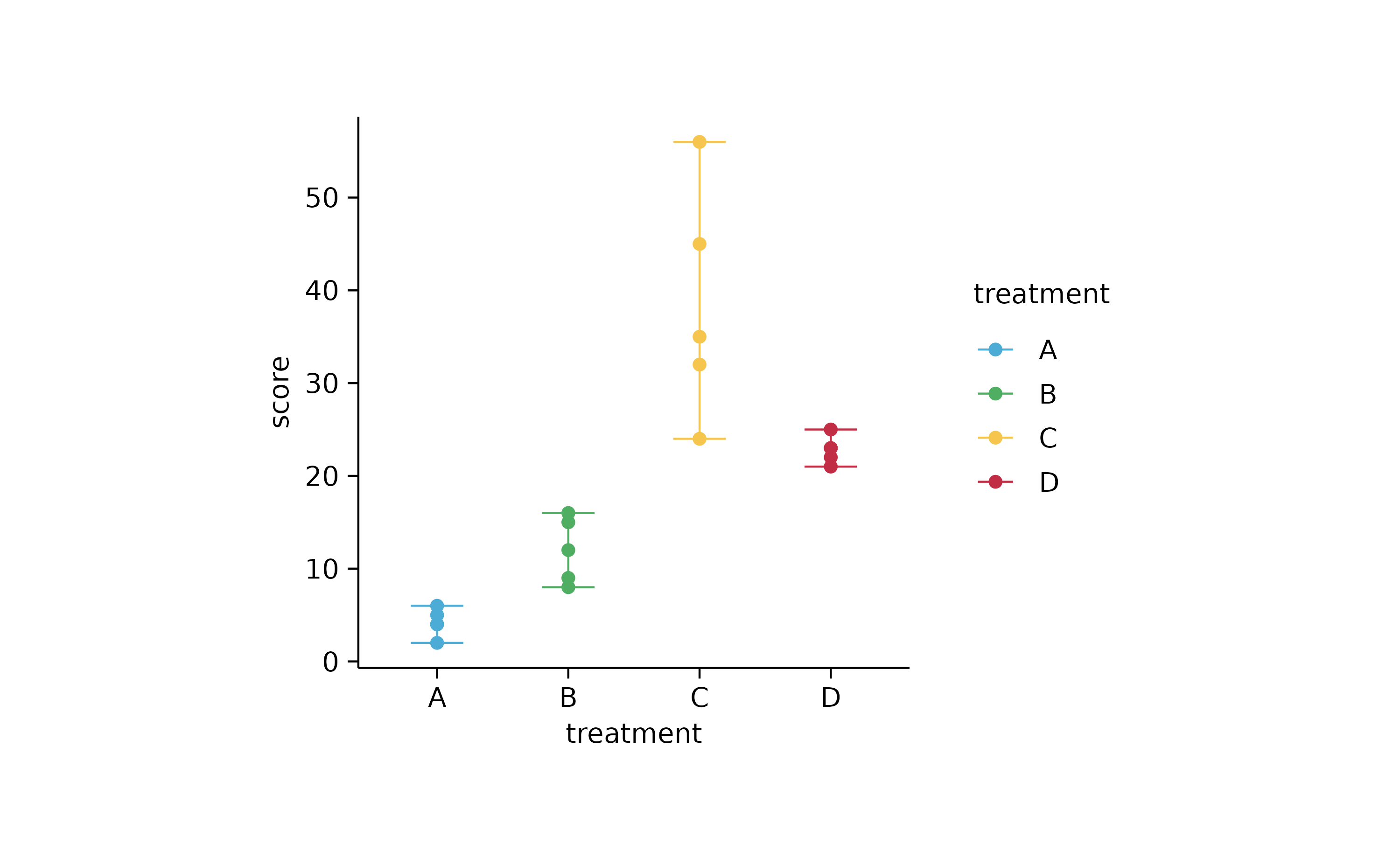
study %>%
  tidyplot(treatment, score) %>%
  add_mean_bar(alpha = 0.3) %>%
  add_error_bar() %>%
  add_data_points() %>%
  add_mean_line()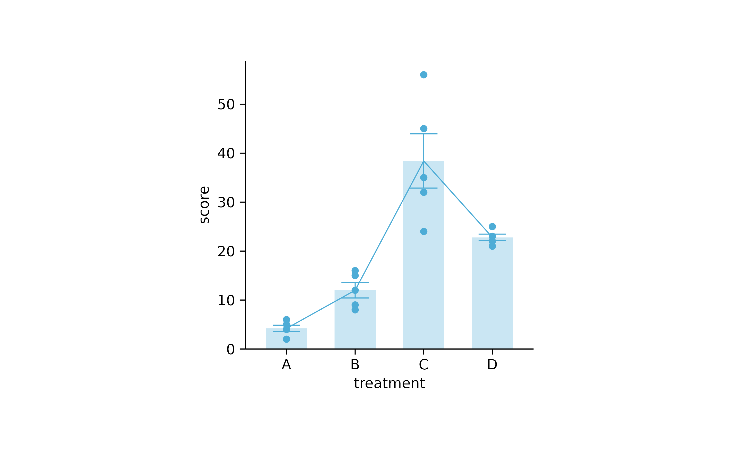
study %>%
  tidyplot(treatment, score) %>%
  add_mean_bar(alpha = 0.3) %>%
  add_error_bar() %>%
  add_data_points() %>%
  add_line(group = participant)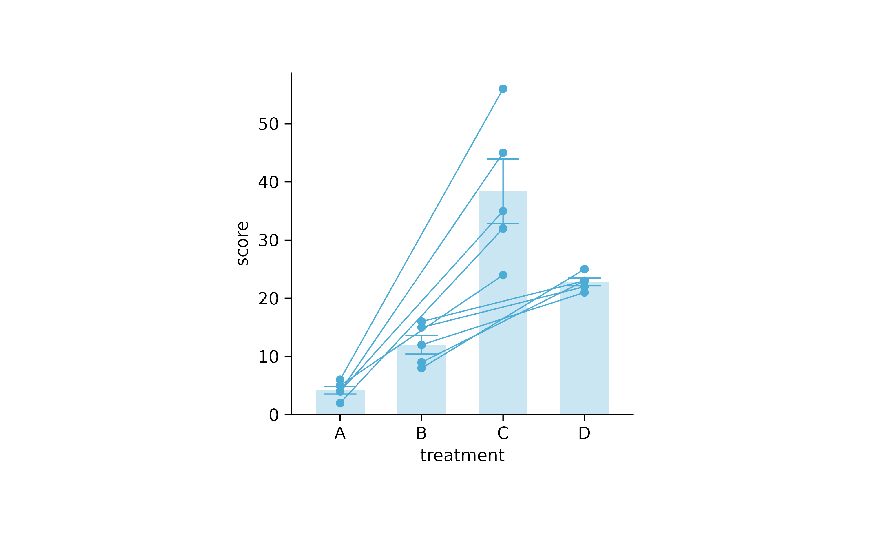
study %>%
  tidyplot(group, score, color = dose) %>%
  add_mean_bar(alpha = 0.3) %>%
  add_error_bar() %>%
  add_data_points_beeswarm()
p1 <-
  study %>%
  tidyplot(x = treatment, y = score, color = treatment) %>%
  add_mean_dash() %>%
  add_error_bar() %>%
  add_data_points_beeswarm()
p1
p2 <-
  study %>%
  tidyplot(x = treatment, y = score, color = treatment) %>%
  add_mean_bar(alpha = 0.3) %>%
  add_error_bar() %>%
  add_data_points_beeswarm()
p2
study %>%
  tidyplot(x = treatment, y = score, color = treatment) %>%
  add_mean_bar(alpha = 0.3) %>%
  add_error_bar() %>%
  add_data_points_beeswarm(confetti = TRUE)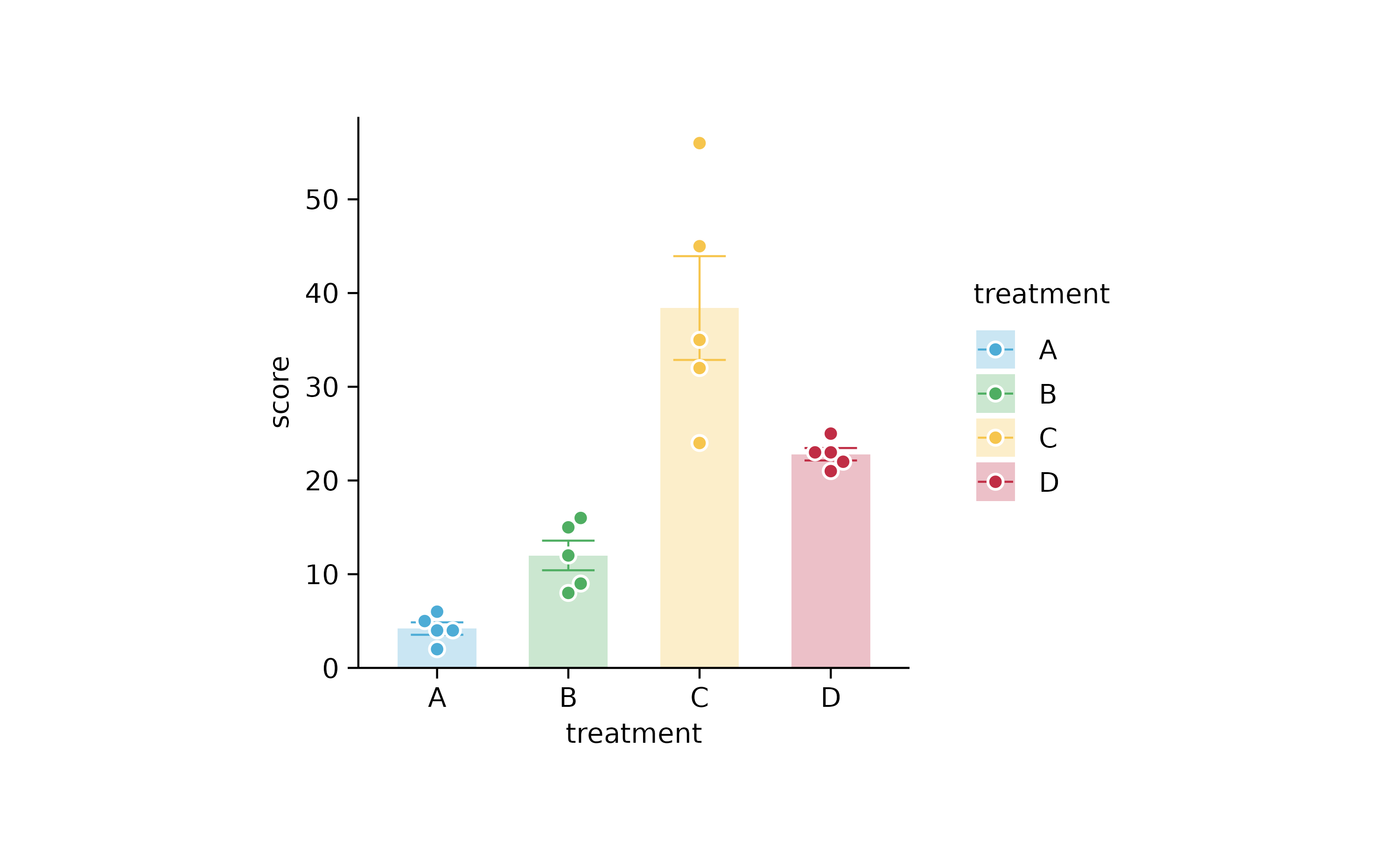
# testing adjust_colors() adjust_data_labels() split_plot() interference
# "split" always after "adjust"
# "adjust_color()" always after "adjust_data_labels()"

# providing less or more colors, not a problem
new_colors <-
  c("A" = "#B0B1B3",
    "B" = "#F18823",
    "C" = "#E23130",
    "D" = "#1D5D83")

# Providing less names, not a problem.
# Providing too many or wrong names -> Warning
new_names <-
  c("A" = "Regime A",
    "B" = "Regime B",
    "C" = "Regime C",
    "D" = "Regime D")

p2 %>% adjust_colors(new_colors)
p2 %>% reorder_x_axis_labels("C") %>% adjust_colors(new_colors)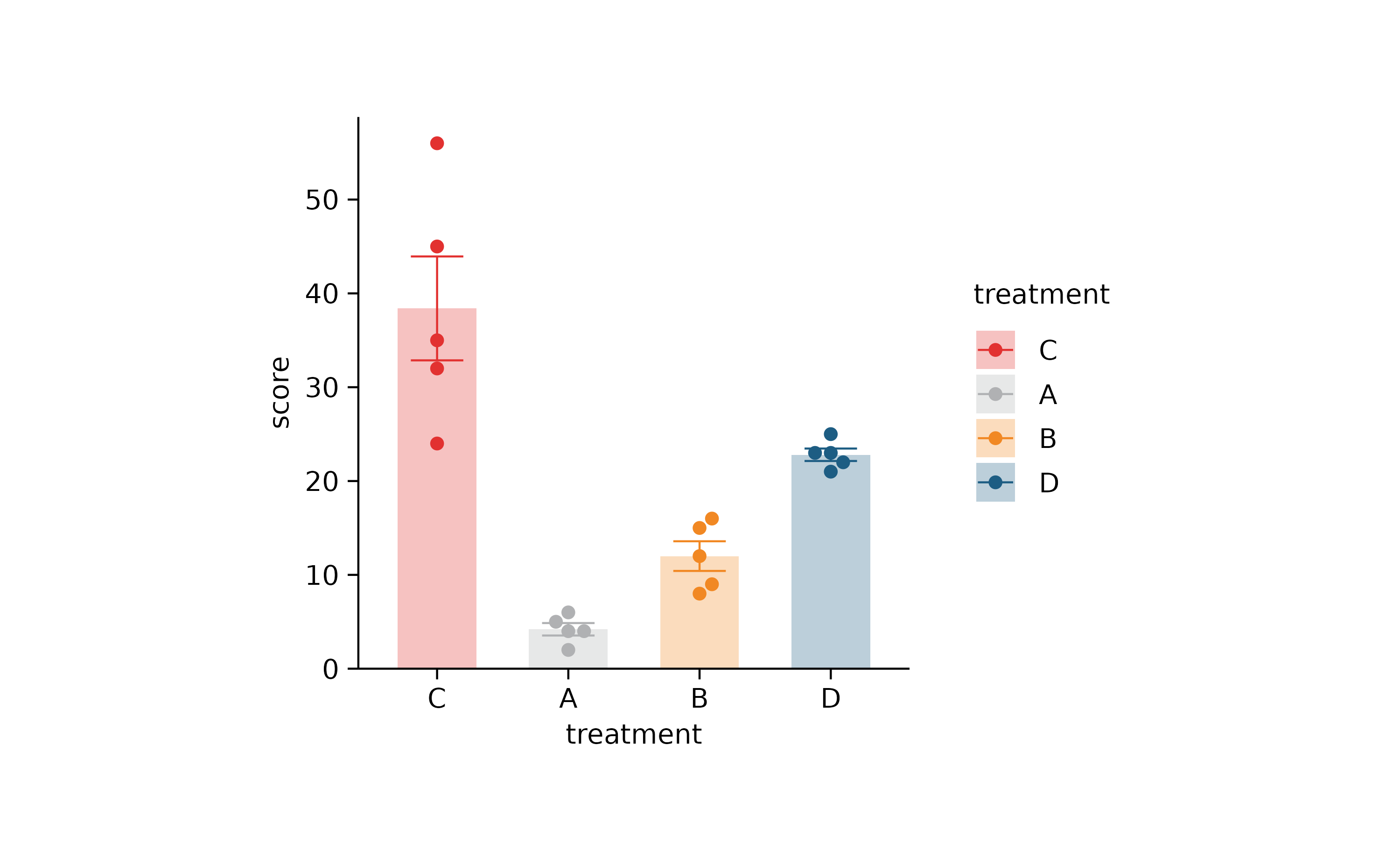
p2 %>% adjust_colors(new_colors) %>% reorder_x_axis_labels("C")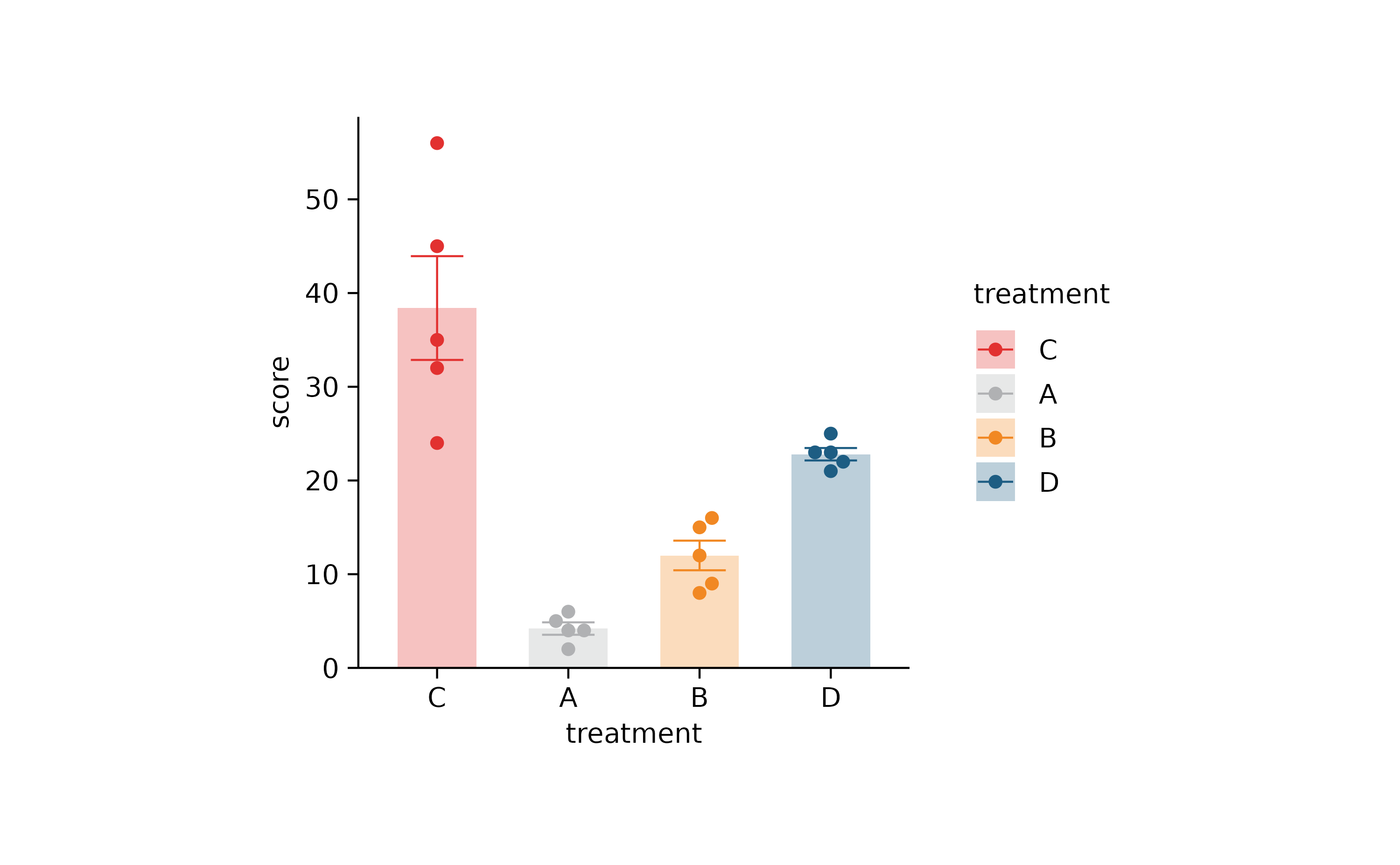
p2 %>% adjust_colors(new_colors)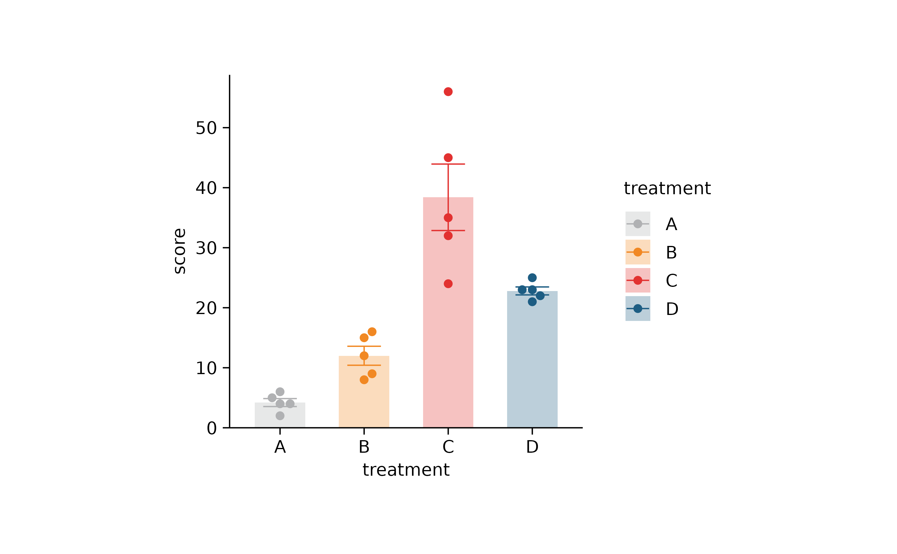
p2 %>% rename_x_axis_labels(new_names) %>% adjust_colors(new_colors)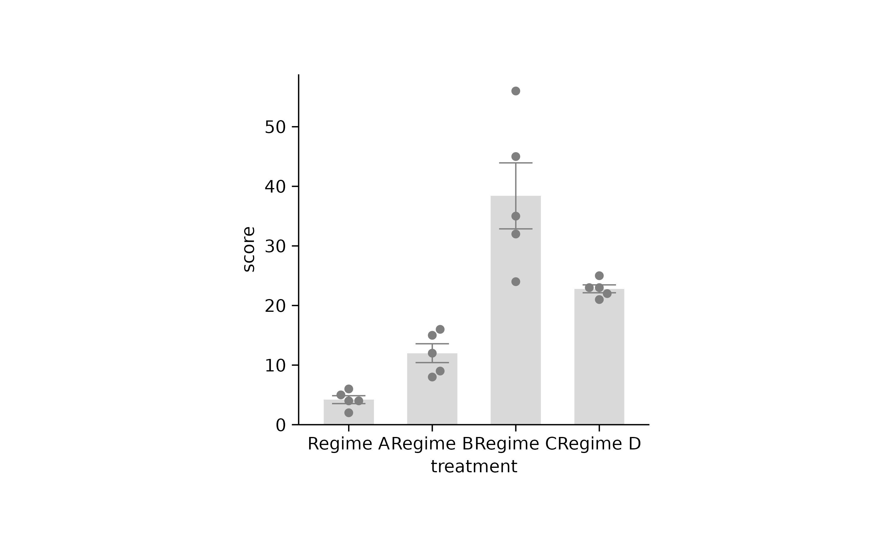
p2 %>% adjust_colors(new_colors) %>% rename_x_axis_labels(new_names)
new_colors2 <-
  c("Regime A" = "#B0B1B3",
    "Regime B" = "#F18823",
    "Regime C" = "#E23130",
    "Regime D" = "#1D5D83")

p2 %>% adjust_colors(new_colors2)
p2 %>% rename_x_axis_labels(new_names) %>% adjust_colors(new_colors2)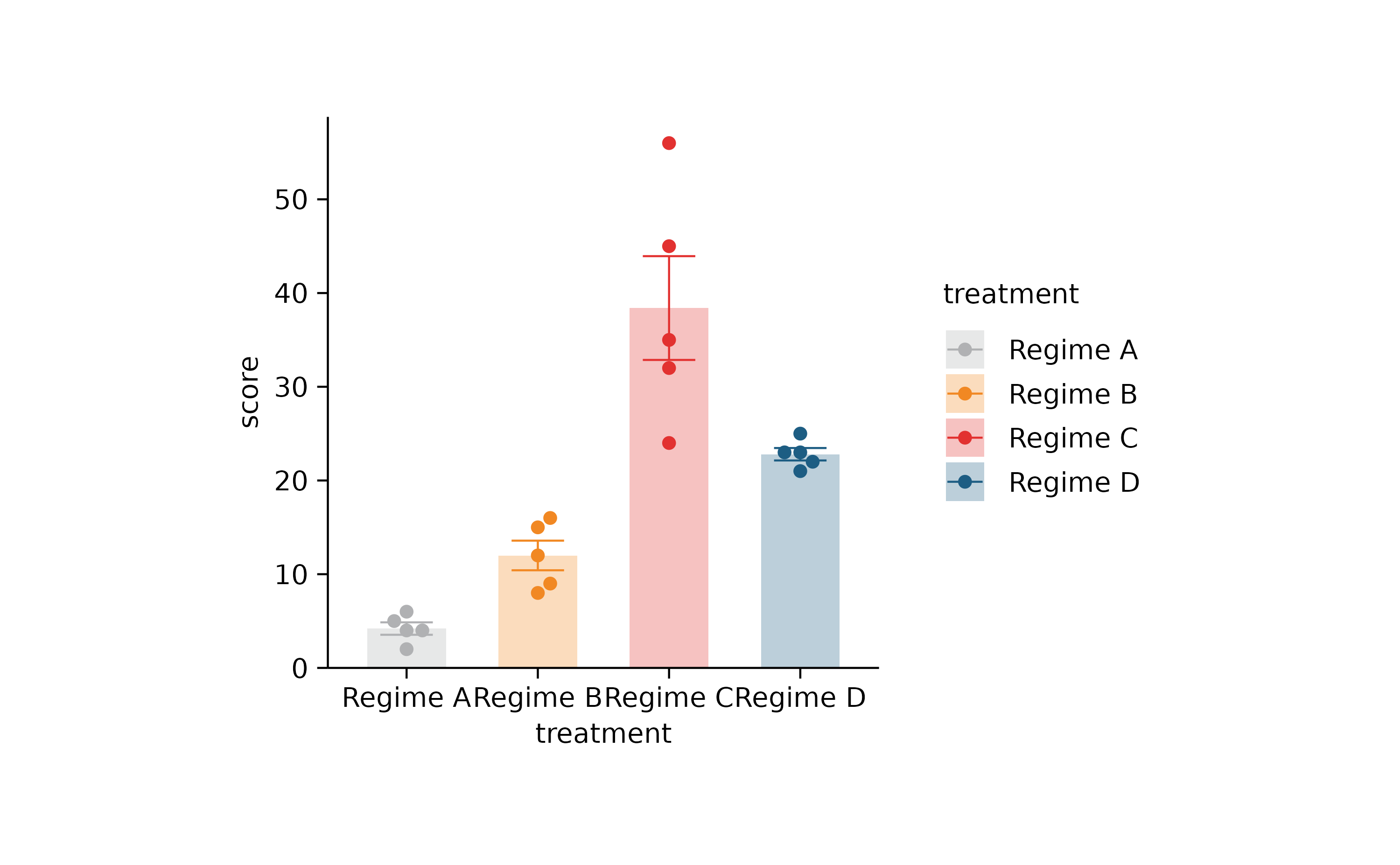
p2 %>% adjust_colors(new_colors2) %>% rename_x_axis_labels(new_names)
# providing more colors, not a problem. Providing less colors -> Error


# during split plot, single subplots might only have NA for certain categories
# this has been fixed apparently by using drop = FALSE in

# adjusting axis limits

p1 %>%
  adjust_y_axis(limits = c(-20, 60))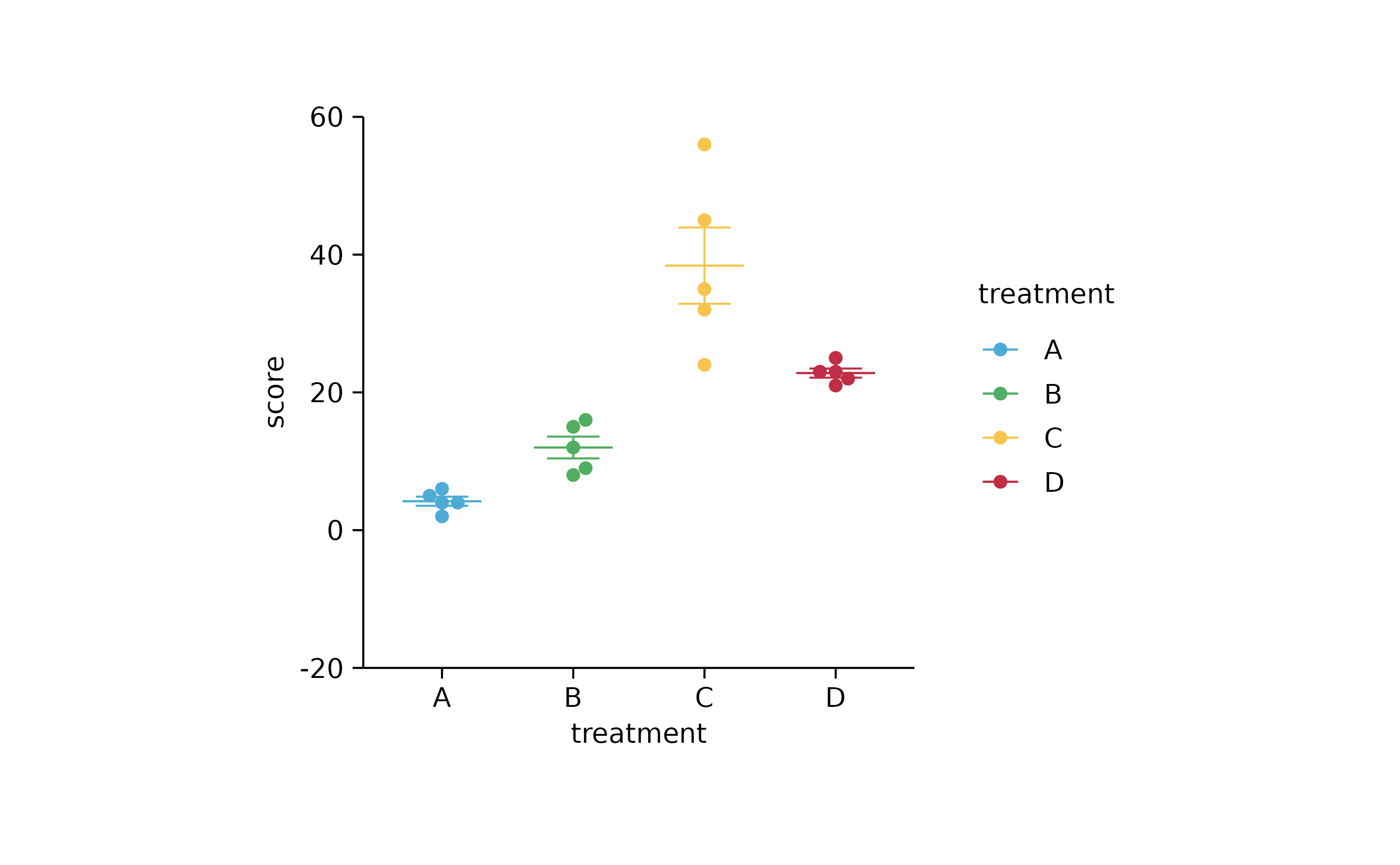
# x--y plots


p3 <-
  animals %>%
  tidyplot(x = weight, y = size, color = number_of_legs) %>%
  add_data_points(confetti = TRUE) %>%
  add_data_points(data = filter_rows(size > 300), color = "red") %>%
  add_text_labels(data = max_rows(weight, n = 3), var = animal, color = "black")

p3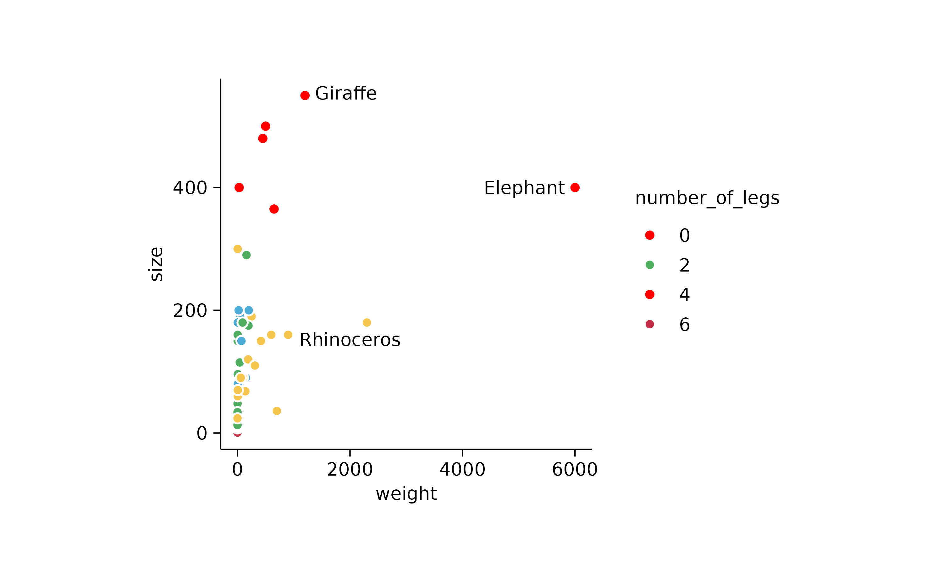
p3 %>% add_reference_lines(x = c(4000), y = c(200, 350))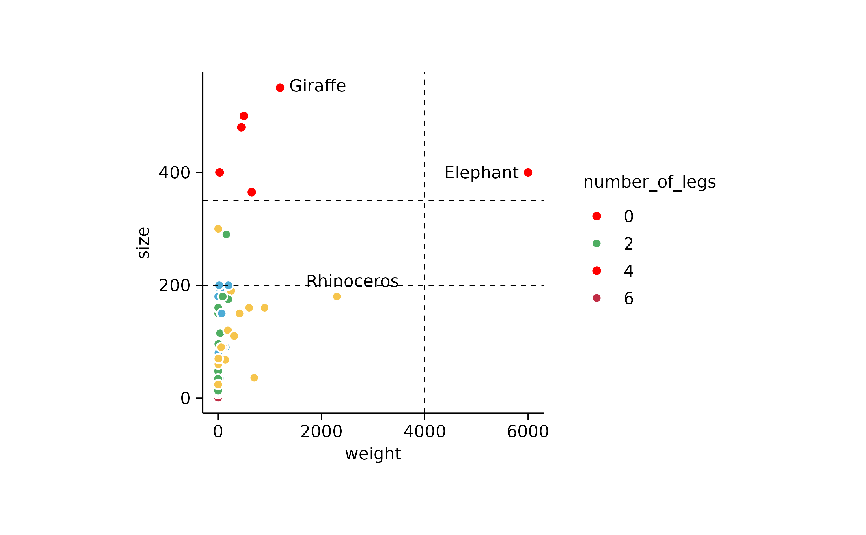
# labels of out of bounds animals still appear
p3 %>%
  adjust_y_axis(limits = c(0, 600)) %>%
  adjust_x_axis(limits = c(0, 1000))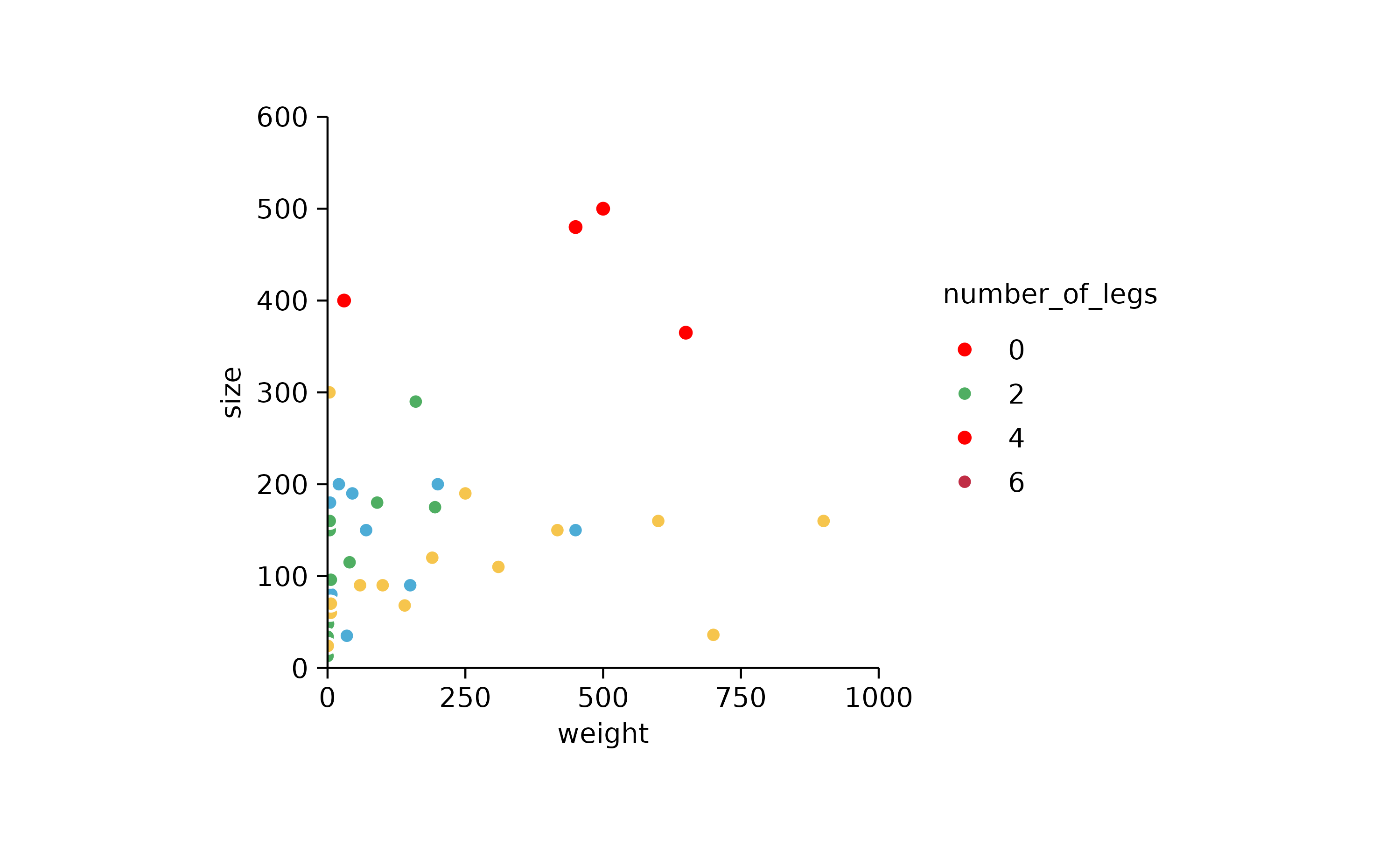
energy_week %>%
  tidyplot(date, power, color = energy_type) %>%
  add_mean_line() %>%
  adjust_y_axis(limits = c(1000, 5000)) %>%
  remove_plot_area_padding()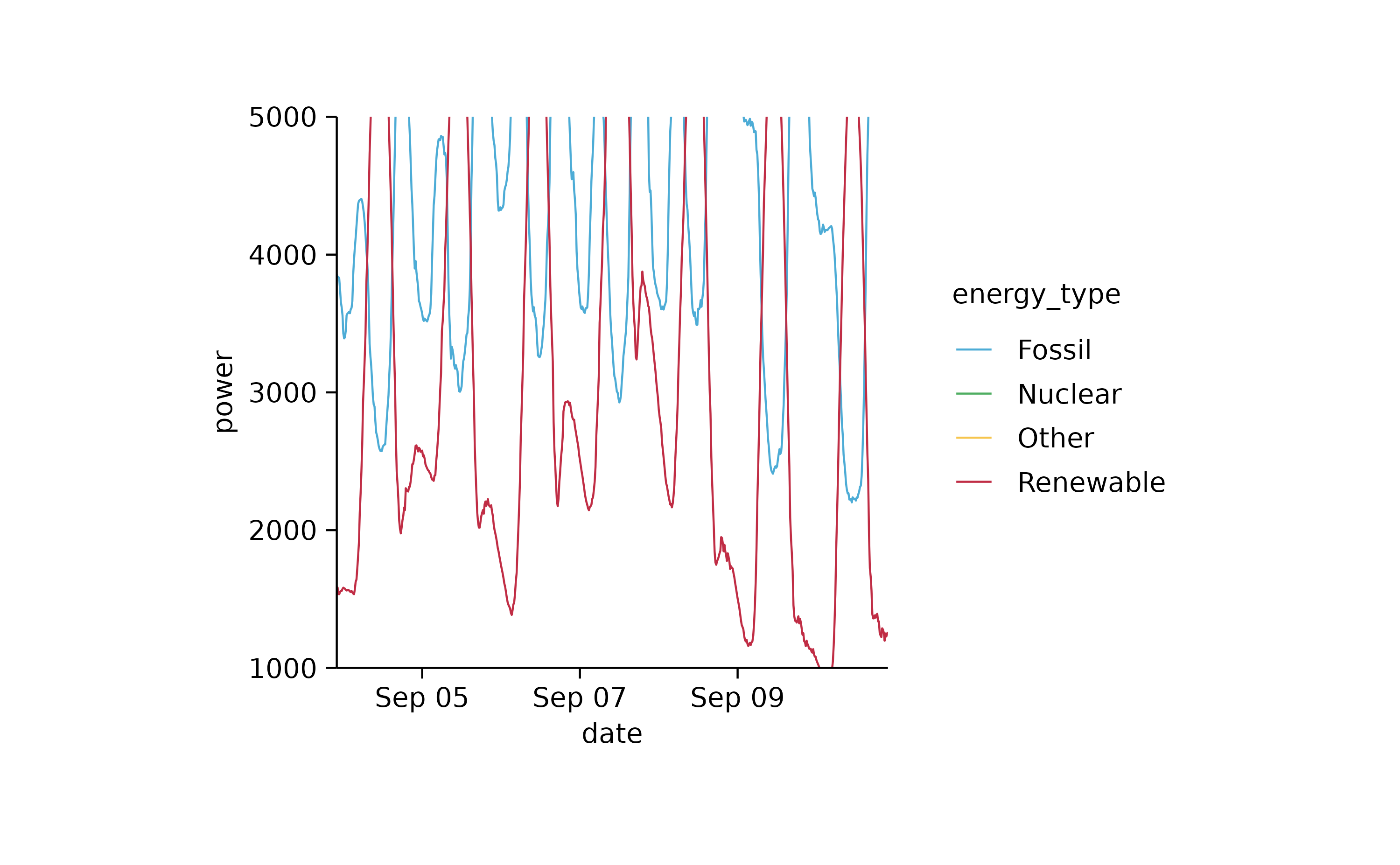
p2 %>% add_caption("Here goes the fine print")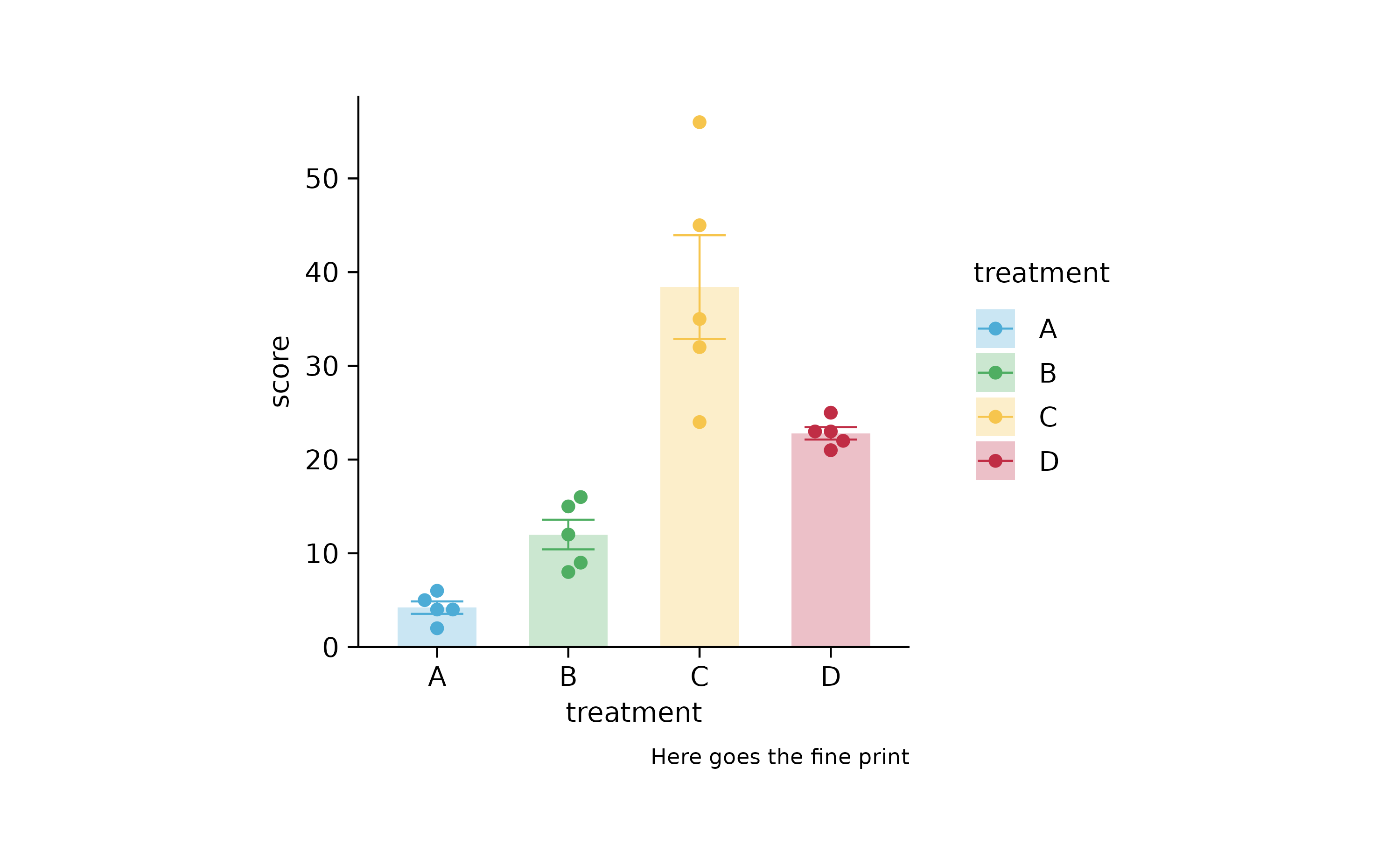
# adjusting axis titles

p2 %>% adjust_x_axis("My x axis title")
p2 %>% adjust_y_axis("My y axis title")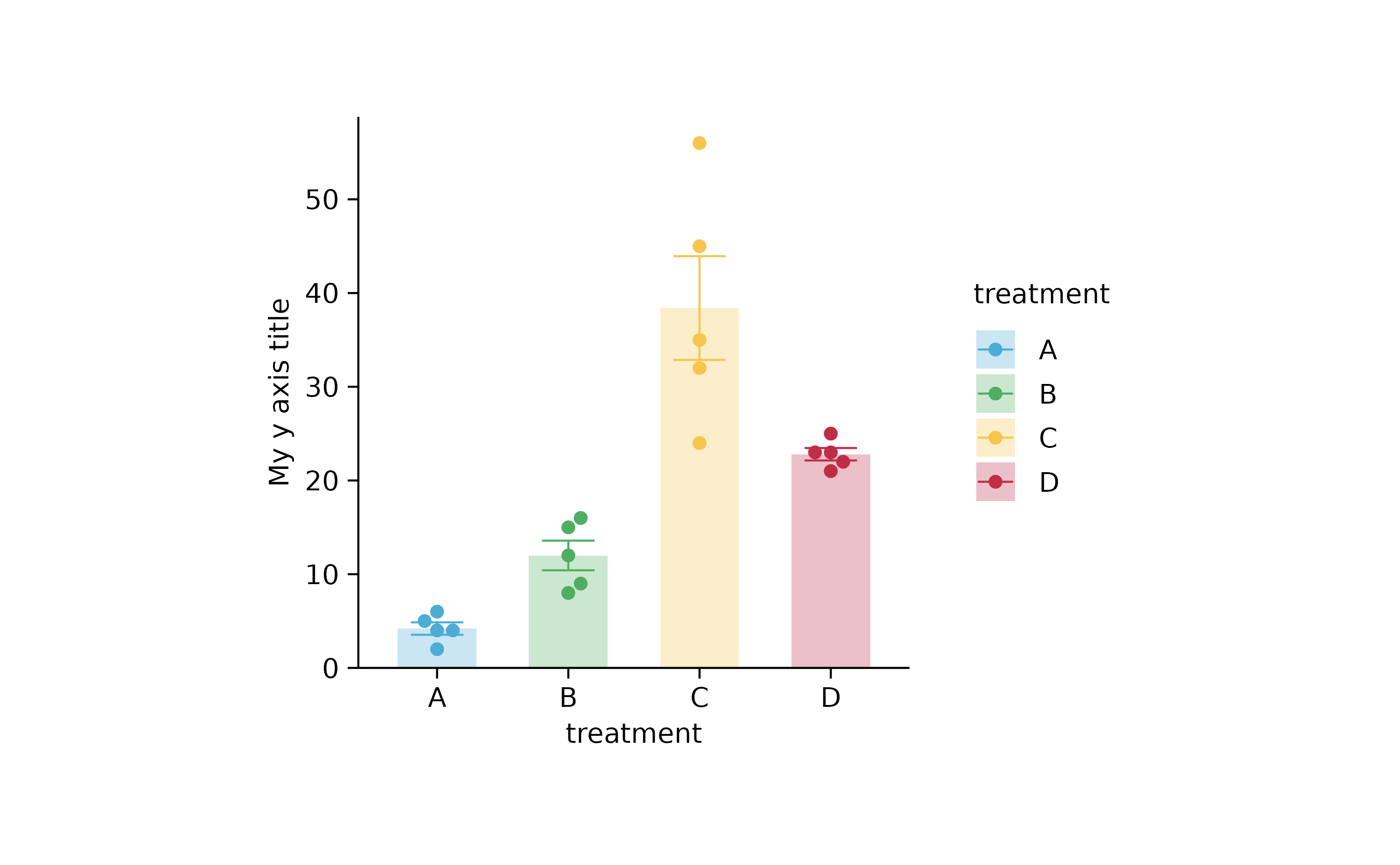
# adjusting legend

p2 %>% adjust_legend(title = "My legend title")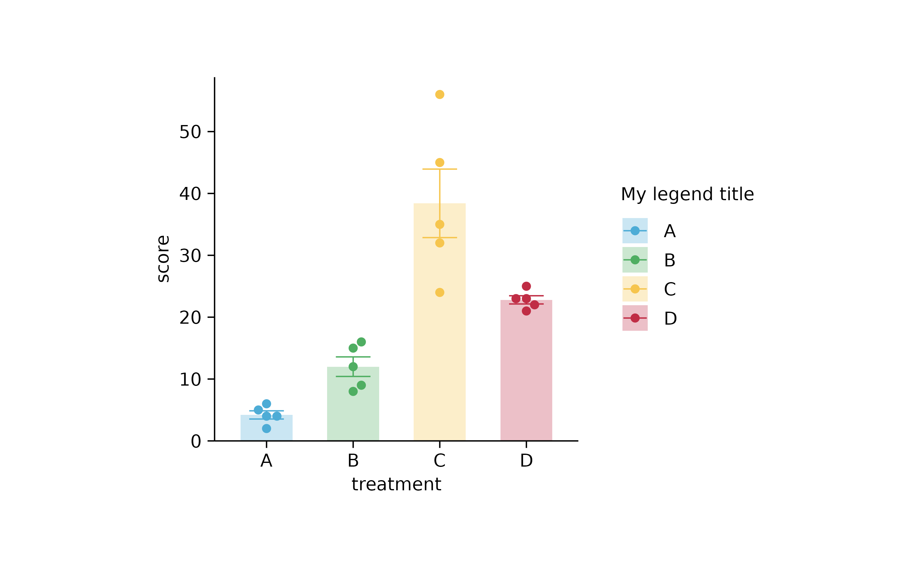
p2 %>% adjust_legend(title = "My legend title", position = "top")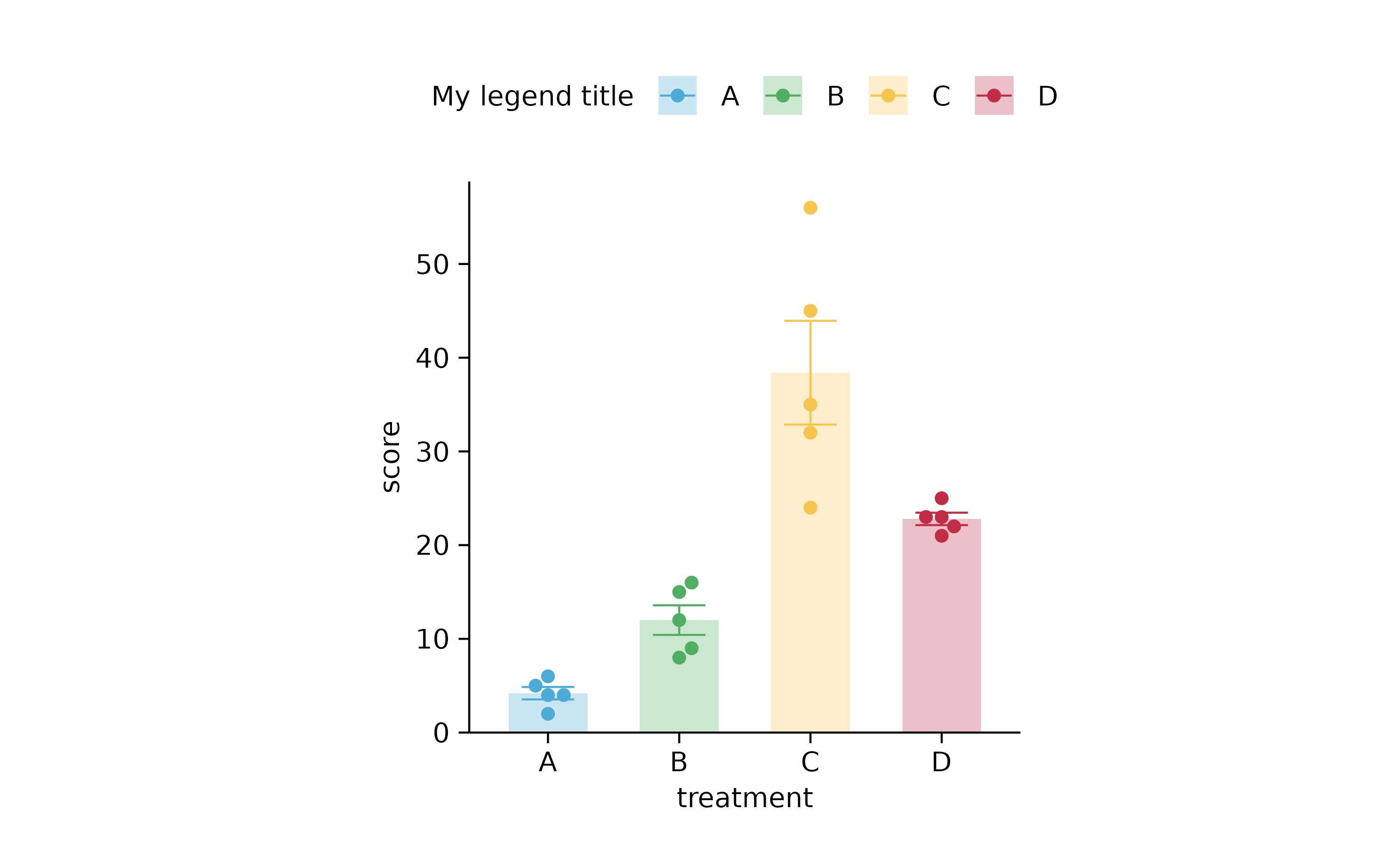
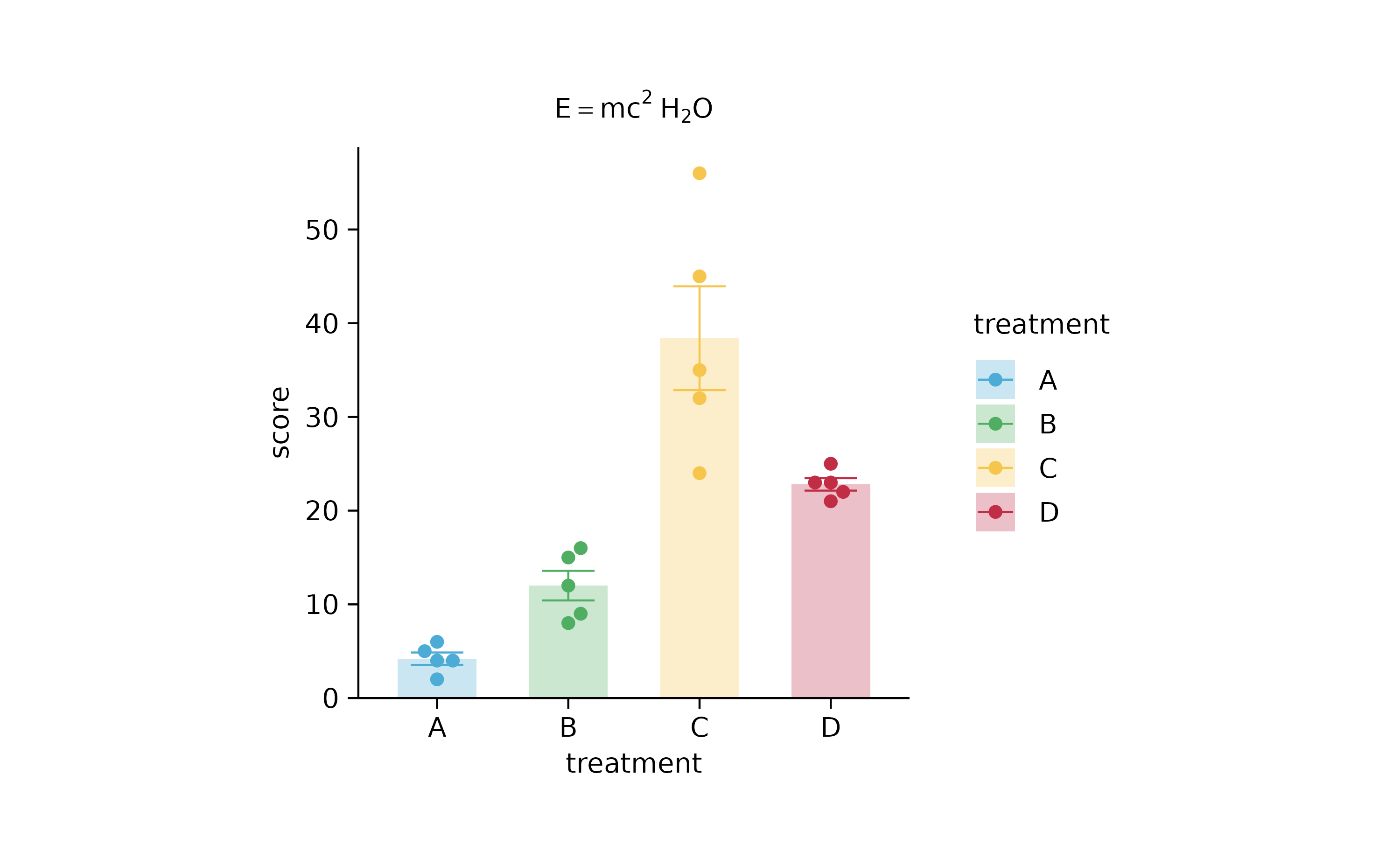
p2 %>% add_caption(caption = "$E==m*c^{2}~H[2]*O$")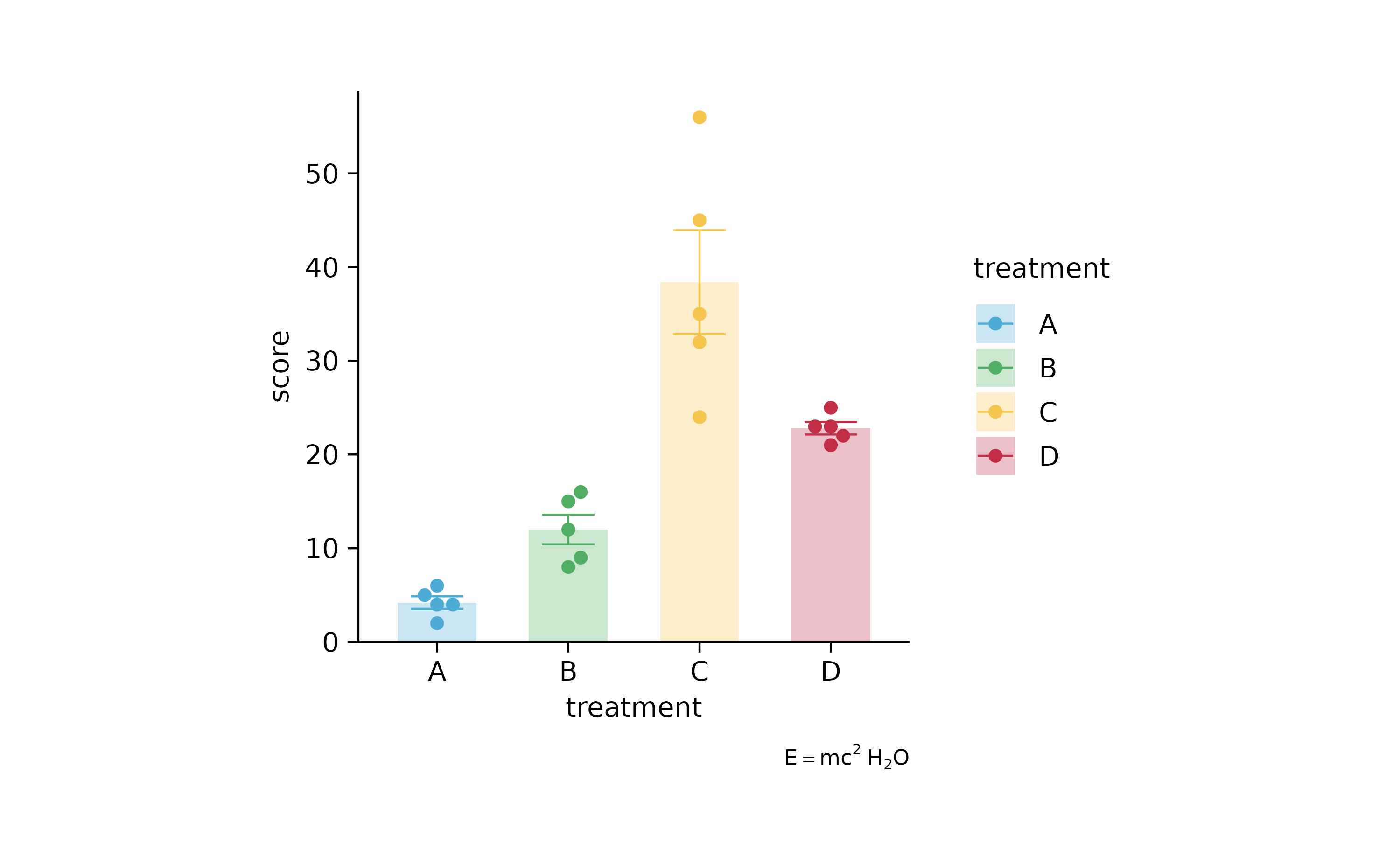
p2 %>% adjust_legend(title = "$E==m*c^{2}~H[2]*O$")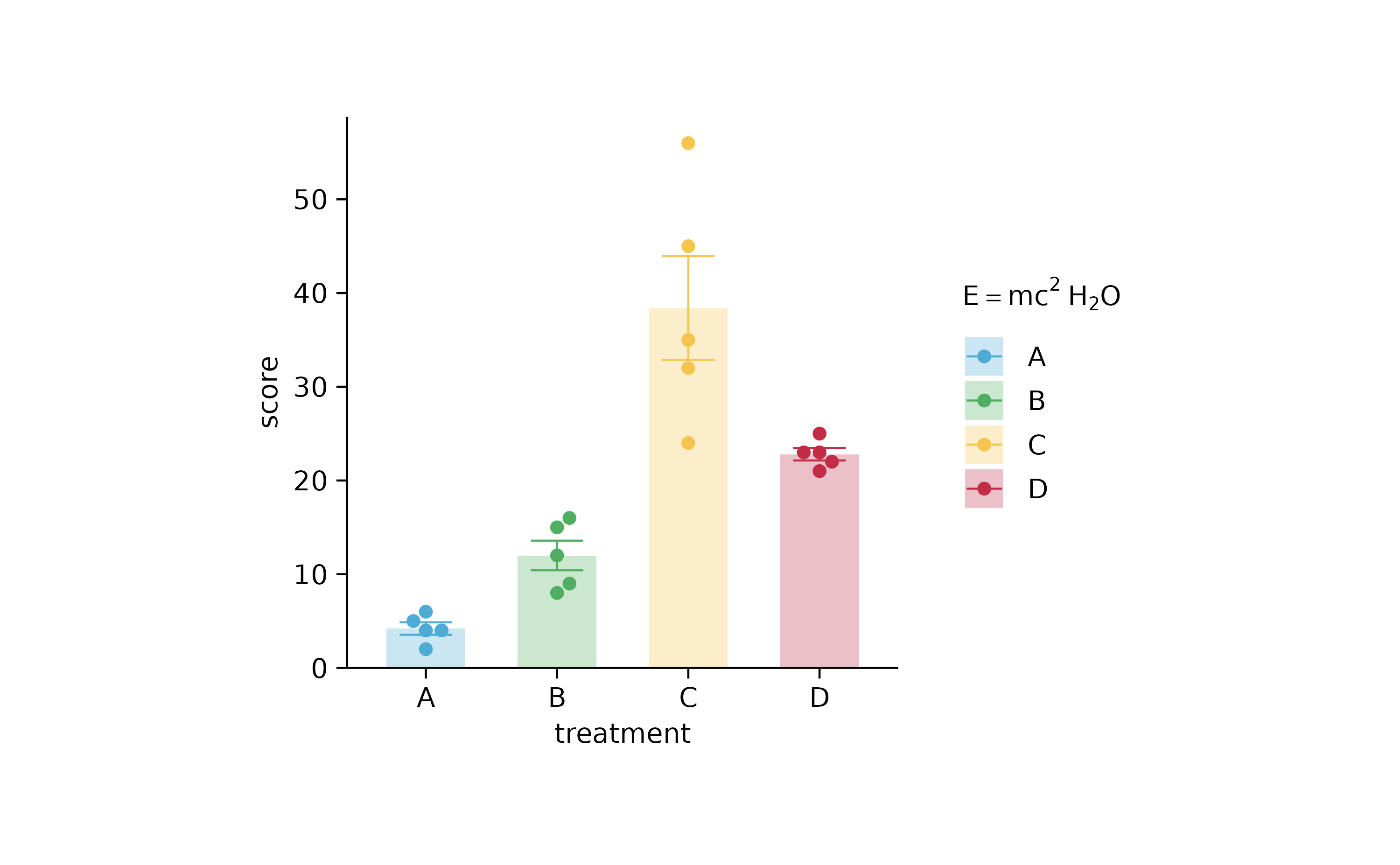
p2 %>% adjust_x_axis(title = "$Domino~E==m*c^{2}$")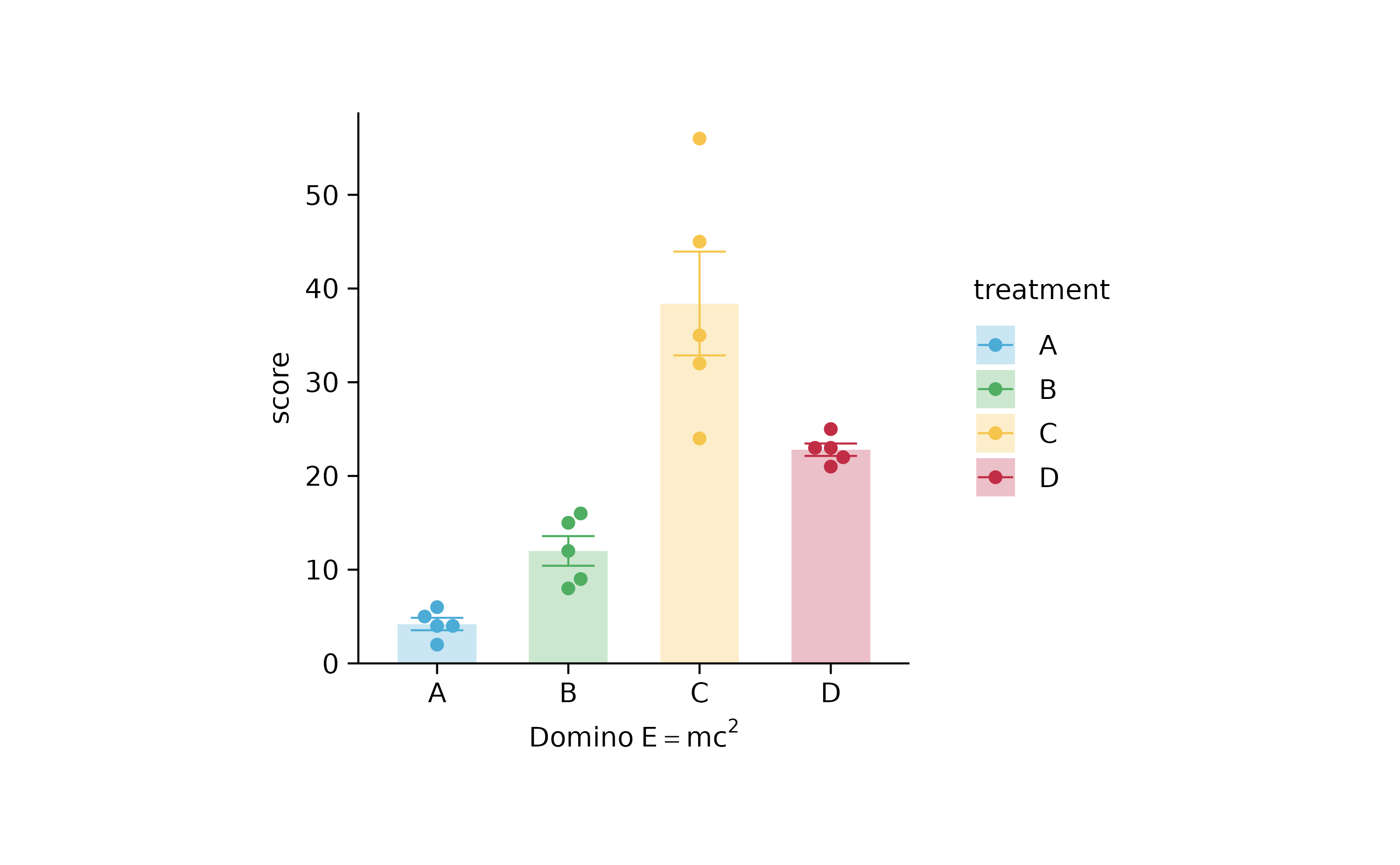
p2 %>% adjust_y_axis(title = "$Domino~E==m*c^{2}$")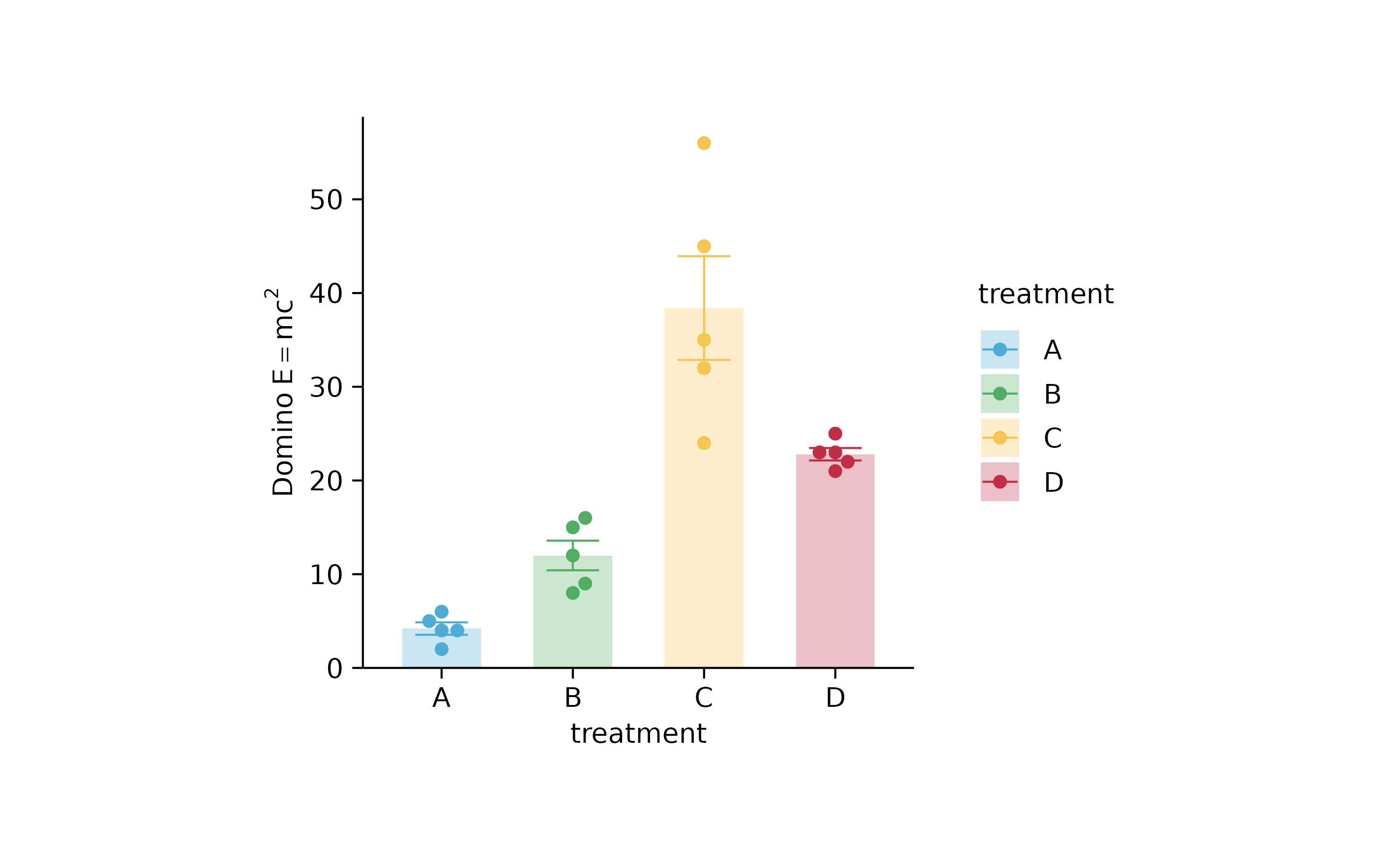
new_names <-
  c("A" = "$TNF*alpha$",
    "B" = "$IFN*gamma$",
    "C" = "plain text",
    "D" = "$H[2]*O$")

p2 %>% rename_x_axis_labels(new_names)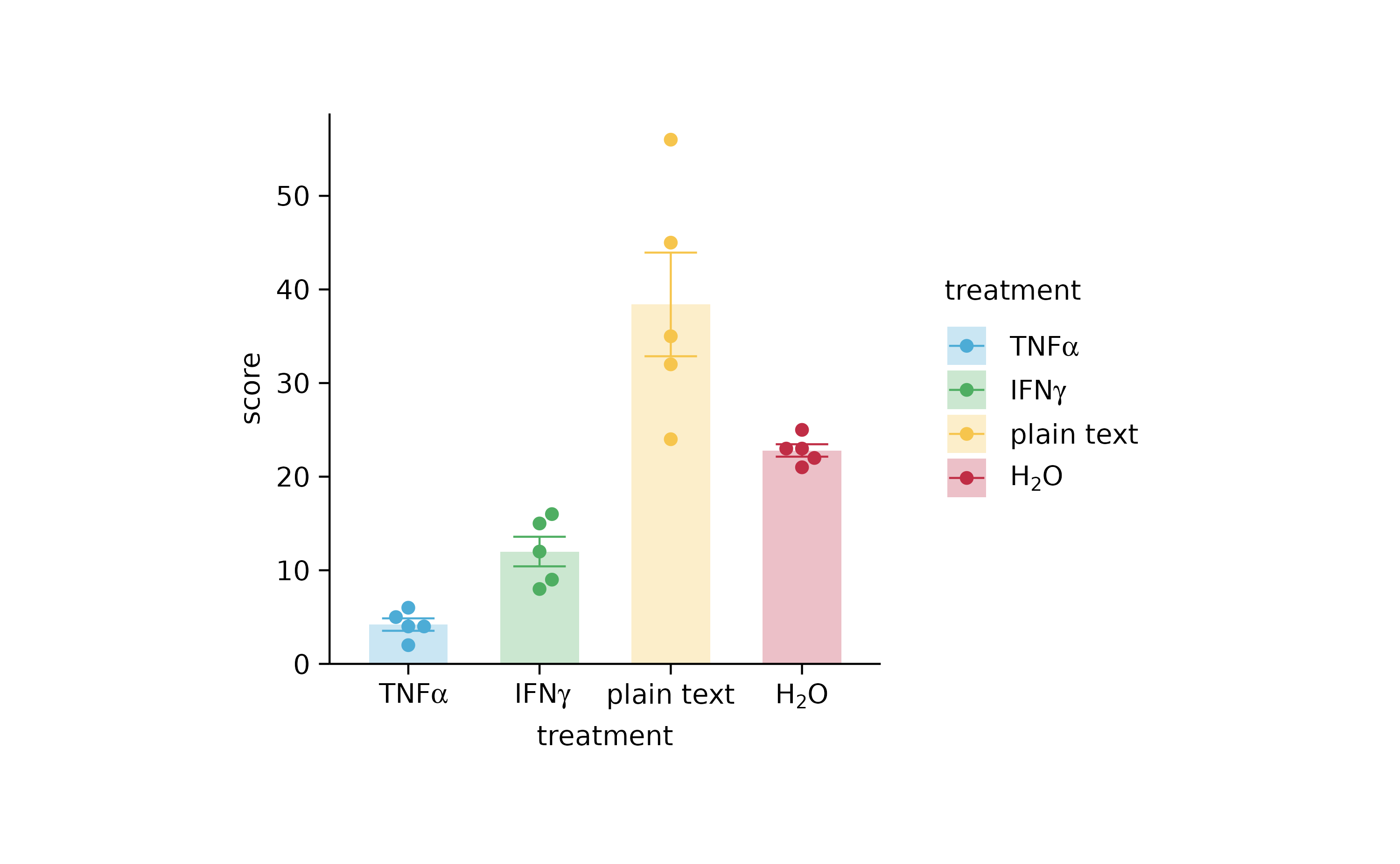
# adjust colors

new_colors <-
  c("A" = "#B0B1B3",
    "B" = "#F18823",
    "C" = "#E23130",
    "D" = "#1D5D83")

p2 %>% adjust_colors(new_colors)
p2 %>% adjust_colors(new_colors)
# add_heatmap()

gene_expression %>%
  tidyplot(x = sample, y = external_gene_name, color = expression) %>%
  add_heatmap(scale = "row") %>%
  adjust_plot_area_size(height = 90)
gene_expression %>%
  tidyplot(x = sample, y = external_gene_name, color = expression) %>%
  add_heatmap() %>%
  adjust_plot_area_size(height = 90)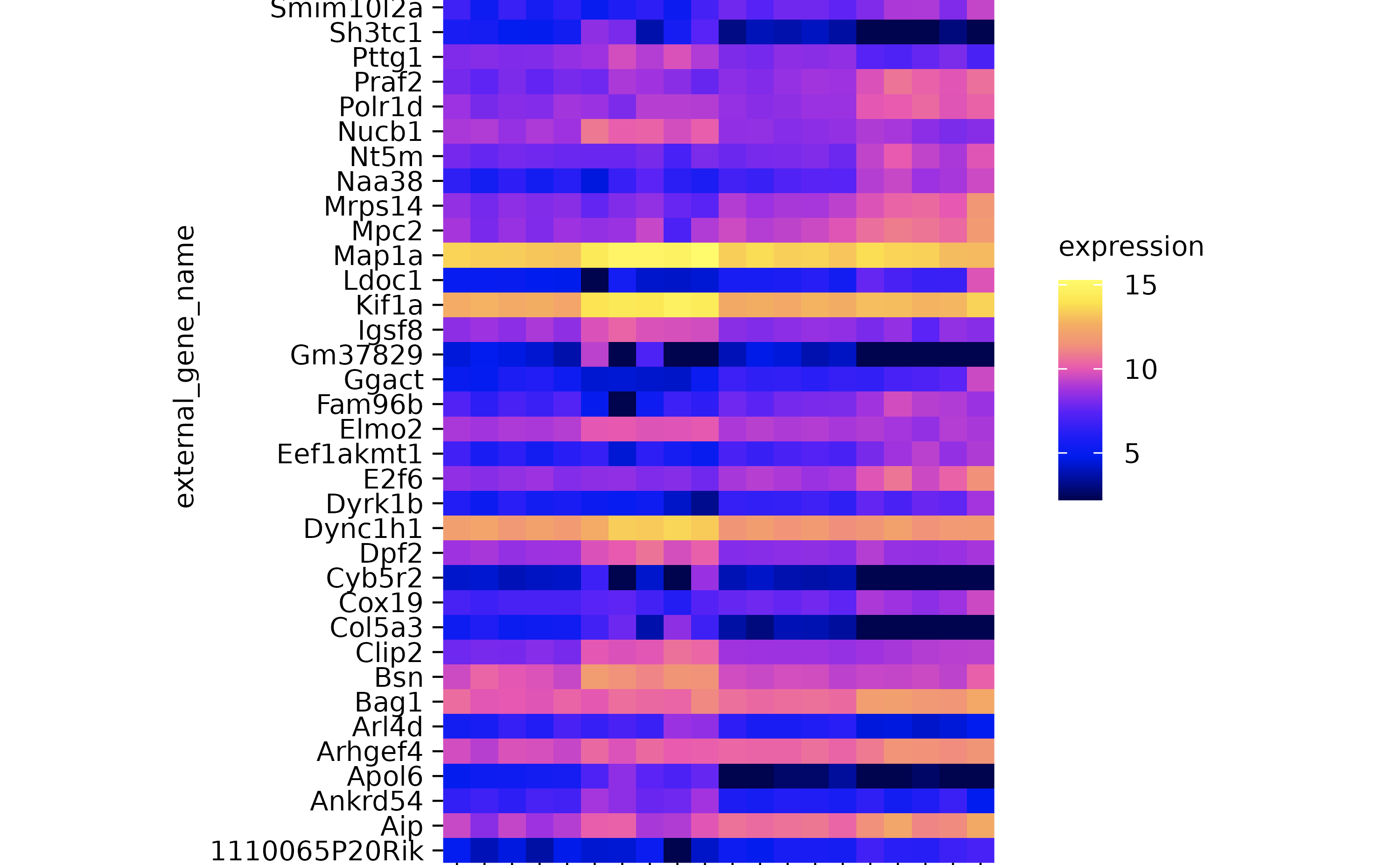
hm <-
  gene_expression %>%
  tidyplot(x = sample, y = external_gene_name, color = expression) %>%
  add_heatmap(scale = "row") %>%
  adjust_plot_area_size(height = 90)

hm %>% reorder_y_axis_labels("Bsn")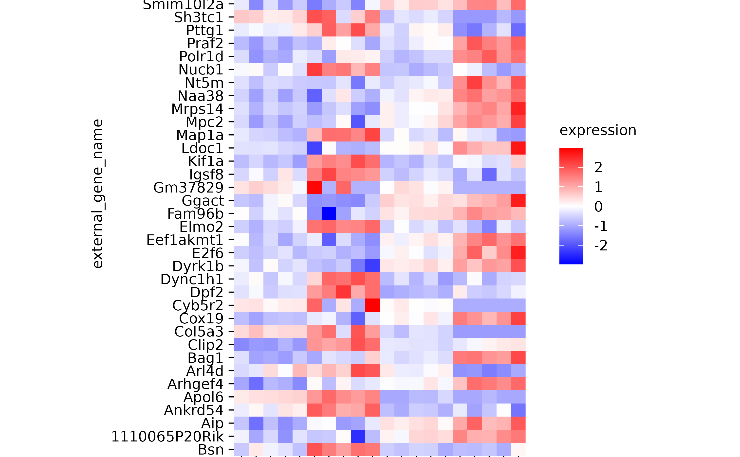
hm %>% reorder_y_axis_labels(c("Bsn", "Apol6"))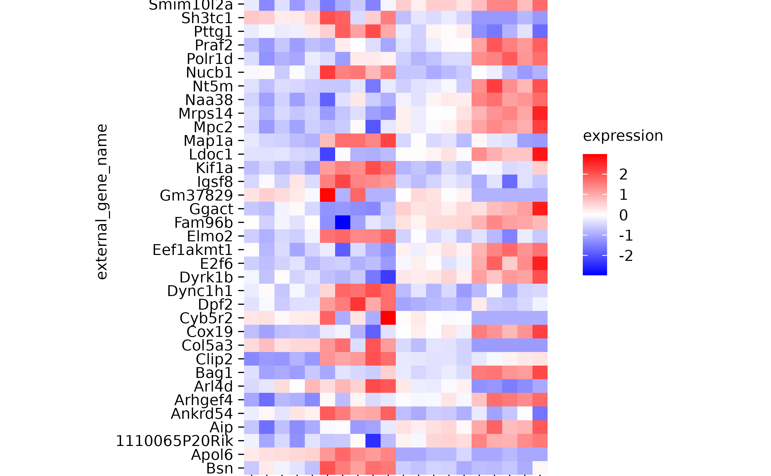
hm %>% reorder_y_axis_labels(sample)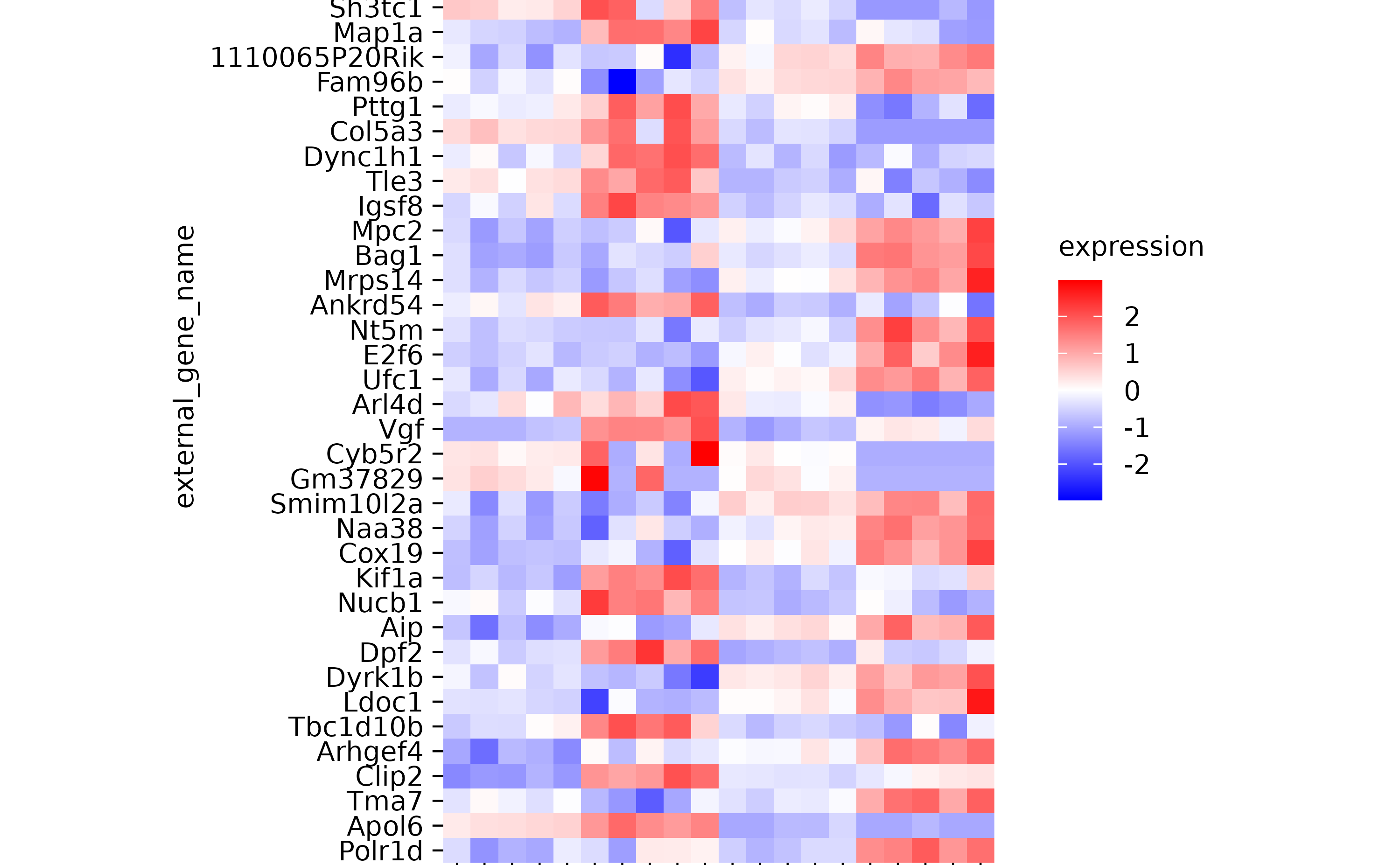
hm %>% sort_y_axis_labels(direction)
hm %>% sort_y_axis_labels(direction, -padj)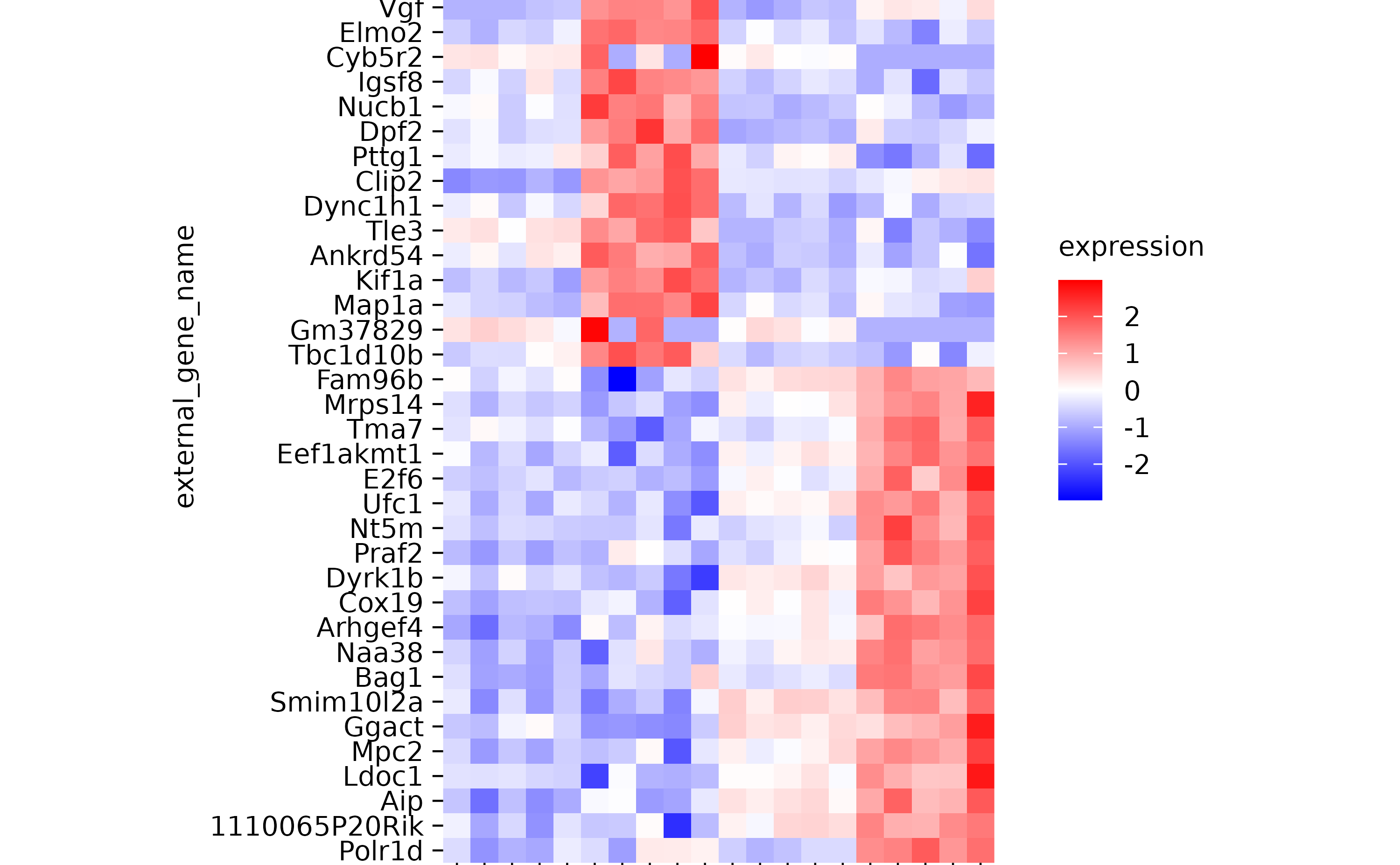
hm
hm %>% reorder_y_axis_labels("Bsn")
hm %>% reorder_x_axis_labels("Hin_3")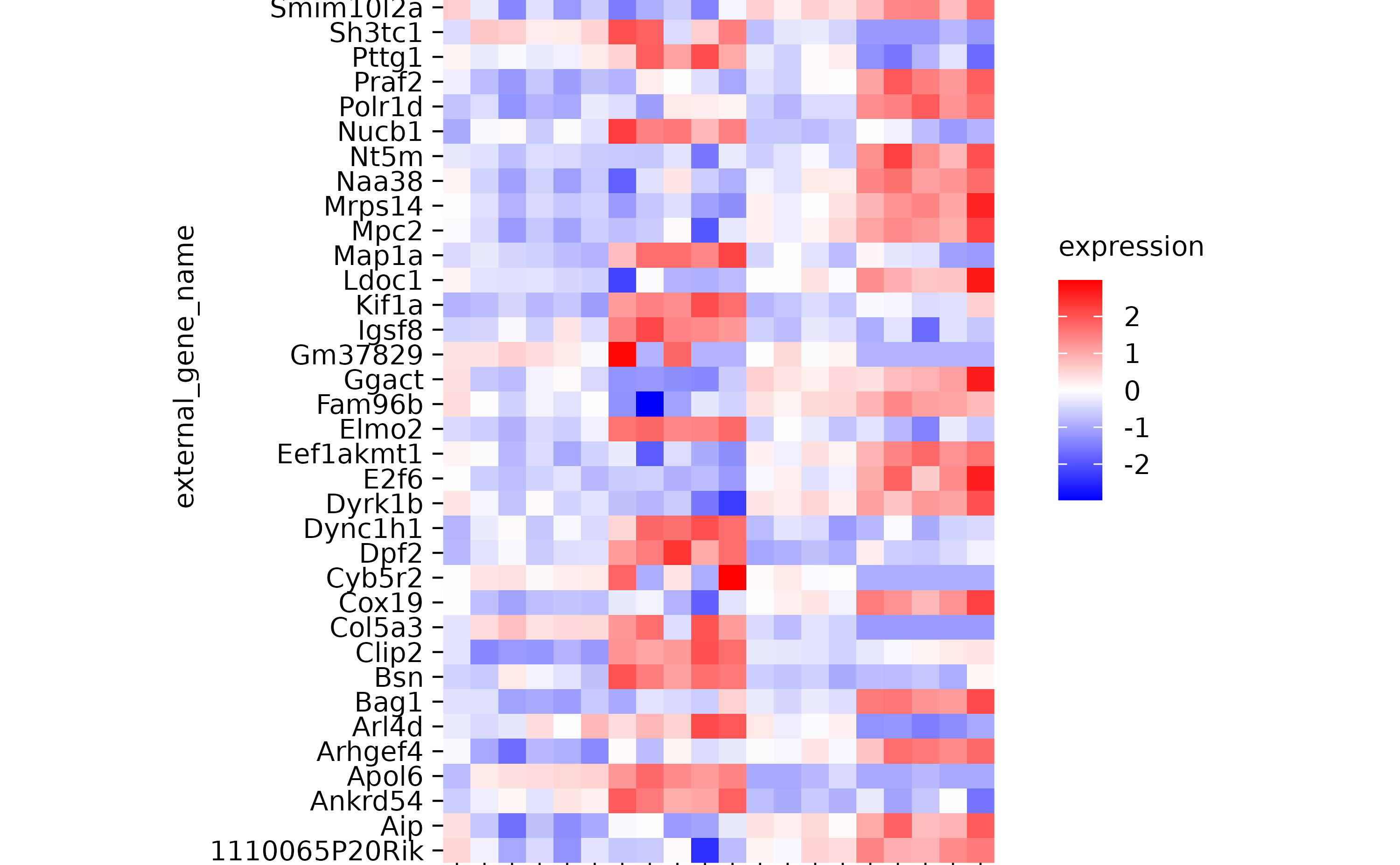
hm %>% reorder_x_axis_labels(sample)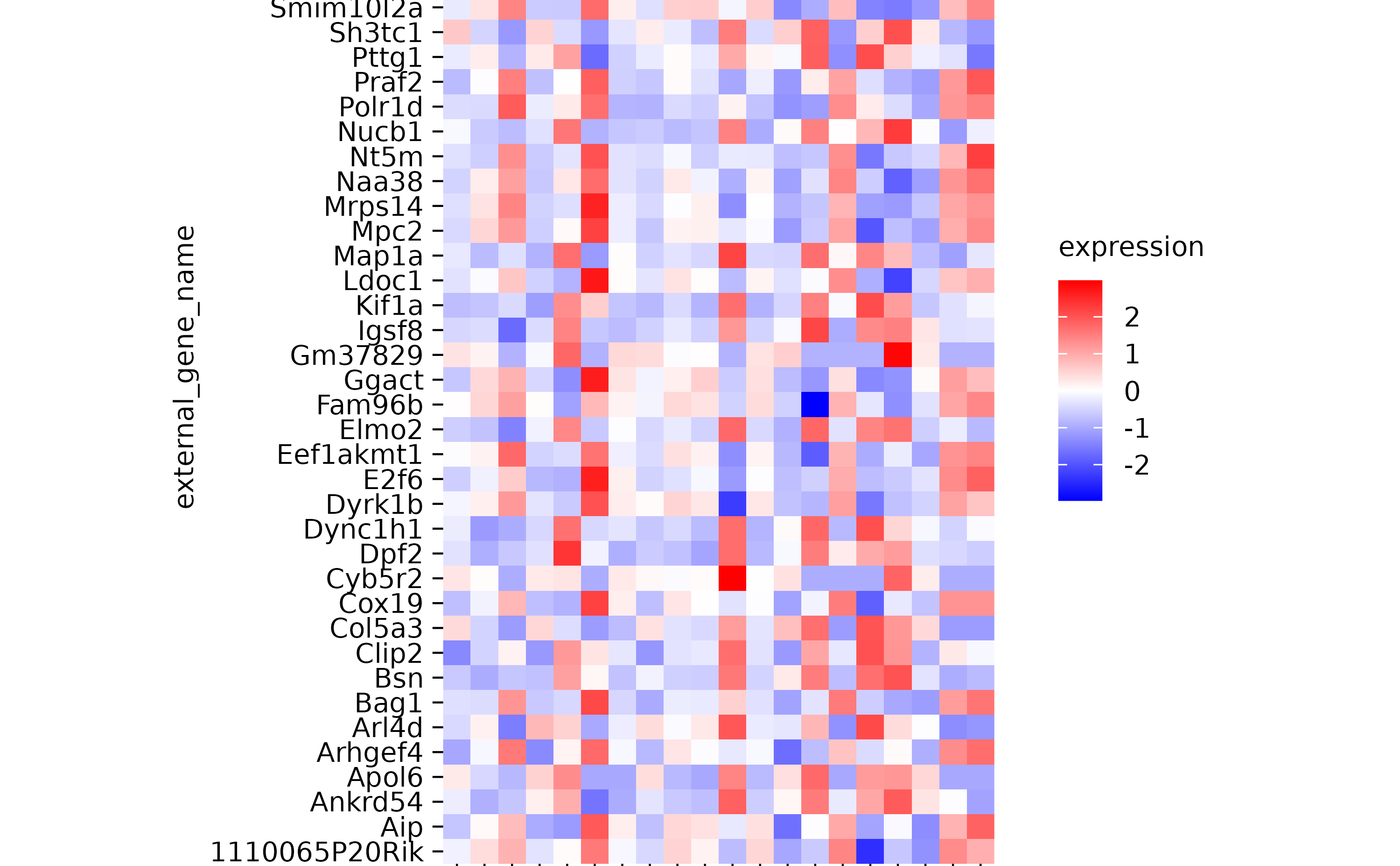
hm
hm %>% sort_y_axis_labels(expression)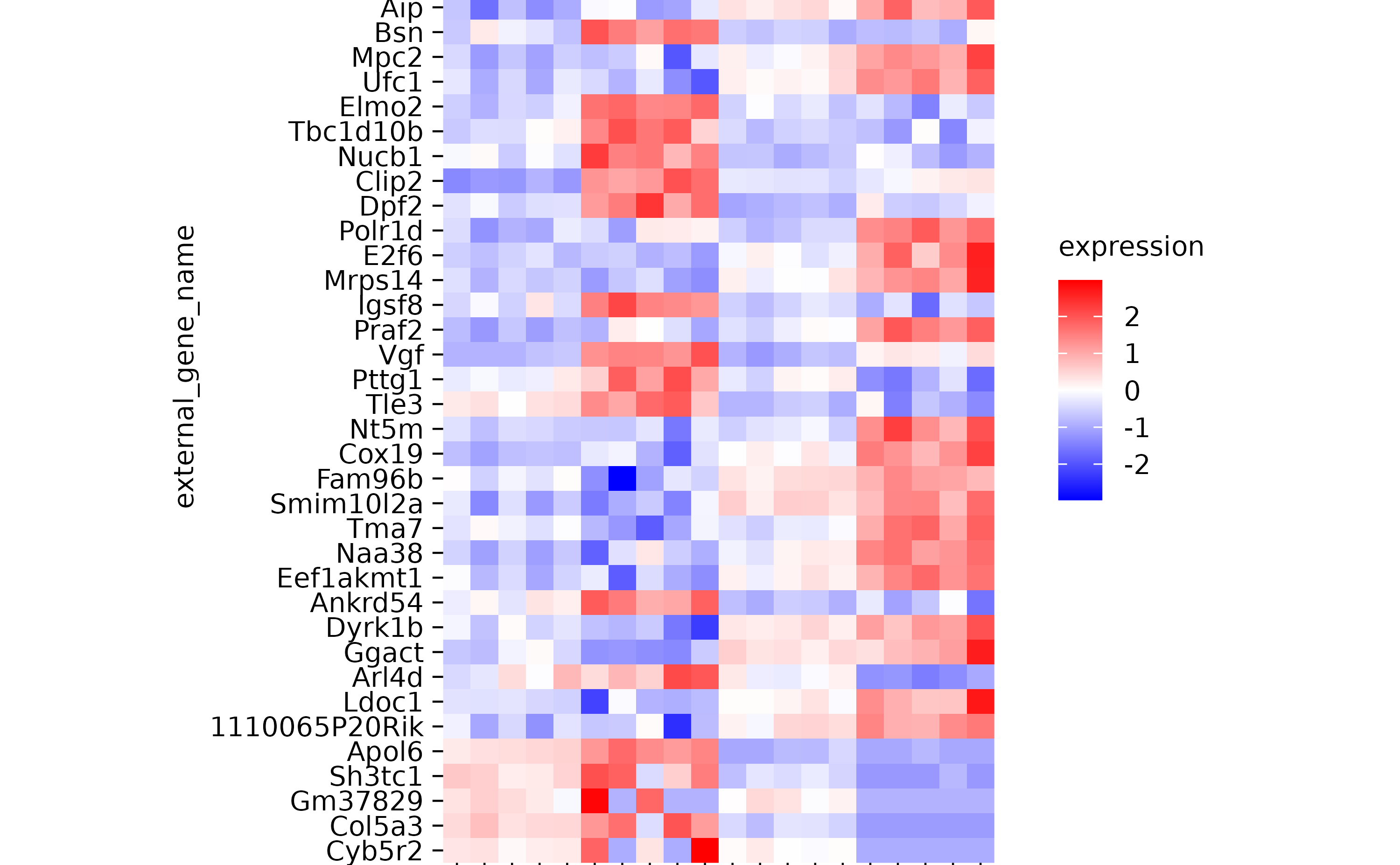
hm %>% sort_y_axis_labels(direction)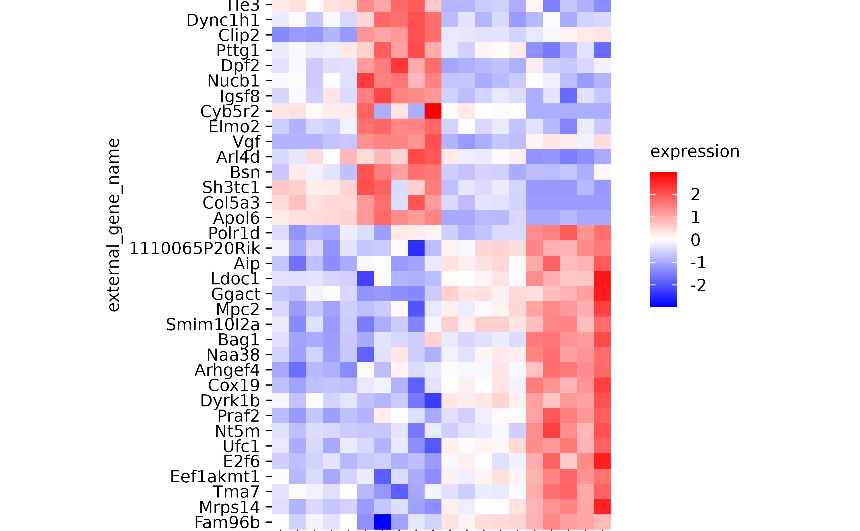
hm %>% sort_y_axis_labels(direction, -padj)
hm %>% sort_x_axis_labels(group)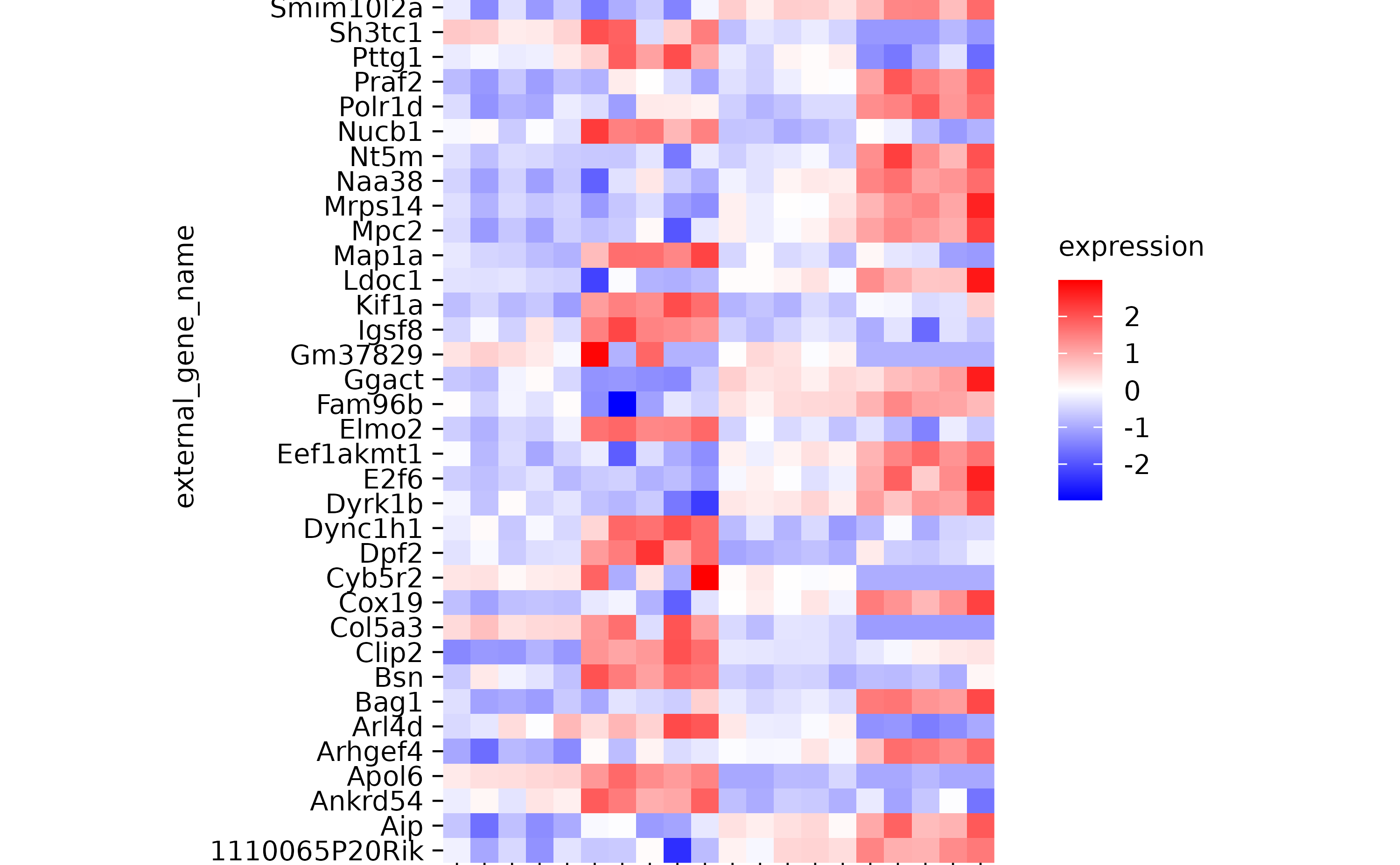
hm %>% sort_x_axis_labels(sample_type)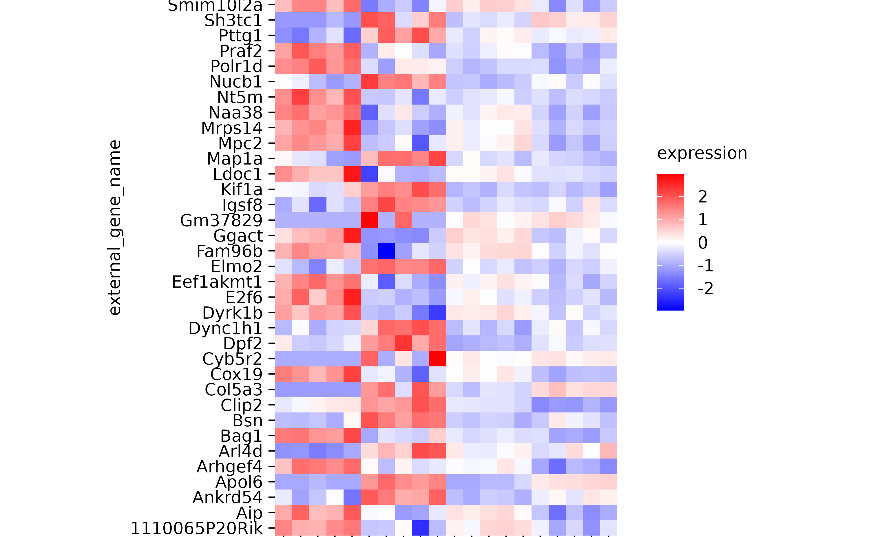
hm %>% sort_x_axis_labels(desc(sample_type))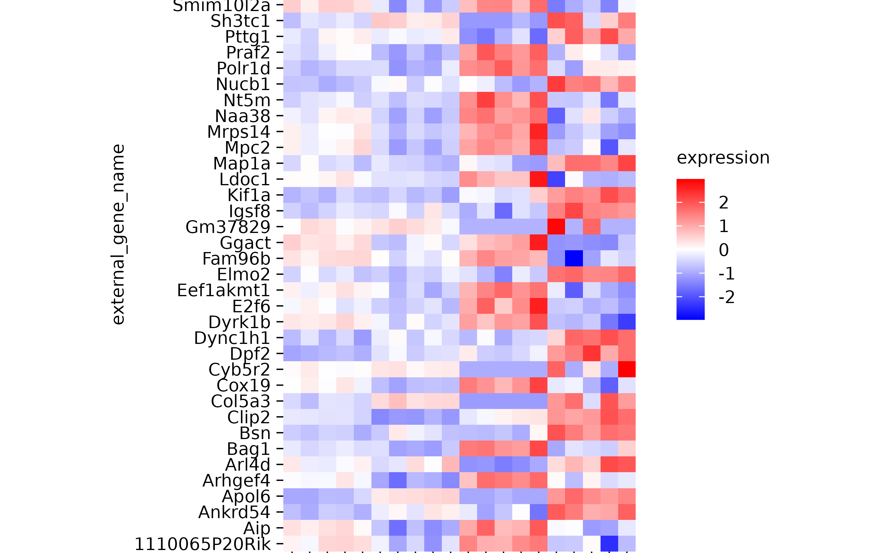
hm %>% sort_x_axis_labels(condition)
hm
hm %>% reverse_x_axis_labels()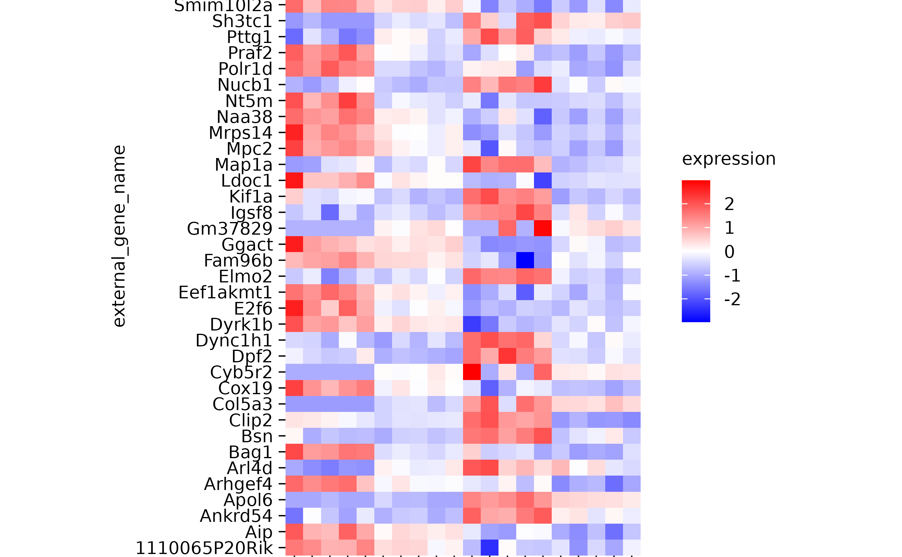
hm %>% reverse_y_axis_labels()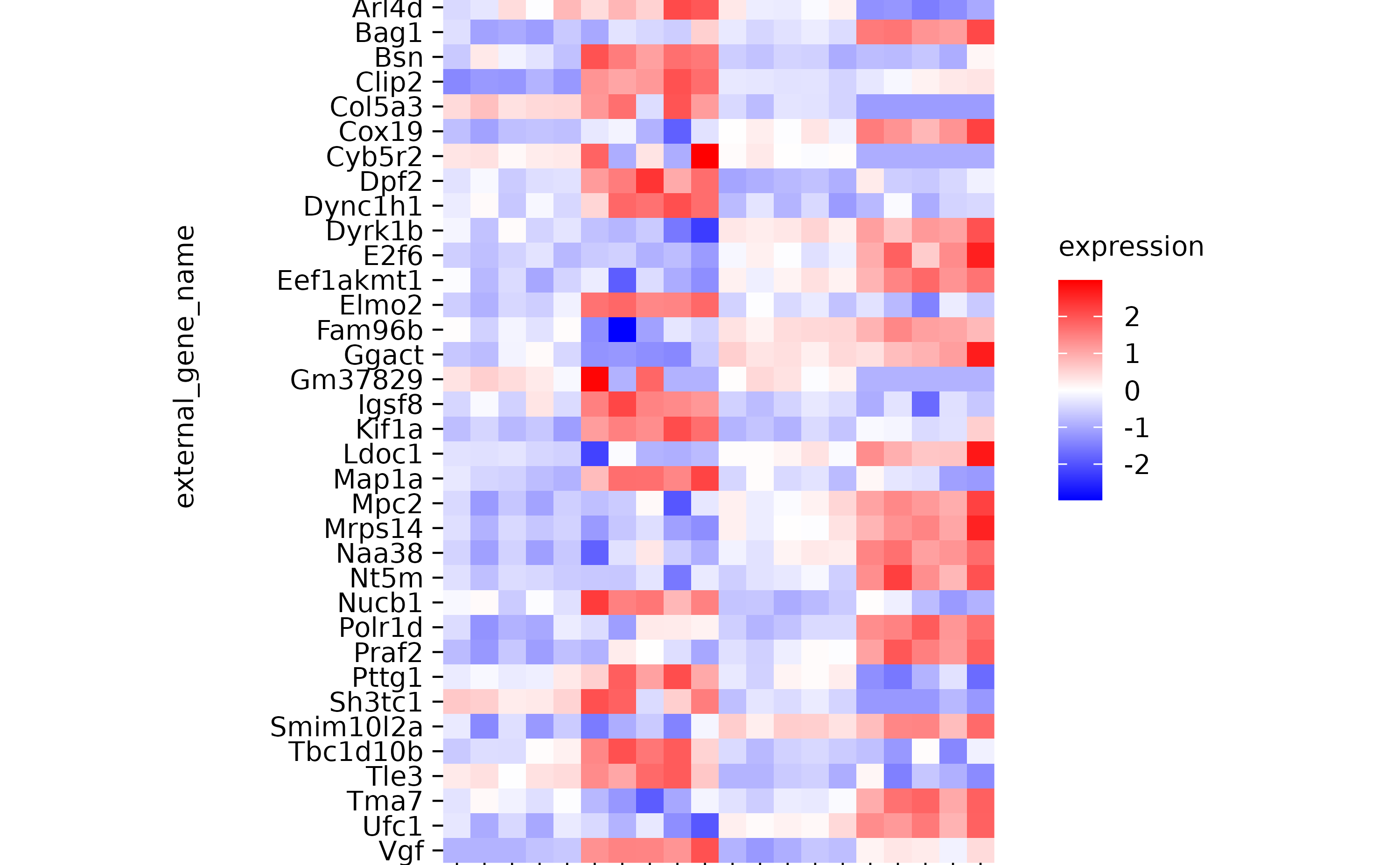
hm
hm %>% rename_x_axis_labels(new_names = c("Ein_1" = "Hallo"))
hm %>% rename_y_axis_labels(new_names = c("Bsn" = "Juhooooooooooooooo!",
                                     "Aip" = "Rabbithoooooooooooole"))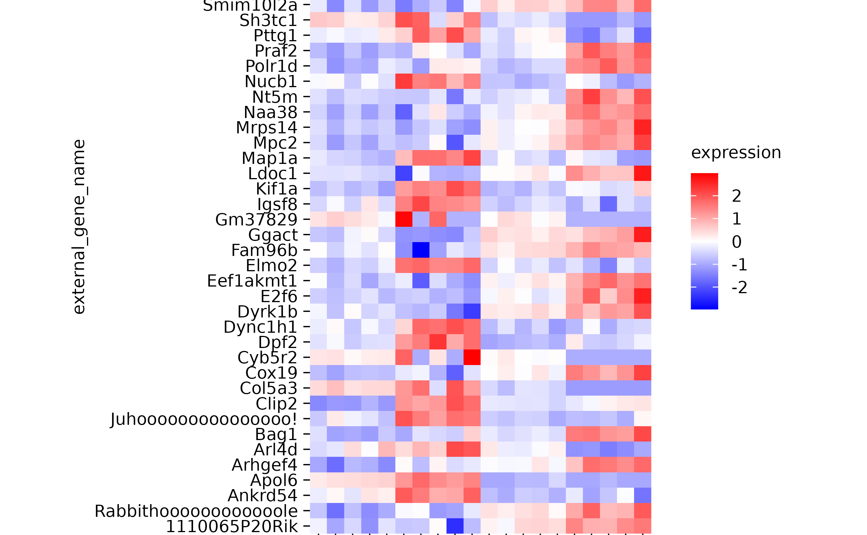
dinosaurs %>%
  tidyplot(speed, dinosaur) %>%
  add_mean_bar() %>%
  sort_y_axis_labels(speed)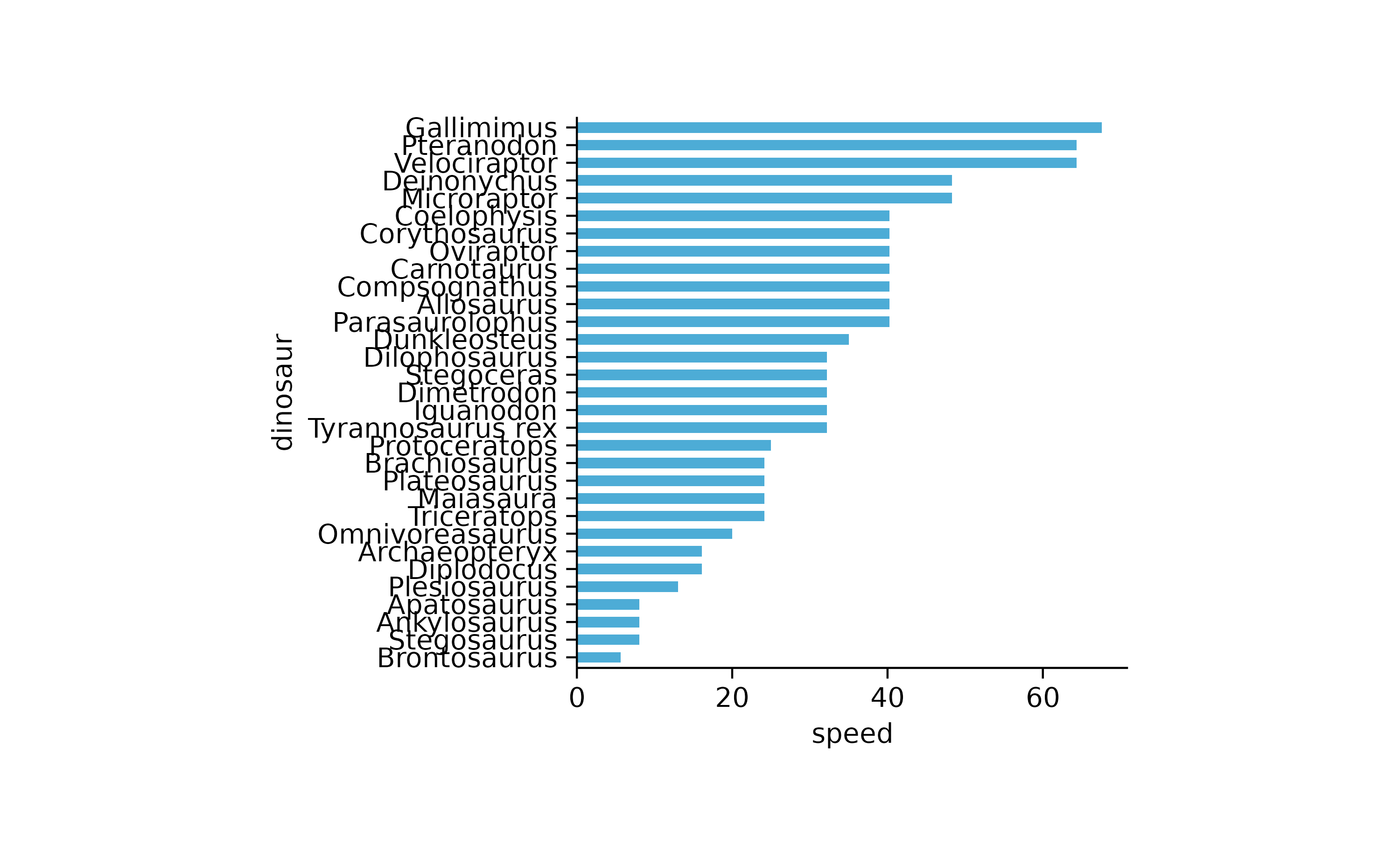
animals %>%
  tidyplot(family, size, color = family) %>%
  add_mean_bar(alpha = 0.3) %>%
  add_error_bar() %>%
  add_data_points() %>%
  sort_x_axis_labels(size)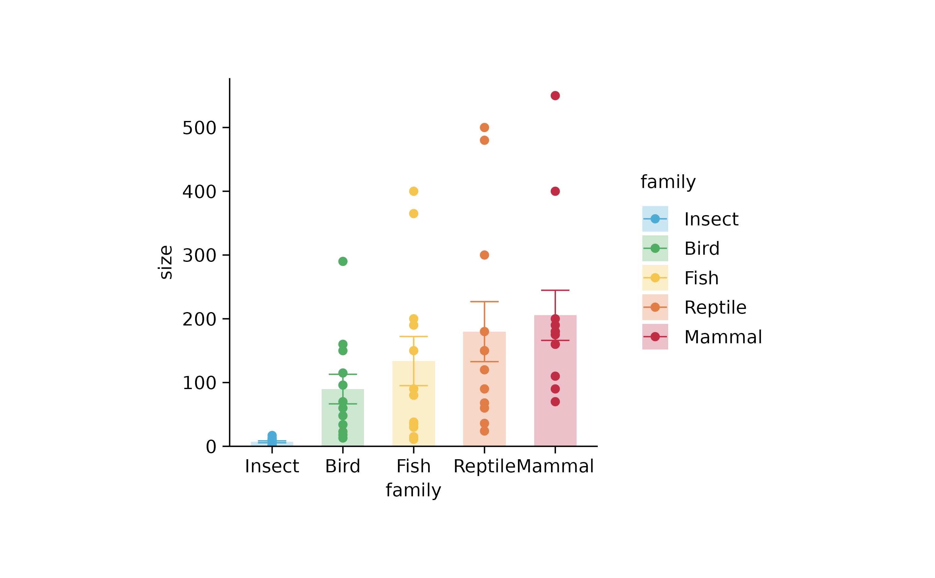
study %>%
  tidyplot(treatment, score, color = treatment) %>%
  add_data_points_beeswarm() %>%
  reorder_x_axis_labels("D") %>%
  sort_x_axis_labels(score) %>%
  reverse_x_axis_labels() %>%
  rename_x_axis_labels(c("A" = "Hallo"))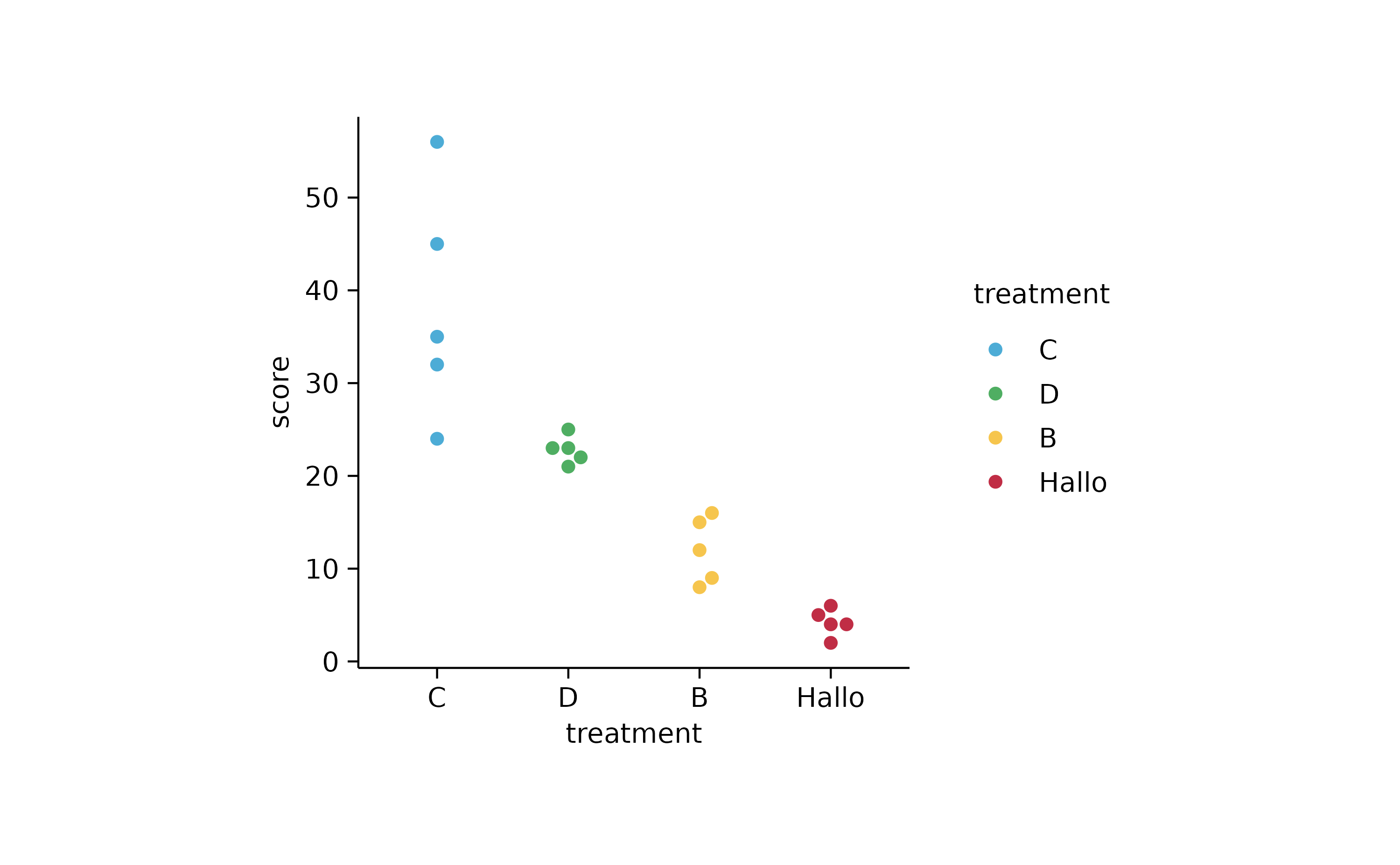
p4 <-
  study %>%
  tidyplot(group, score, color = dose) %>%
  add_mean_bar(alpha = 0.3) %>%
  add_error_bar() %>%
  add_data_points_beeswarm()

p4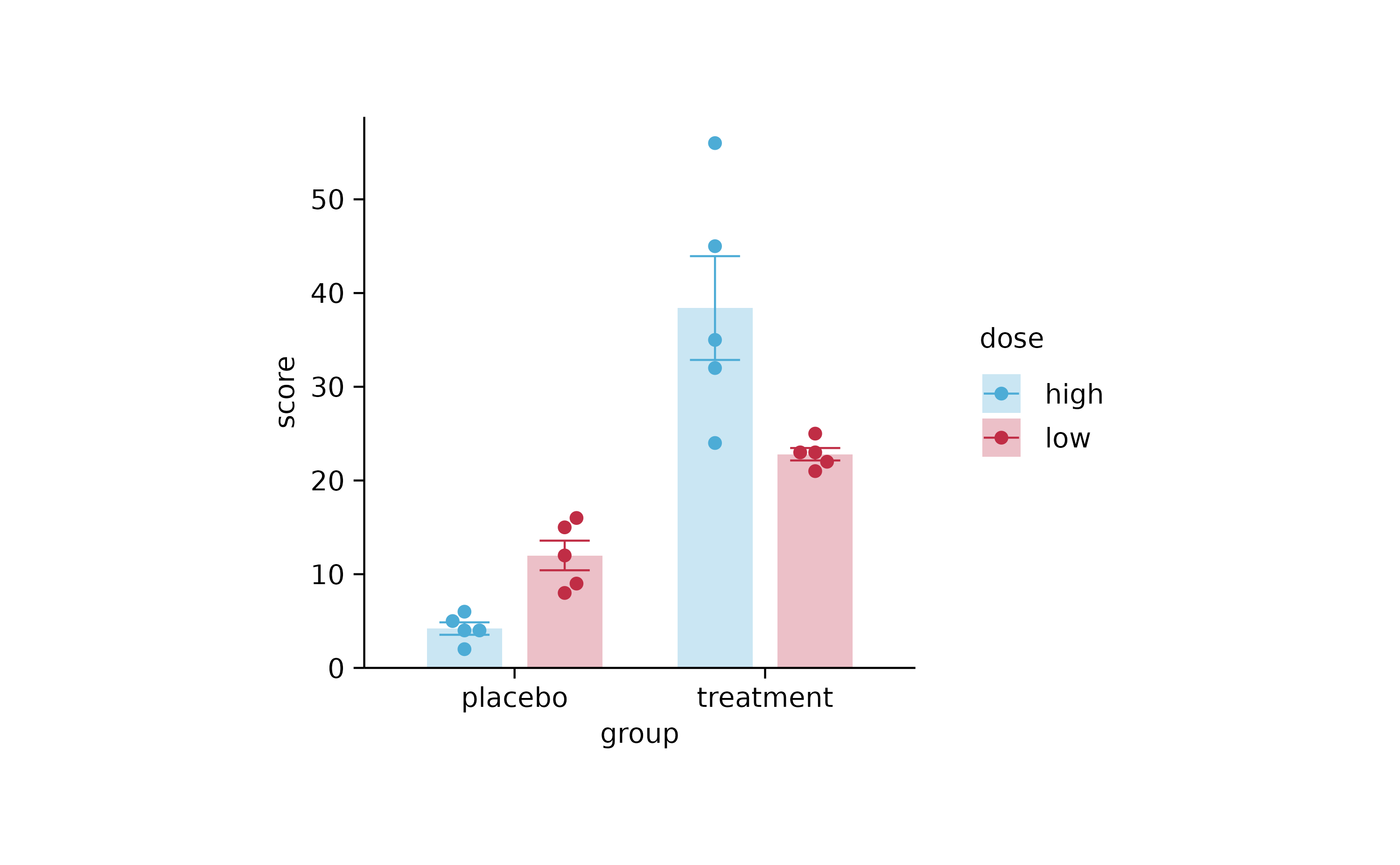
p4 %>% reverse_color_labels()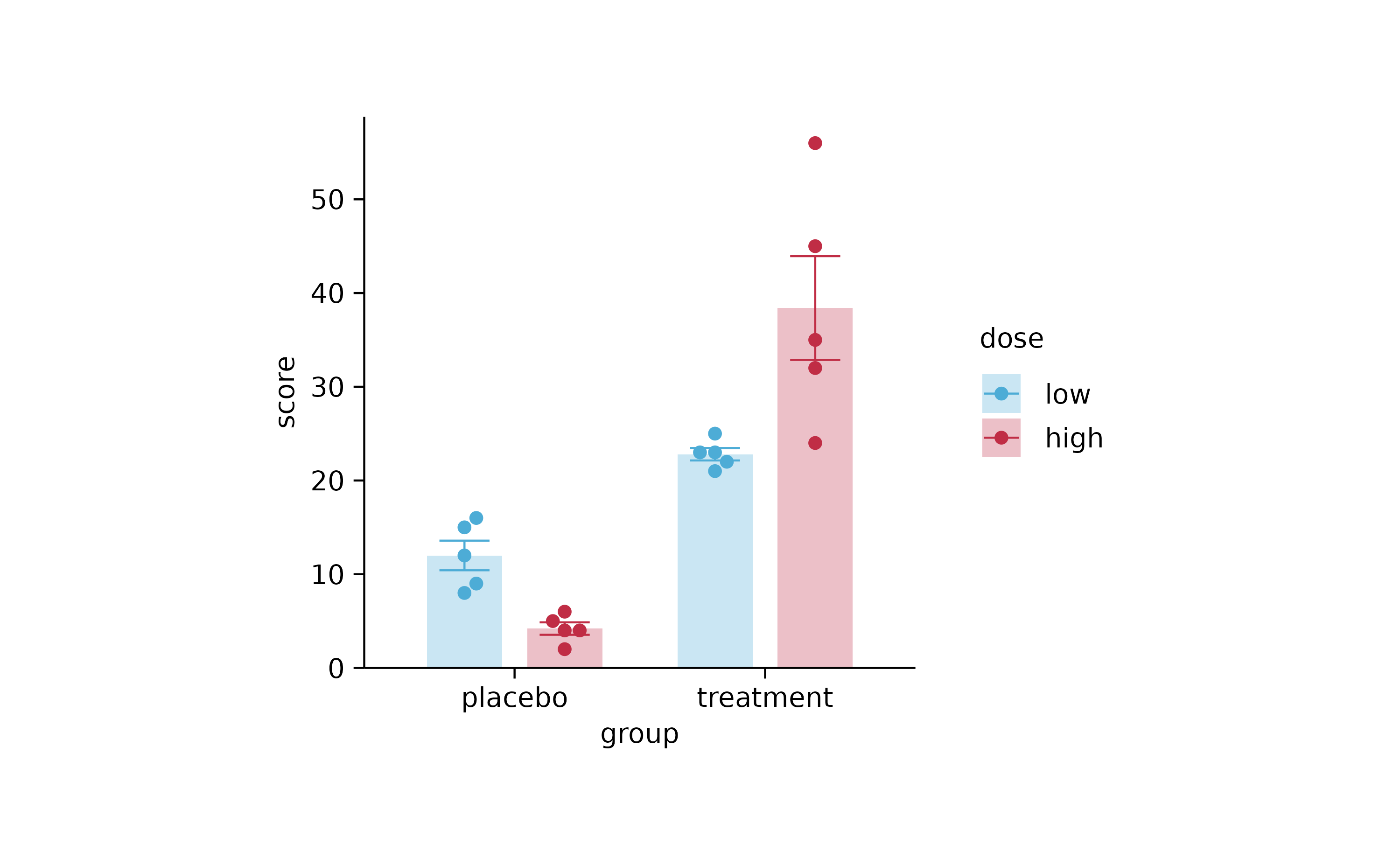
p4
p4 %>% rename_color_labels(c("low" = "Nearly nothing", "high" = "Sky high"))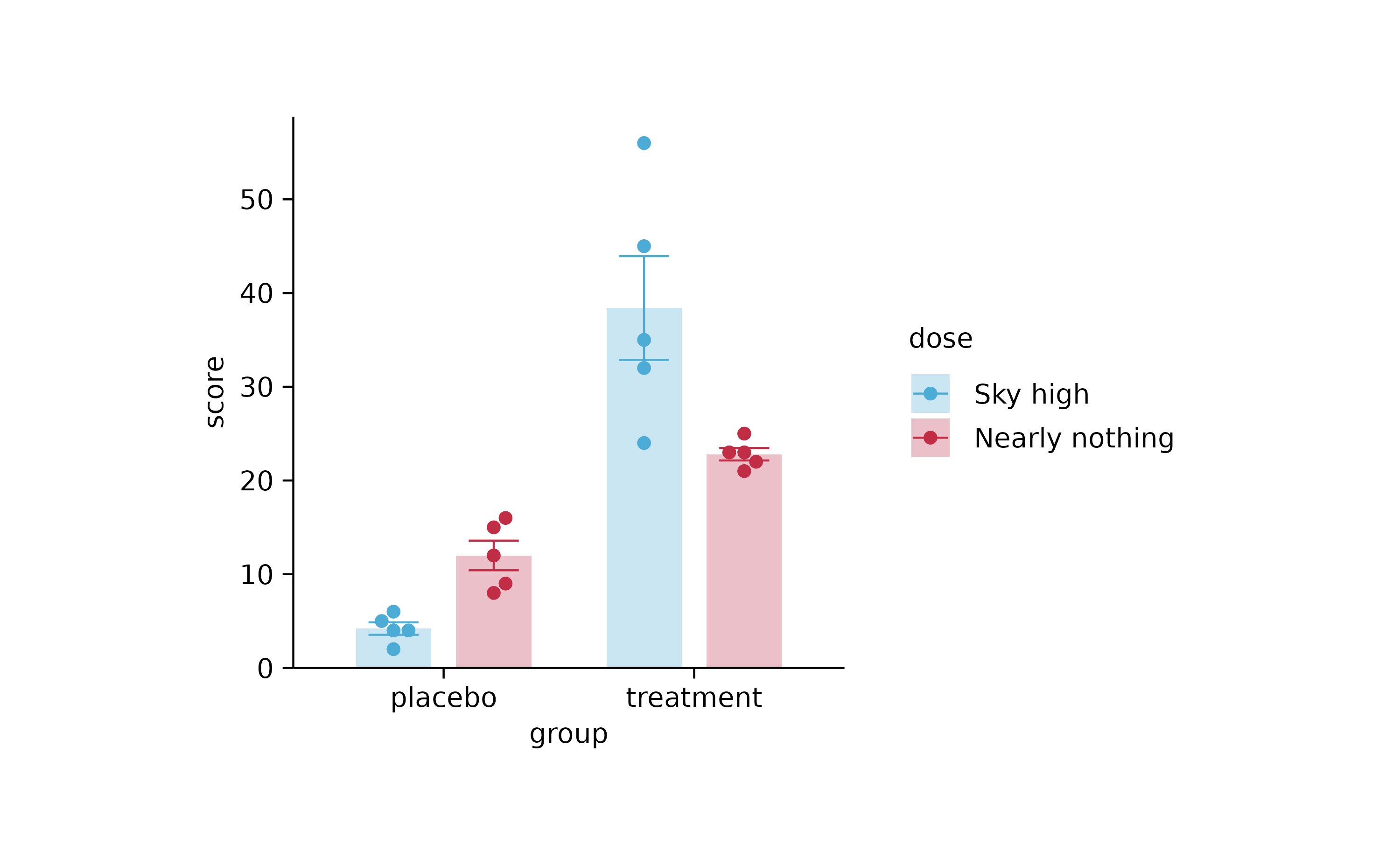
gene_expression %>%
  tidyplot(x = sample, y = external_gene_name, color = expression) %>%
  add_heatmap(scale = "row", rasterize = TRUE, rasterize_dpi = 20) %>%
  sort_y_axis_labels(direction) %>%
  adjust_plot_area_size(height = 90)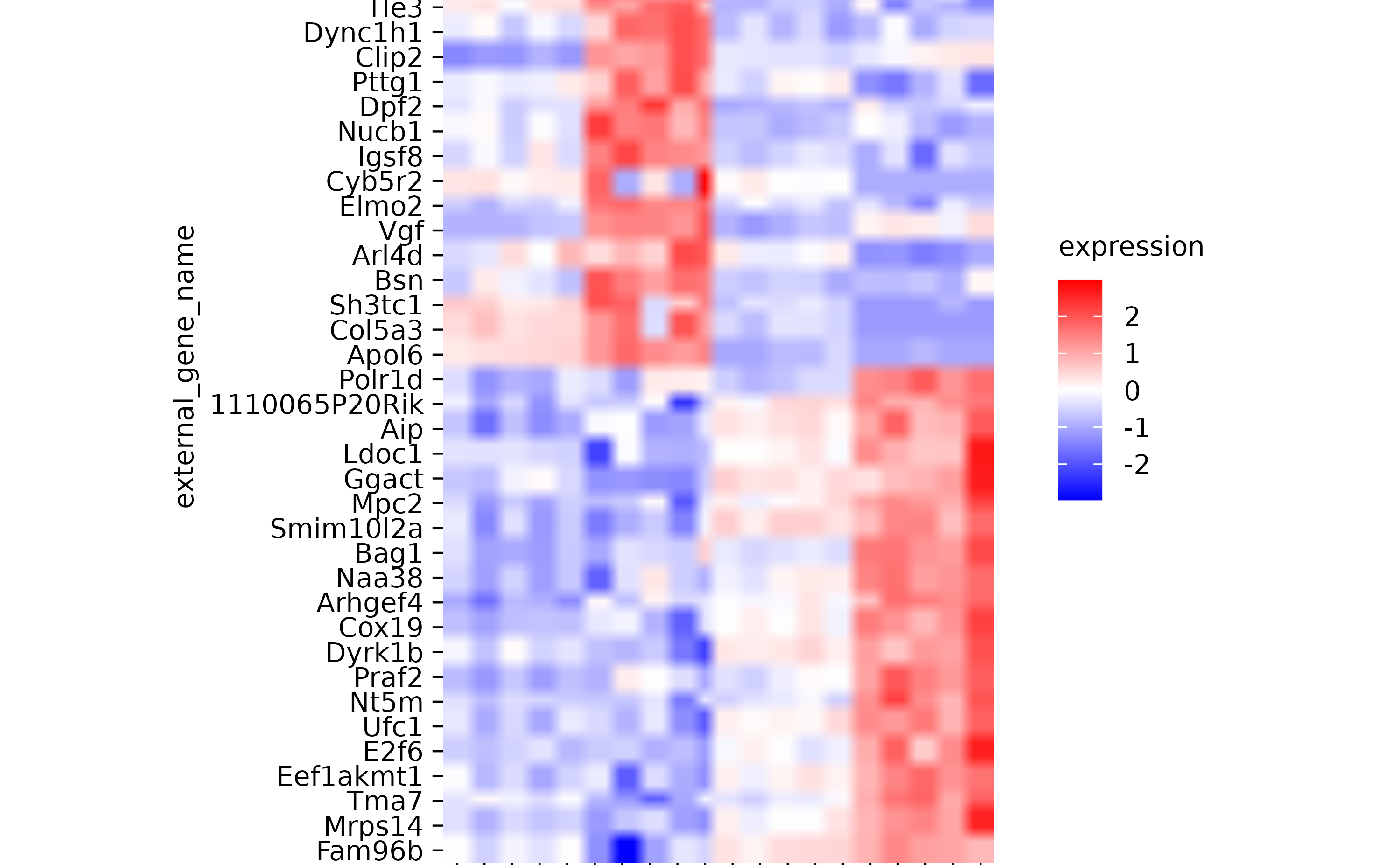
gene_expression %>%
  tidyplot(x = sample, y = external_gene_name, color = expression) %>%
  add_heatmap(scale = "column") %>%
  adjust_plot_area_size(height = 90)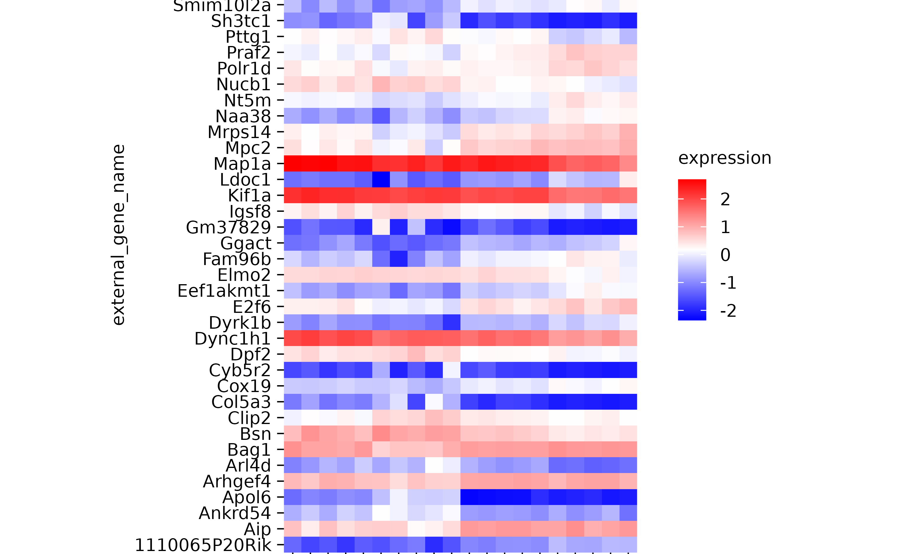
# plotmath expressions

p2 %>% adjust_x_axis(title = "$Domino~E==m*c^{2}$")
p2 %>% adjust_y_axis(title = "$Domino~E==m*c^{2}$")
# next chapter

study %>%
  tidyplot(x = treatment, y = score, color = treatment) %>%
  add_mean_dash() %>%
  add_error_bar() %>%
  add_data_points_beeswarm(rasterize = TRUE, rasterize_dpi = 50)
study %>%
  tidyplot(x = treatment, y = score, color = treatment) %>%
  add_mean_bar(alpha = 0.3)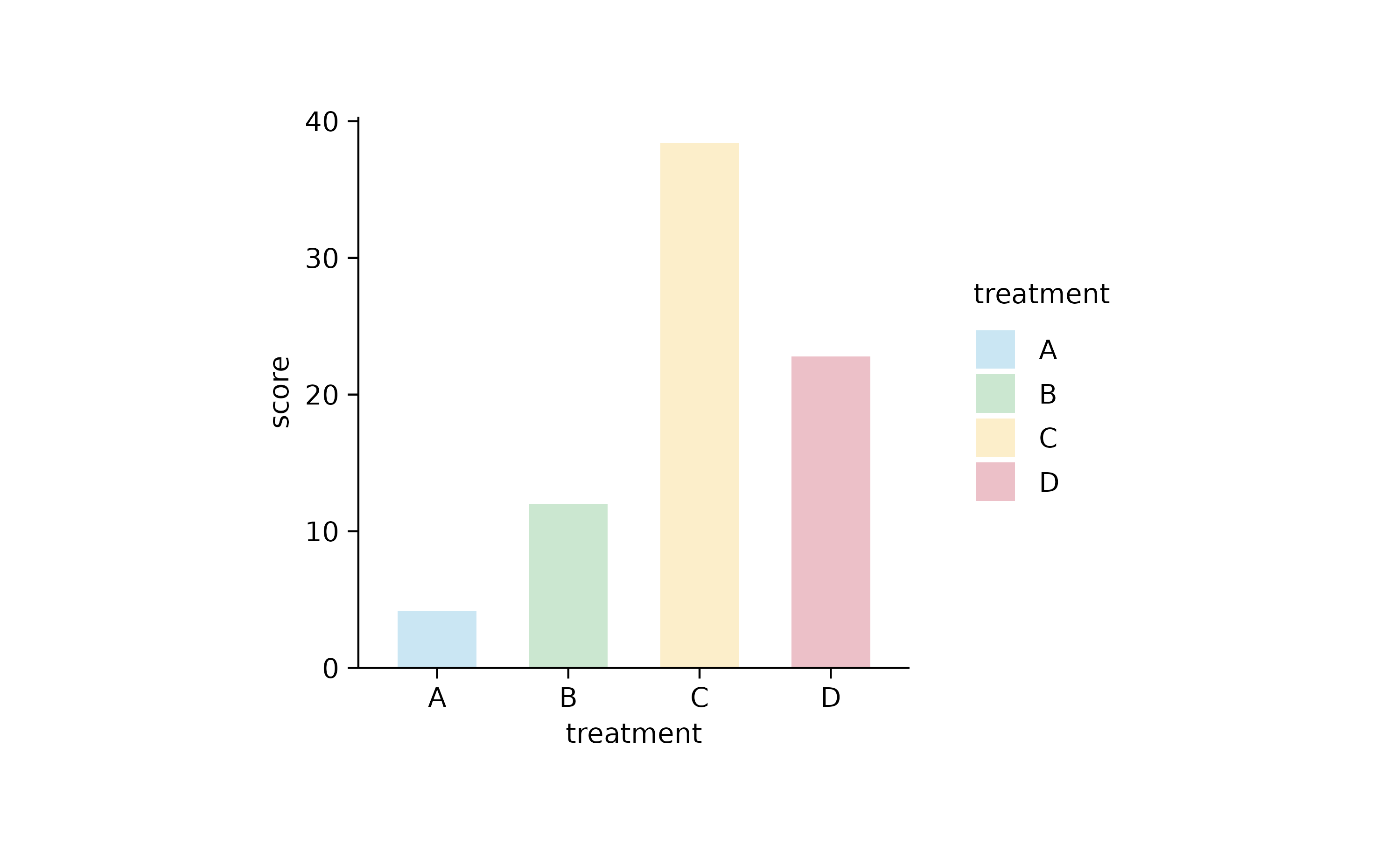
study %>%
  tidyplot(x = treatment, y = score, color = treatment) %>%
  add_mean_bar(alpha = 0.3) %>%
  add_mean_dash() %>%
  add_mean_value()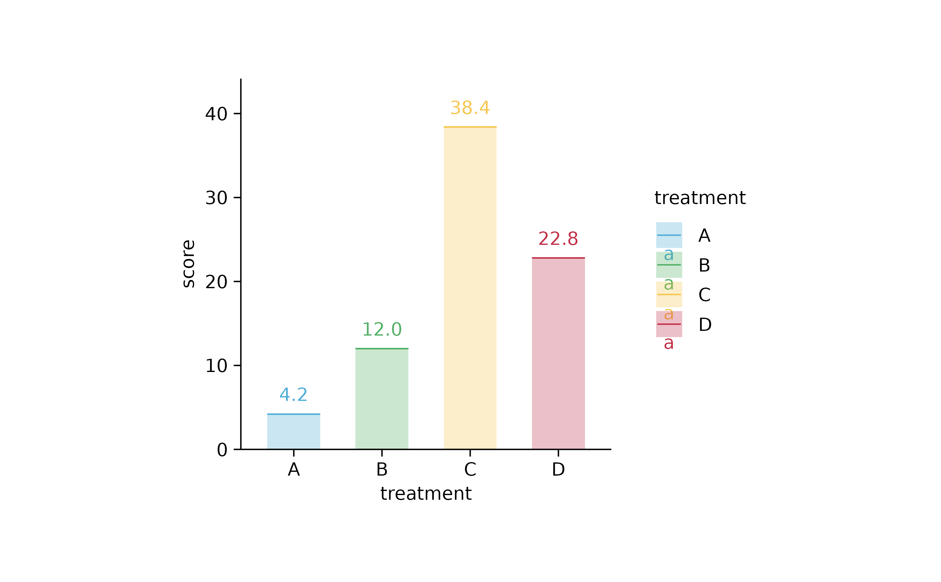
study %>%
  tidyplot(x = treatment, y = score, color = treatment) %>%
  add_mean_bar(alpha = 0.3) %>%
  add_error_bar() %>%
  add_data_points_beeswarm()
study %>%
  tidyplot(x = group, y = score, color = dose) %>%
  add_mean_bar(alpha = 0.3) %>%
  add_error_bar() %>%
  add_data_points_beeswarm()
study %>%
  tidyplot(x = group, y = score, color = dose) %>%
  add_mean_bar(alpha = 0.3) %>%
  add_mean_dash() %>%
  add_mean_value()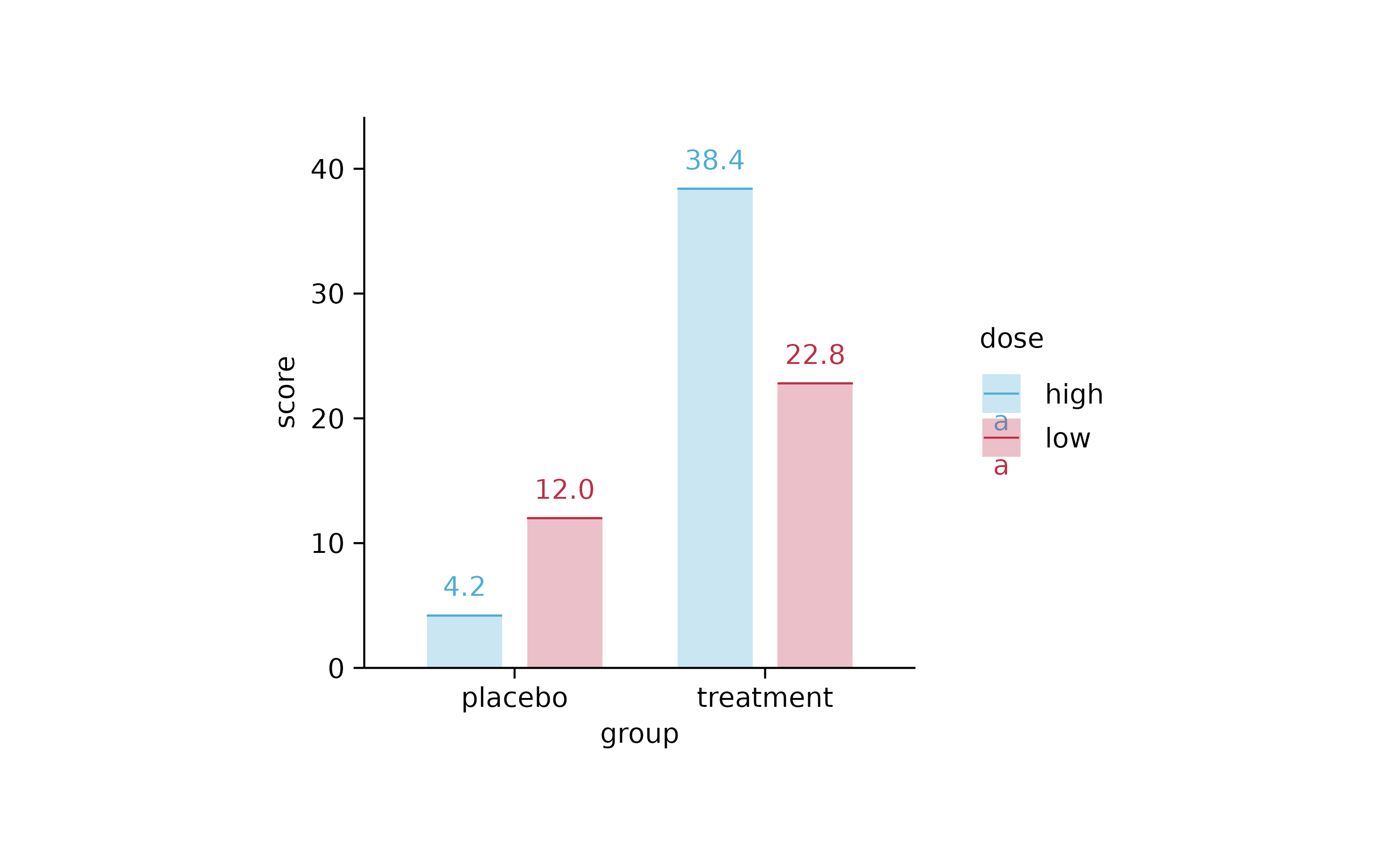
study %>%
  tidyplot(x = group, y = score, color = dose, dodge_width = 0.6) %>%
  add_mean_bar(alpha = 0.3) %>%
  add_mean_dash() %>%
  add_mean_value()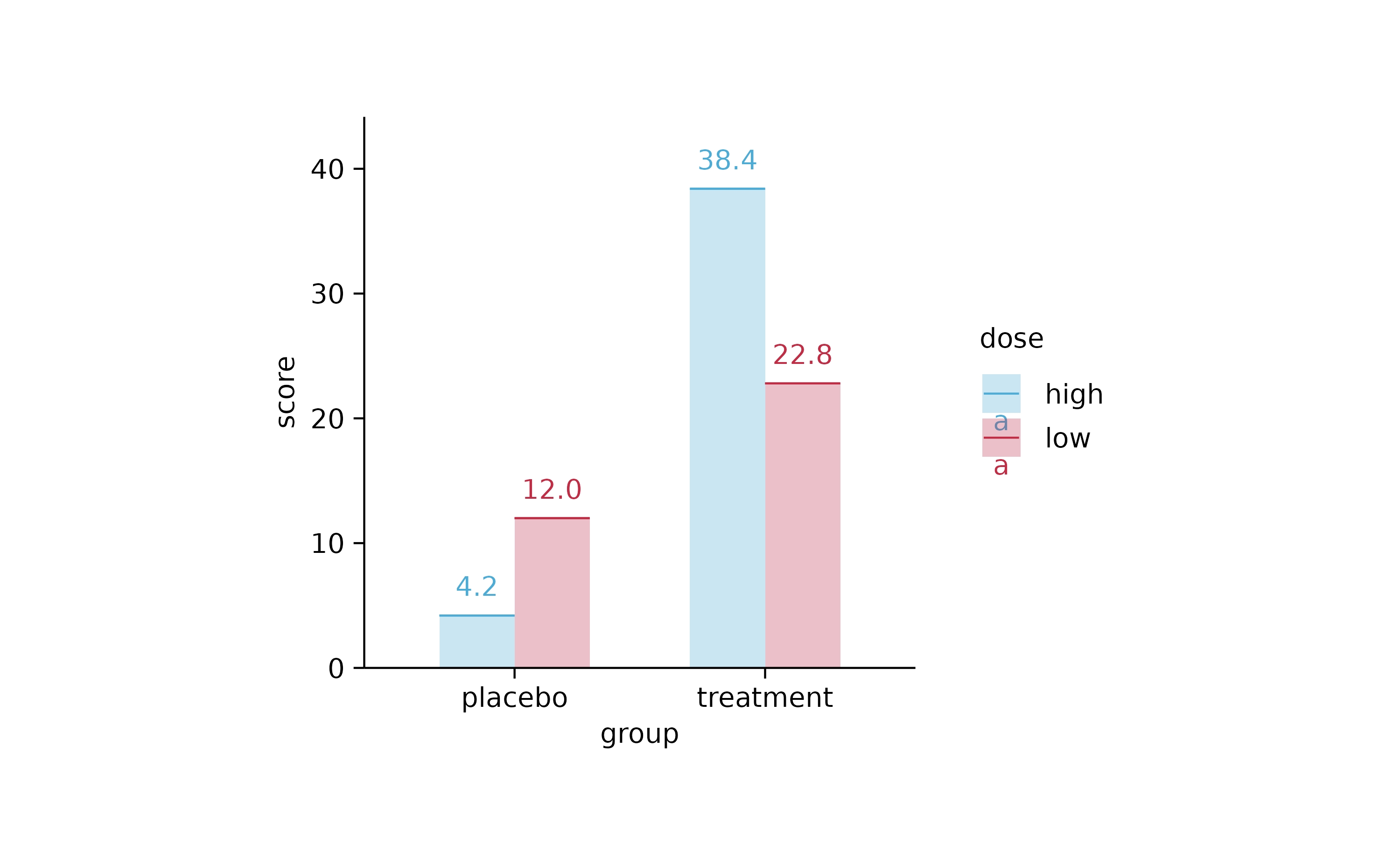
study %>%
  tidyplot(x = treatment, y = score, color = treatment) %>%
  add_mean_bar(width = 0.02) %>%
  add_mean_dot()
study %>%
  tidyplot(x = treatment, y = score, color = treatment) %>%
  add_mean_bar(width = 0.02) %>%
  add_mean_dot() %>%
  add_mean_value(vjust = -1, extra_padding = 0.2)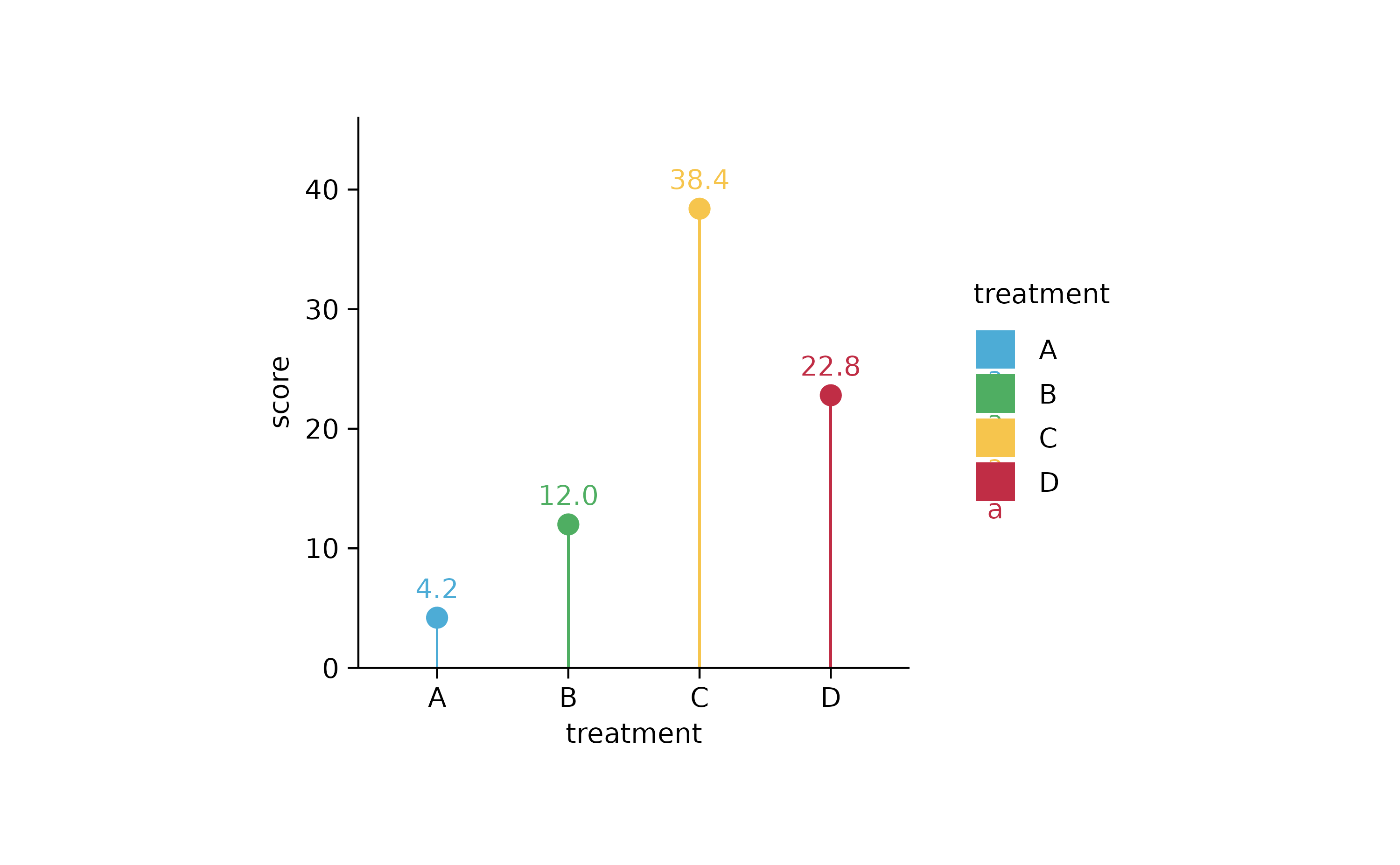
study %>%
  tidyplot(x = group, y = score, color = dose) %>%
  add_mean_bar(width = 0.02) %>%
  add_mean_dot()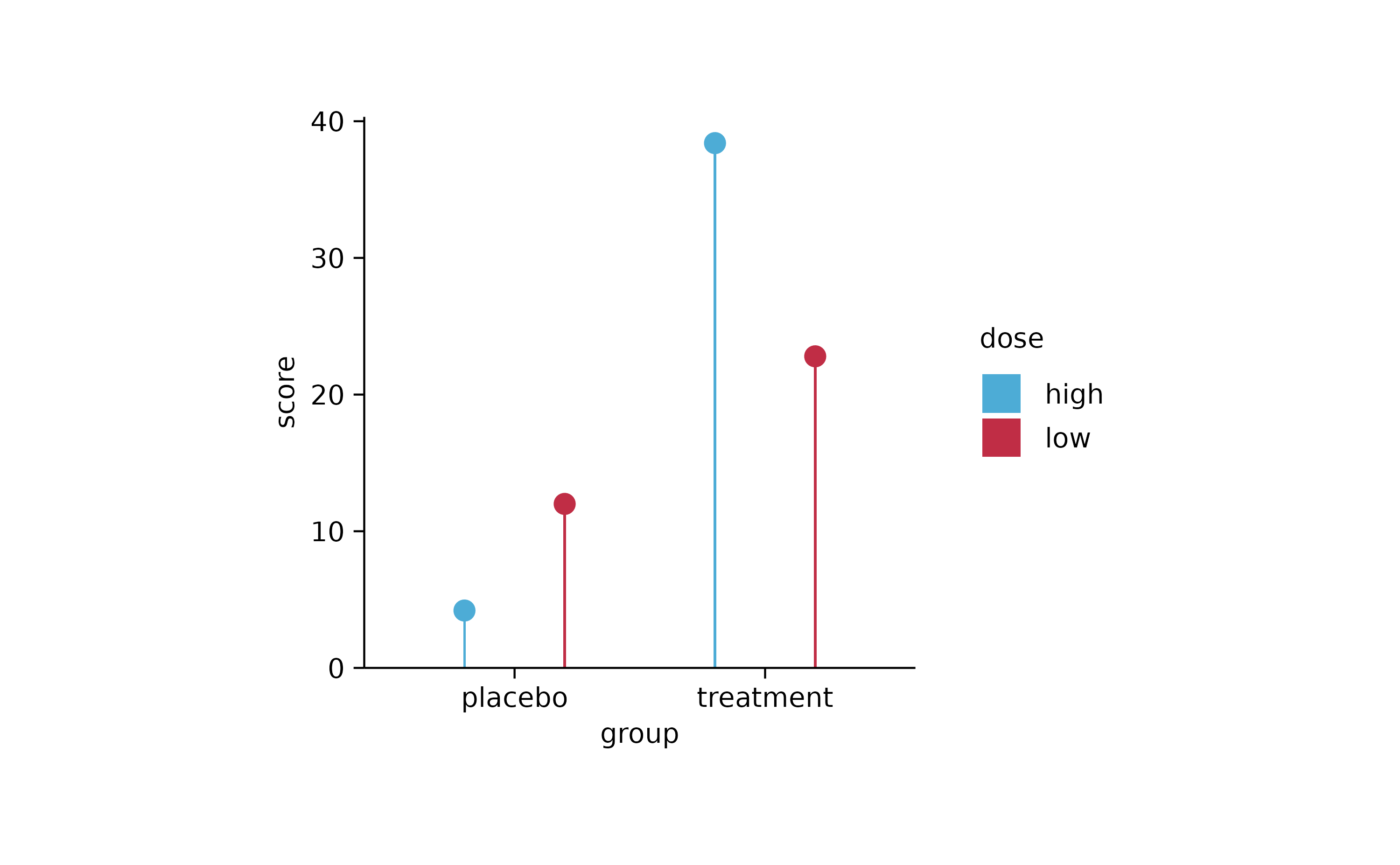
study %>%
  tidyplot(x = treatment, y = score, color = treatment) %>%
  add_range_bar() %>%
  add_mean_dot()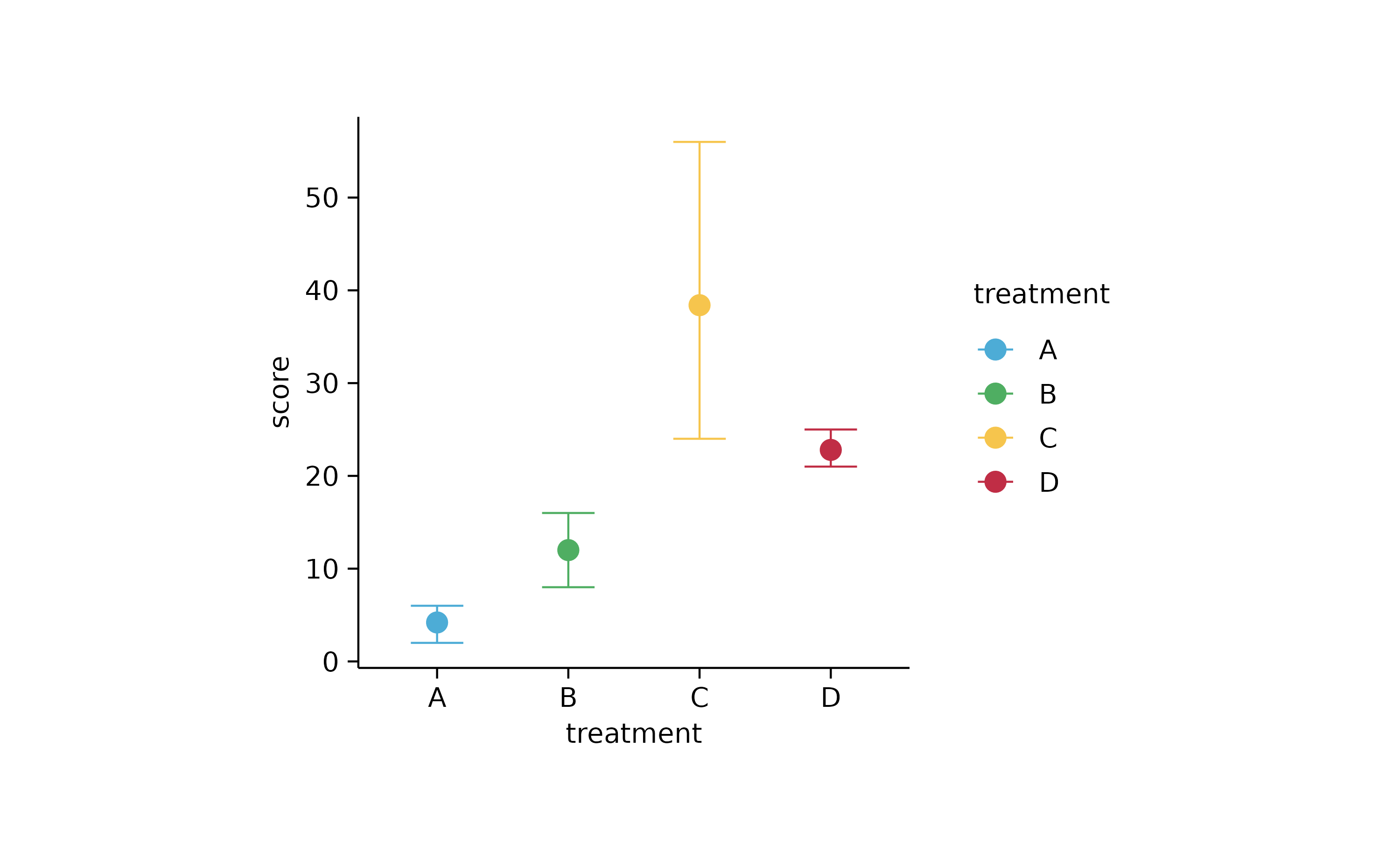
# box and violin

study %>%
  tidyplot(x = treatment, y = score, color = treatment) %>%
  add_range_bar() %>%
  add_mean_dash()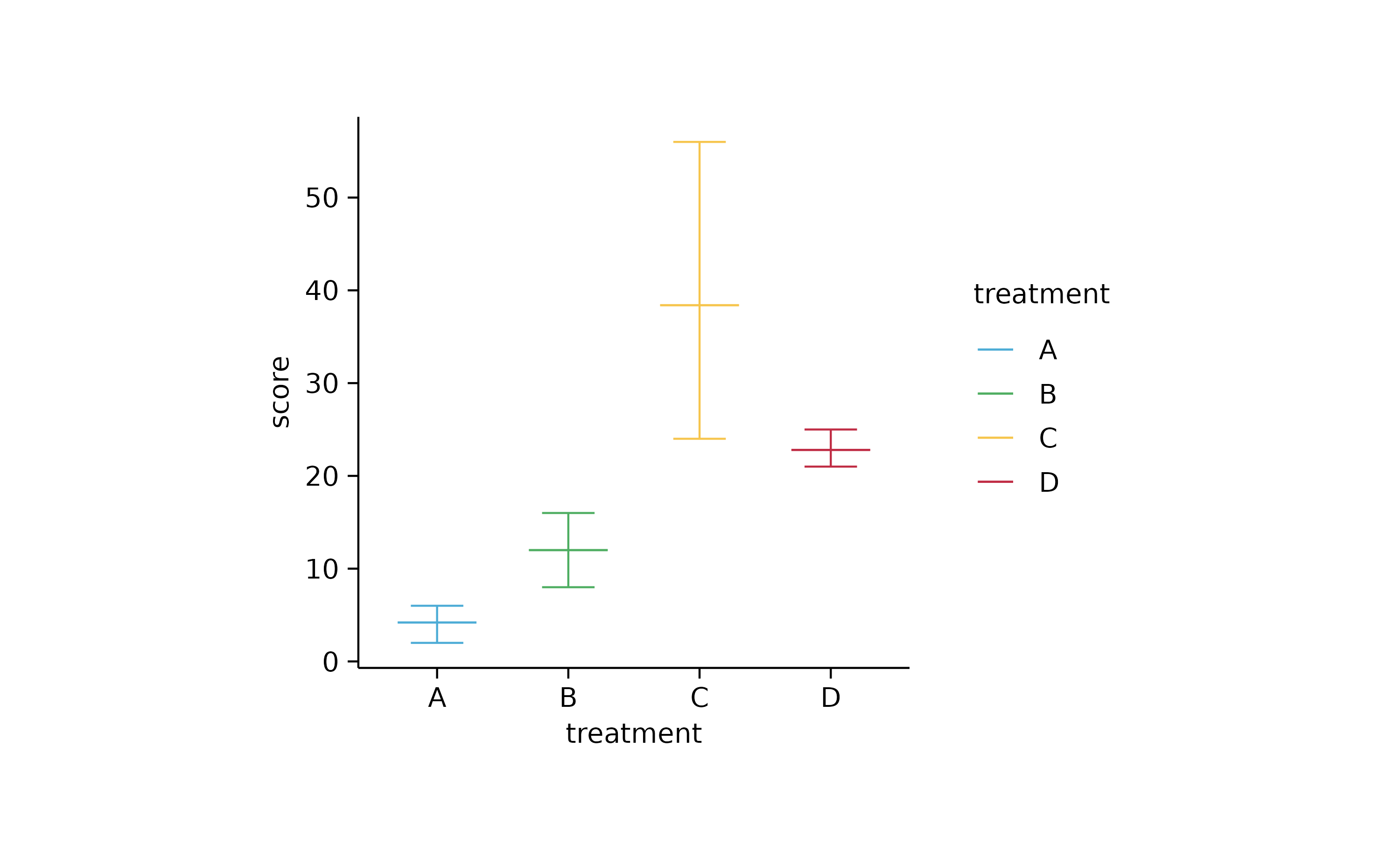
study %>%
  tidyplot(x = treatment, y = score, color = treatment) %>%
  add_boxplot()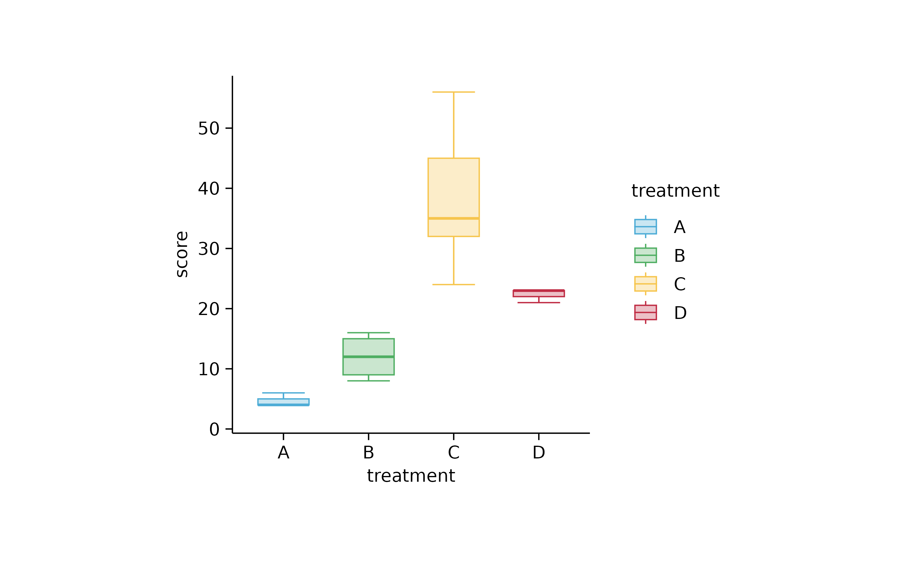
study %>%
  tidyplot(x = dose, y = score, color = group) %>%
  add_boxplot() %>%
  add_data_points_beeswarm()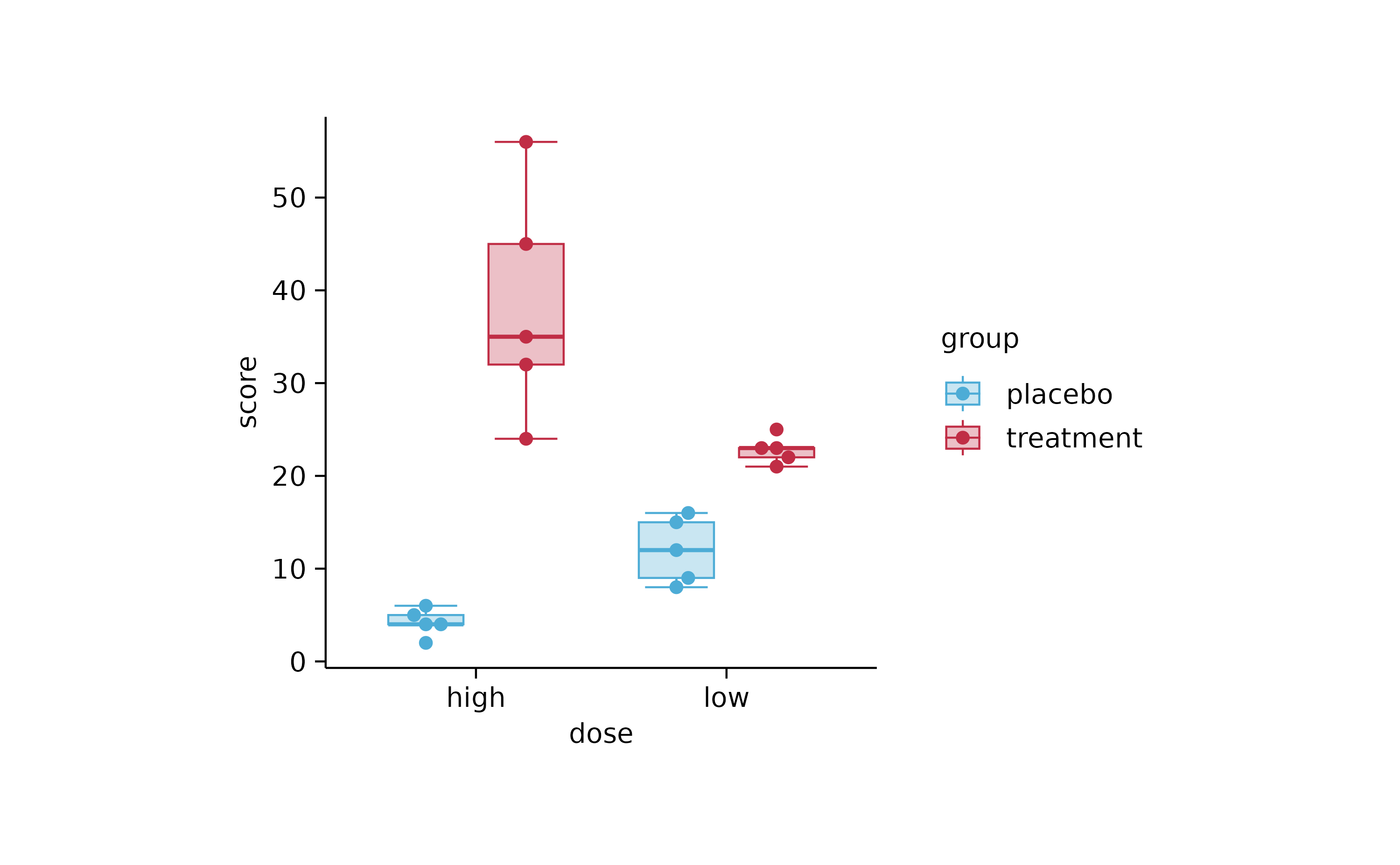
study %>%
  tidyplot(x = treatment, y = score, color = treatment) %>%
  add_violin() %>%
  add_data_points_beeswarm()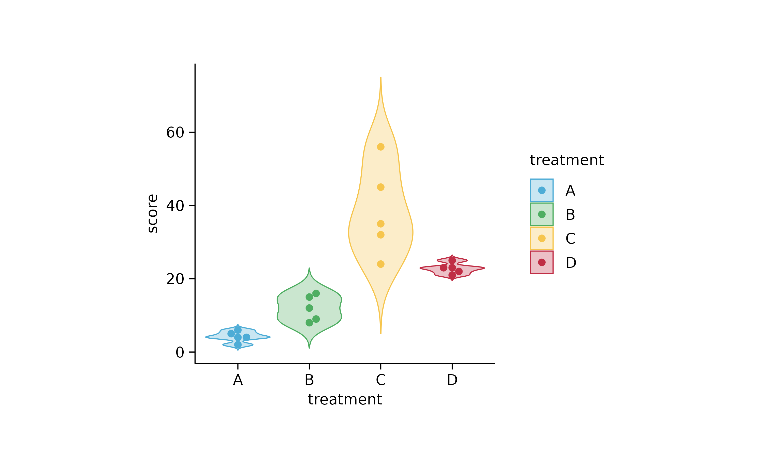
study %>%
  tidyplot(x = dose, y = score, color = group) %>%
  add_violin() %>%
  add_data_points_beeswarm()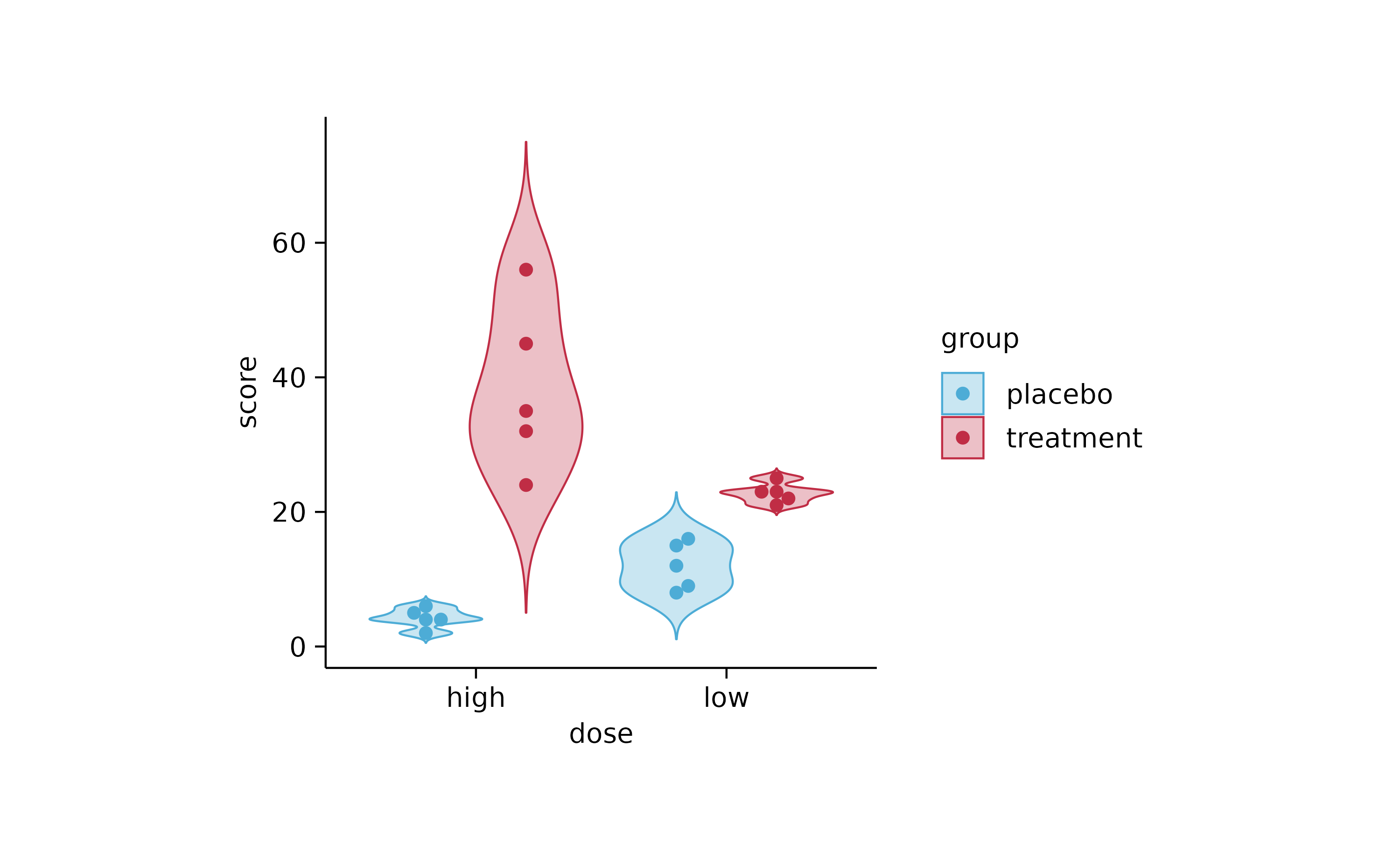
# adjust_plot_area_size

p1
p1 %>% adjust_plot_area_size(width = 70)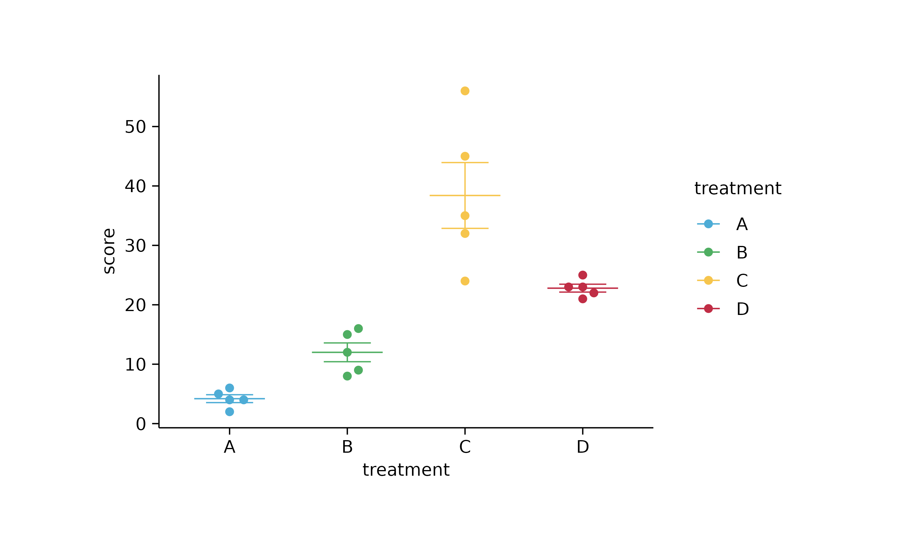
p1 %>% adjust_plot_area_size(width = 44, height = 25)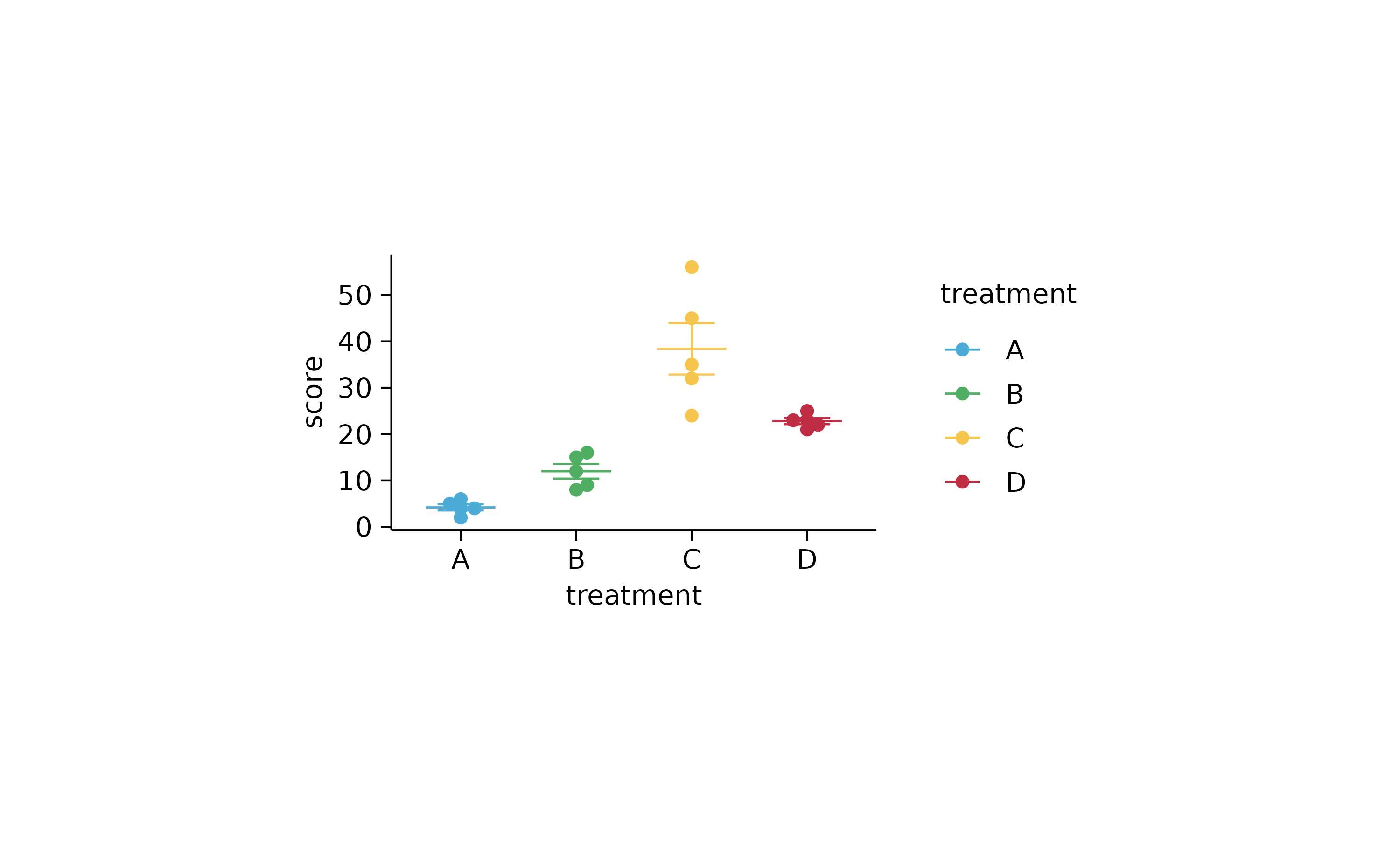
p1 %>% adjust_plot_area_size(width = NA, height = NA)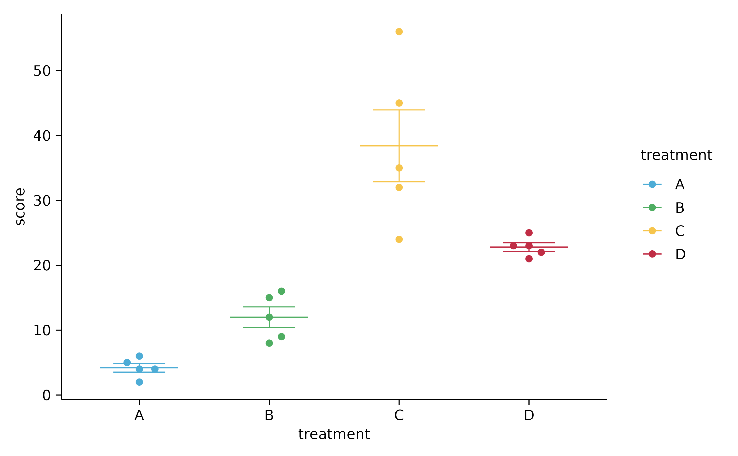
# line plots

study %>%
  tidyplot(x = group, y = score, group = participant, color = dose) %>%
  add_line() %>%
  add_area()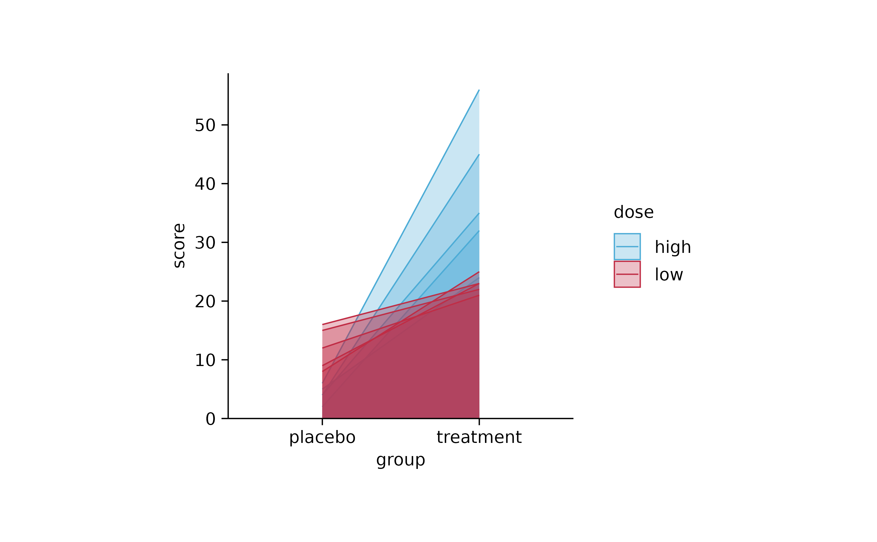
# summary lines

study %>%
  tidyplot(x = treatment, y = score) %>%
  add_mean_line()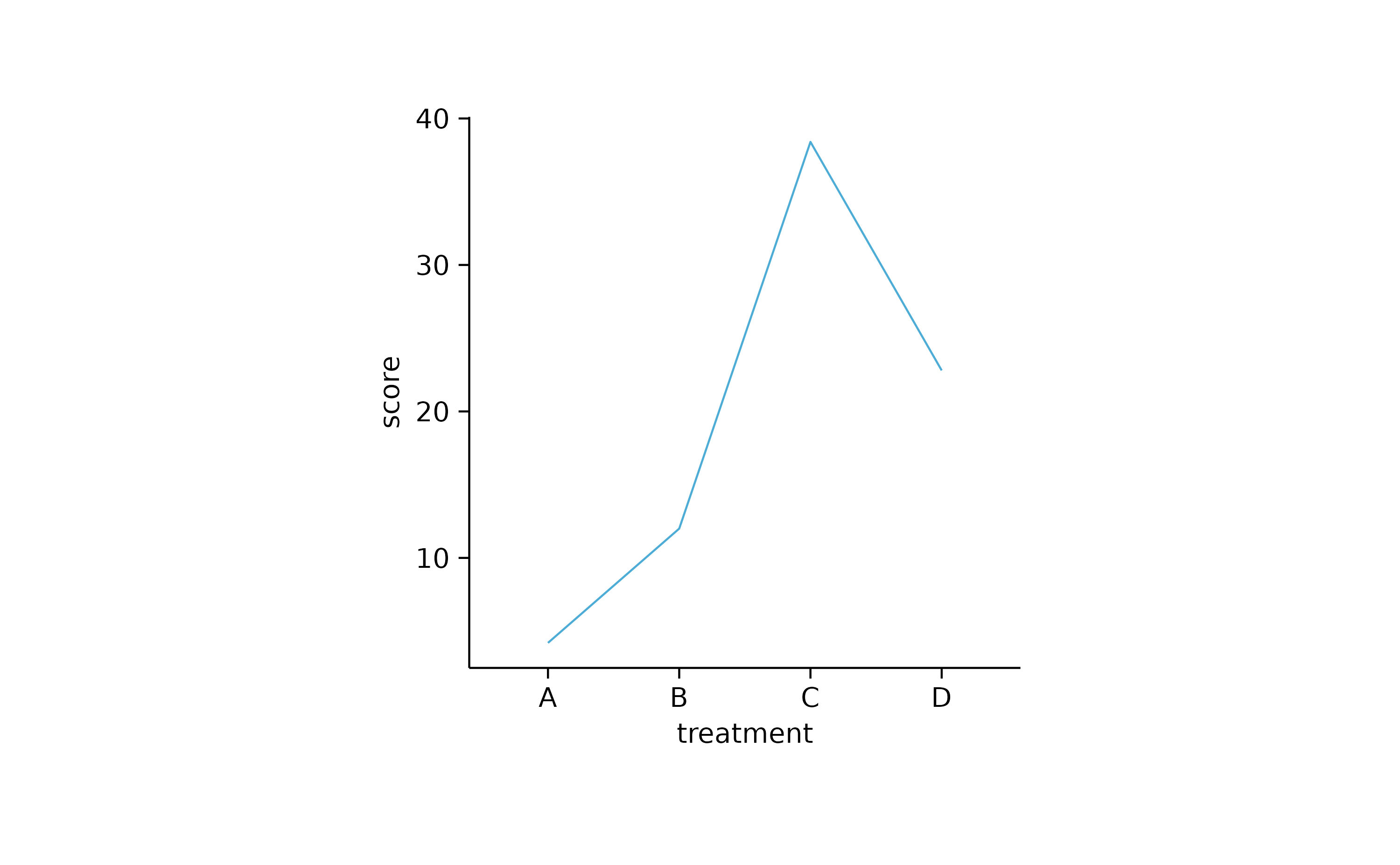
study %>%
  tidyplot(x = treatment, y = score) %>%
  add_mean_line() %>%
  add_mean_dot()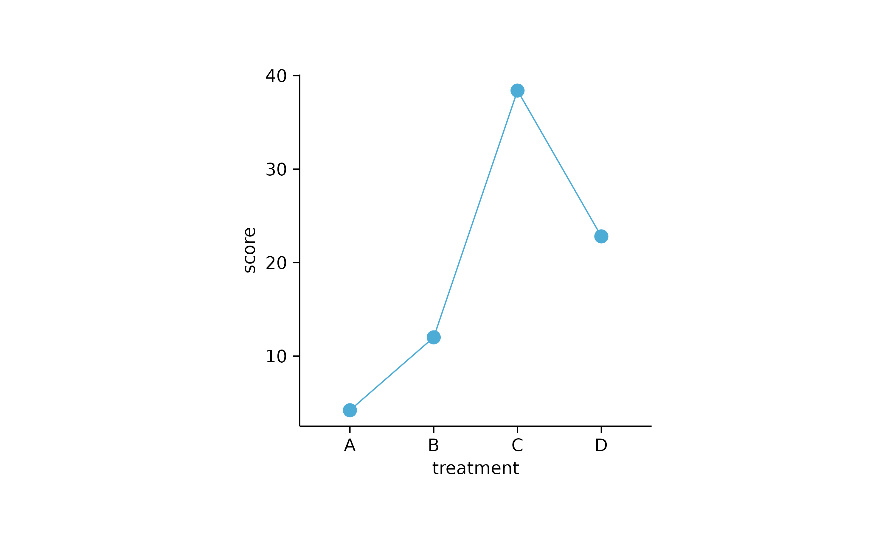
study %>%
  tidyplot(x = treatment, y = score) %>%
  add_mean_line() %>%
  add_mean_dot() %>%
  add_error_bar()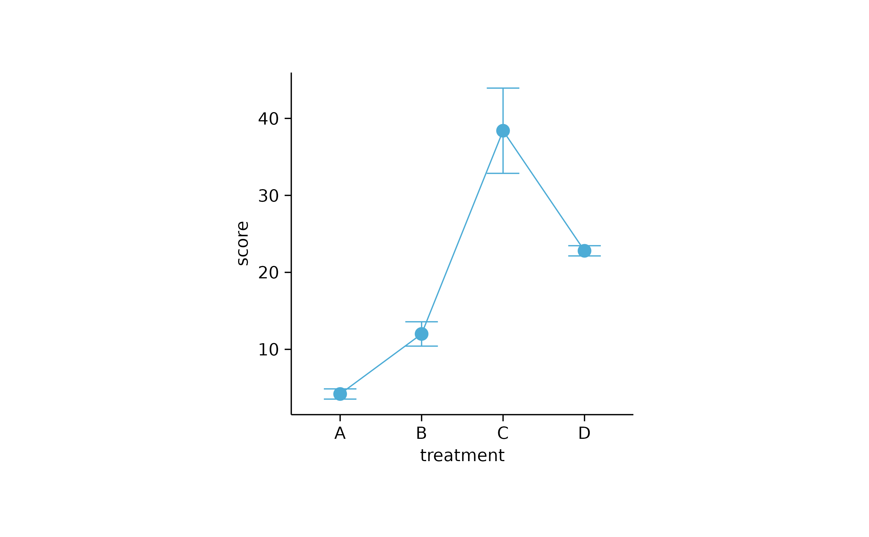
study %>%
  tidyplot(x = treatment, y = score) %>%
  add_mean_line() %>%
  add_mean_dash() %>%
  add_error_bar() %>%
  add_data_points_beeswarm()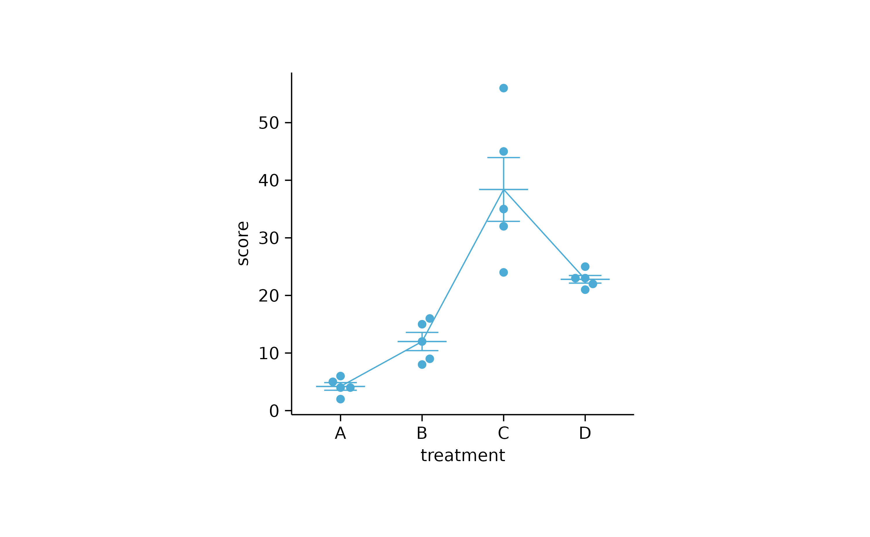
study %>%
  tidyplot(x = treatment, y = score) %>%
  add_error_ribbon() %>%
  add_mean_line() %>%
  add_data_points_beeswarm()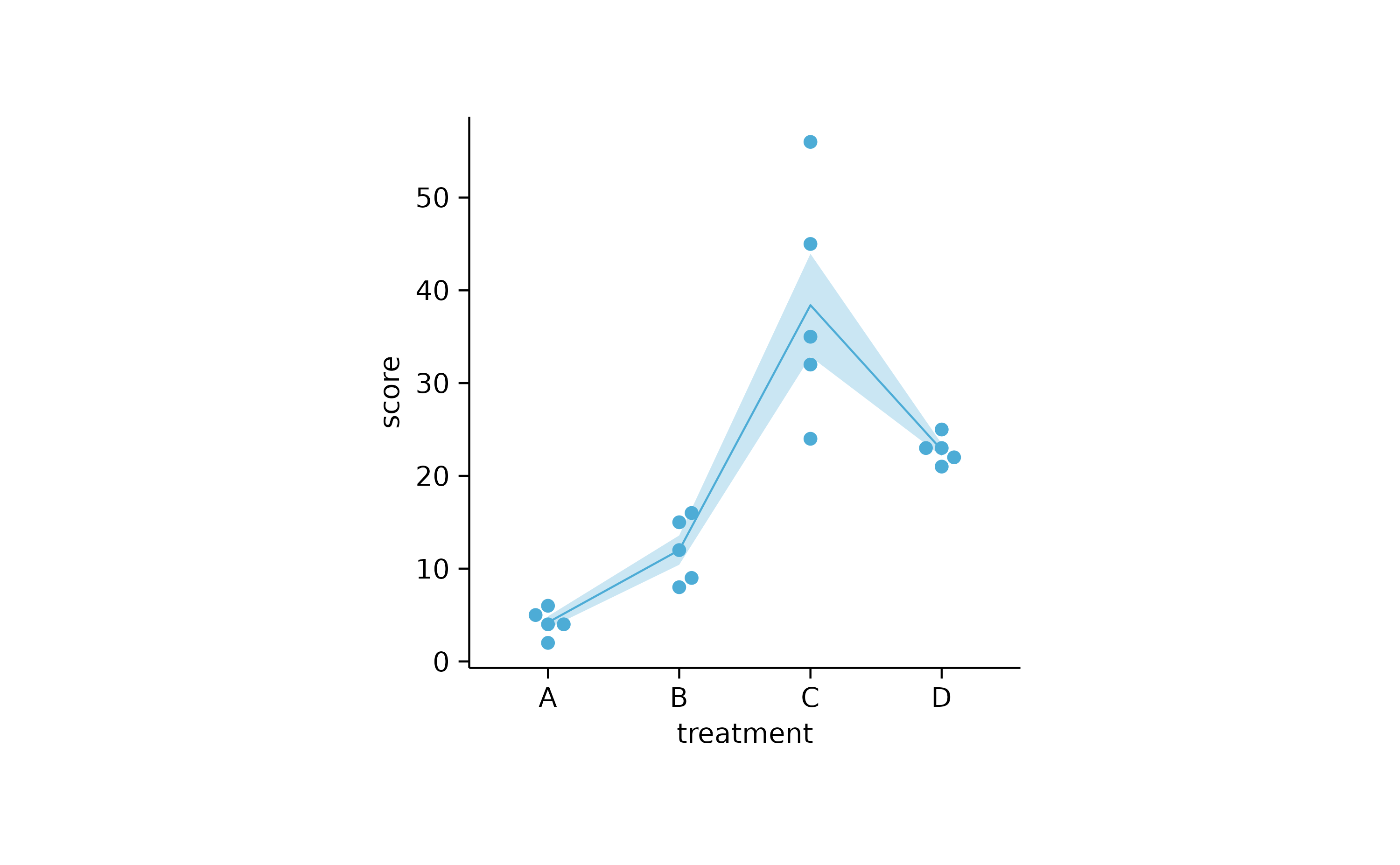
study %>%
  tidyplot(x = treatment, y = score) %>%
  add_range_ribbon() %>%
  add_mean_line() %>%
  add_data_points_beeswarm()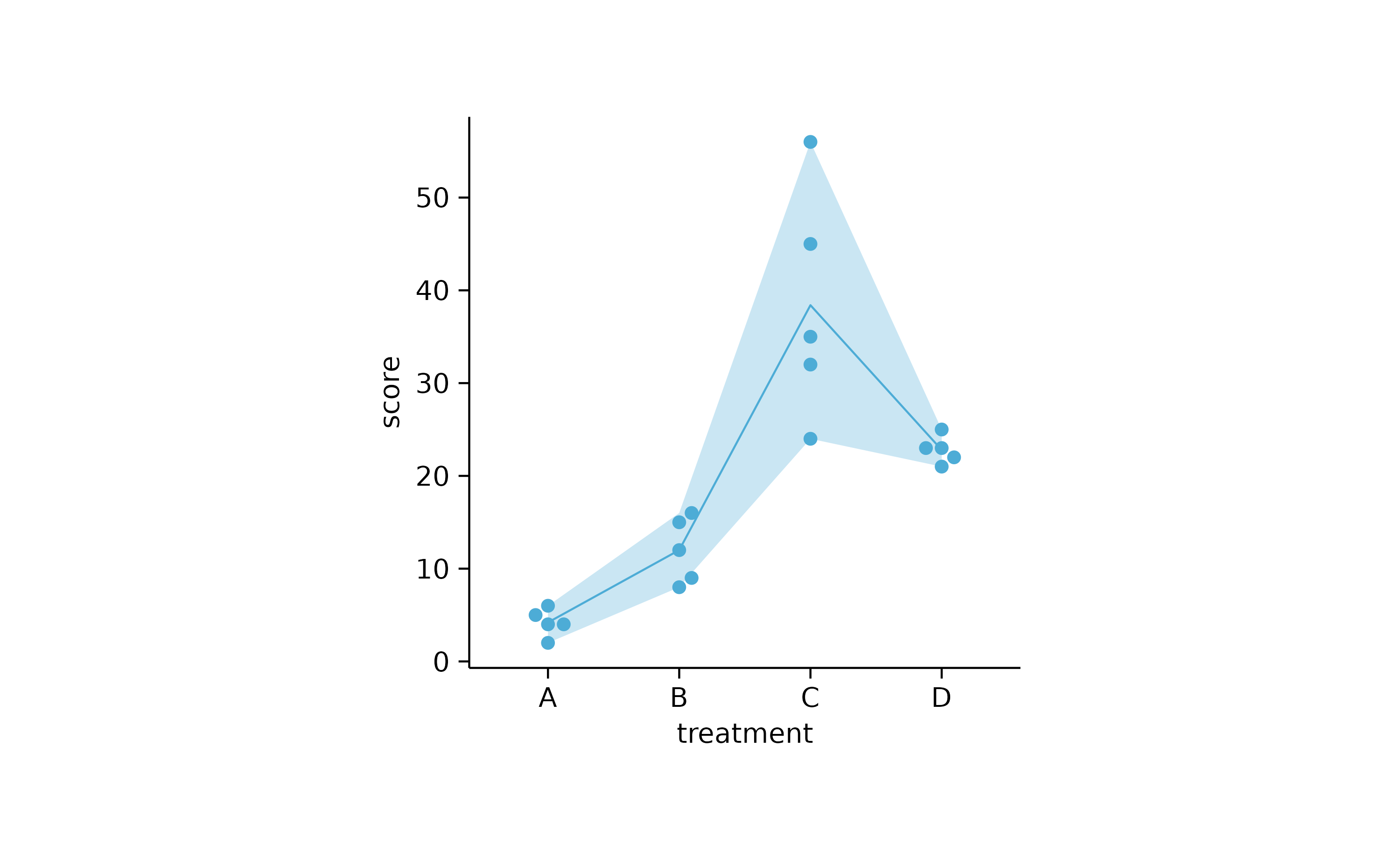
study %>%
  tidyplot(x = treatment, y = score) %>%
  add_sd_ribbon() %>%
  add_mean_line() %>%
  add_data_points_beeswarm()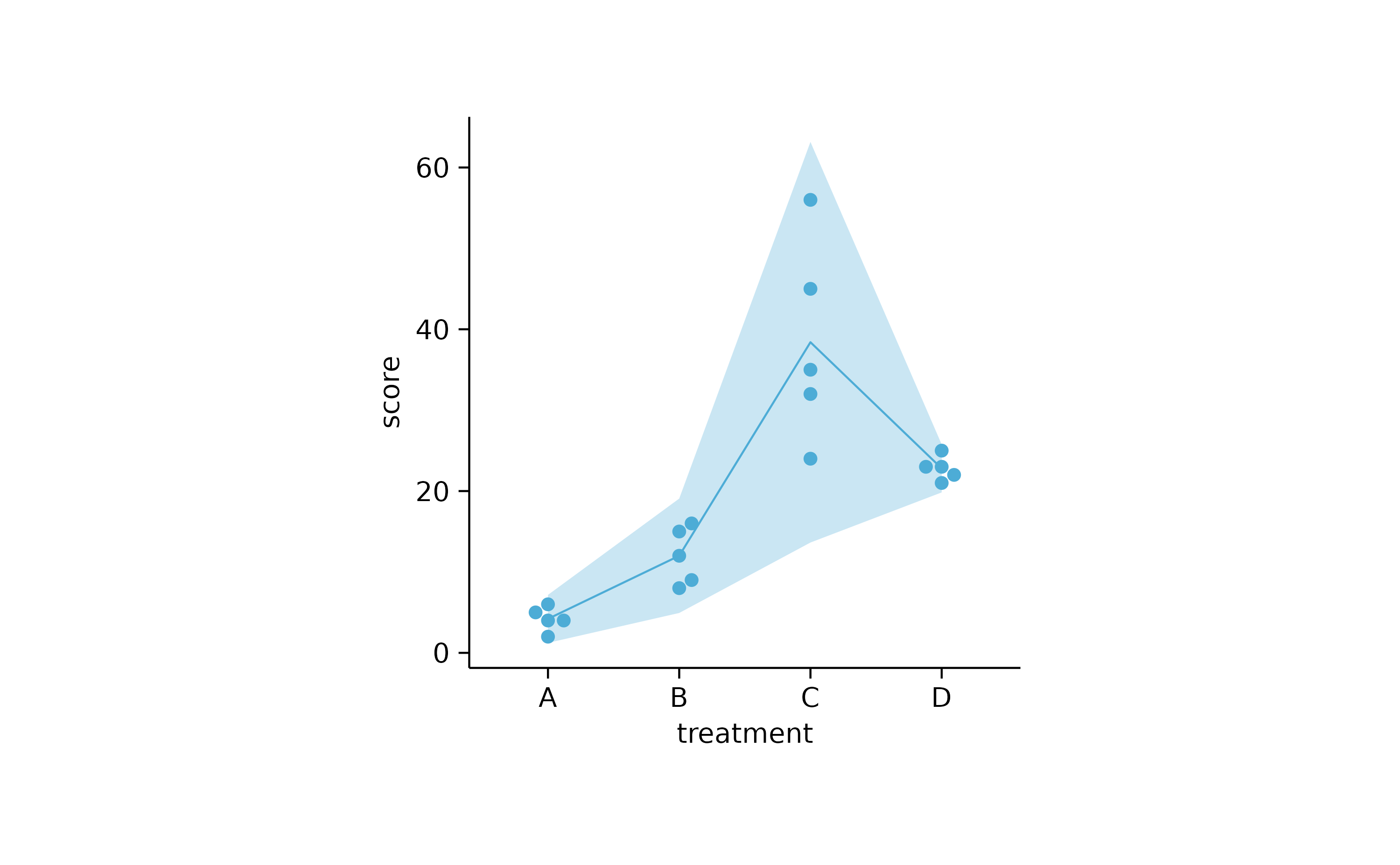
study %>%
  tidyplot(x = treatment, y = score) %>%
  add_ci95_ribbon() %>%
  add_mean_line() %>%
  add_data_points_beeswarm()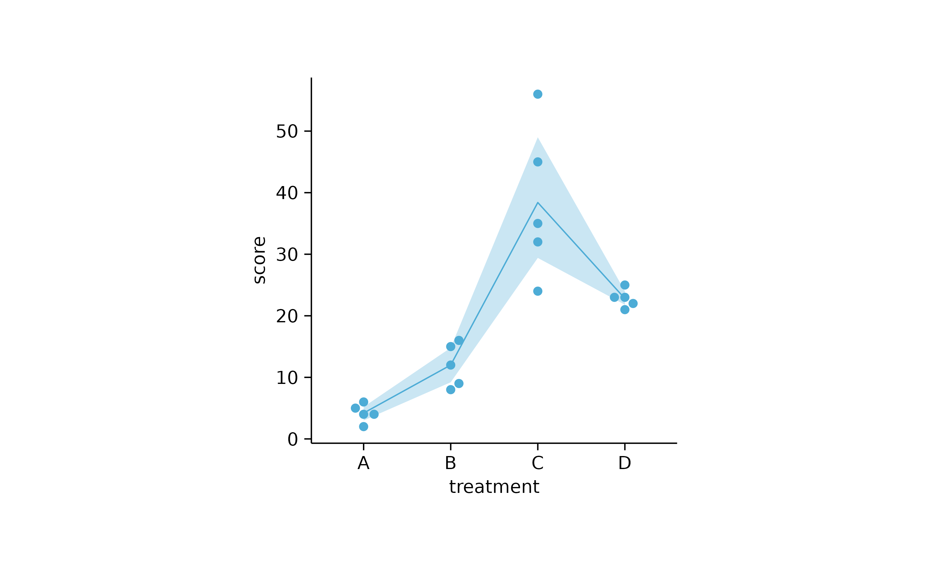
study %>%
  tidyplot(x = treatment, y = score) %>%
  add_curve_fit() %>%
  add_data_points_beeswarm()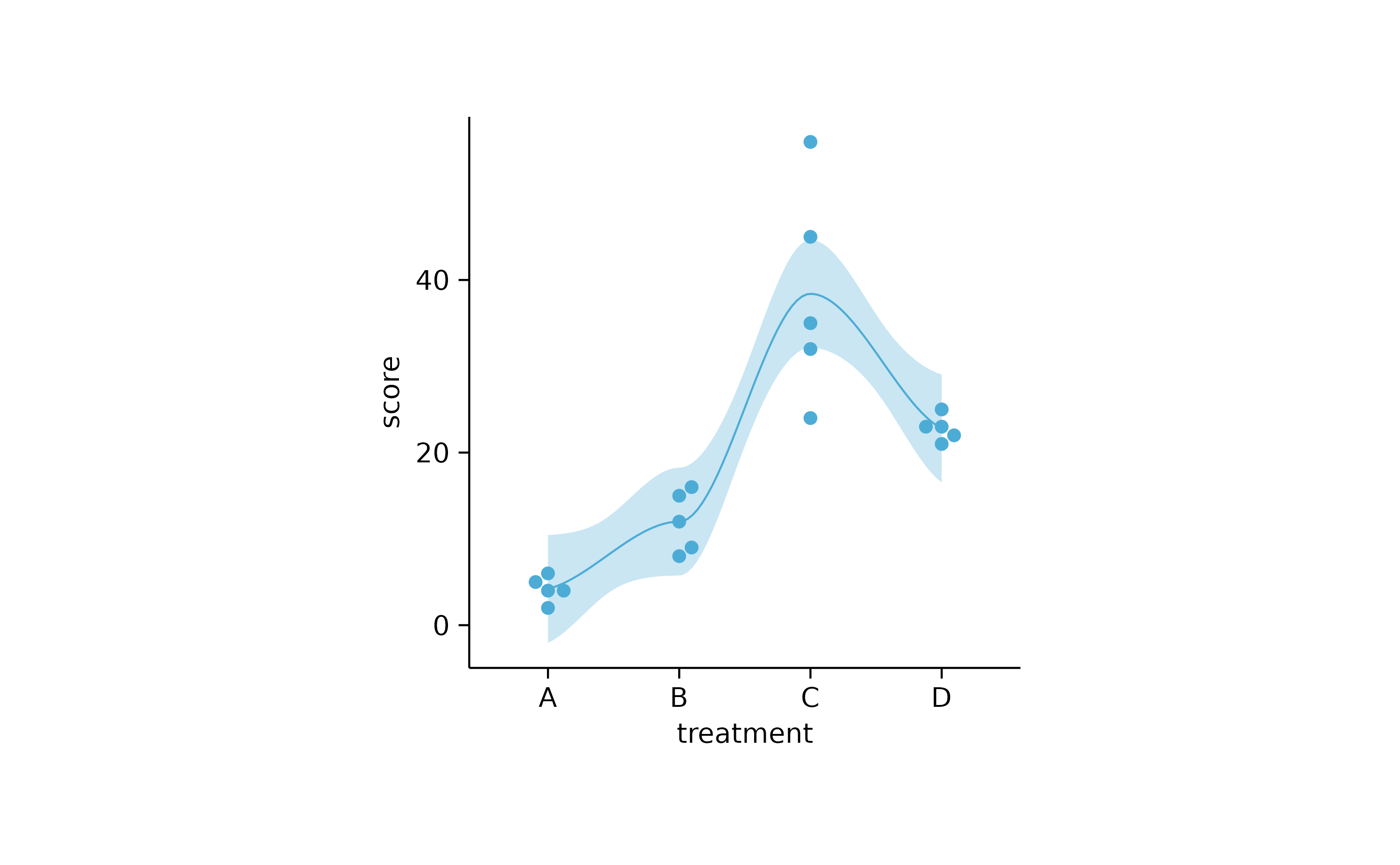
# grouped line

study %>%
  tidyplot(x = dose, y = score, color = group) %>%
  add_mean_line() %>%
  add_mean_dash() %>%
  add_error_bar() %>%
  add_data_points_beeswarm()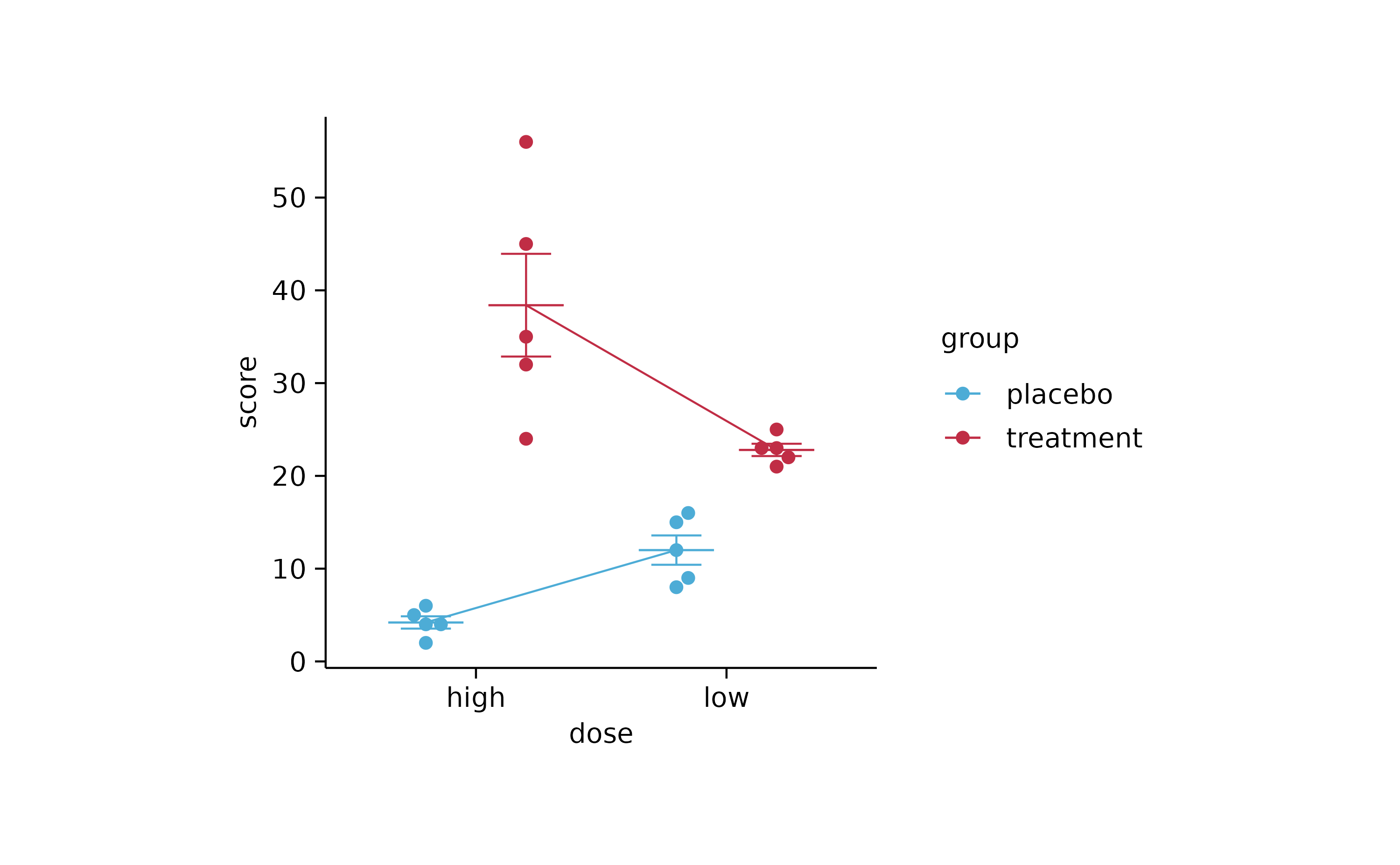
study %>%
  tidyplot(x = dose, y = score, color = group) %>%
  add_error_ribbon() %>%
  add_mean_line() %>%
  add_mean_dash() %>%
  add_error_bar() %>%
  add_data_points_beeswarm()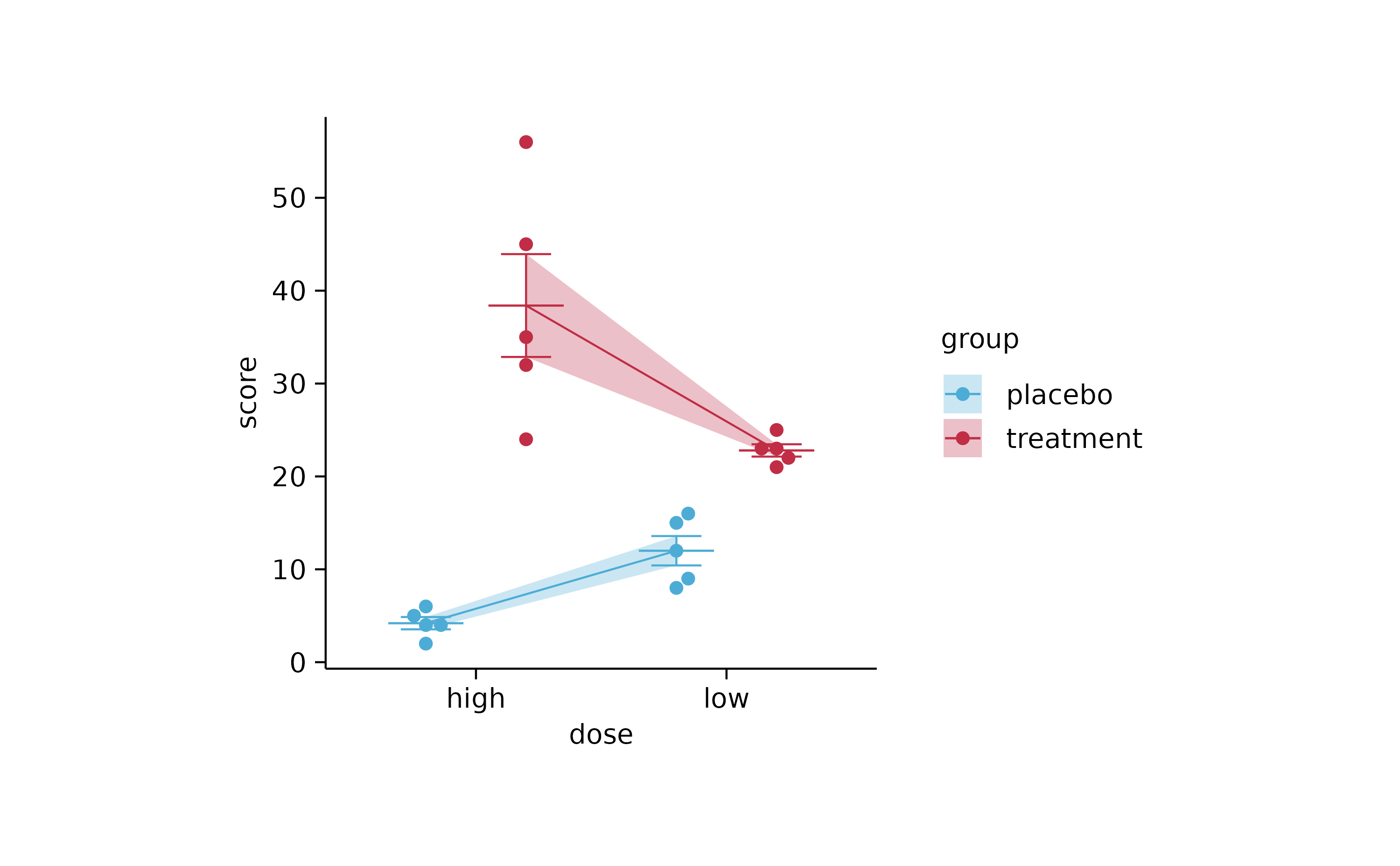
study %>%
  tidyplot(x = dose, y = score, color = group, dodge_width = 0) %>%
  add_mean_line() %>%
  add_mean_dash() %>%
  add_error_bar() %>%
  add_data_points_beeswarm()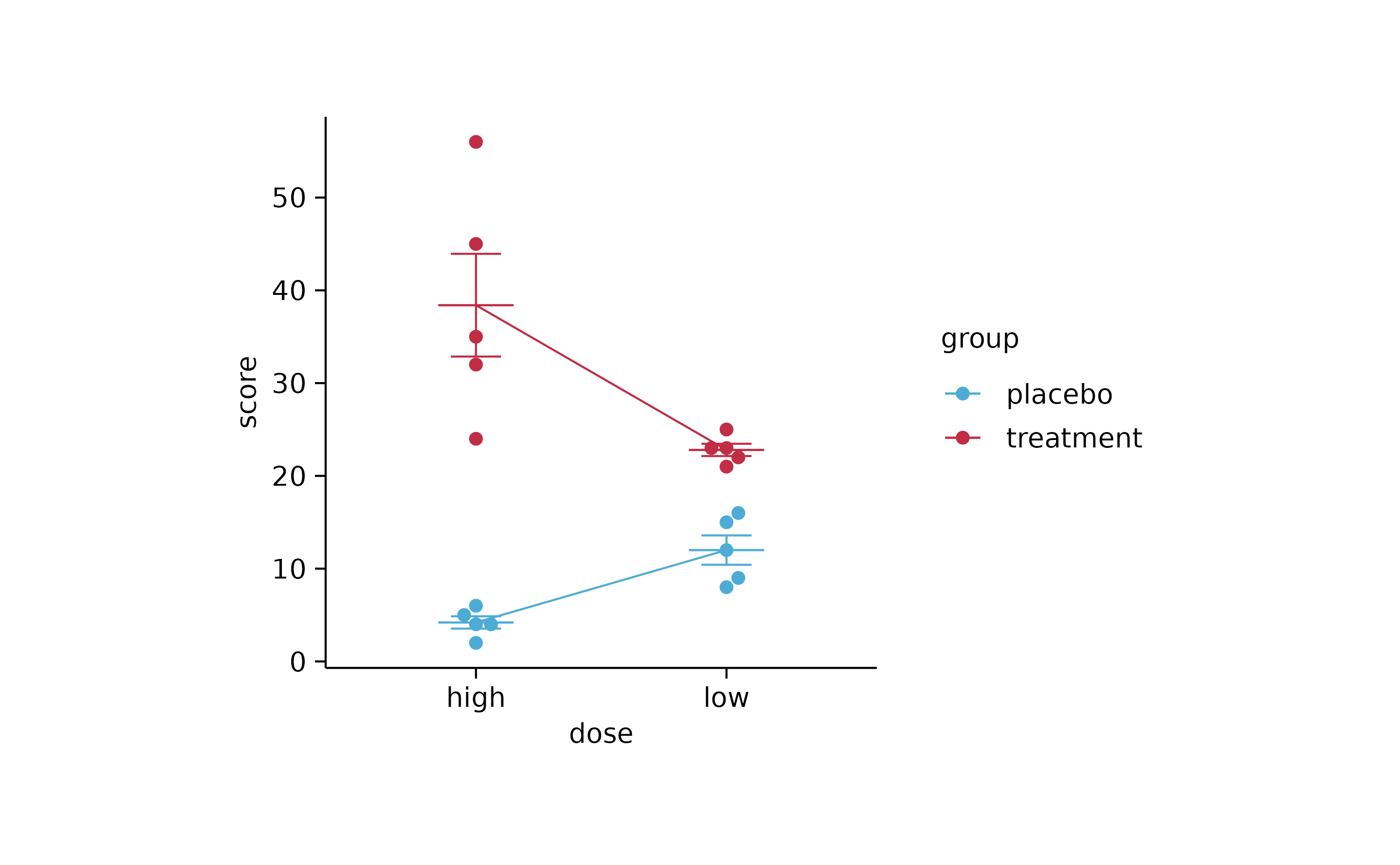
study %>%
  tidyplot(x = dose, y = score, color = group, dodge_width = 0) %>%
  add_error_ribbon() %>%
  add_mean_line() %>%
  add_mean_dash() %>%
  add_error_bar() %>%
  add_data_points_beeswarm()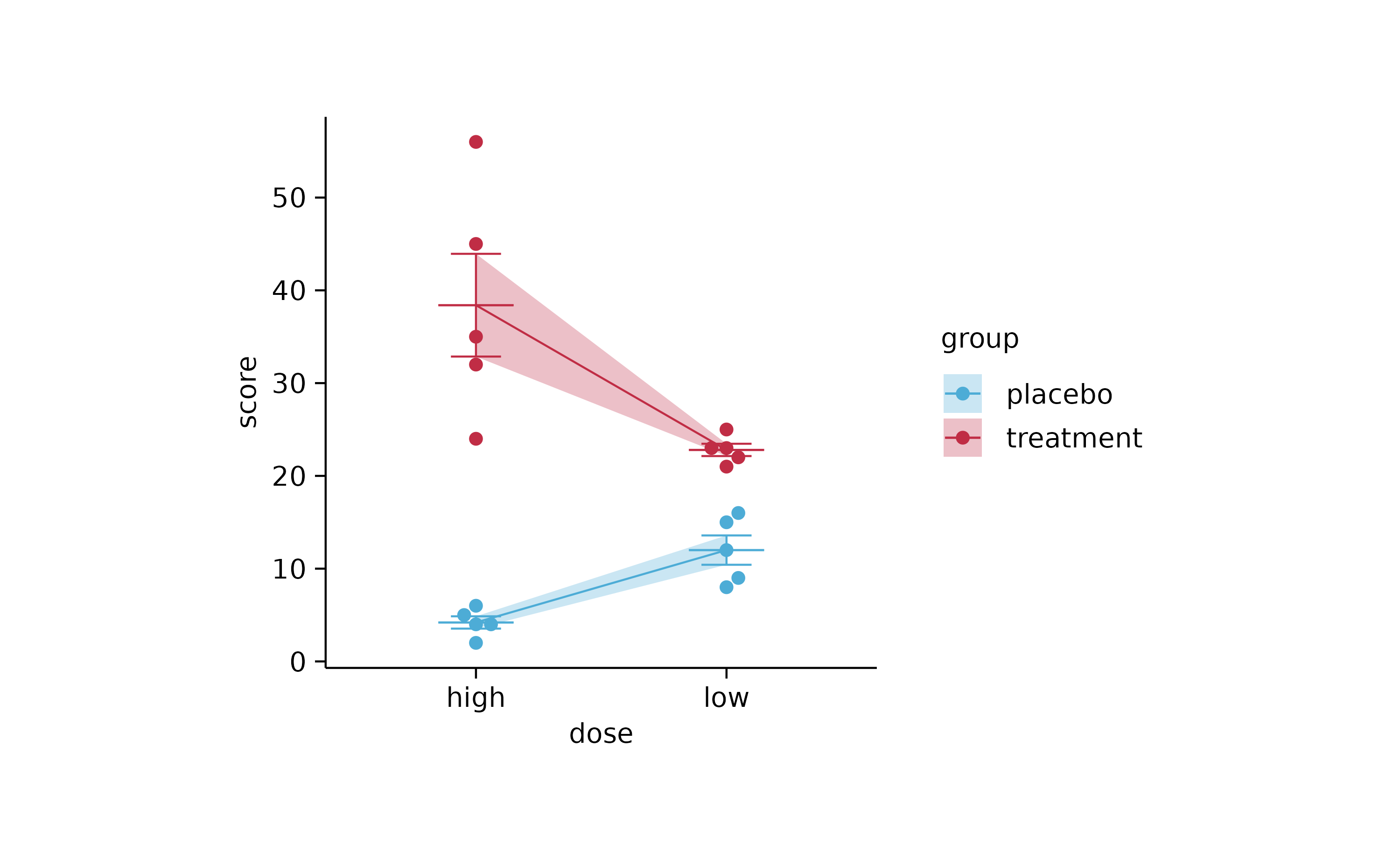
# apparently there can be no lines between doged data points with the same x axis label
# because they need to be in a different aes(group) to be dodged AND they need to in the same aes(group) to be connected by a geom_line()
# solution: bring them to different x axis labels

study %>%
  tidyplot(x = treatment, y = score, color = group) %>%
  add_line(group = participant, color = "grey") %>%
  add_mean_dash() %>%
  add_error_bar() %>%
  add_data_points()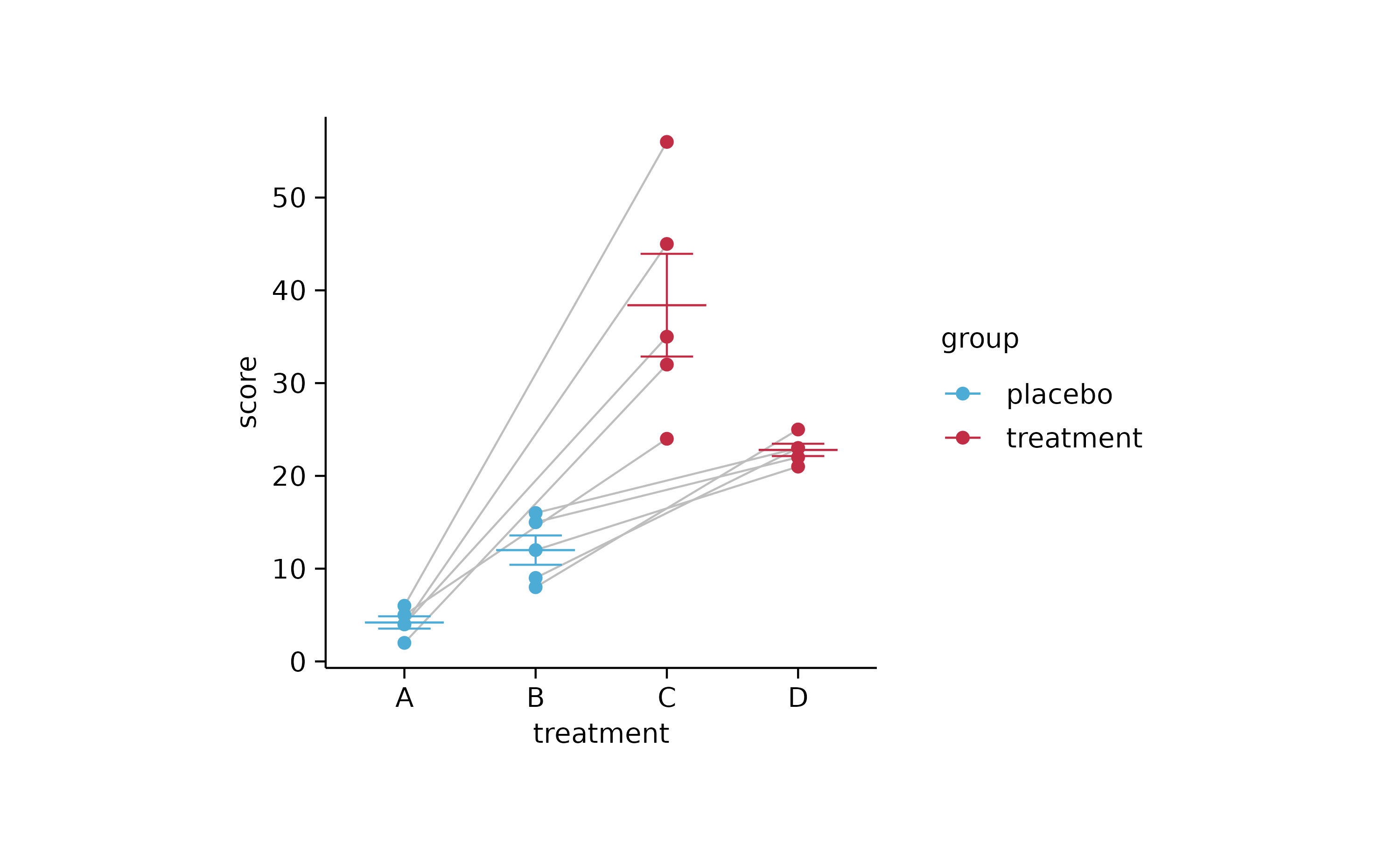
study %>%
  tidyplot(treatment, score, color = group) %>%
  add_mean_bar(alpha = 0.3) %>%
  add_error_bar() %>%
  add_data_points() %>%
  add_line(group = participant, color = "grey") %>%
  sort_x_axis_labels(dose)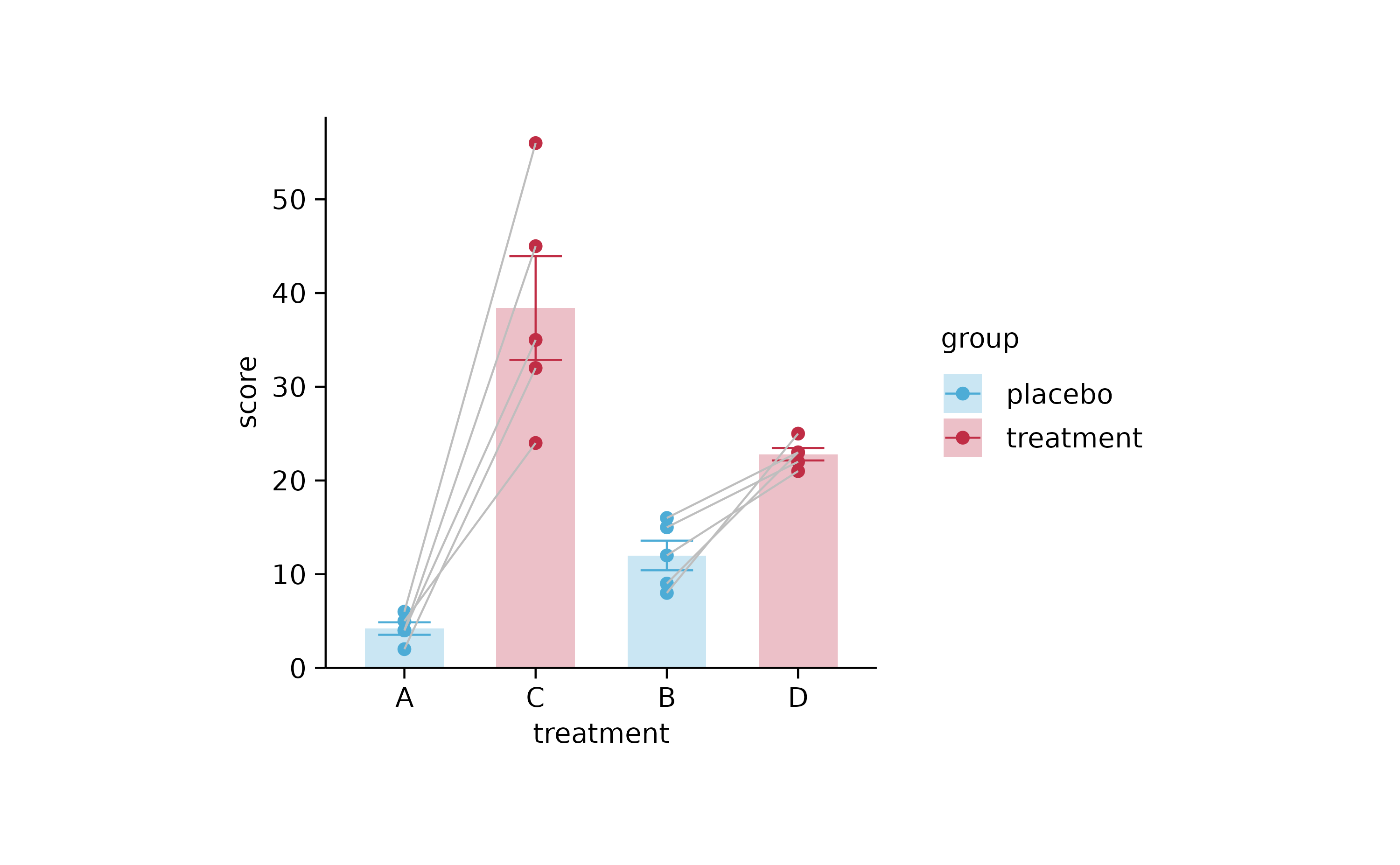
# proportions
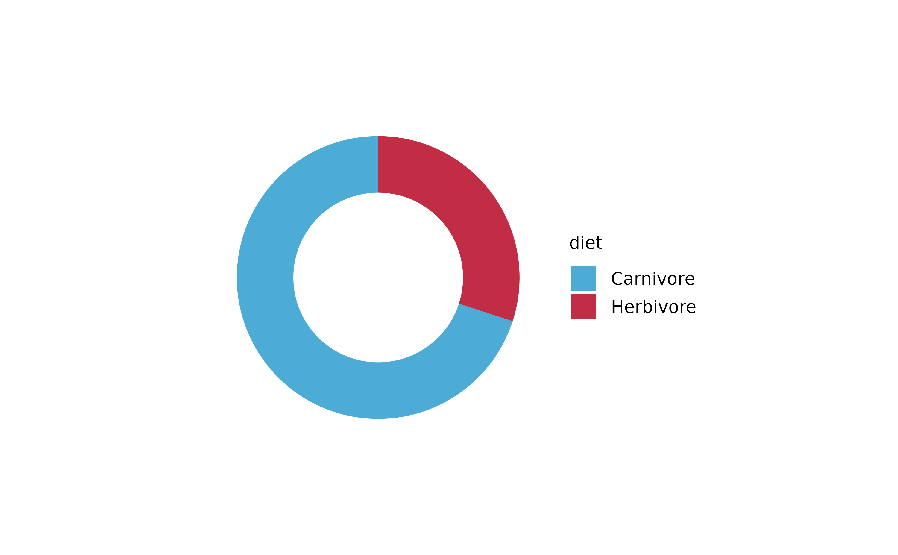
animals %>%
tidyplot(x = diet, color = family) %>%
add_barstack_absolute()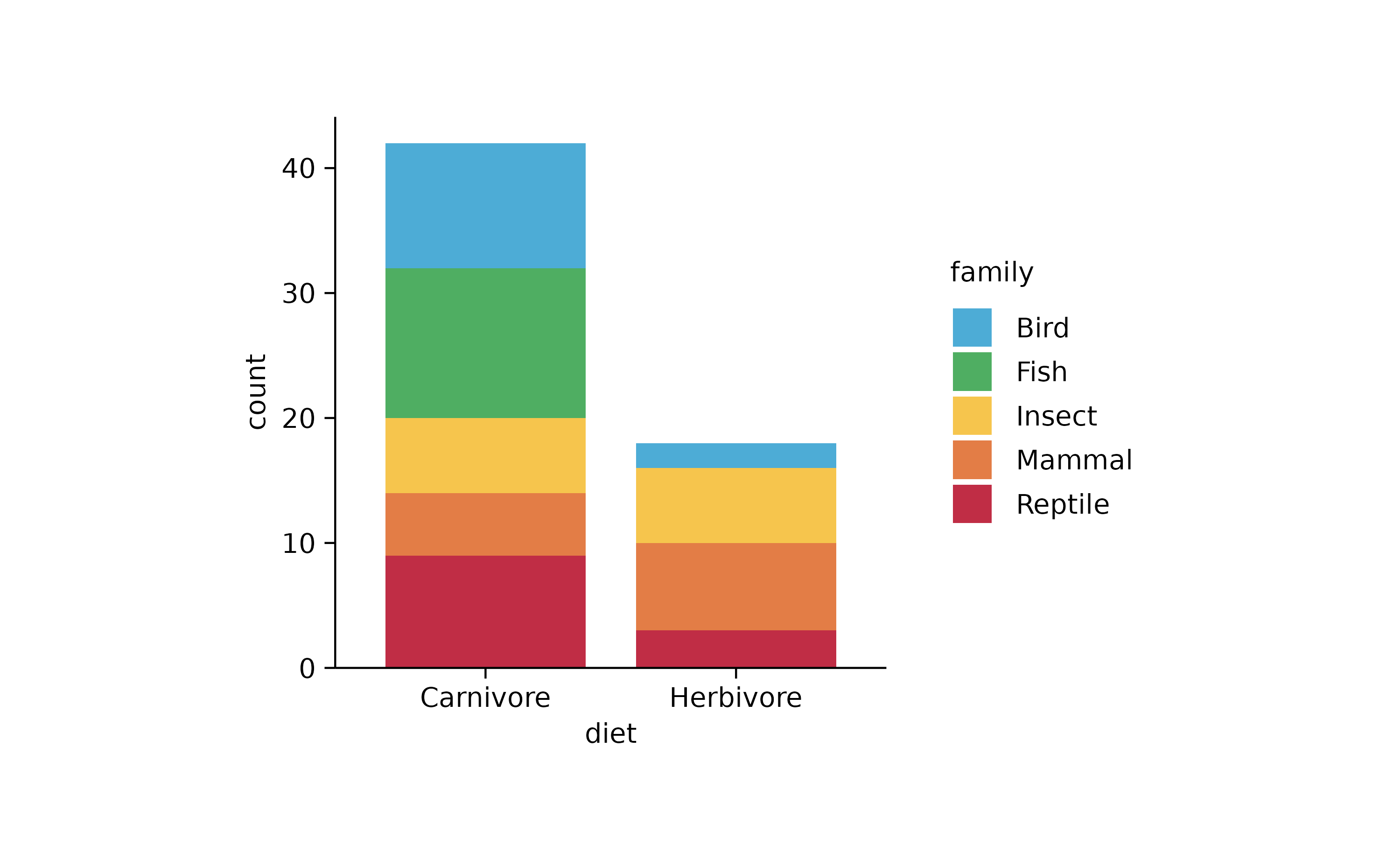
animals %>%
  tidyplot(y = diet, color = family) %>%
  add_barstack_absolute()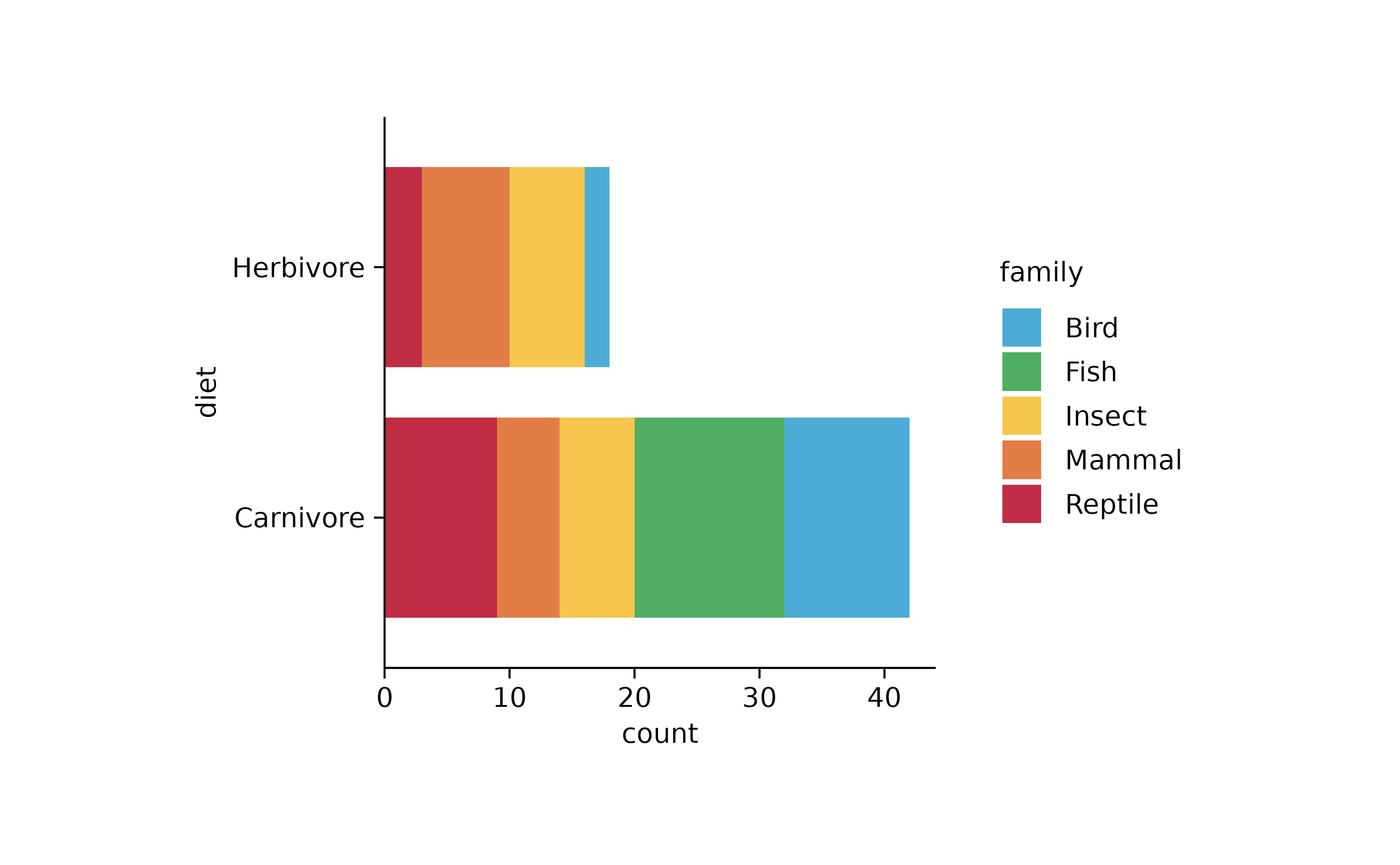
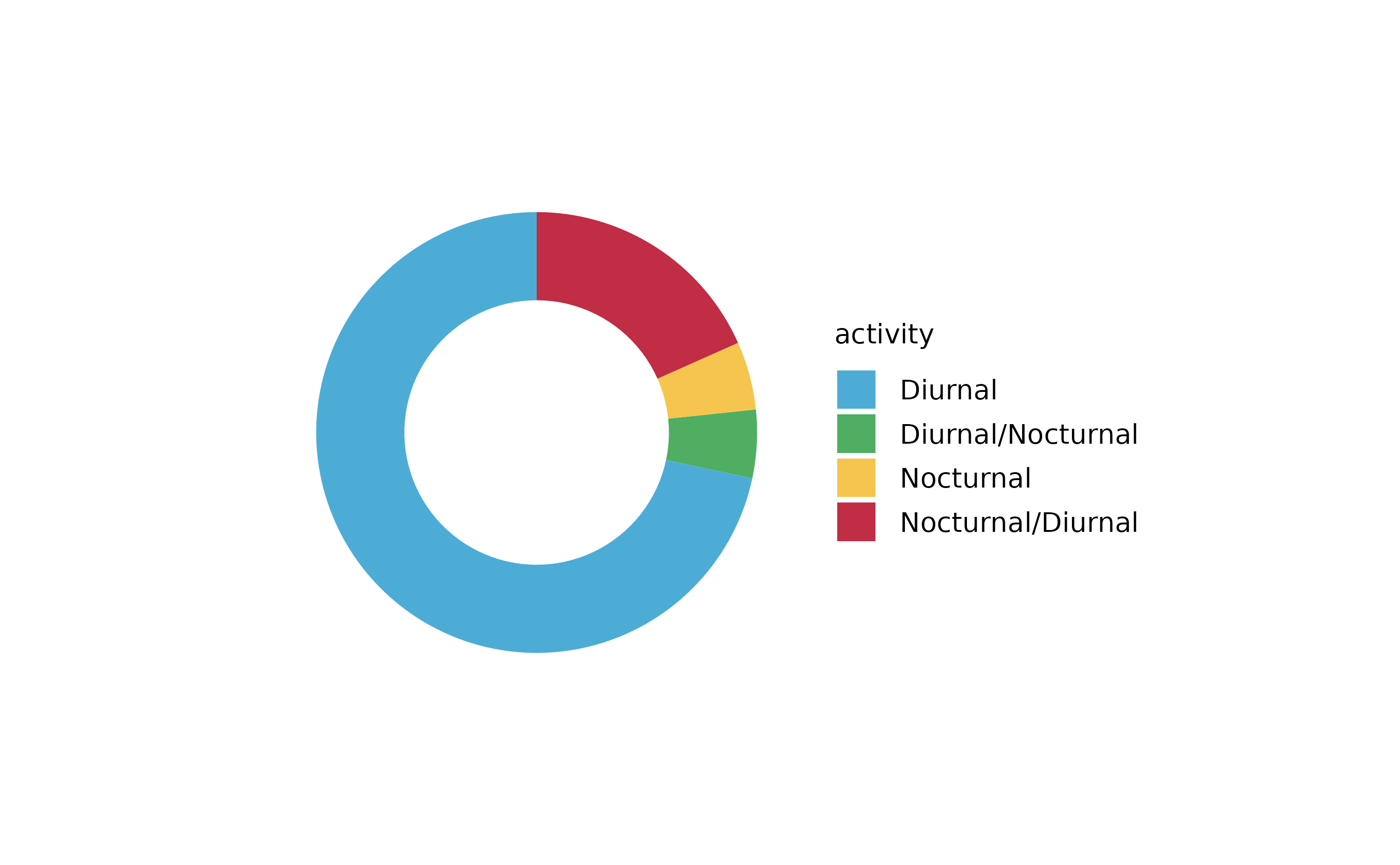
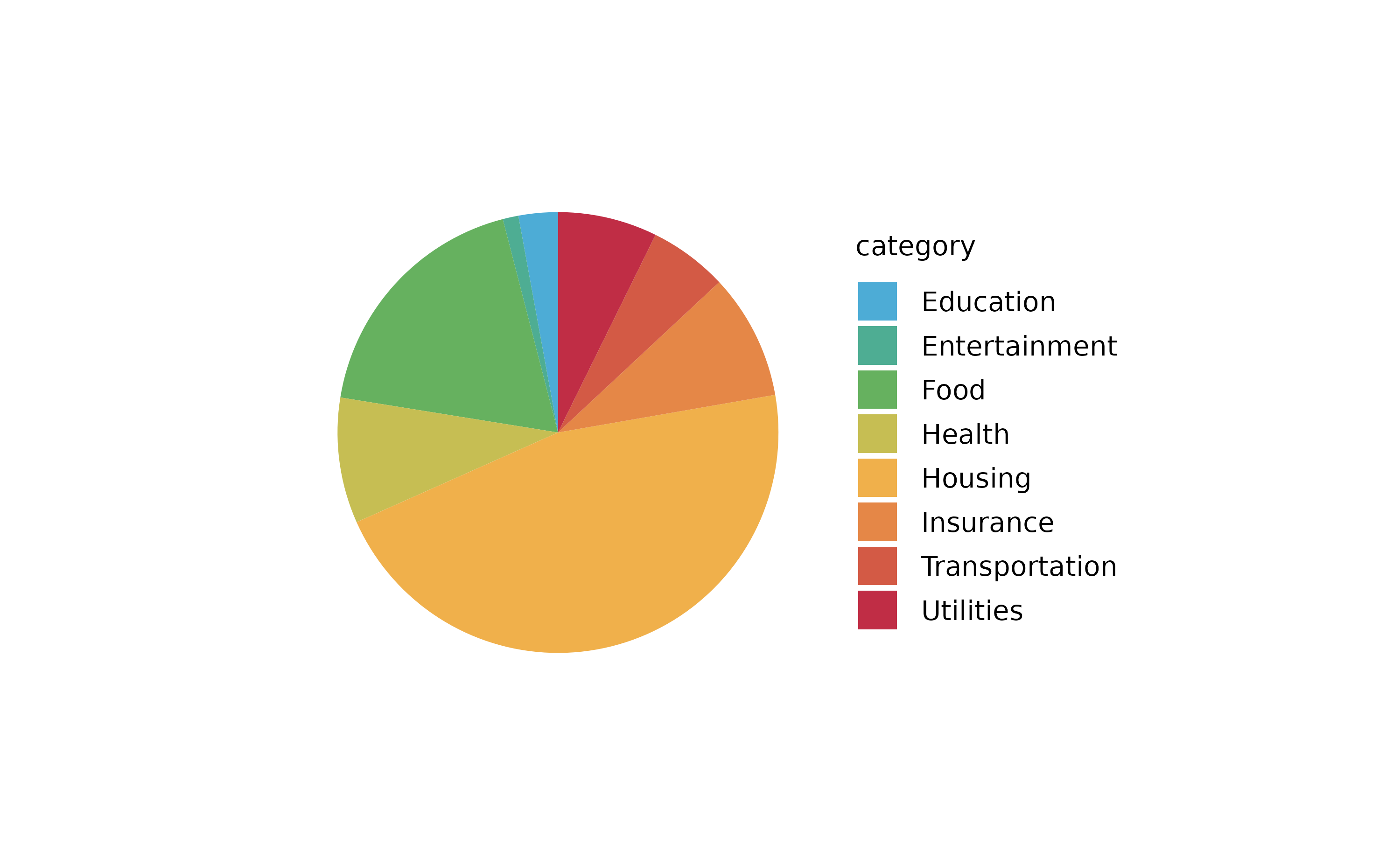
animals %>%
  tidyplot(color = family) %>%
  add_barstack_absolute()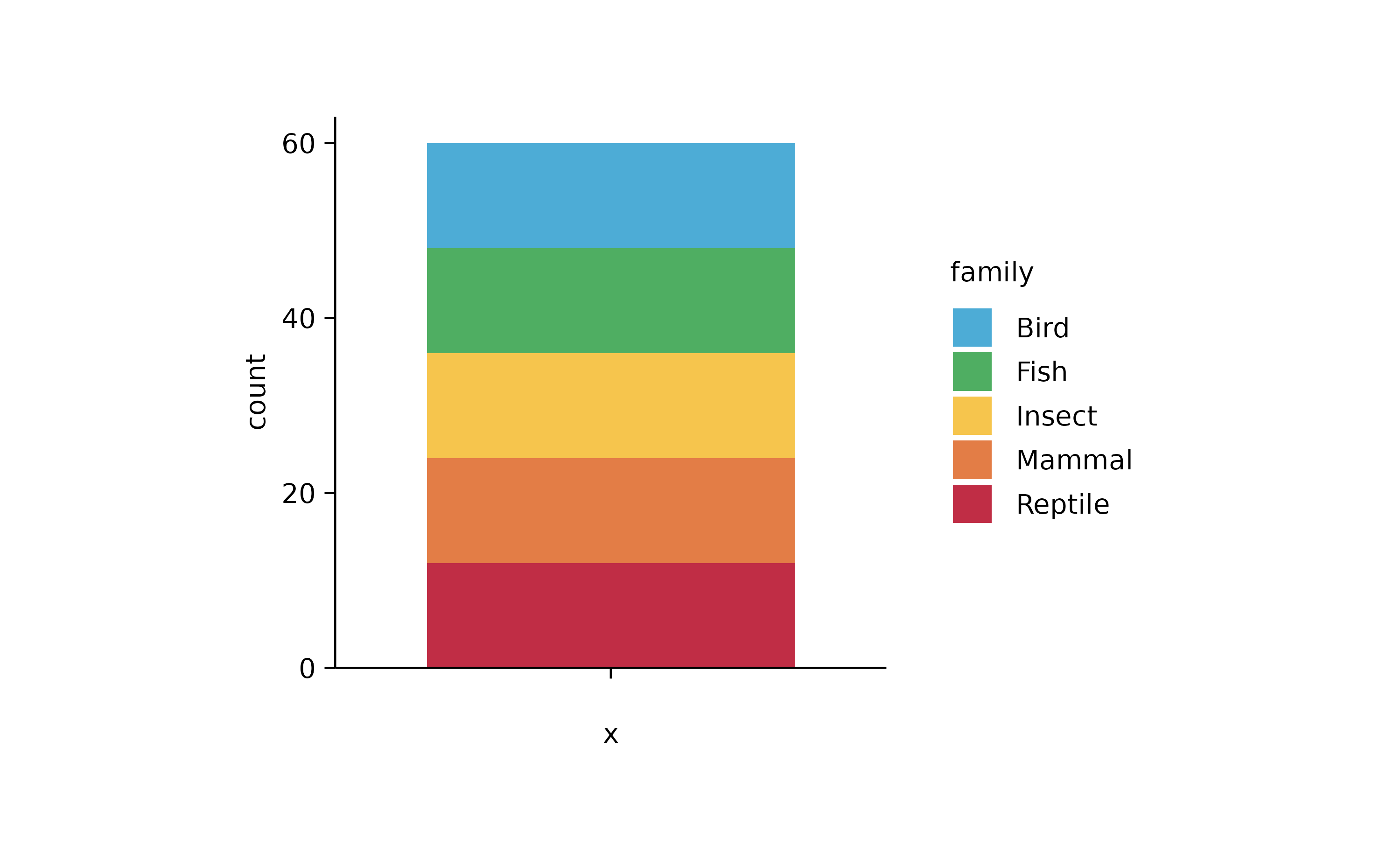
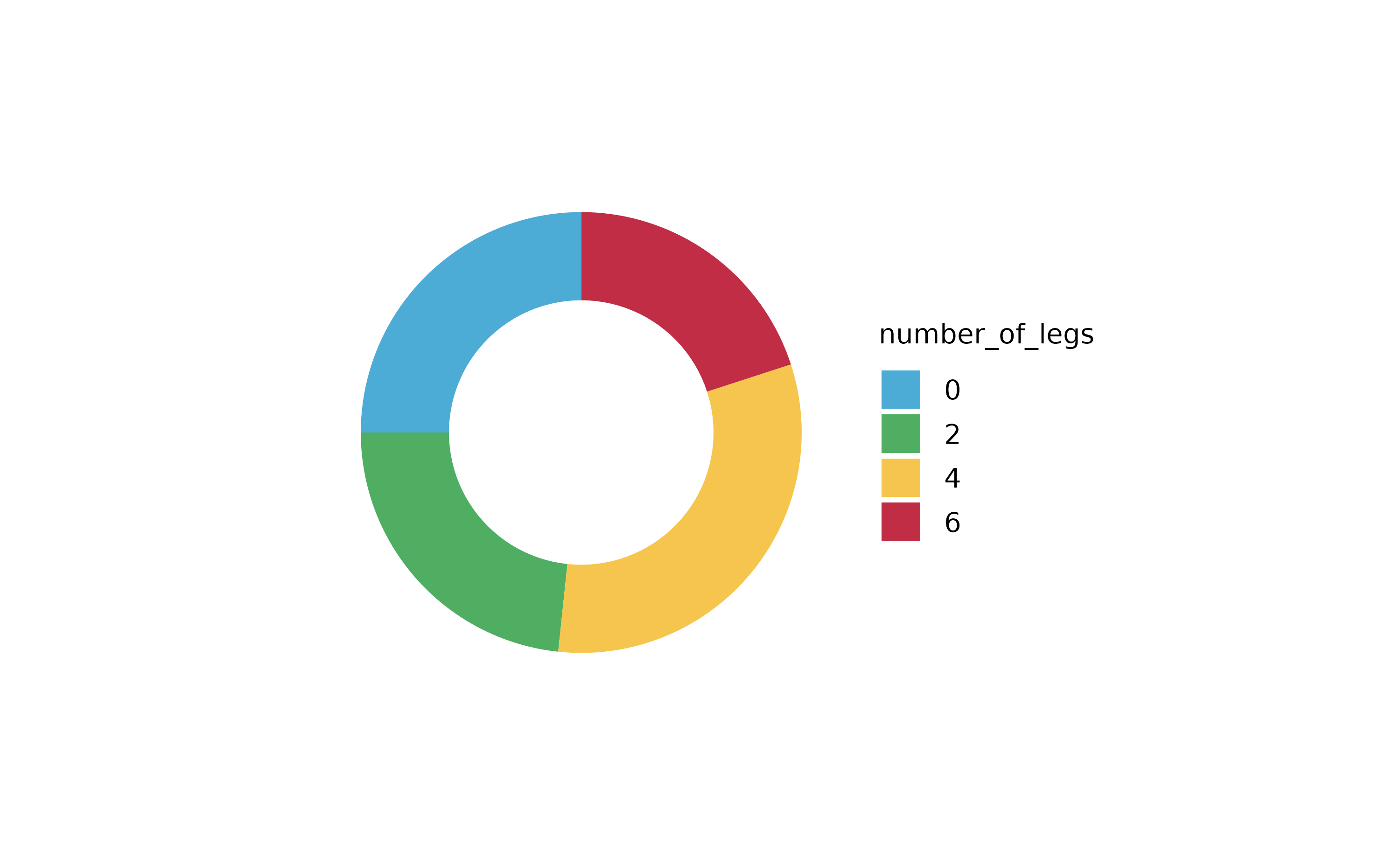
animals %>%
  tidyplot(x = number_of_legs, color = family) %>%
  add_barstack_relative()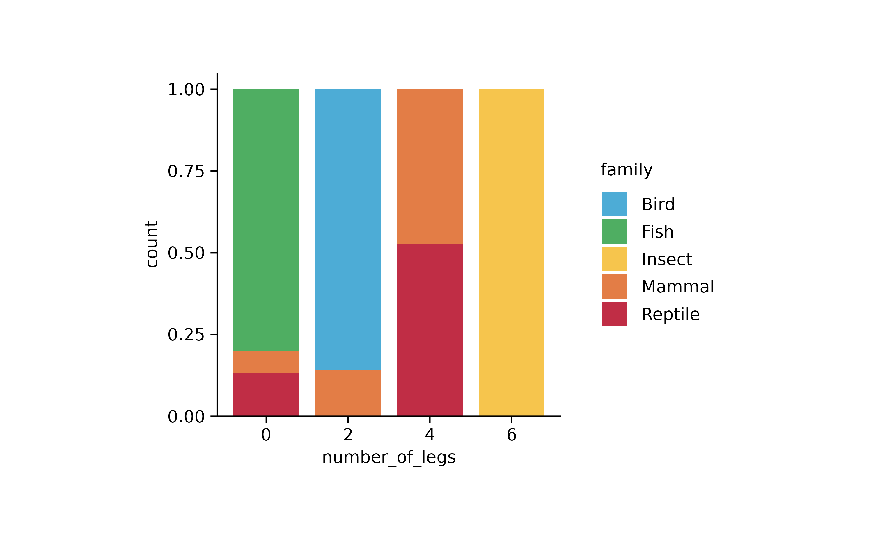
animals %>%
  tidyplot(x = family, color = number_of_legs) %>%
  add_barstack_relative()
animals %>%
  tidyplot(x = family, y = speed, color = number_of_legs) %>%
  add_barstack_relative()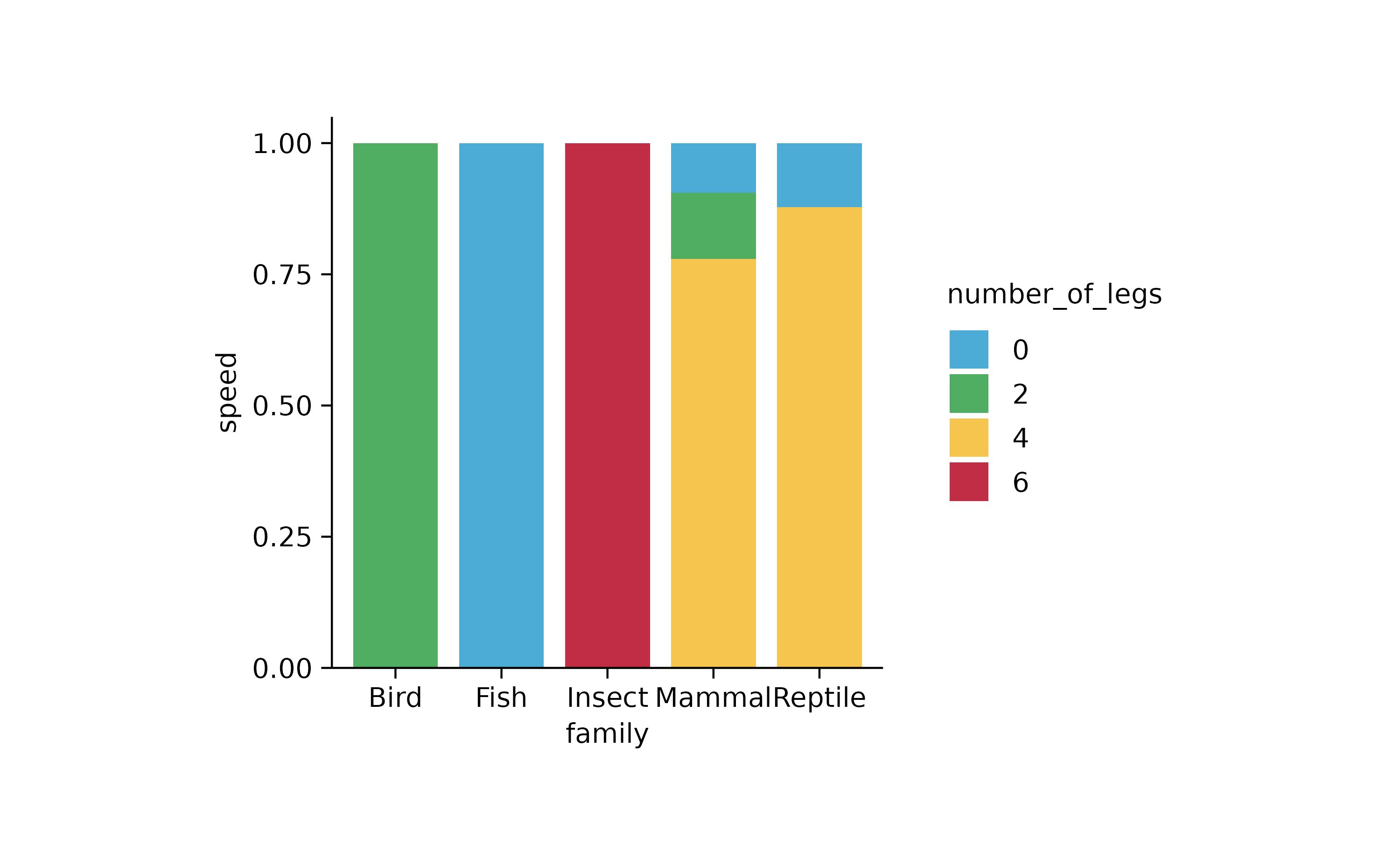
animals %>%
  tidyplot(number_of_legs, color = family) %>%
  add_areastack_absolute()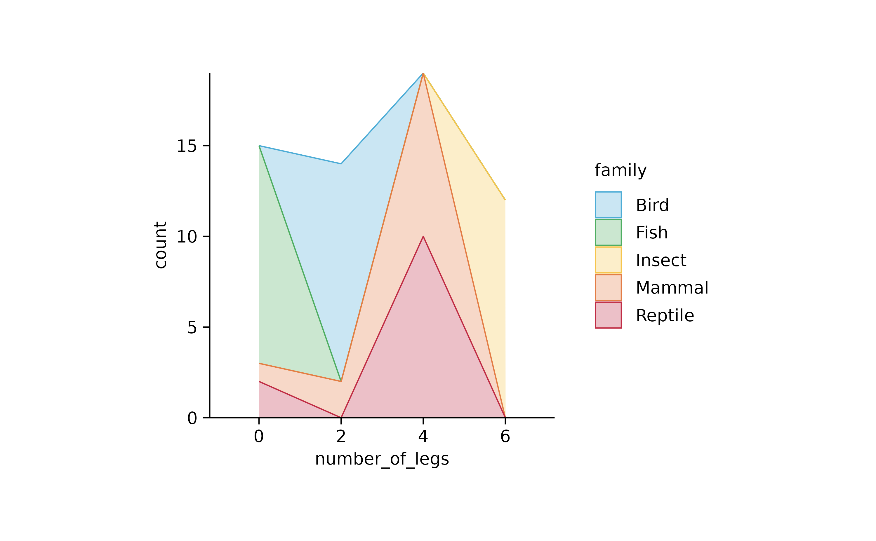
animals %>%
  tidyplot(number_of_legs, color = family) %>%
  add_areastack_relative()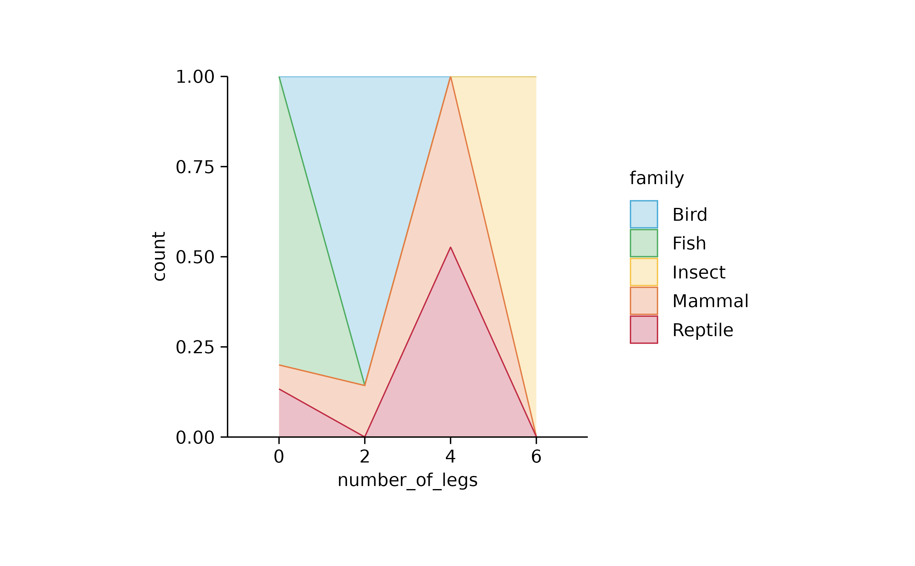
animals %>%
  tidyplot(number_of_legs, speed, color = family) %>%
  add_areastack_absolute()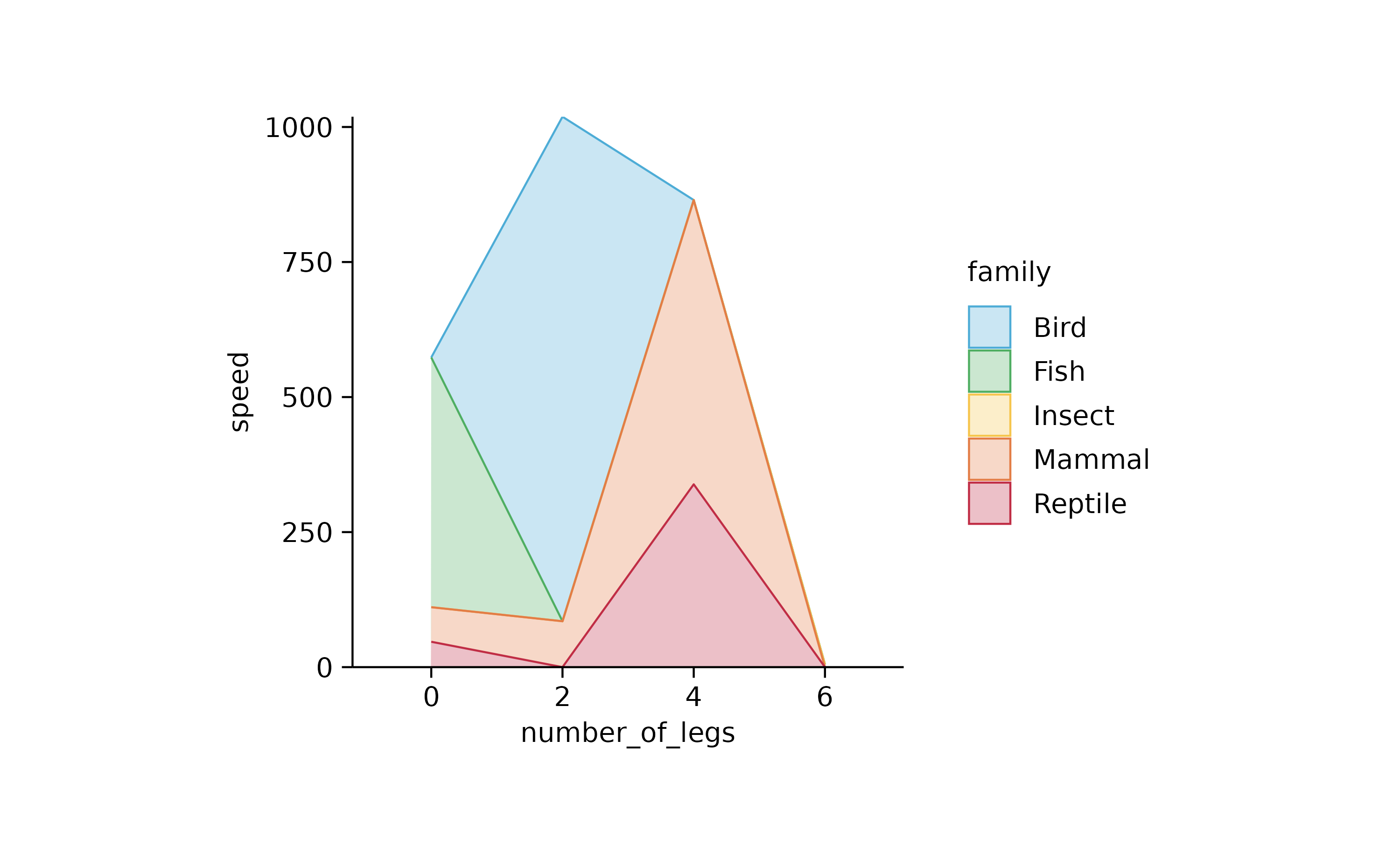
animals %>%
  tidyplot(number_of_legs, speed, color = family) %>%
  add_areastack_relative()
# orientation = "y" needed

animals %>%
  tidyplot(y = number_of_legs, color = family) %>%
  add_areastack_absolute()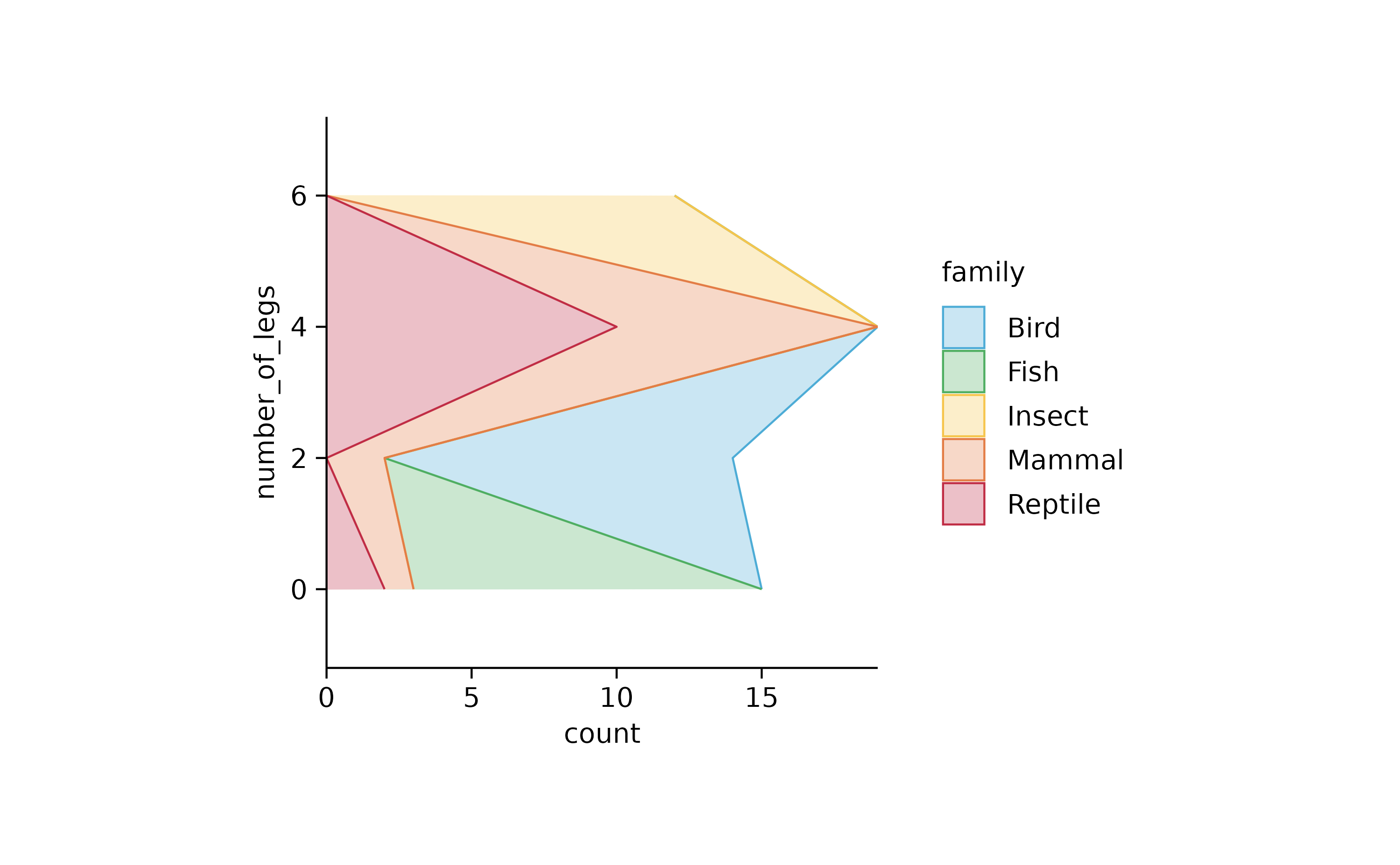
animals %>%
  tidyplot(y = number_of_legs, color = family) %>%
  add_areastack_relative()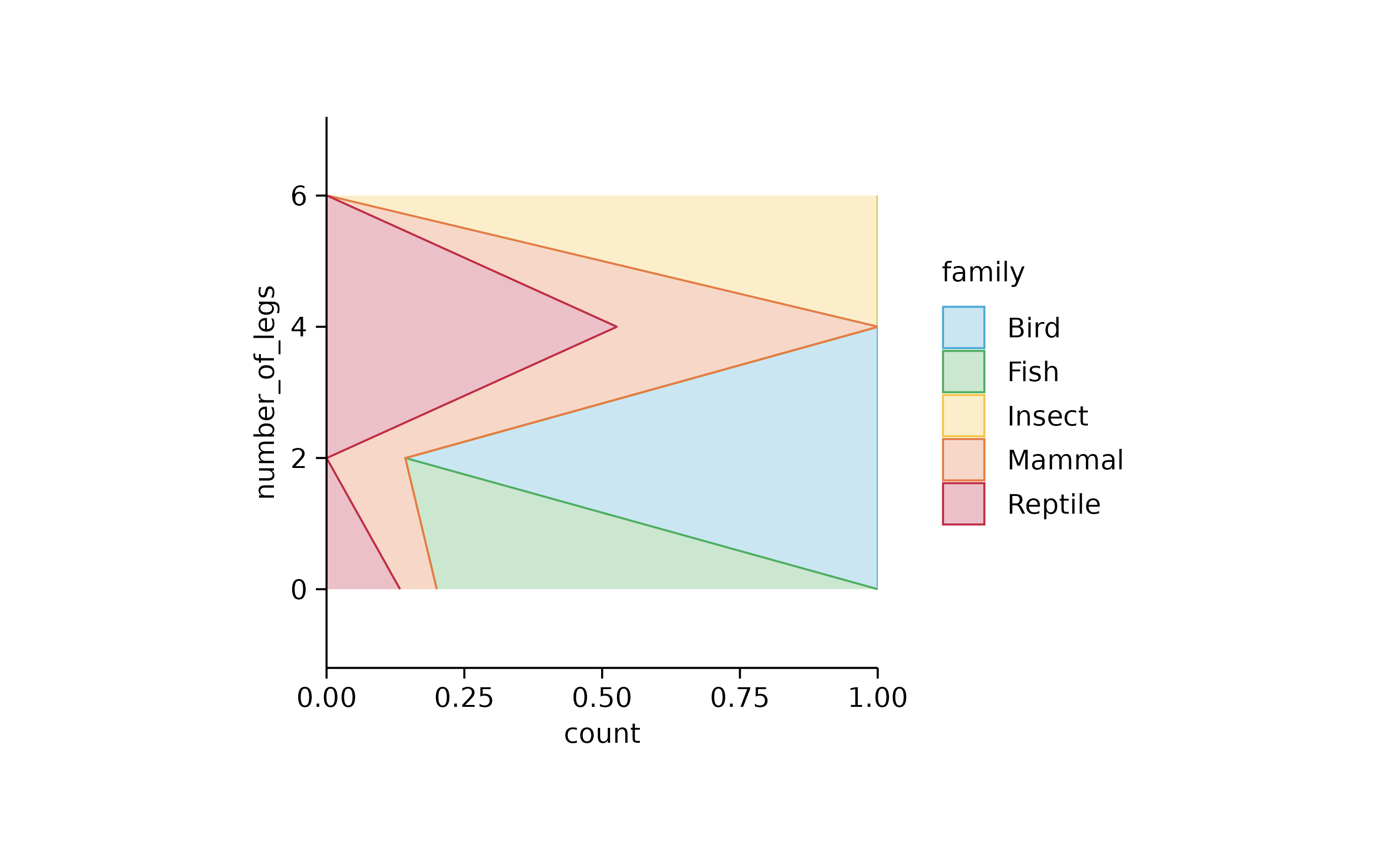
animals %>%
  tidyplot(y = diet, color = family) %>%
  add_areastack_absolute()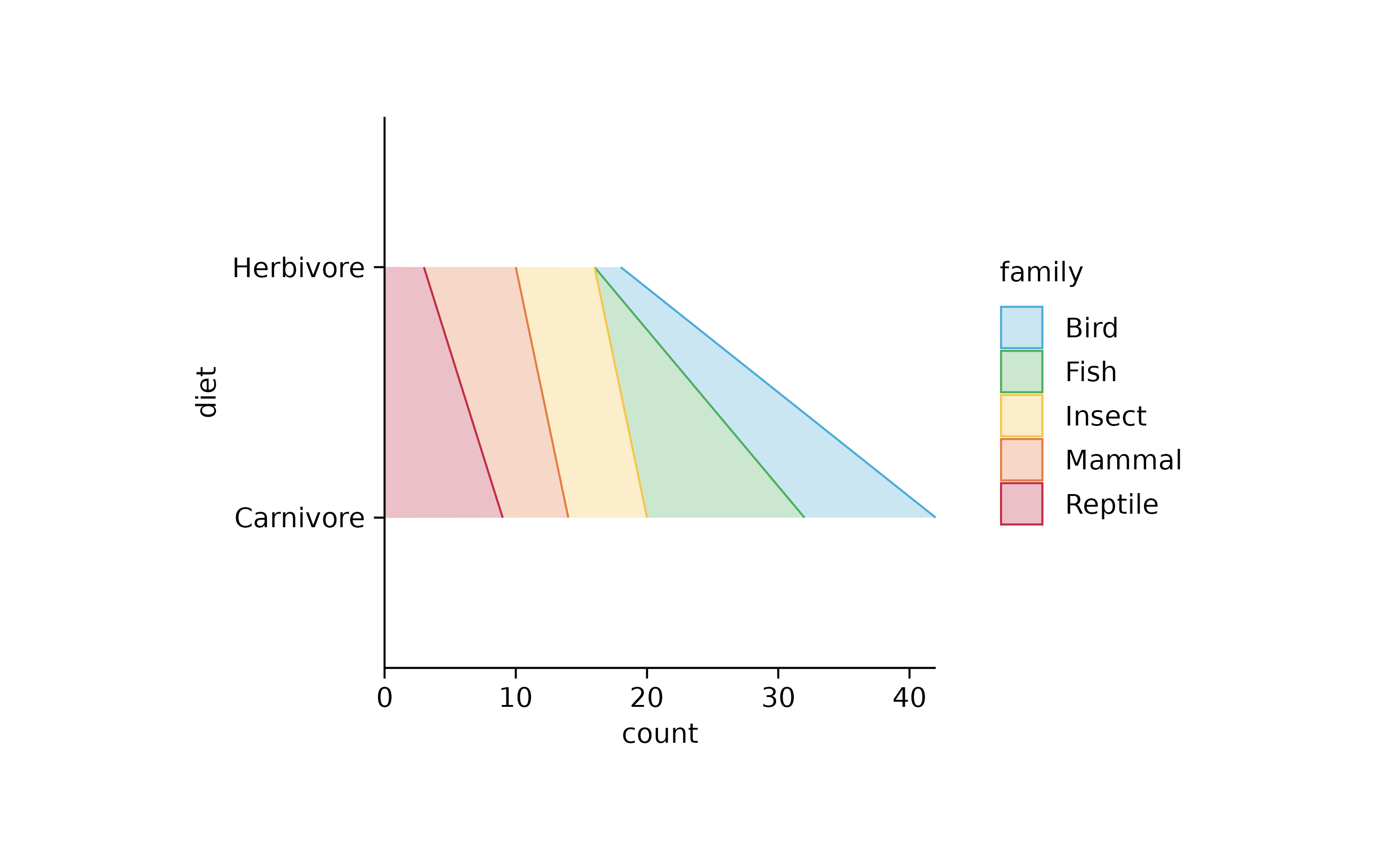
animals %>%
  tidyplot(y = diet, color = family) %>%
  add_areastack_absolute() %>%
  reverse_y_axis_labels()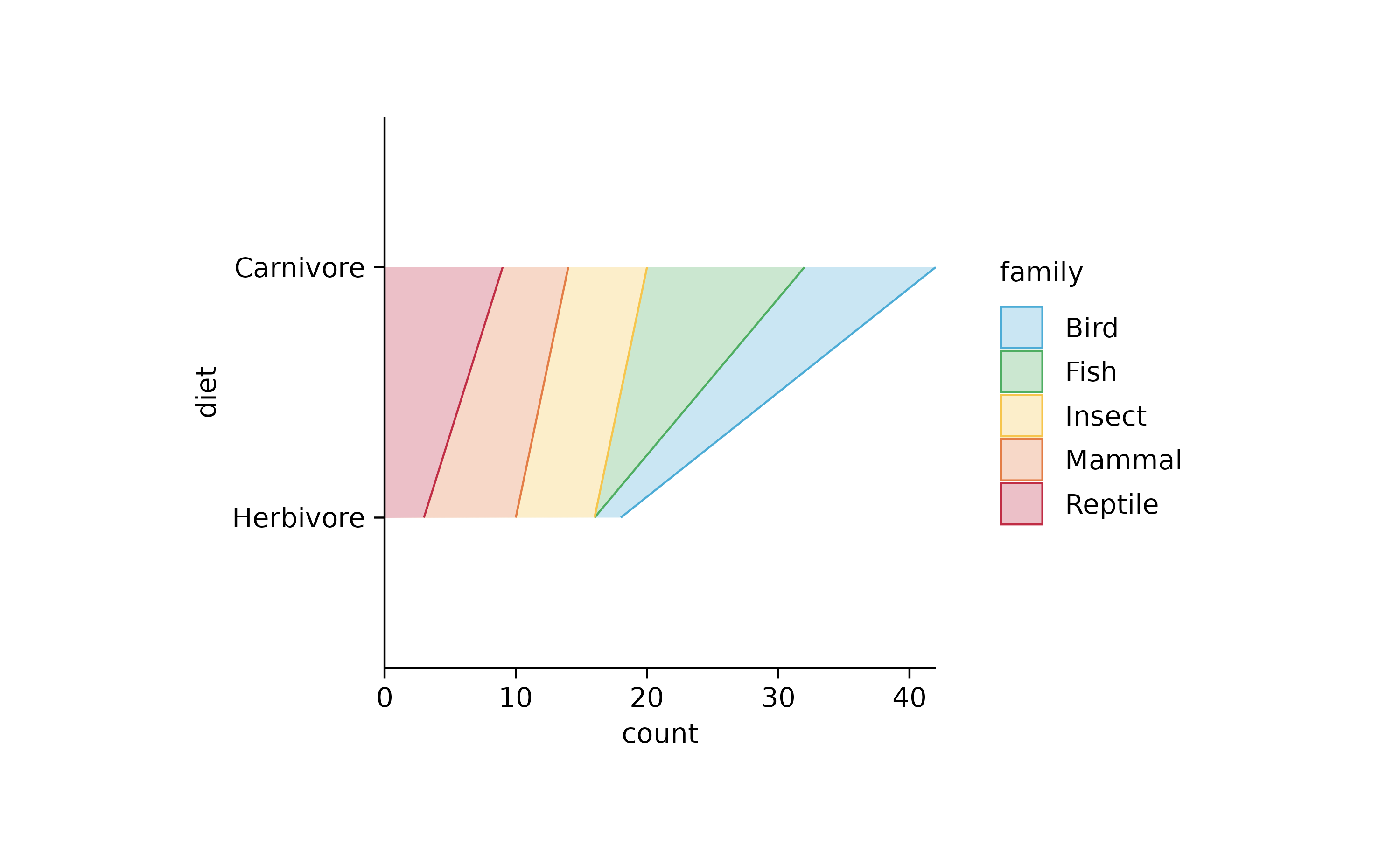
animals %>%
  tidyplot(y = diet, x = speed, color = family) %>%
  add_areastack_absolute()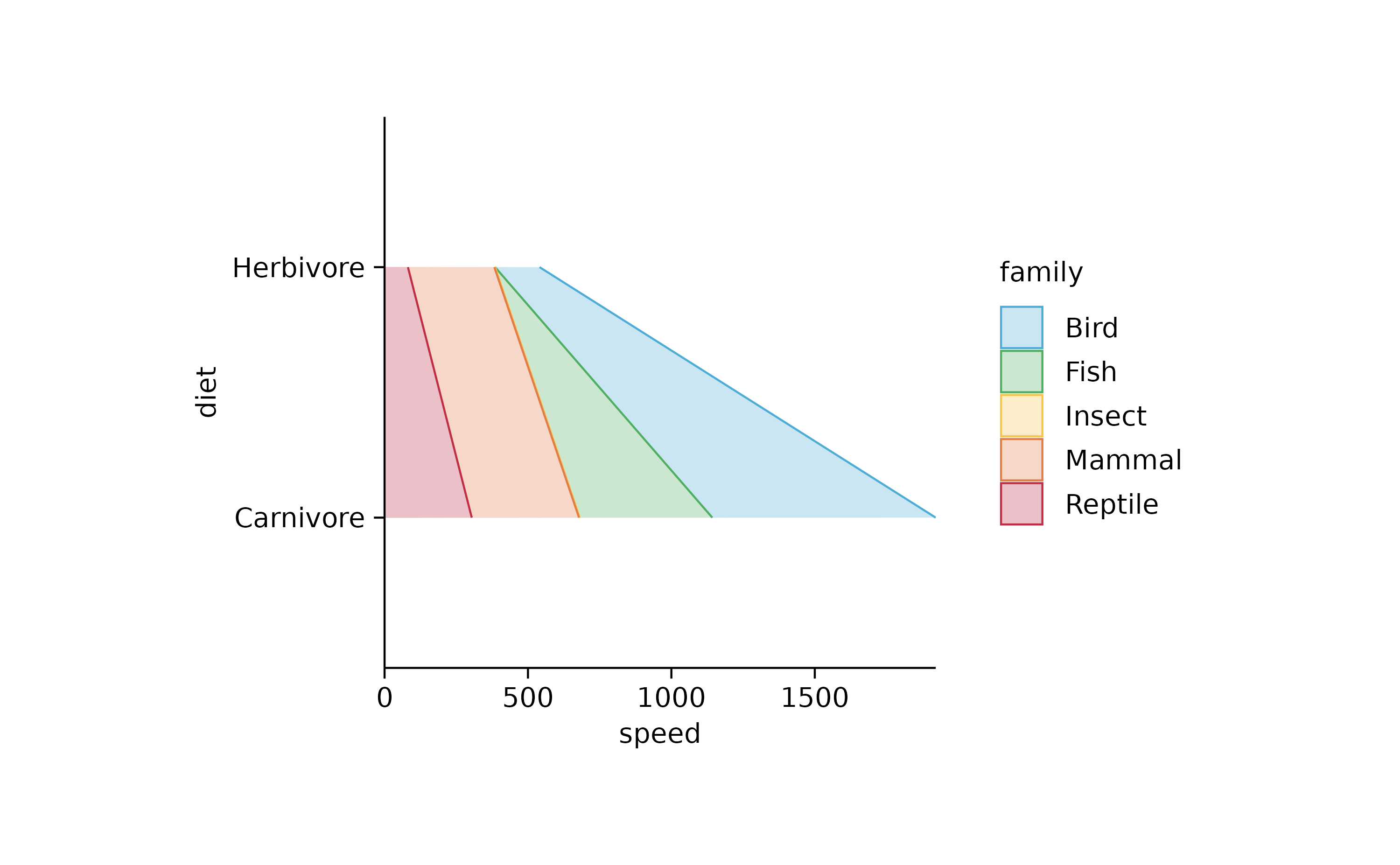
animals %>%
  tidyplot(speed, number_of_legs, color = family) %>%
  add_areastack_absolute()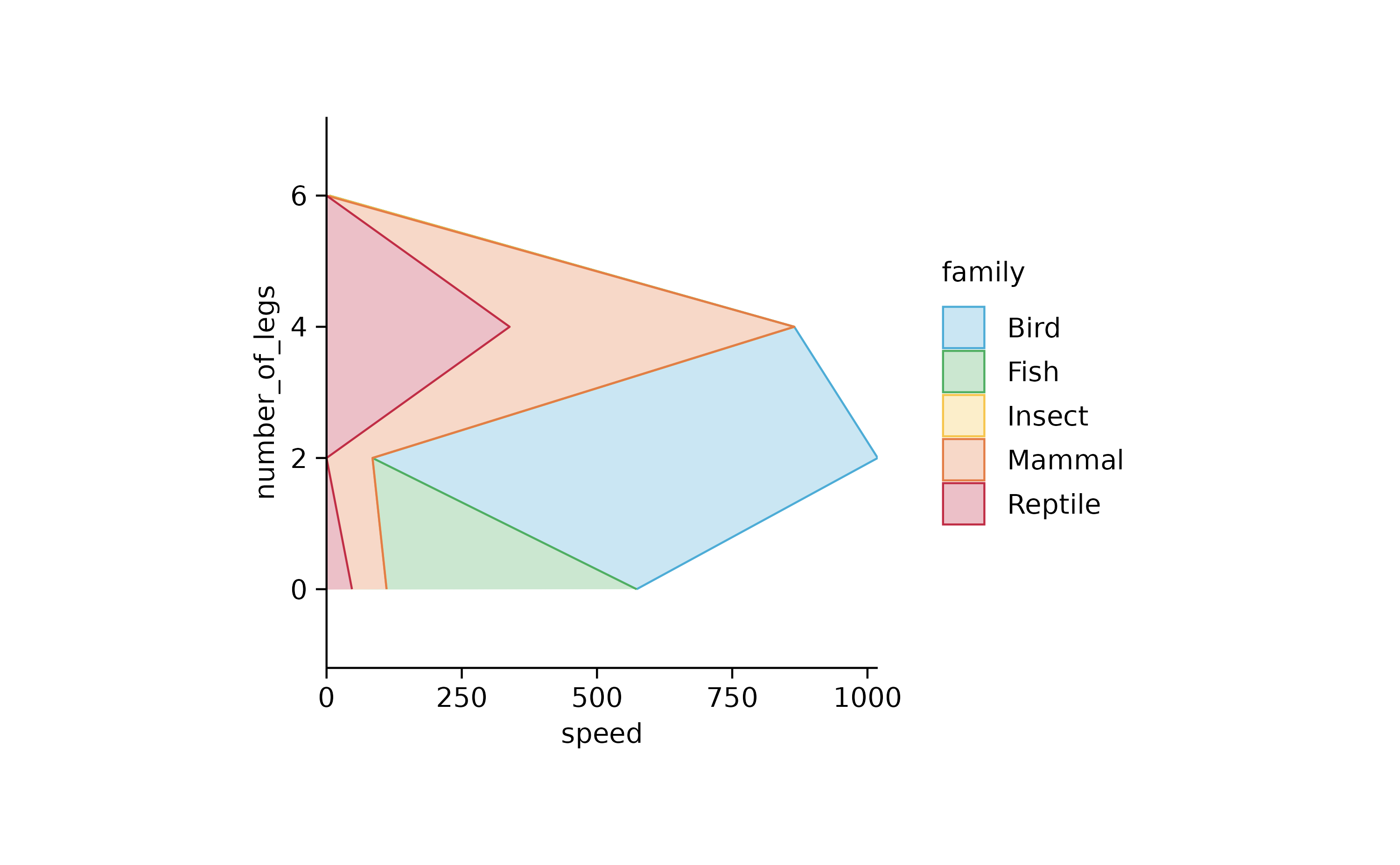
animals %>%
  tidyplot(speed, number_of_legs, color = family) %>%
  add_areastack_absolute() %>%
  reorder_y_axis_labels("2")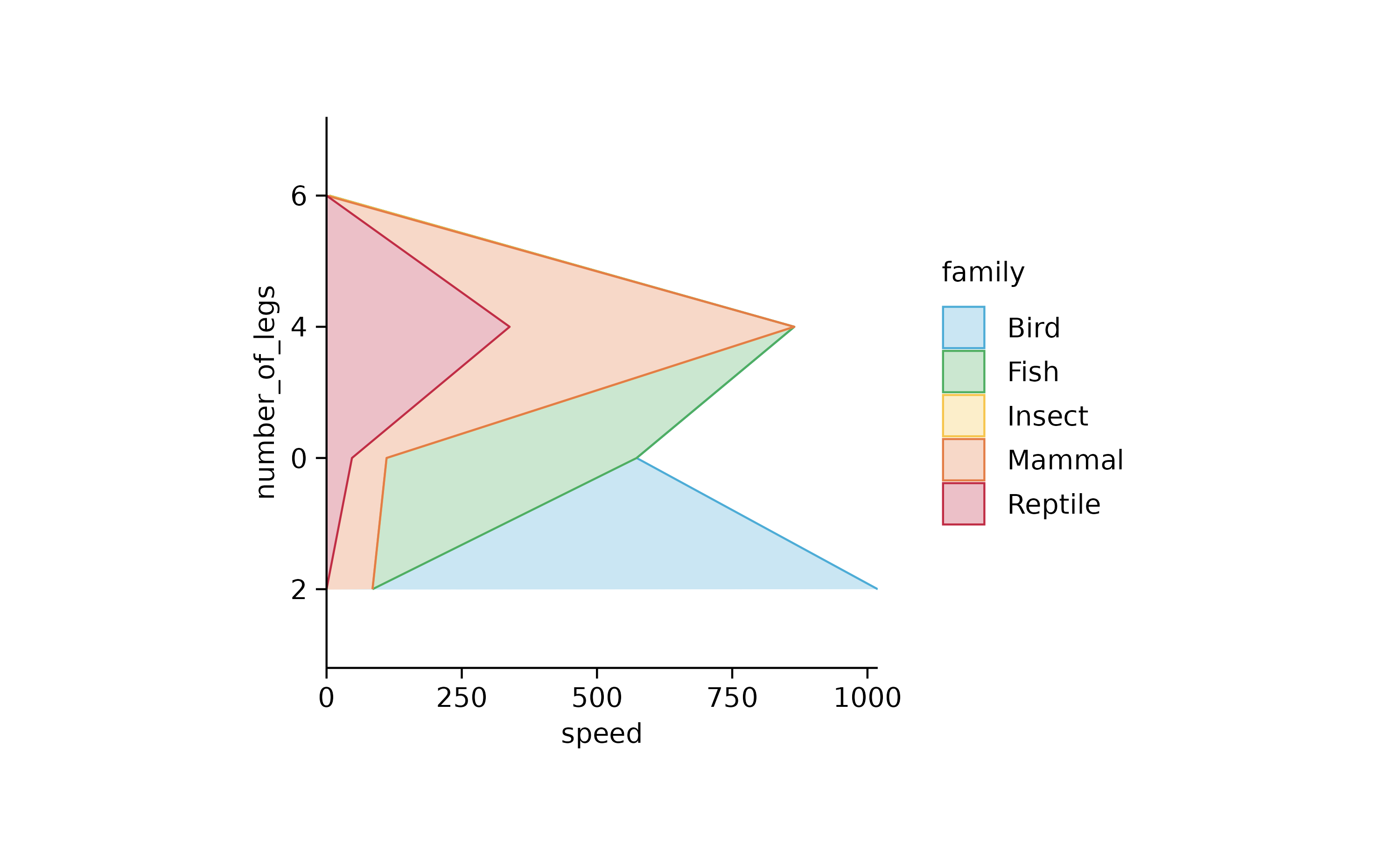
animals %>%
  tidyplot(speed, number_of_legs, color = family) %>%
  add_areastack_relative()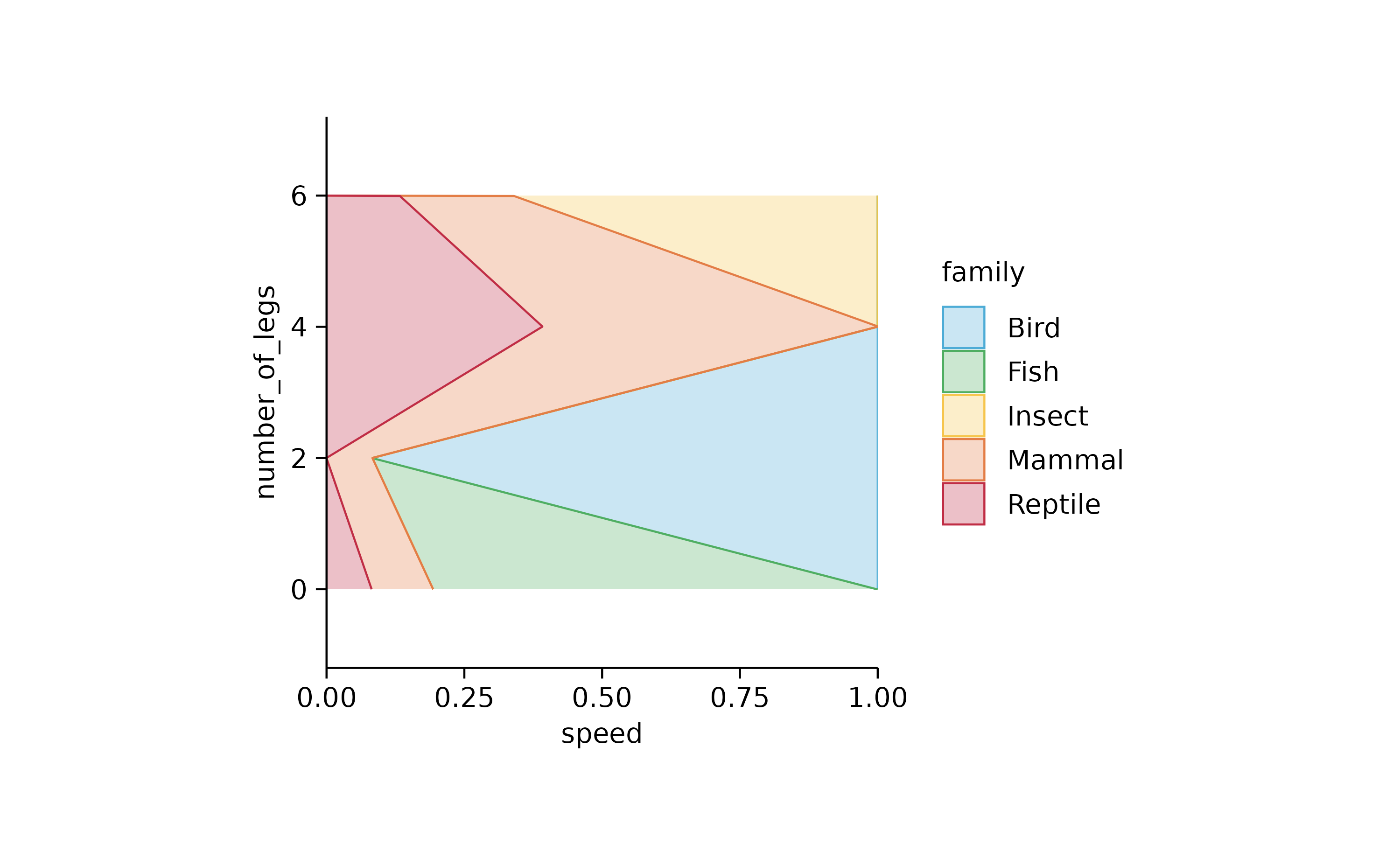
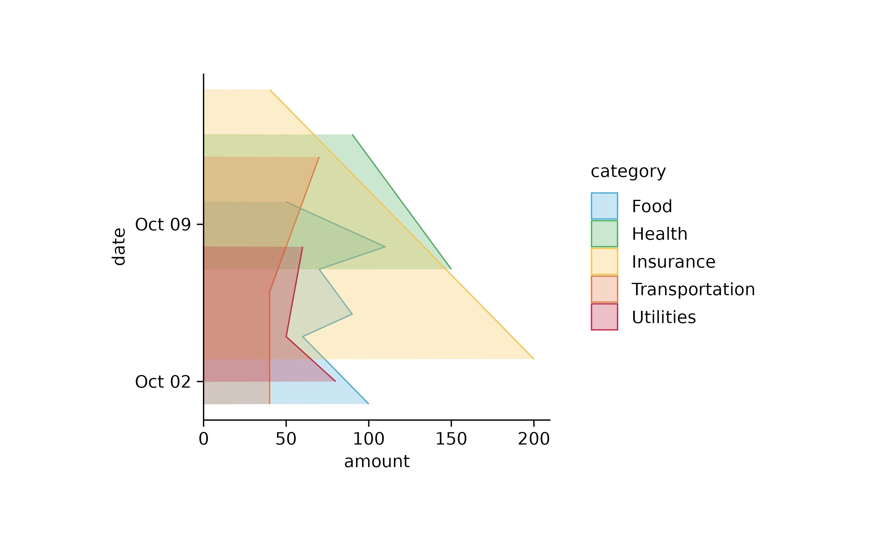
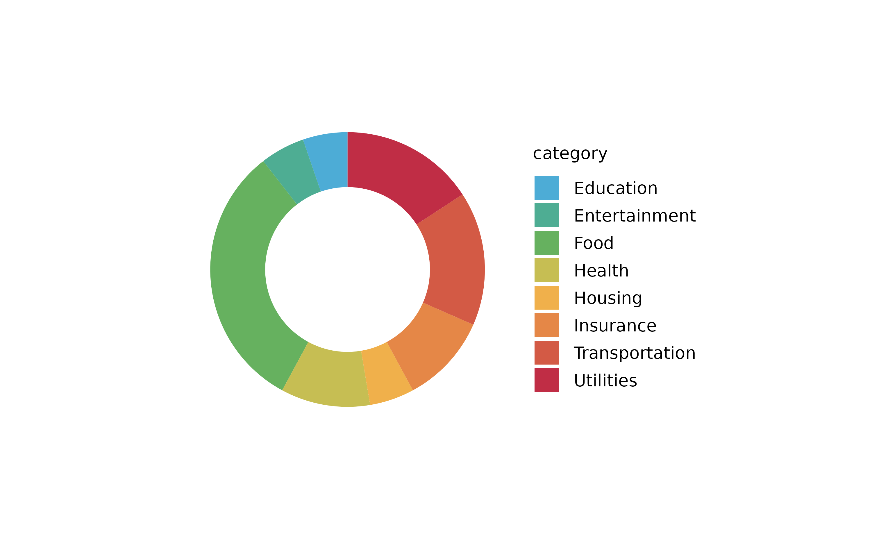
spendings %>%
  tidyplot(x = amount, y = date, color = category) %>%
  add_barstack_absolute()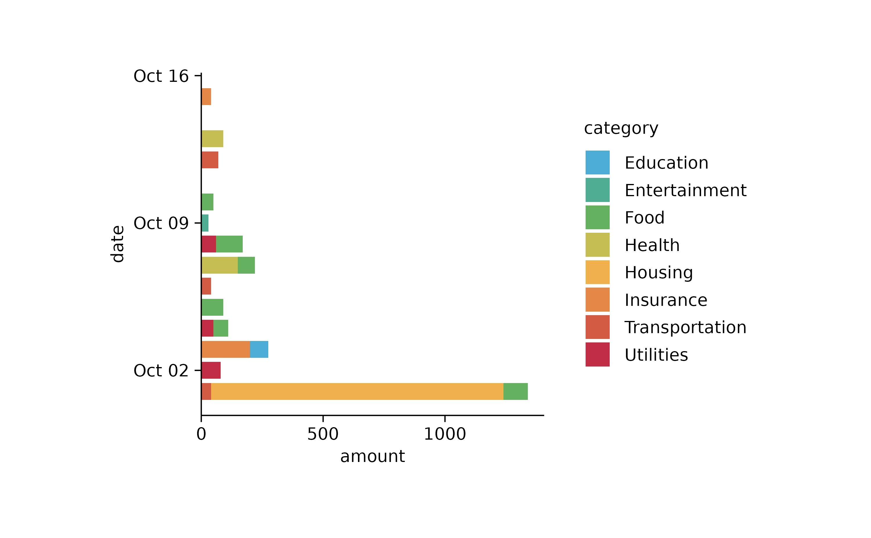
## end orientation = "y"

animals %>%
  tidyplot(number_of_legs, speed, color = family) %>%
  add_areastack_absolute()
animals %>%
  tidyplot(number_of_legs, speed, color = family) %>%
  add_areastack_relative()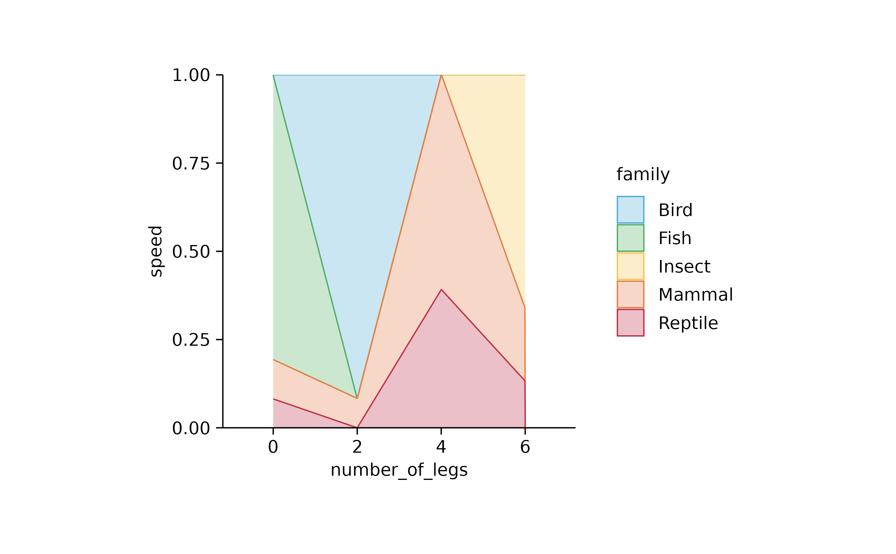
##
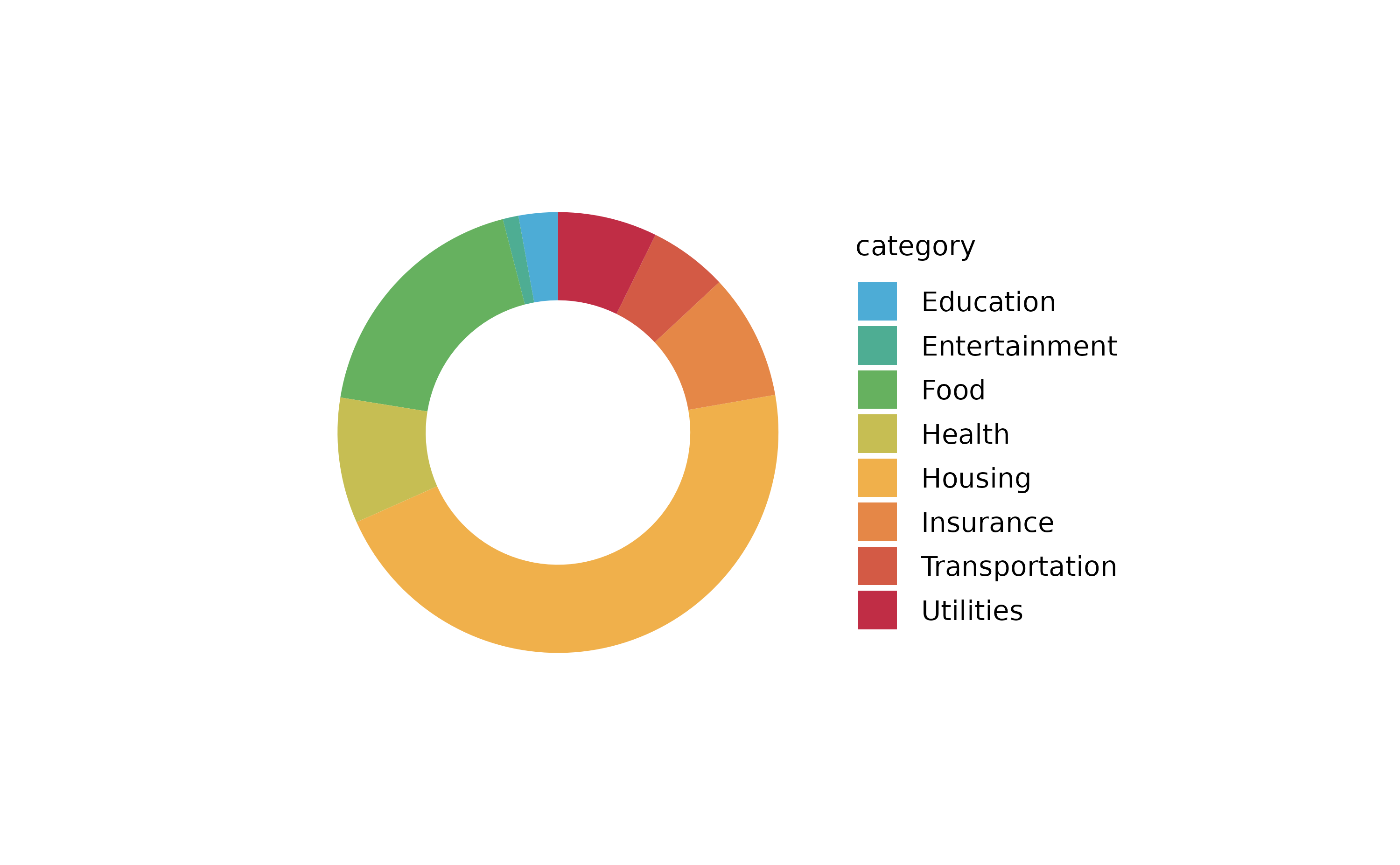
spendings %>%
tidyplot(y = amount, color = category) %>%
add_barstack_absolute()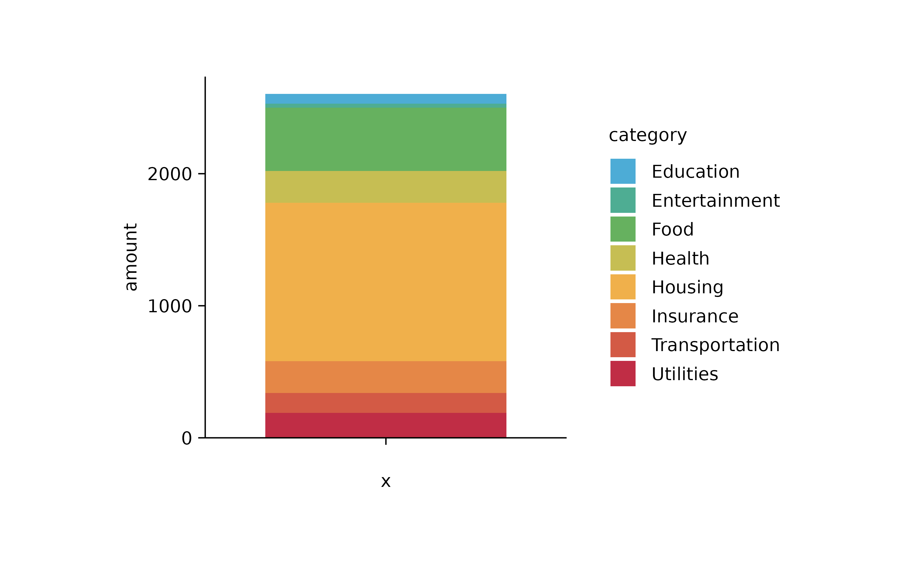
spendings %>%
  tidyplot(x = amount, color = category) %>%
  add_barstack_absolute()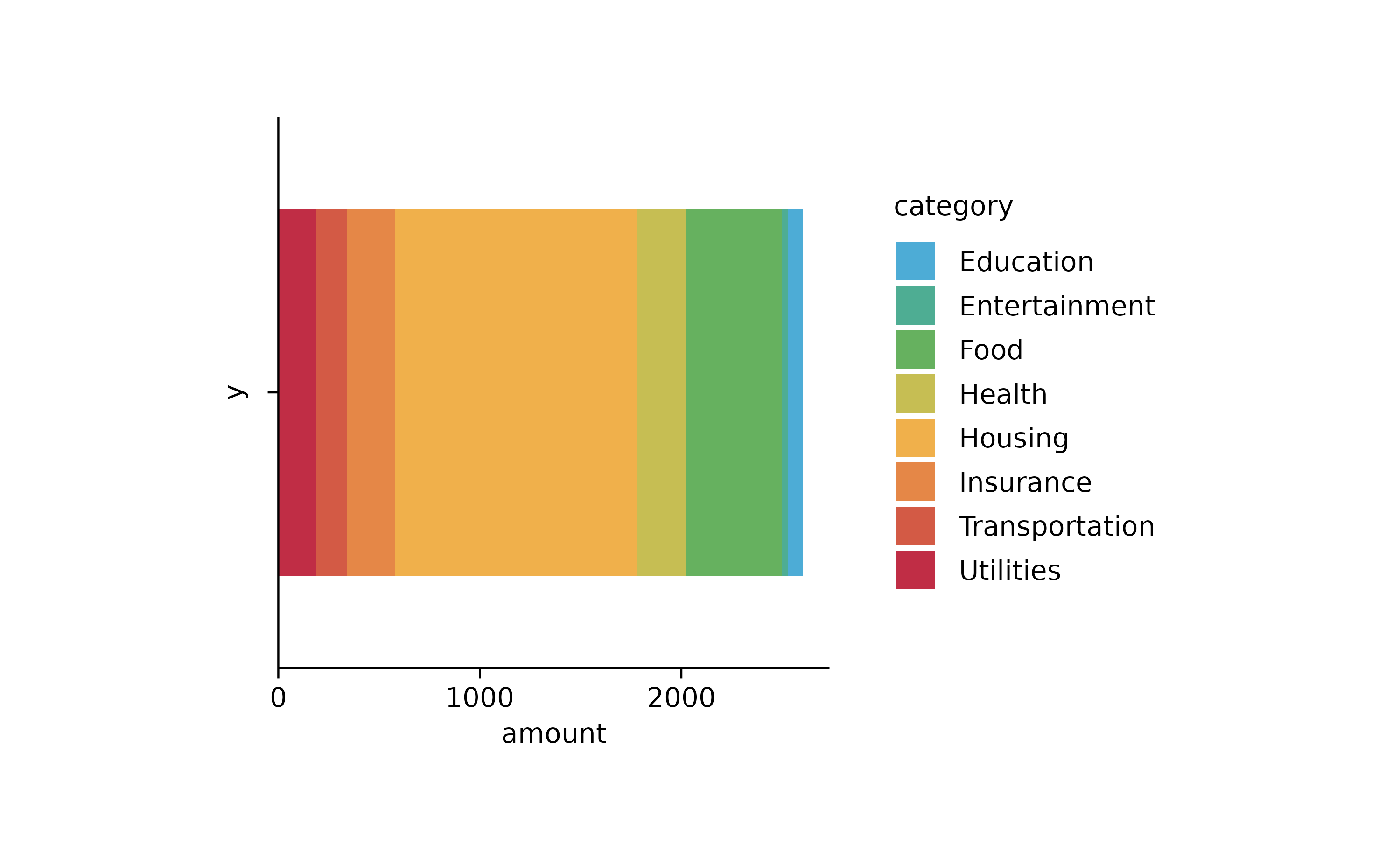
spendings %>%
  tidyplot(y = date, color = category) %>%
  add_barstack_absolute()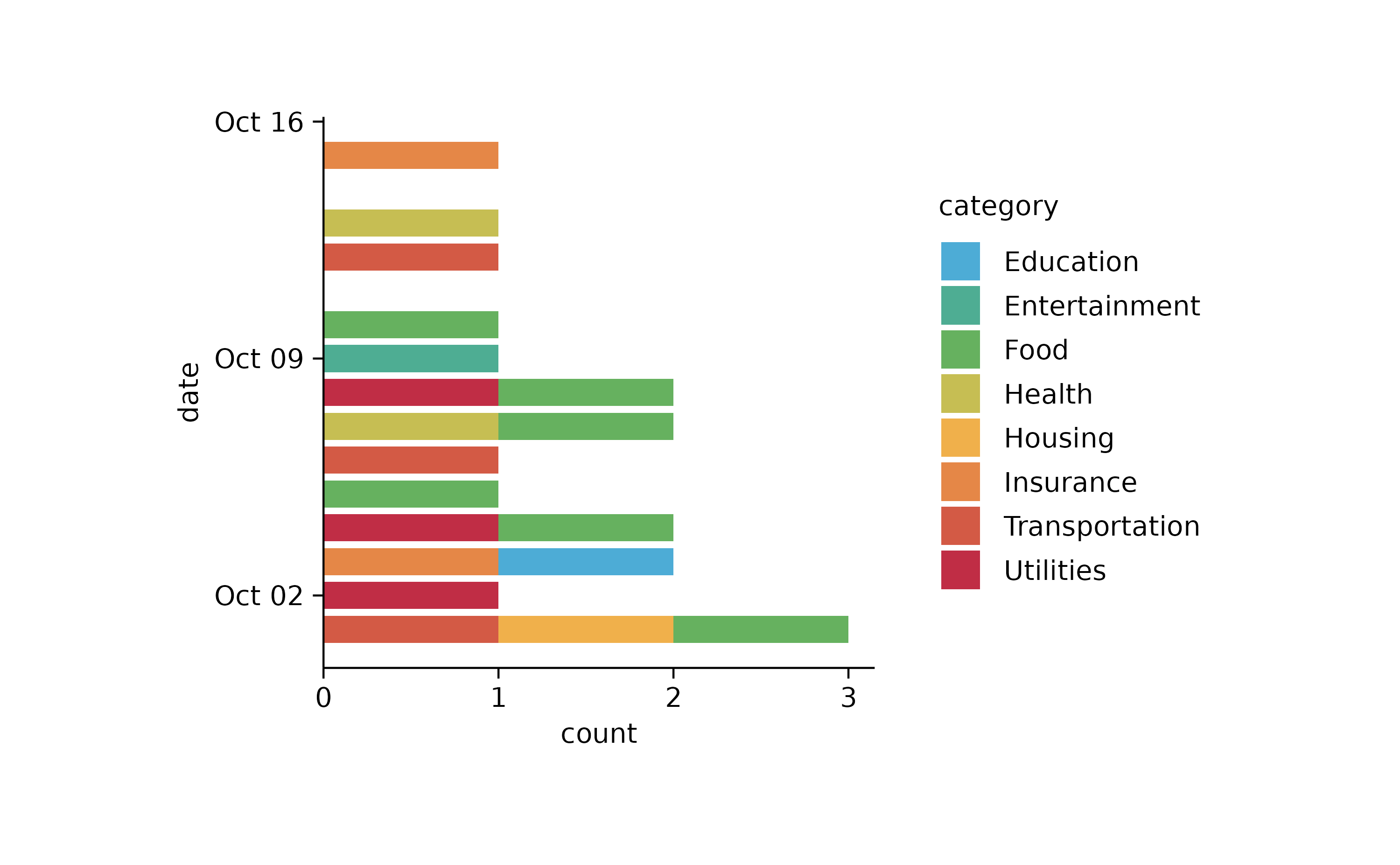
spendings %>%
  tidyplot(x = date, color = category) %>%
  add_barstack_absolute()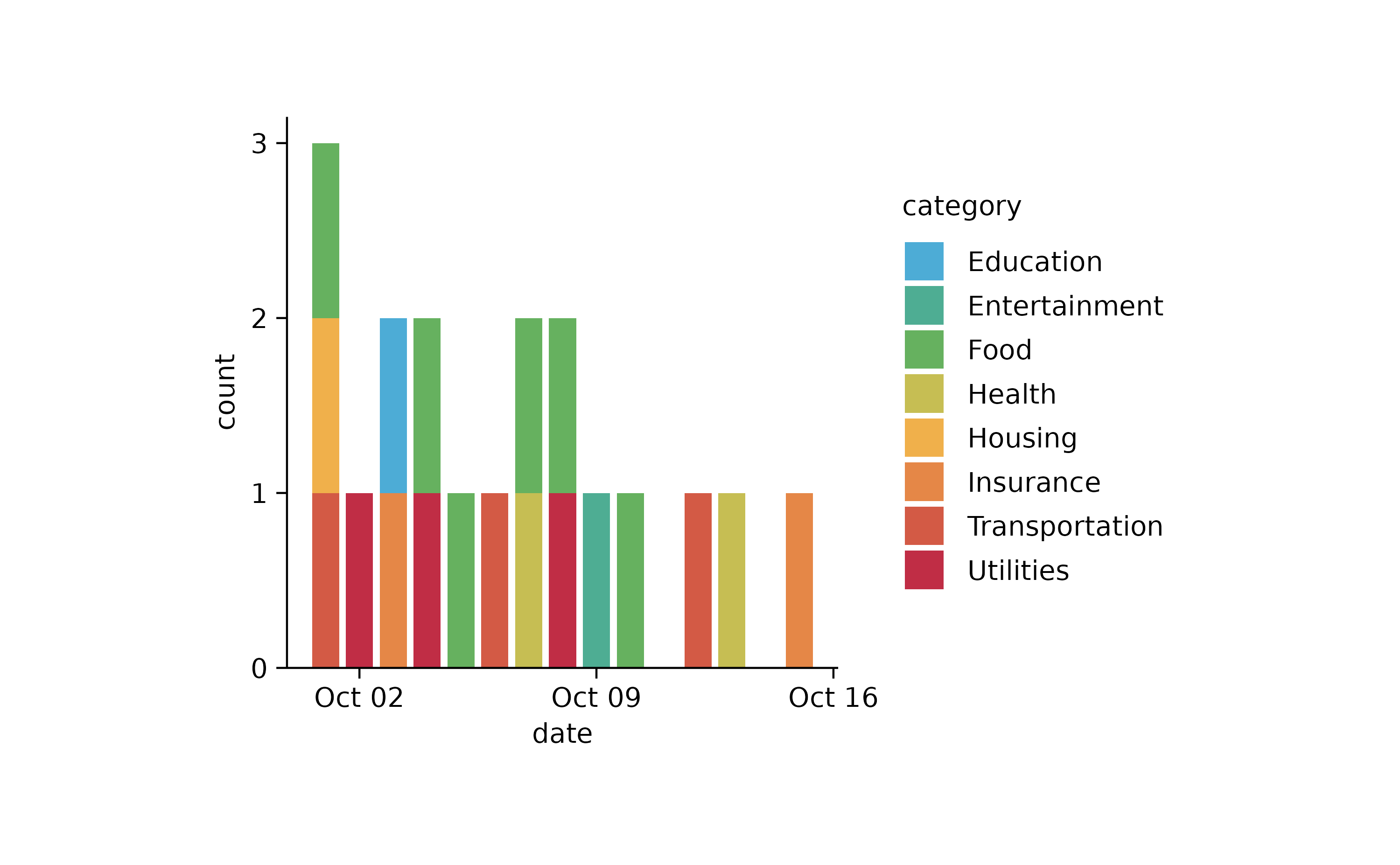
spendings %>%
  tidyplot(x = date, y = amount, color = category) %>%
  add_barstack_absolute()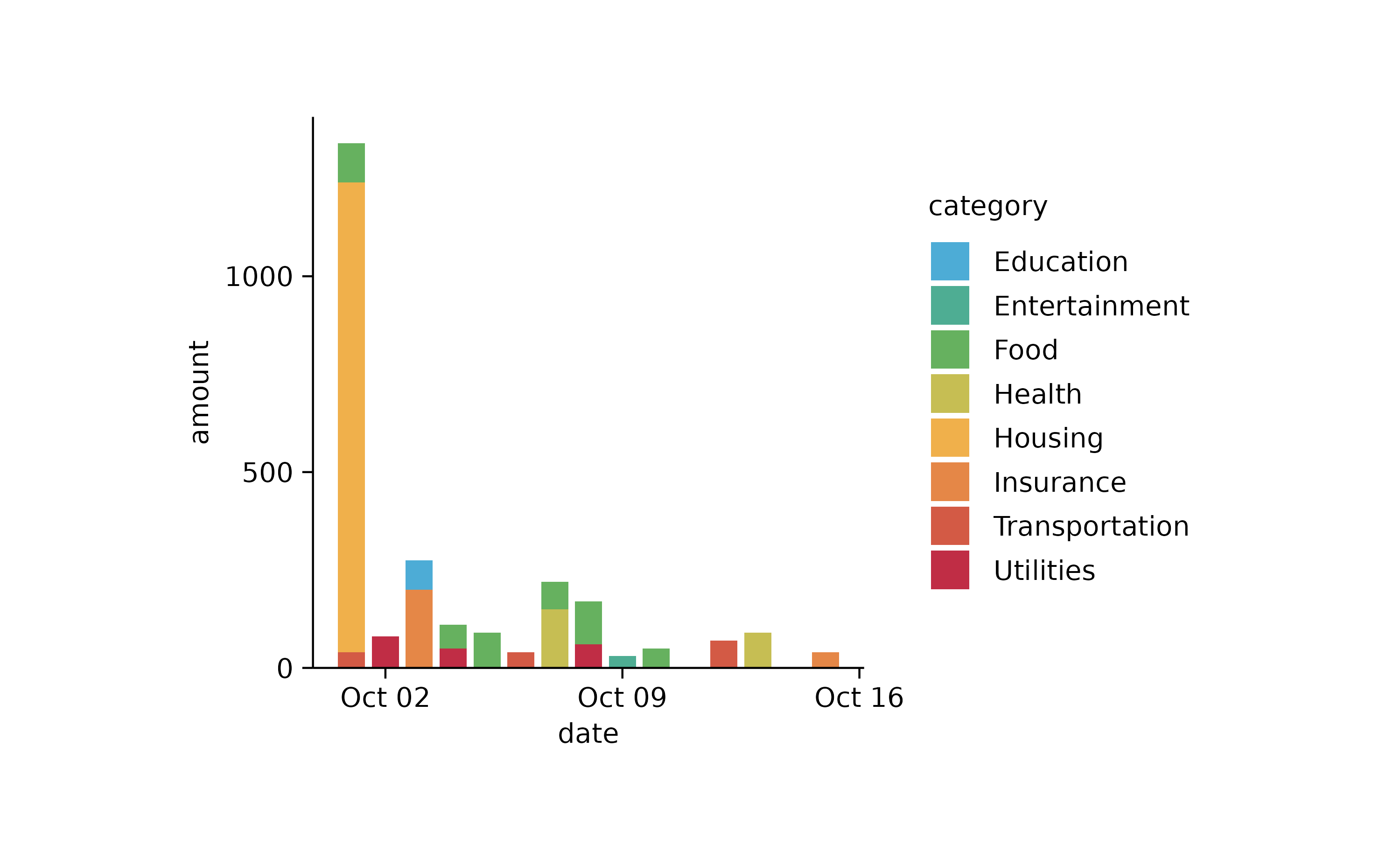
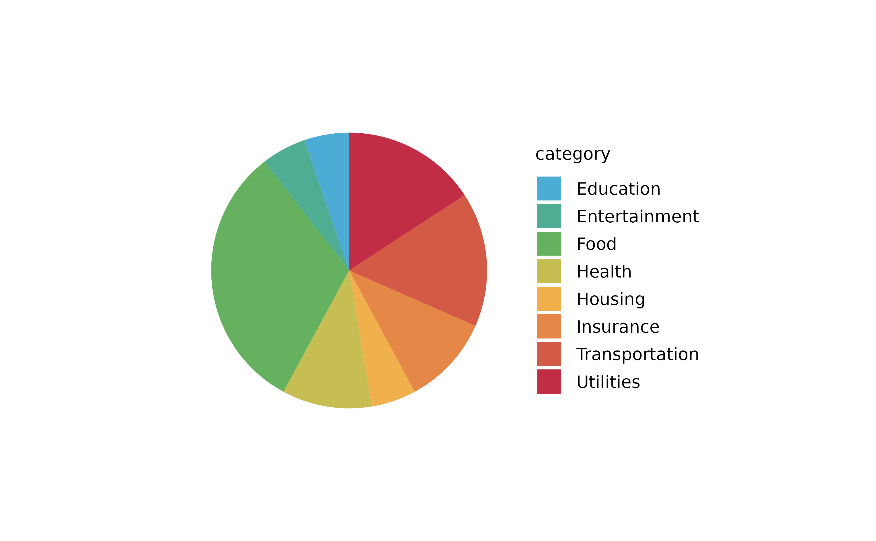
spendings %>%
  tidyplot(color = category) %>%
  add_barstack_absolute()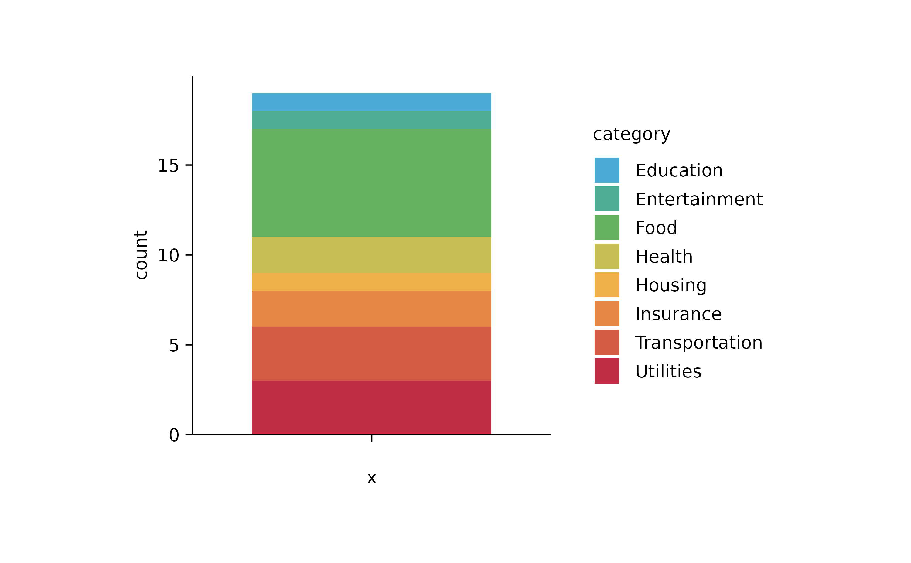
spendings %>%
  tidyplot(x = category, y = amount, color = category) %>%
  add_sum_bar() %>%
  add_sum_value(accuracy = 1) %>%
  adjust_x_axis(rotate_labels = TRUE)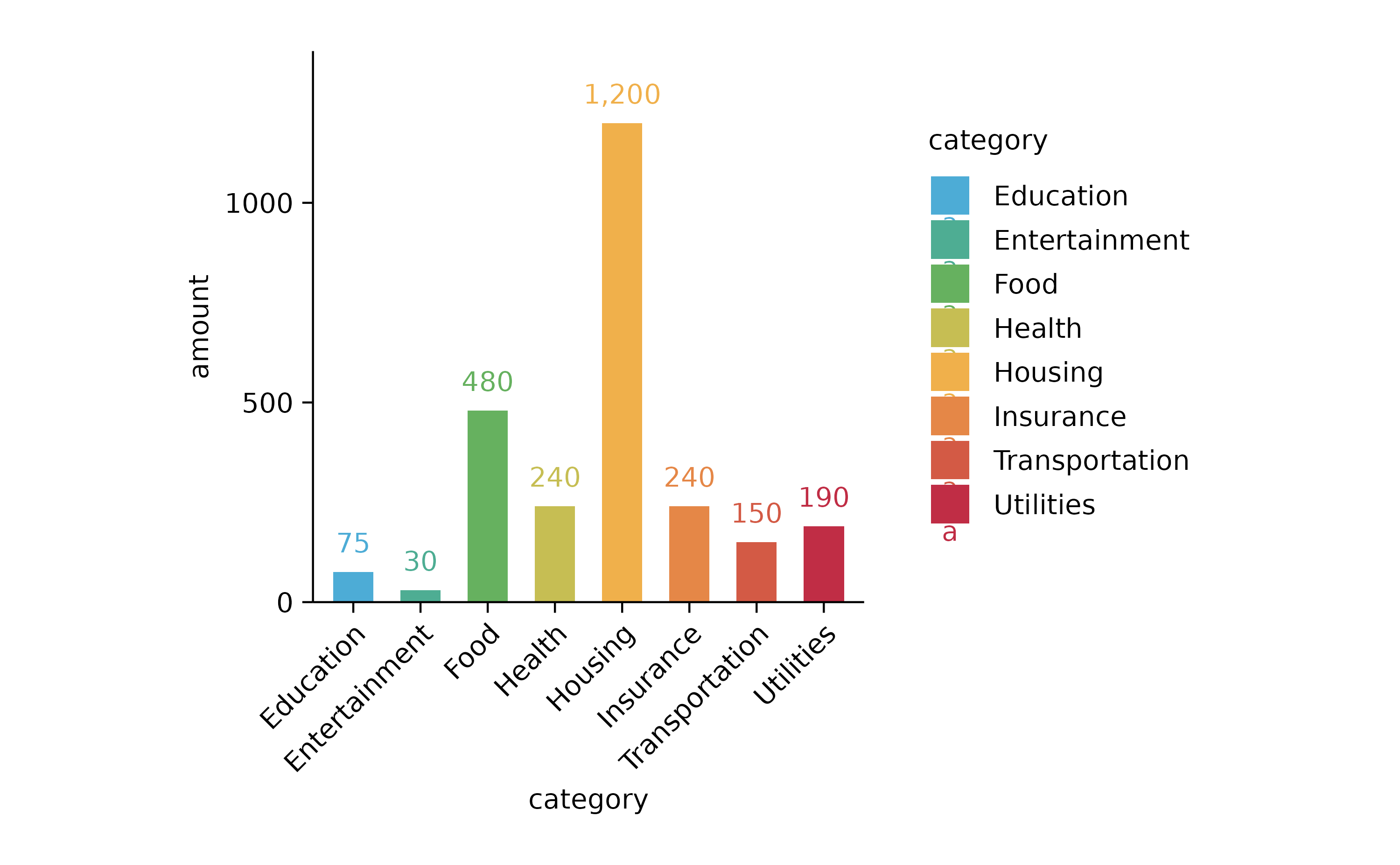
spendings %>%
  tidyplot(x = amount, y = category, color = category) %>%
  add_sum_bar() %>%
  add_sum_value(accuracy = 1, extra_padding = 0.3) %>%
  adjust_x_axis()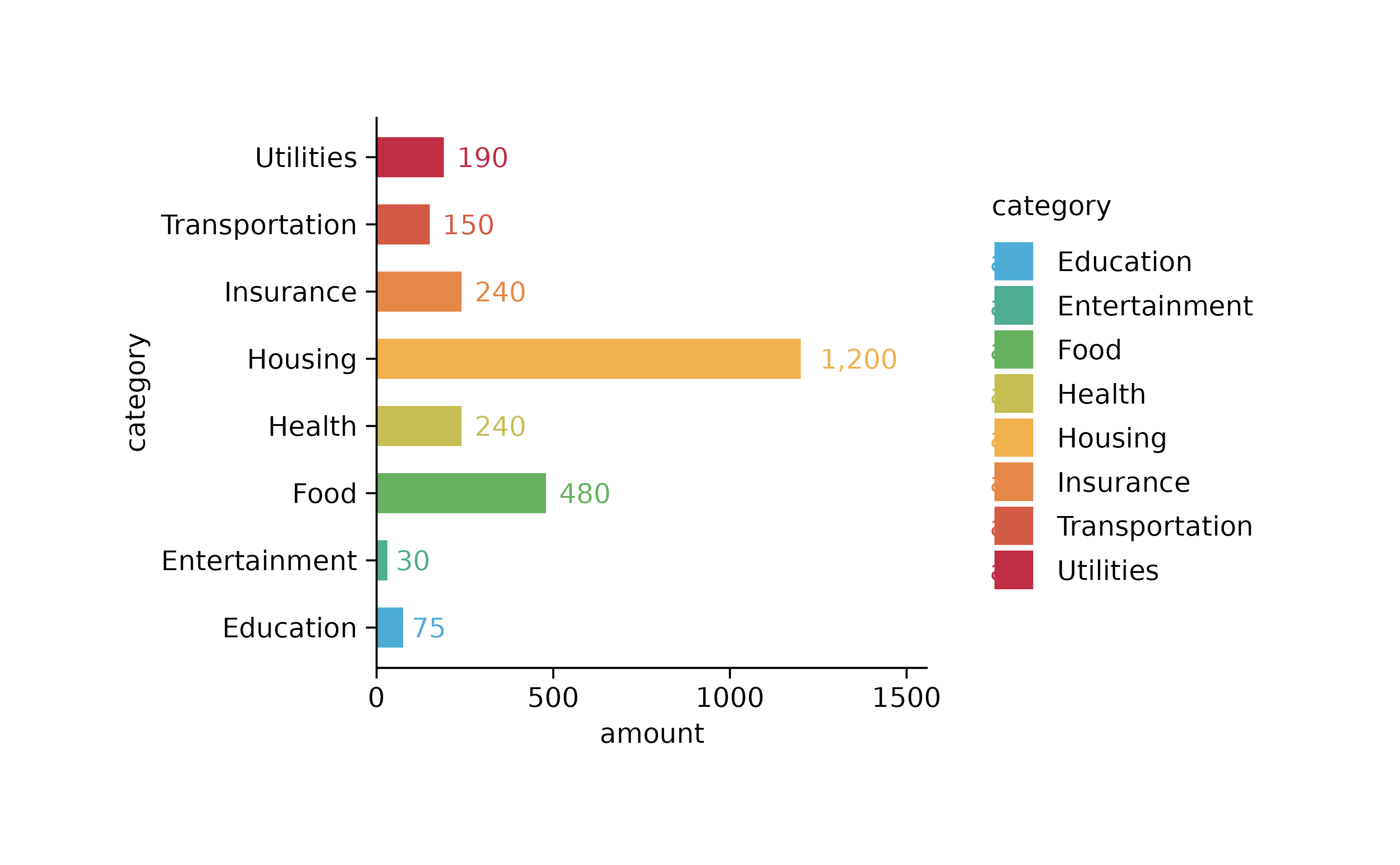
spendings %>%
  tidyplot(x = amount, y = category, color = category) %>%
  add_sum_bar(alpha = 0.3) %>%
  add_sum_dash() %>%
  add_sum_value(accuracy = 1, extra_padding = 0.3) %>%
  adjust_x_axis()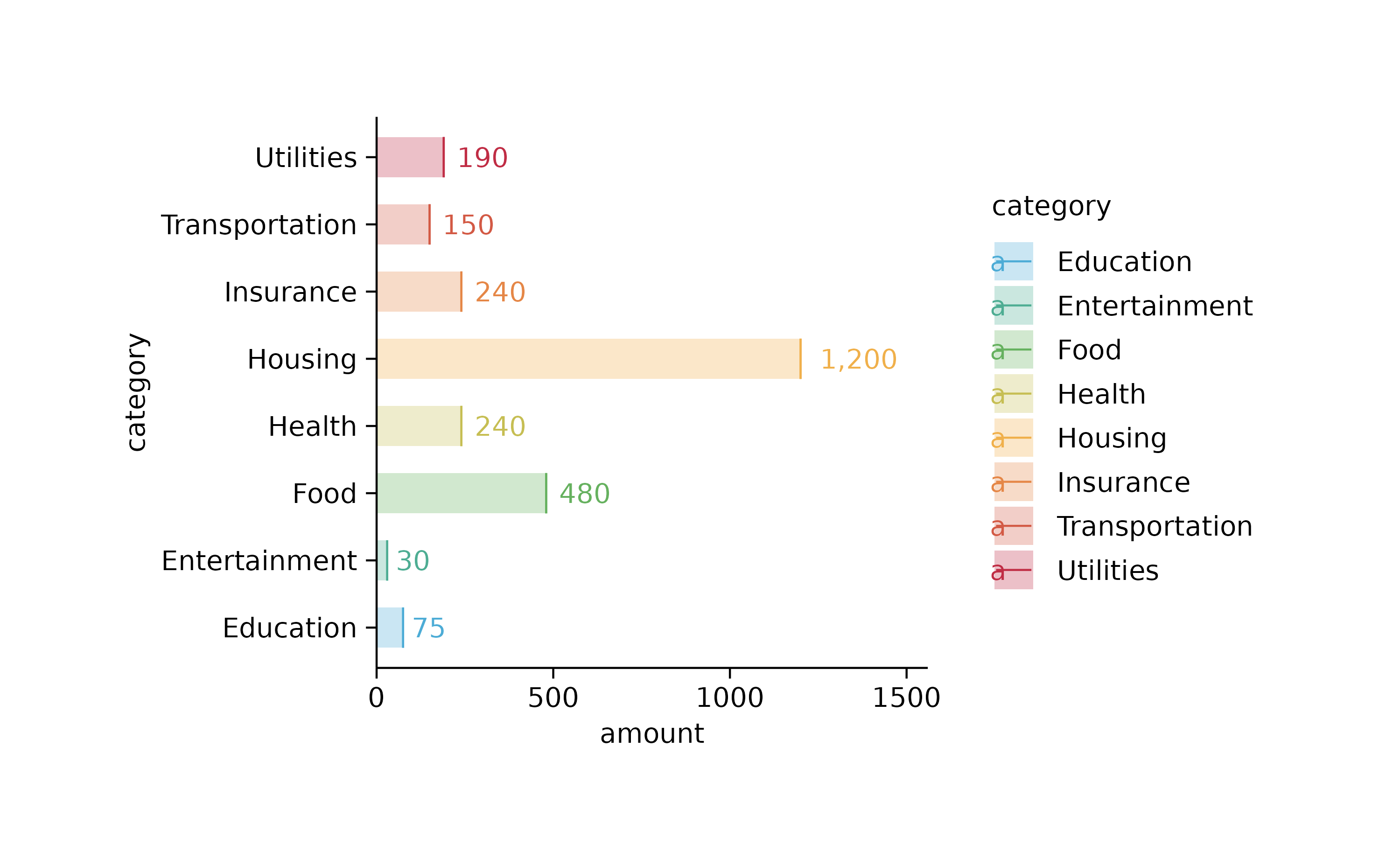
spendings %>%
  tidyplot(x = date, y = amount, color = category) %>%
  add_sum_dot() %>%
  add_sum_value(accuracy = 1)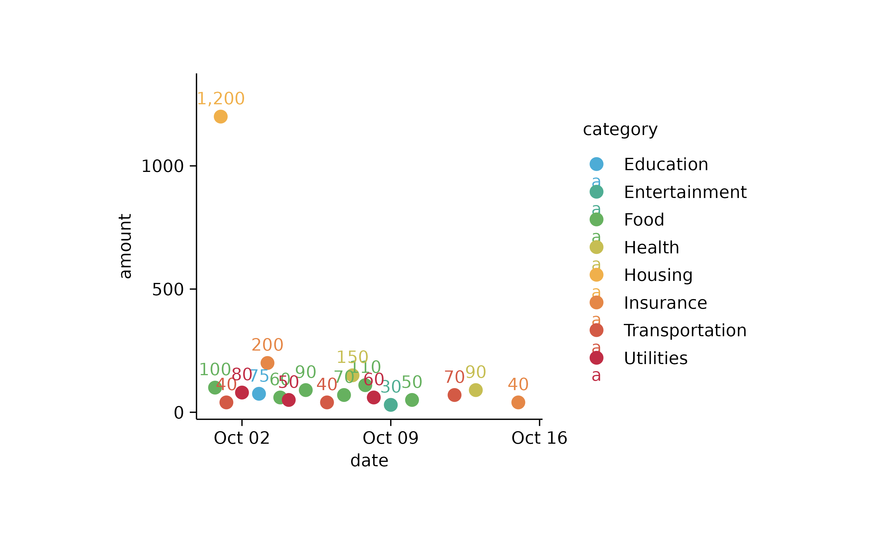
spendings %>%
  dplyr::mutate(cum_amount = cumsum(amount)) %>%
  tidyplot(x = date, y = cum_amount) %>%
  add_line() %>%
  add_data_points()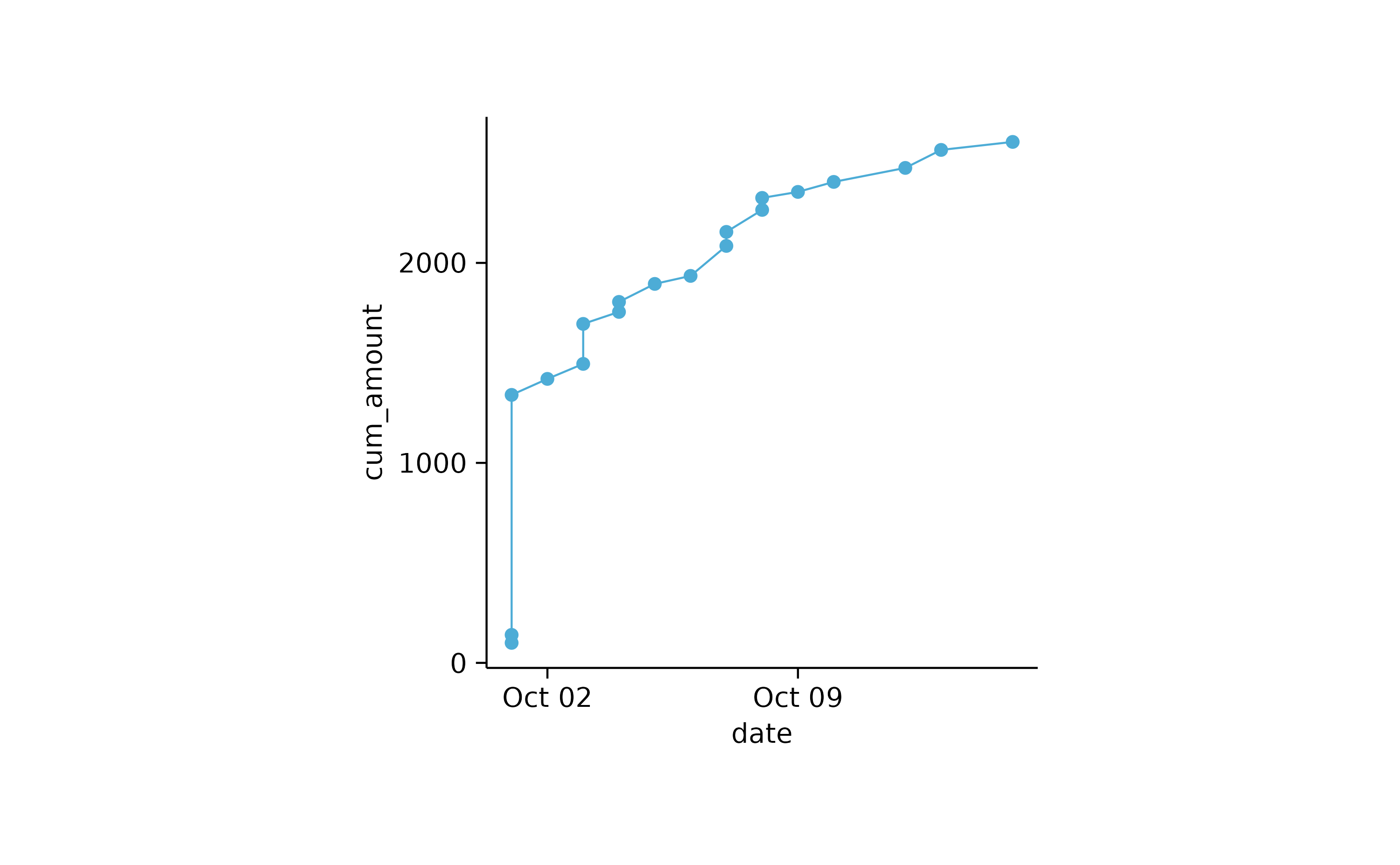
spendings %>%
  dplyr::mutate(cum_amount = cumsum(amount)) %>%
  tidyplot(x = date, y = cum_amount) %>%
  add_area() %>%
  add_data_points()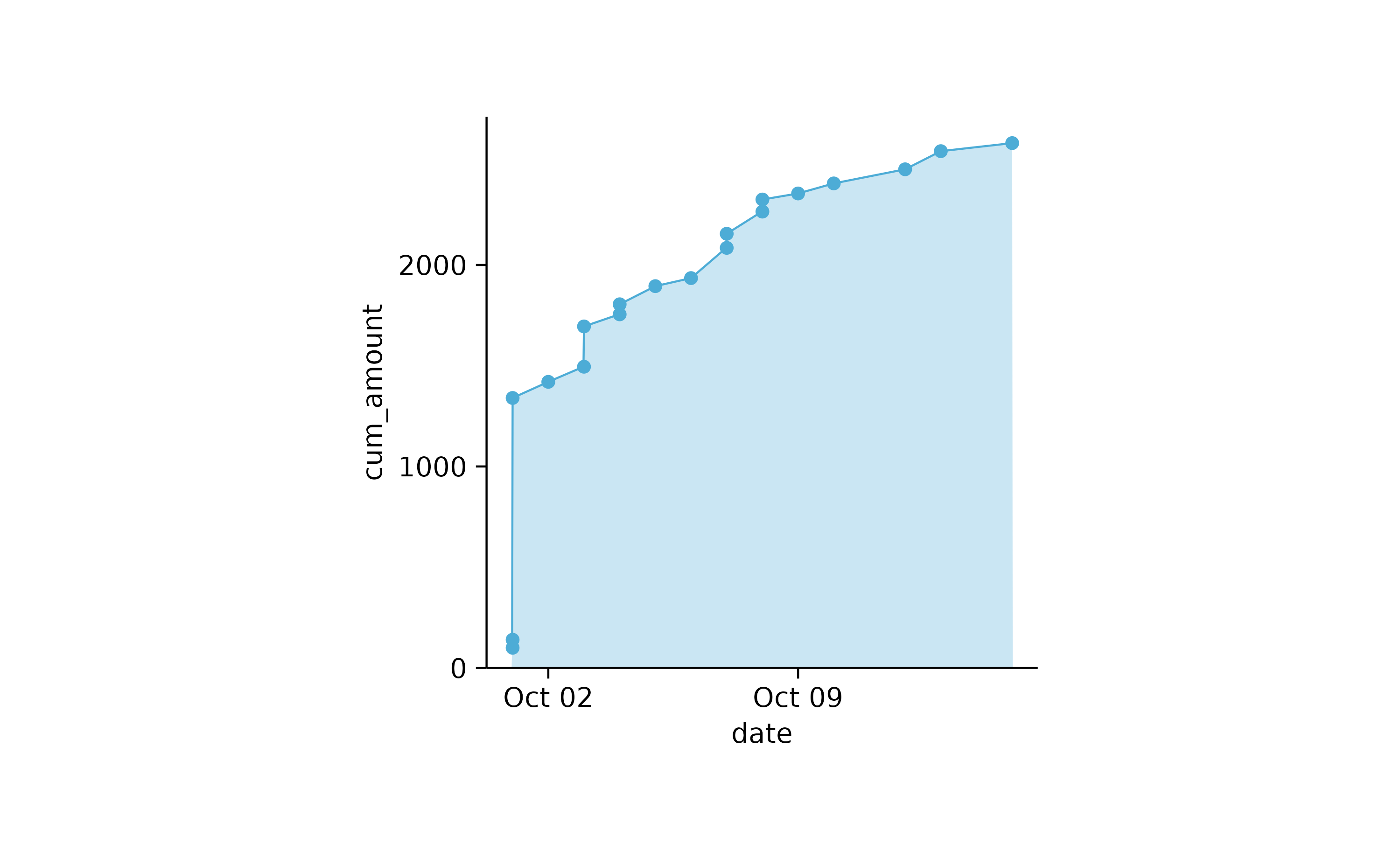
spendings %>%
  dplyr::mutate(cum_amount = cumsum(amount), .by = category) %>%
  tidyplot(x = date, y = cum_amount, color = category) %>%
  add_area()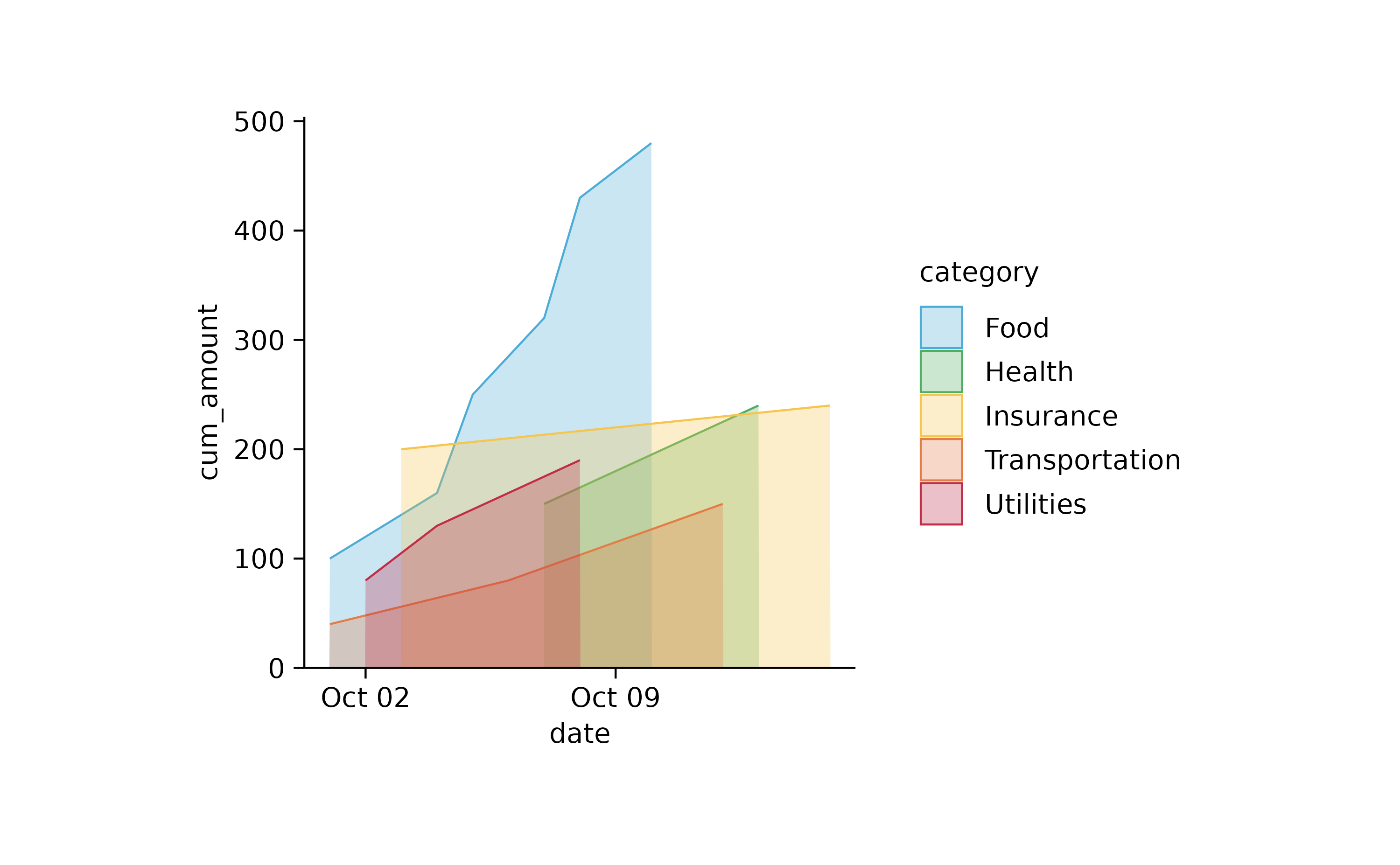
spendings %>%
  tidyr::complete(date, category, fill = list(title = NA, amount = 0)) %>%
  dplyr::mutate(cum_amount = cumsum(amount), .by = category) %>%
  tidyplot(x = date, y = cum_amount, color = category) %>%
  add_area()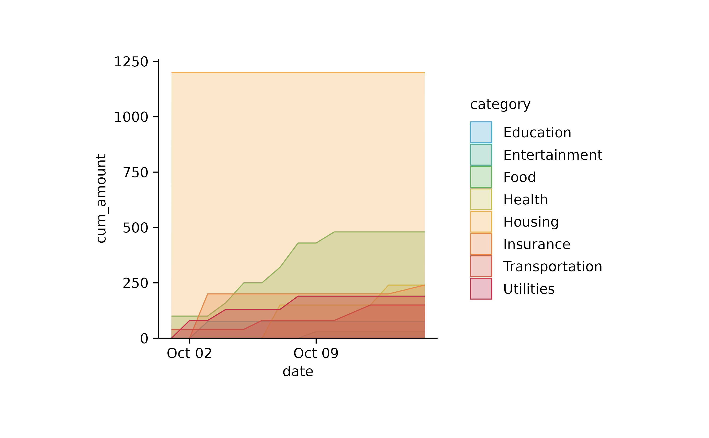
spendings %>%
  tidyr::complete(date, category, fill = list(title = NA, amount = 0)) %>%
  dplyr::mutate(cum_amount = cumsum(amount), .by = category) %>%
  tidyplot(x = date, y = cum_amount, color = category) %>%
  add_areastack_absolute(alpha = 0.3)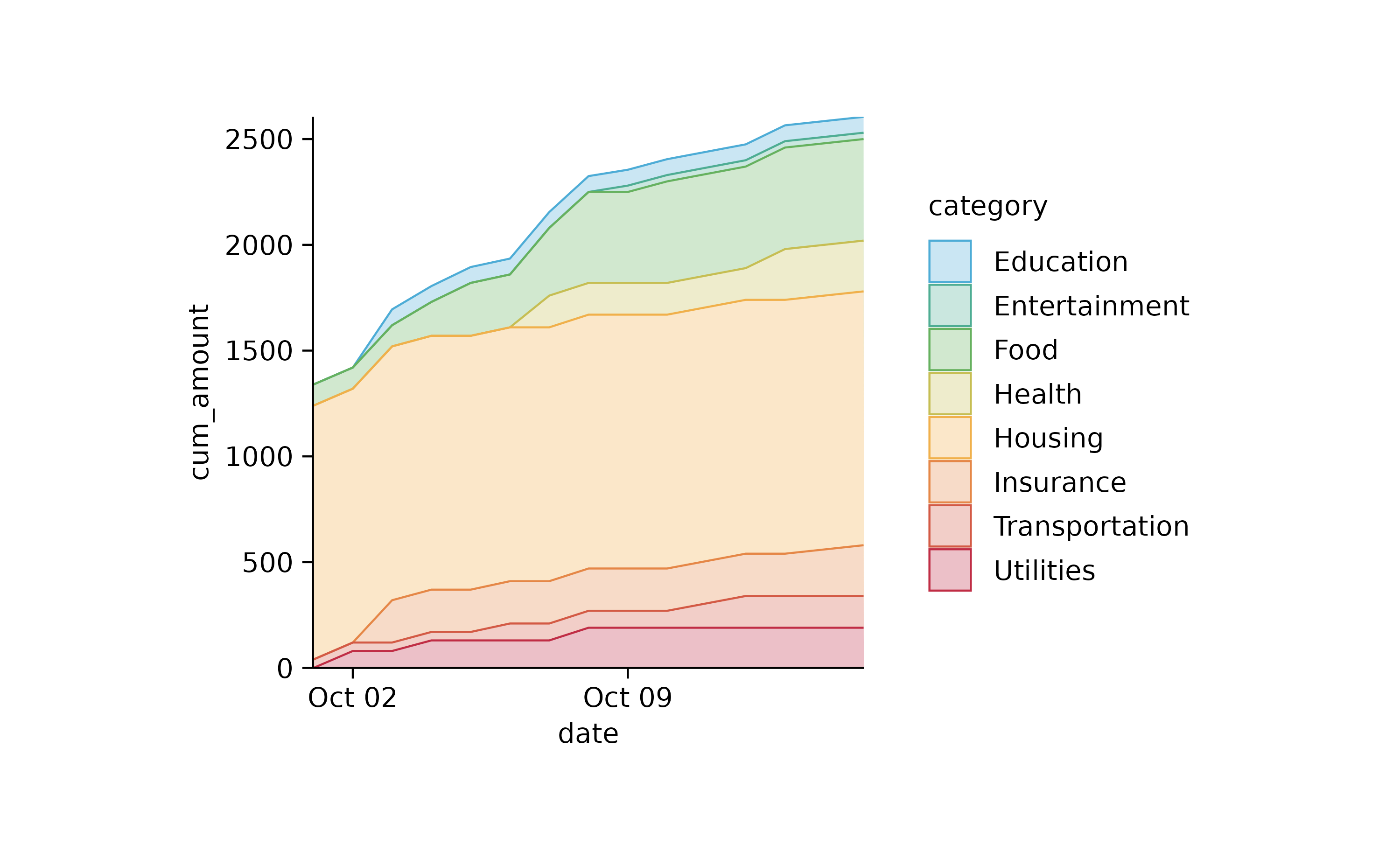
# subset data

study %>%
  tidyplot(x = treatment, y = score, color = treatment) %>%
  add_mean_dash() %>%
  add_error_bar() %>%
  add_data_points()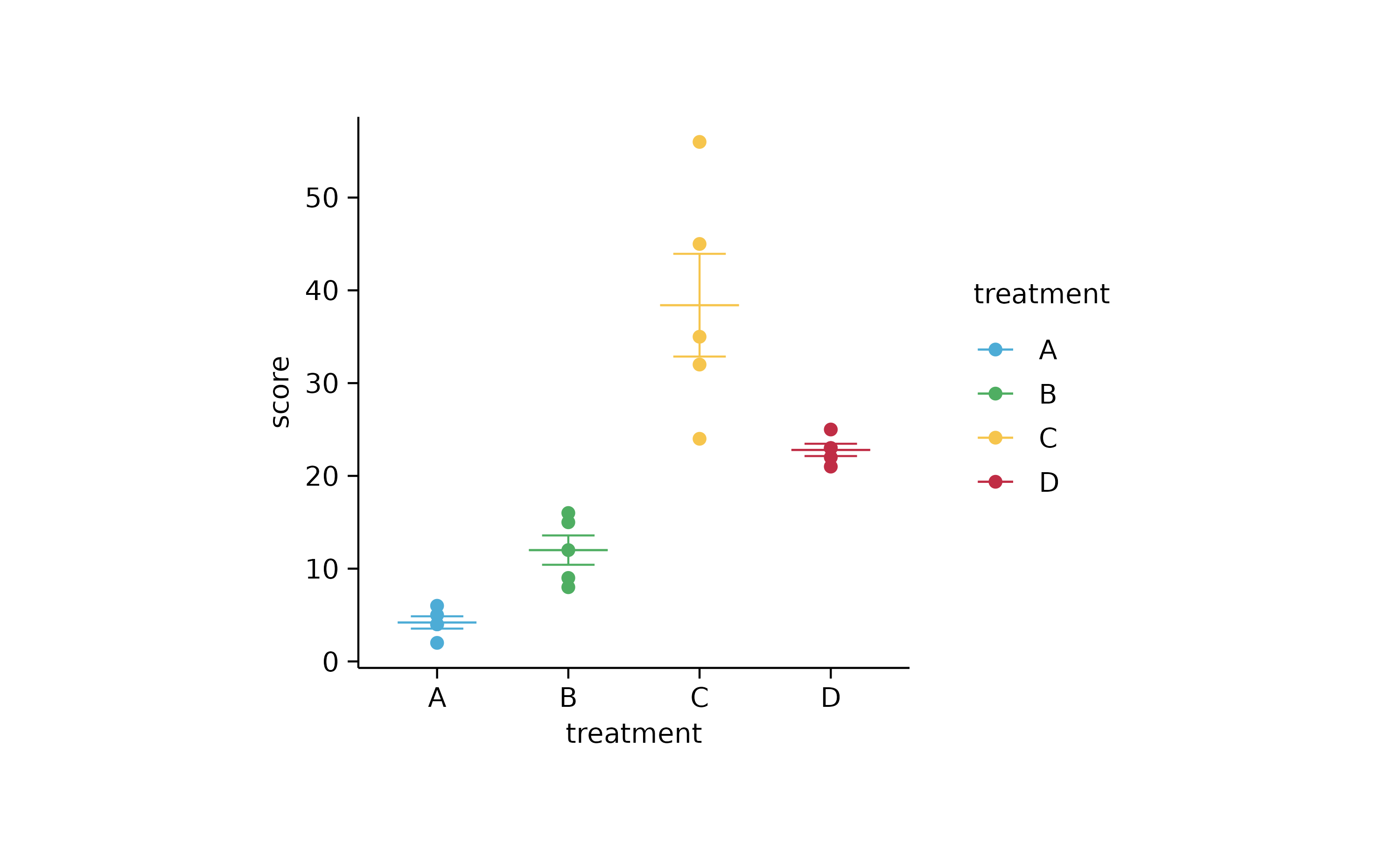
study %>%
  tidyplot(x = treatment, y = score, color = treatment) %>%
  add_mean_dash() %>%
  add_error_bar() %>%
  add_data_points(data = filter_rows(treatment == "C"))
study %>%
  tidyplot(x = treatment, y = score, color = treatment) %>%
  add_mean_dash() %>%
  add_error_bar() %>%
  add_data_points(data = max_rows(score, n = 1, by = treatment))
# add stats

p2
p2 %>% add_stats_pvalue(ref.group = 1)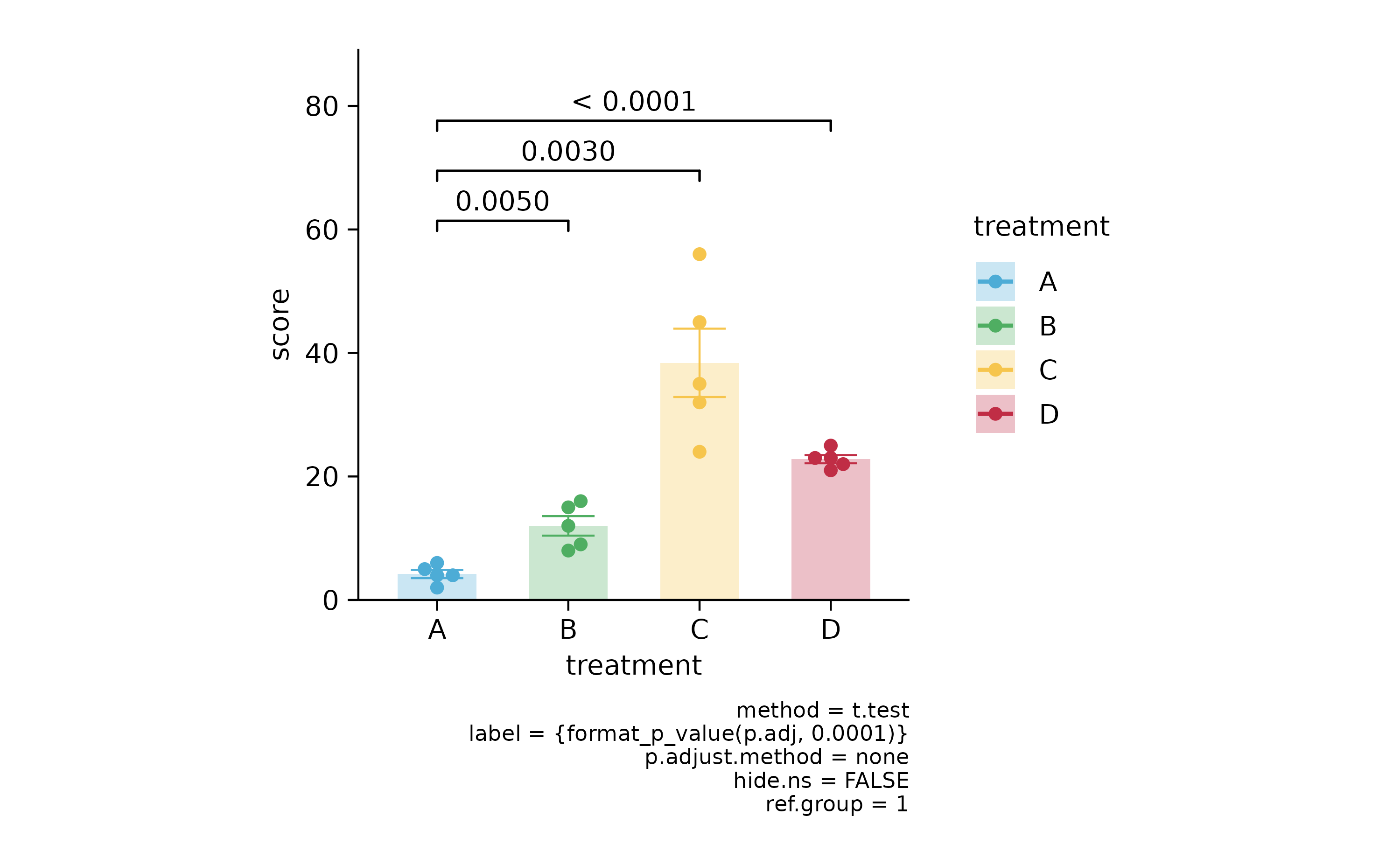
p2 %>% add_stats_pvalue(ref.group = 1, p.adjust.method = "bonferroni")
p2 %>% add_stats_asterisks(ref.group = 1, p.adjust.method = "bonferroni")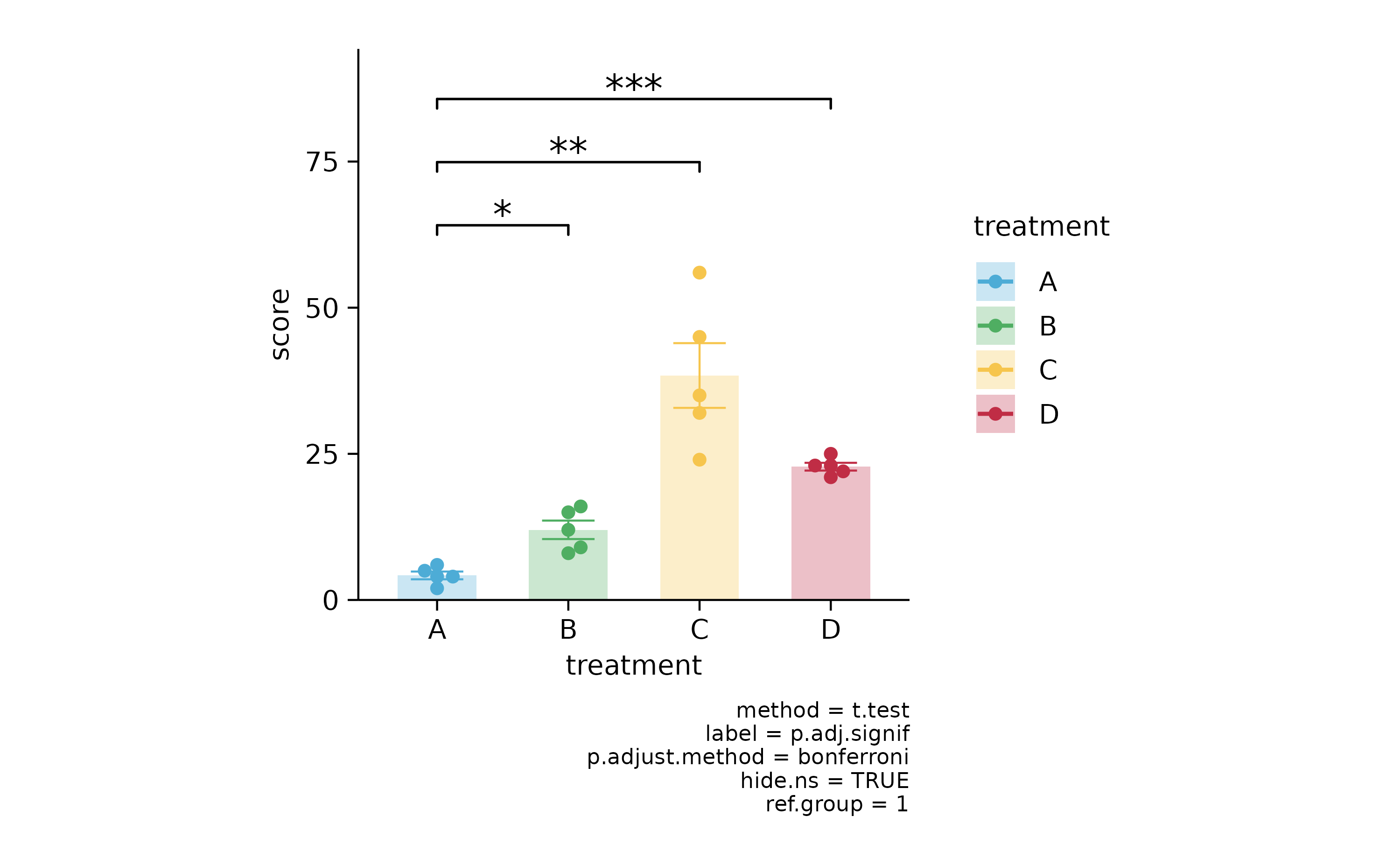
# grouped

p3 <-
  study %>%
  tidyplot(x = dose, y = score, color = group) %>%
  add_mean_bar(alpha = 0.3) %>%
  add_error_bar() %>%
  add_data_points_beeswarm()

p3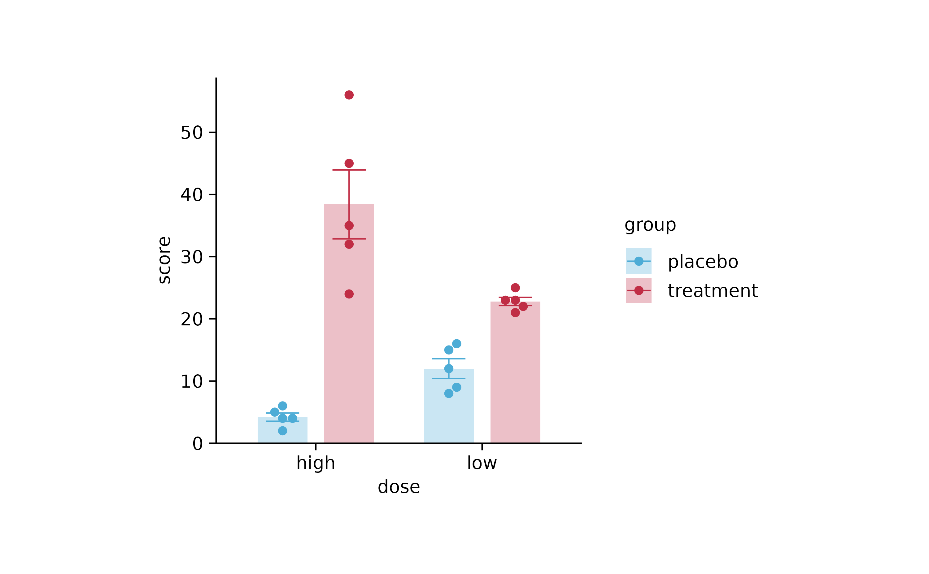
p3 %>% add_stats_pvalue()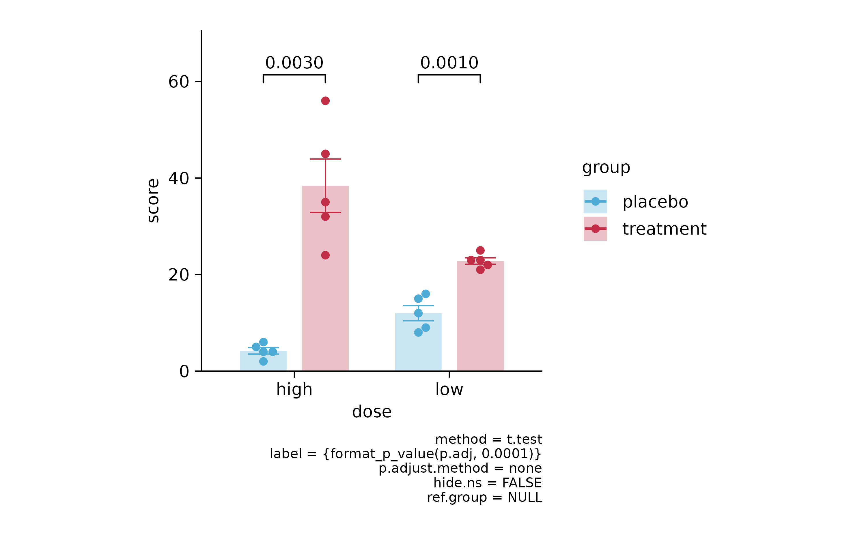
p3 %>% add_stats_pvalue(p.adjust.method = "bonferroni")
p3 %>% add_stats_asterisks(p.adjust.method = "bonferroni")
# animals

animals %>%
  tidyplot(x = family) %>%
  add_count_bar(alpha = 0.3) %>%
  add_count_value(accuracy = 1) %>%
  add_count_dash()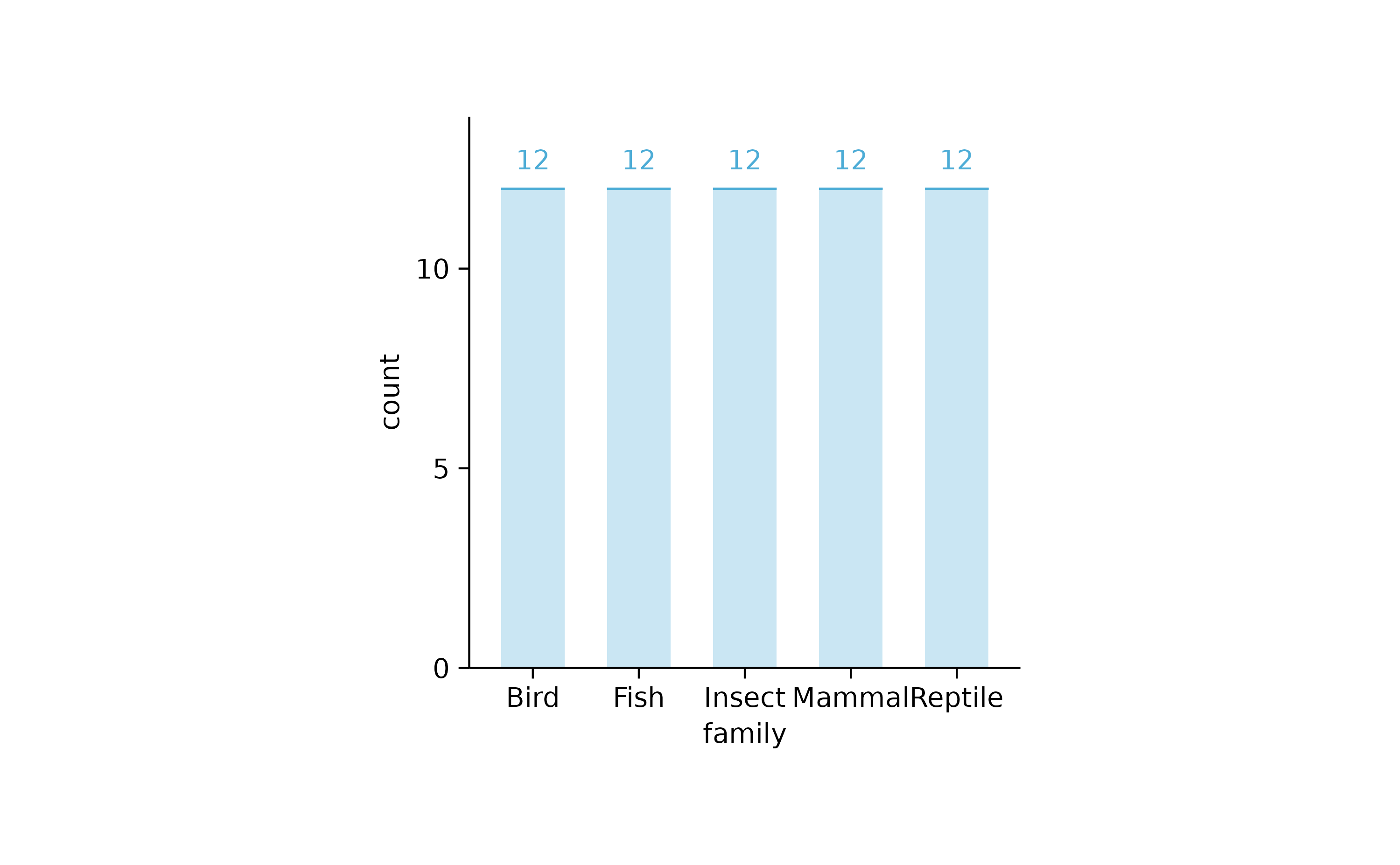
animals %>%
  tidyplot(x = family, y = weight) %>%
  add_sum_bar(alpha = 0.3) %>%
  add_sum_value() %>%
  add_sum_dash()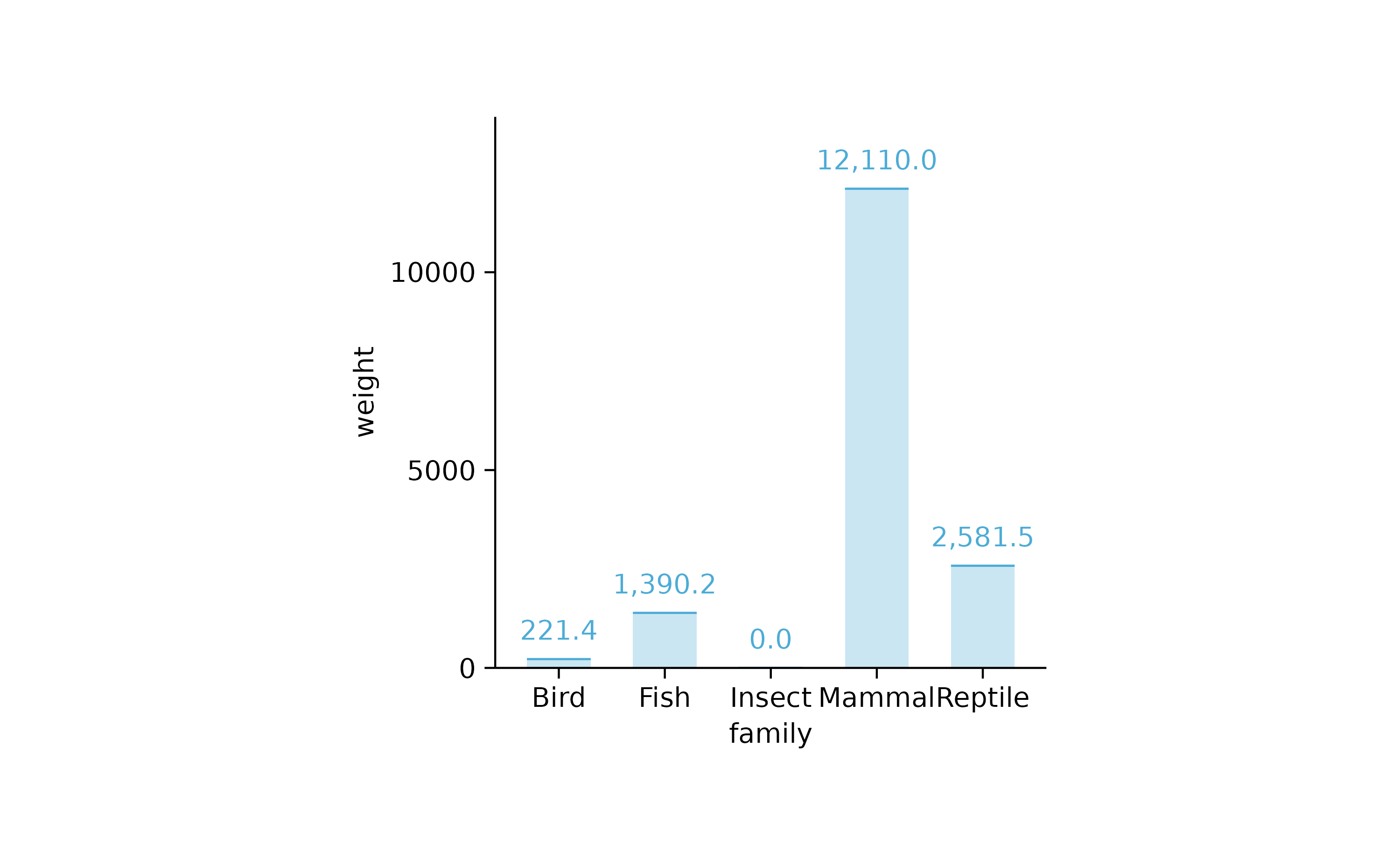
animals %>%
  tidyplot(x = family, y = weight) %>%
  add_mean_bar(alpha = 0.3) %>%
  add_mean_value()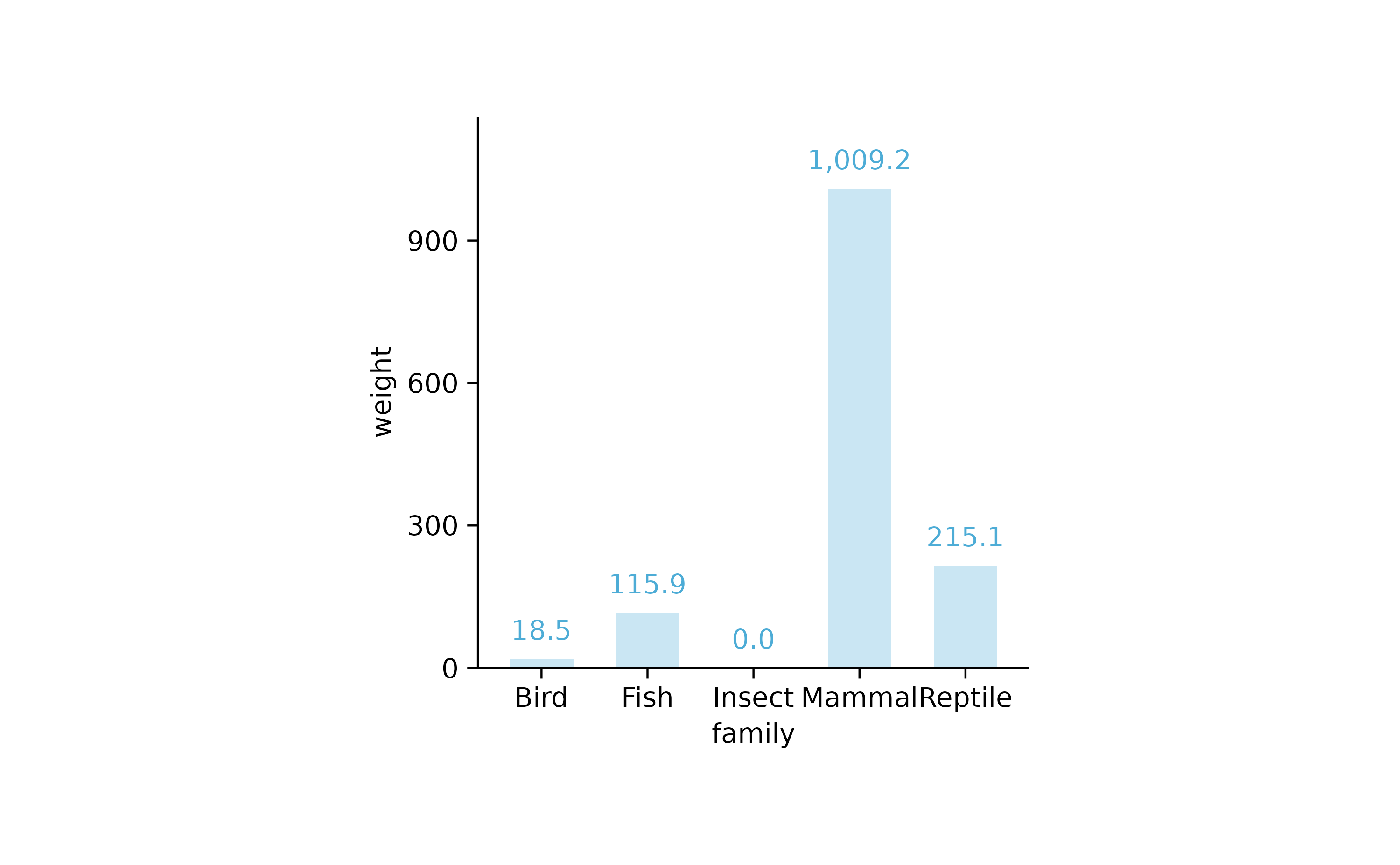
animals %>%
  tidyplot(x = weight, y = family) %>%
  add_mean_bar(alpha = 0.3) %>%
  add_mean_value(extra_padding = 0.3)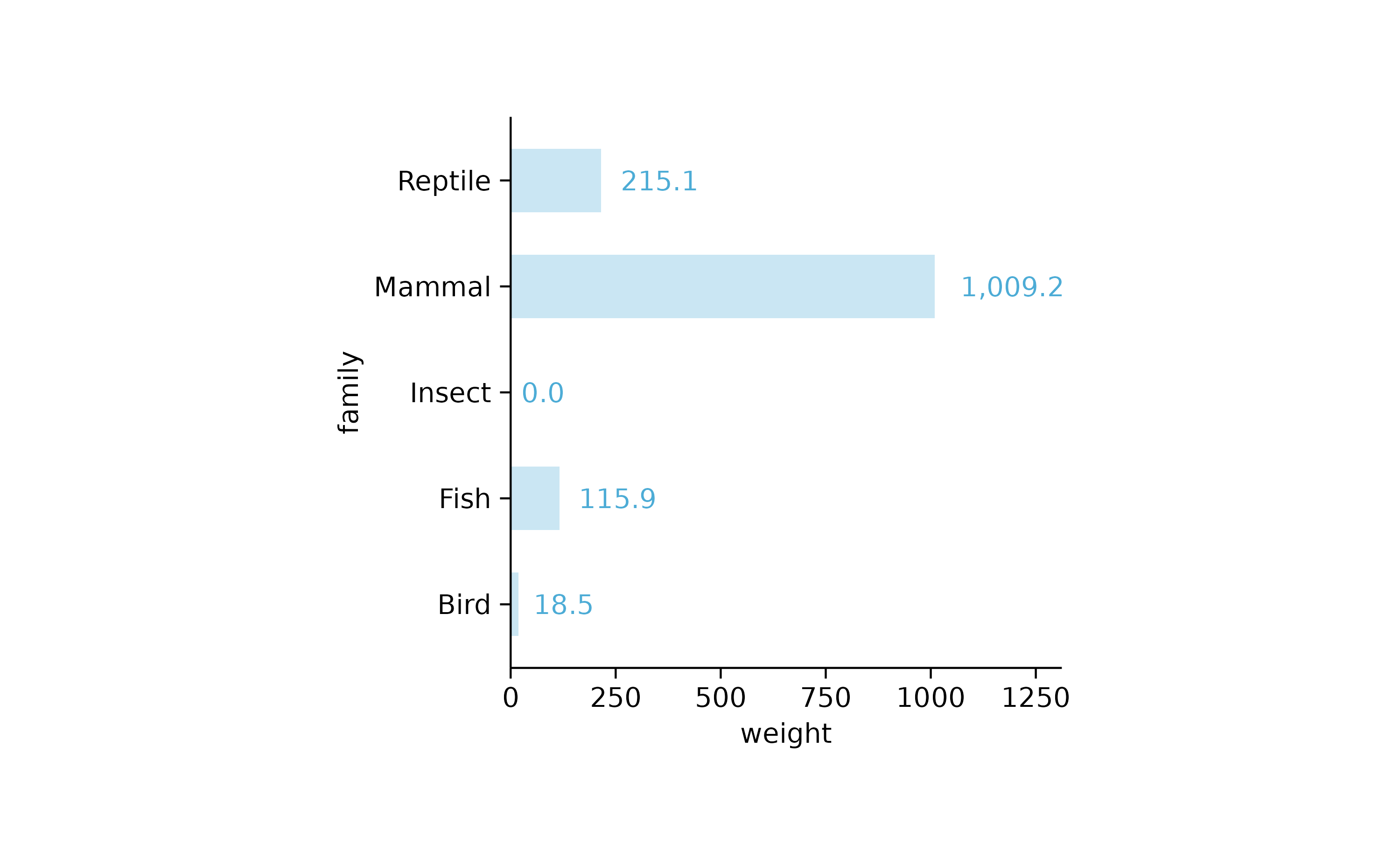
animals %>%
  tidyplot(x = family, y = speed) %>%
  add_mean_bar(alpha = 0.3) %>%
  add_error_bar() %>%
  add_data_points_beeswarm() %>%
  adjust_x_axis(rotate_labels = TRUE)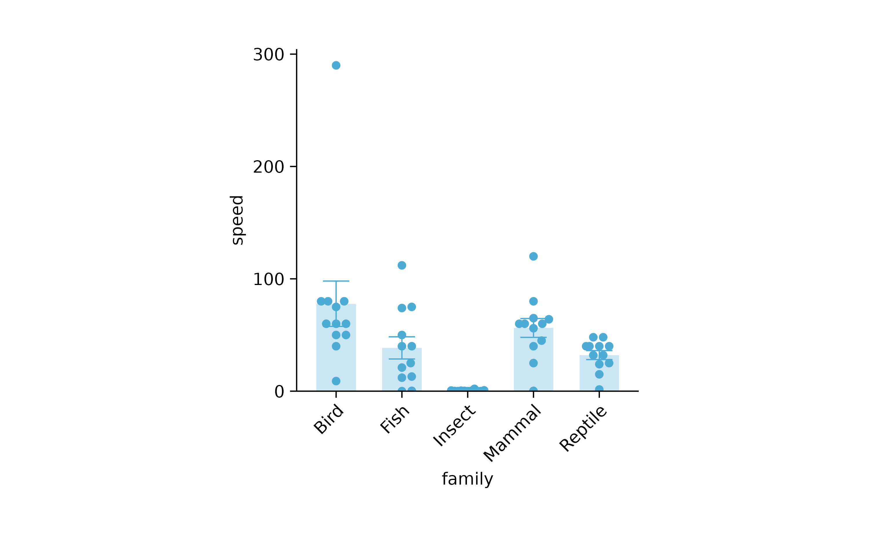
# split_plot
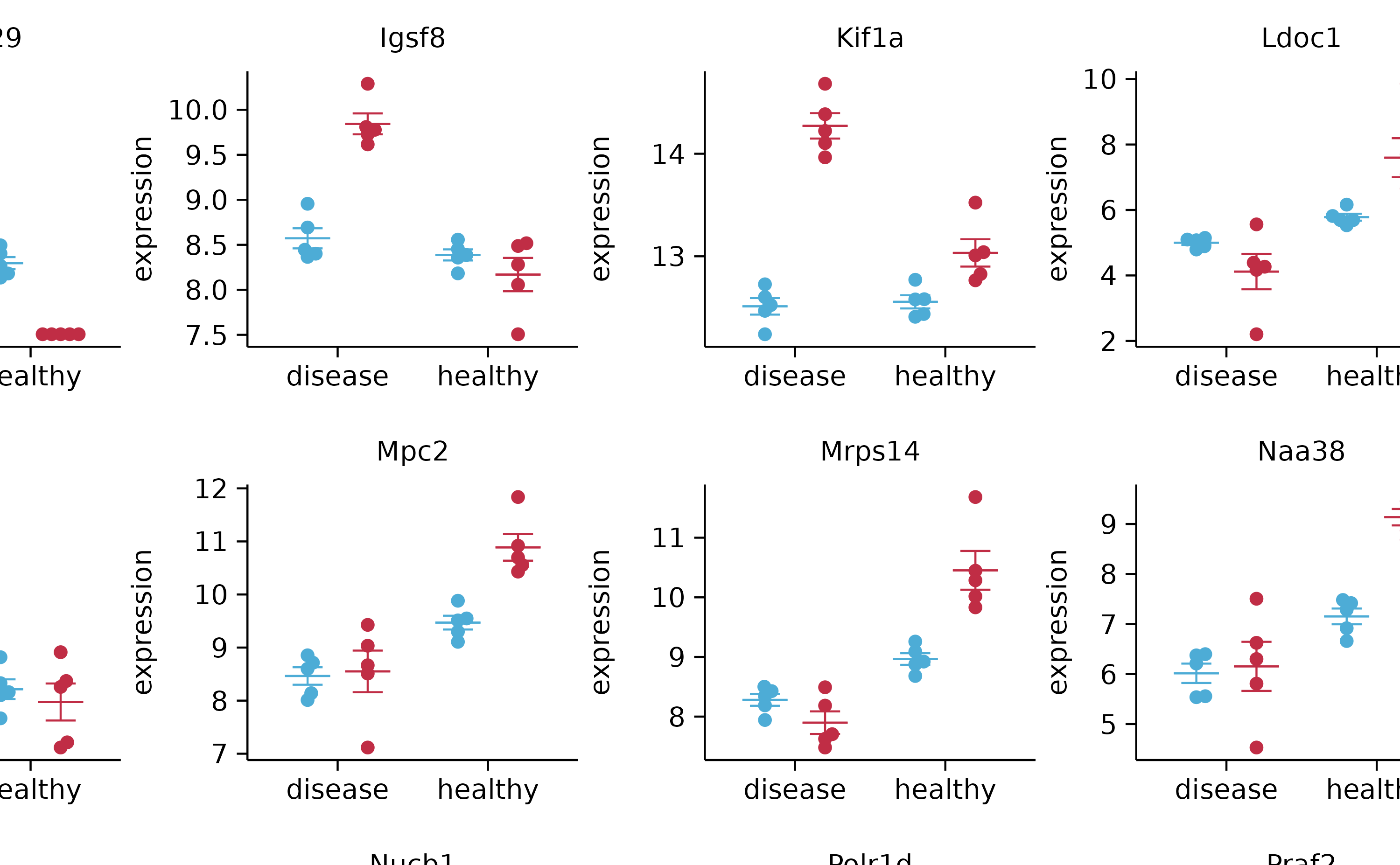
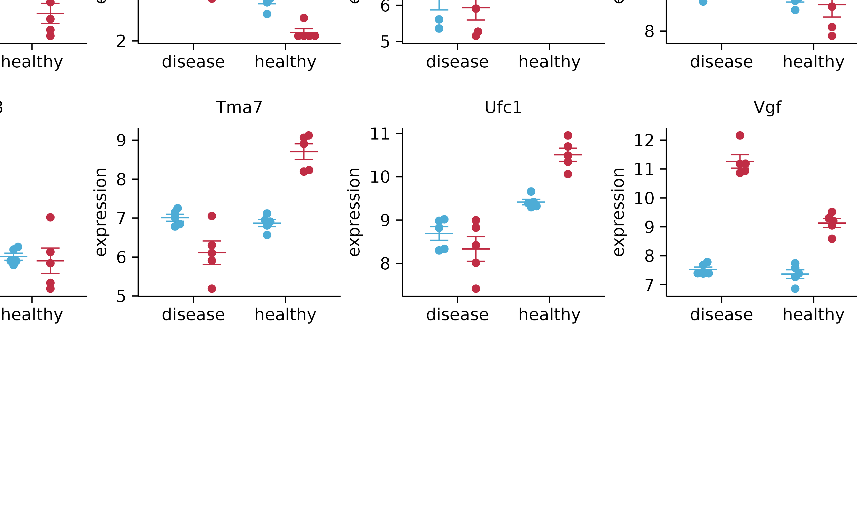
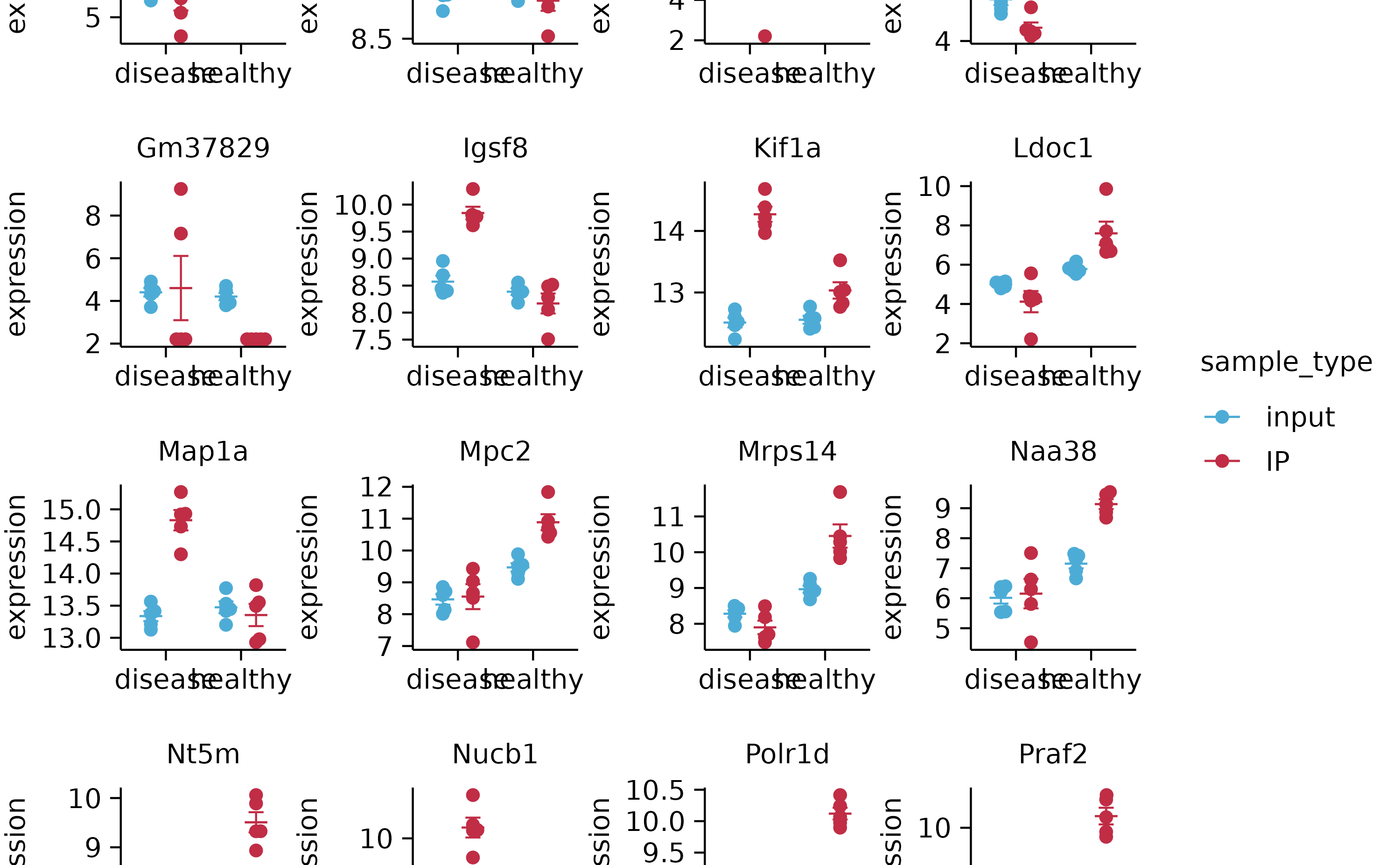
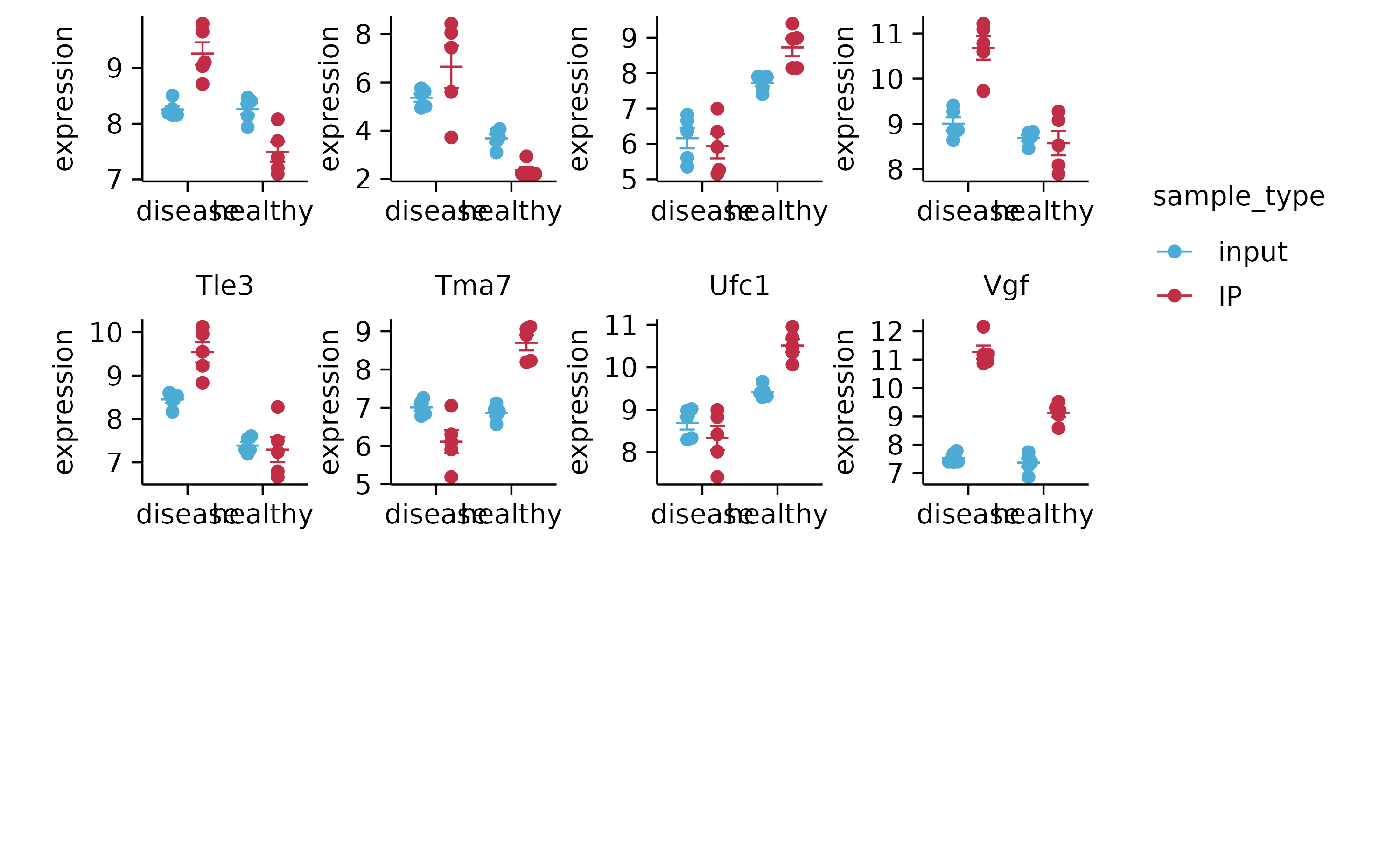
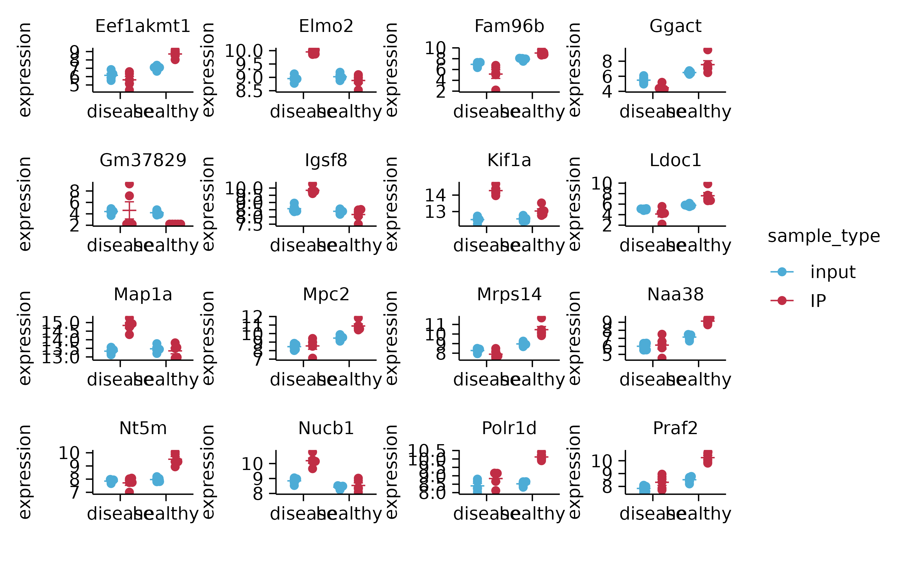
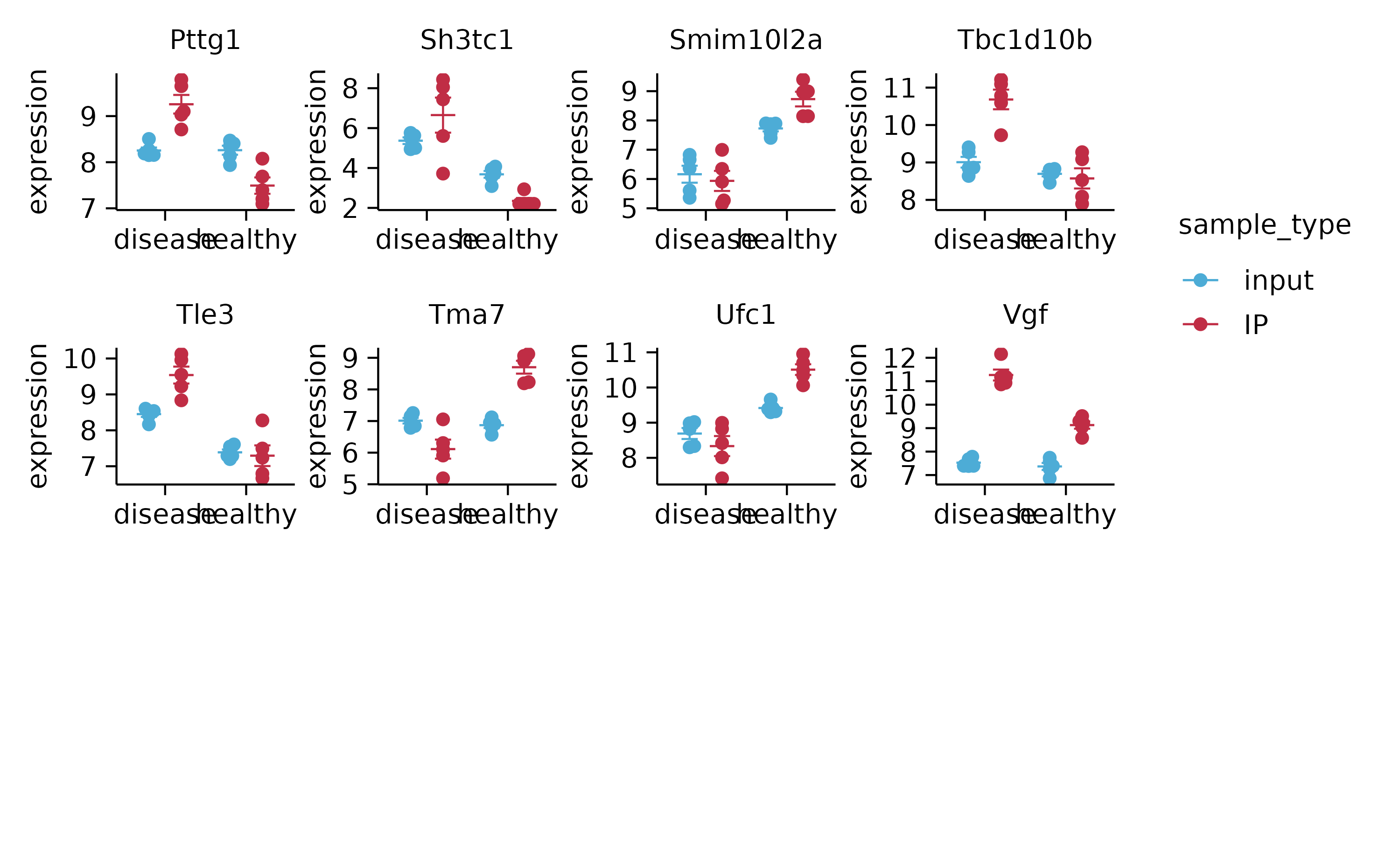
gene_expression %>%
tidyplot(x = condition, y = expression, color = sample_type) %>%
add_mean_dash() %>%
add_error_bar() %>%
add_data_points_beeswarm() %>%
adjust_x_axis(title = "") %>%
split_plot(by = external_gene_name, ncol = 4, nrow = 4)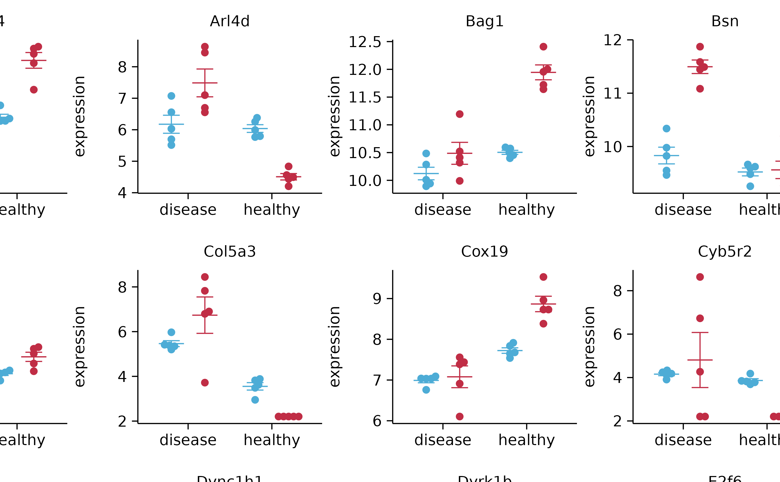
gene_expression %>%
  tidyplot(x = condition, y = expression, color = sample_type) %>%
  add_mean_dash() %>%
  add_error_bar() %>%
  add_data_points_beeswarm() %>%
  adjust_x_axis(title = "") %>%
  split_plot(by = external_gene_name, ncol = 4, nrow = 4, widths = 15, heights = 15)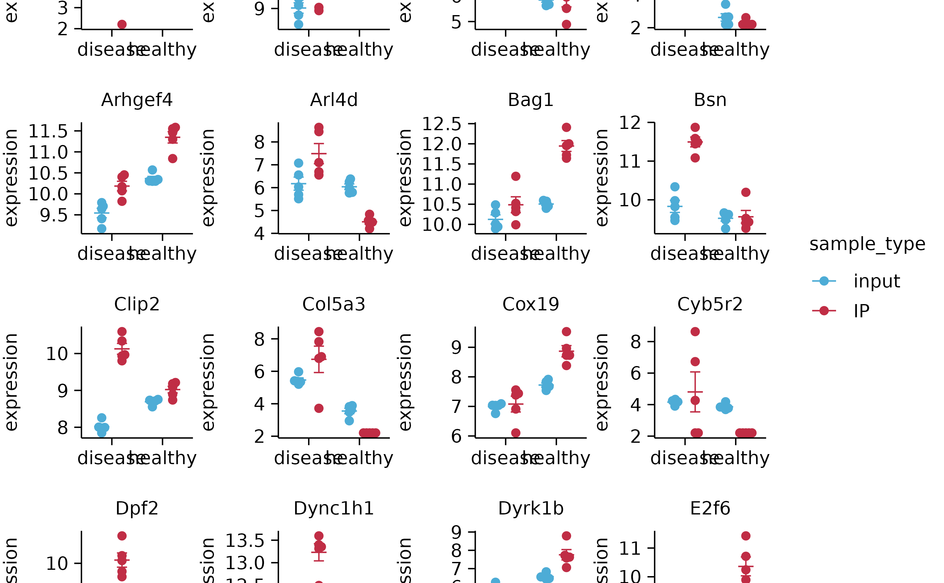
gene_expression %>%
  tidyplot(x = condition, y = expression, color = sample_type) %>%
  add_mean_dash() %>%
  add_error_bar() %>%
  add_data_points_beeswarm() %>%
  adjust_x_axis(title = "") %>%
  split_plot(by = external_gene_name, ncol = 4, nrow = 4, widths = NA, heights = NA)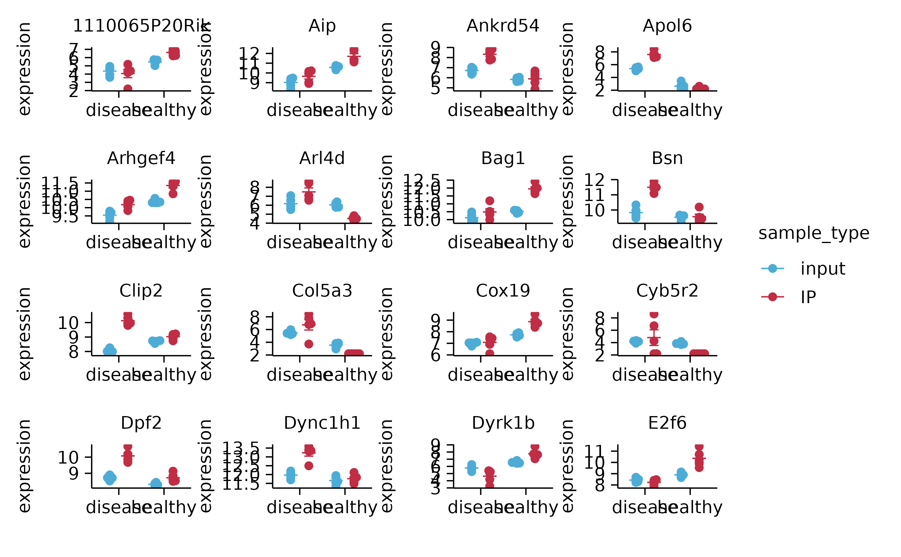
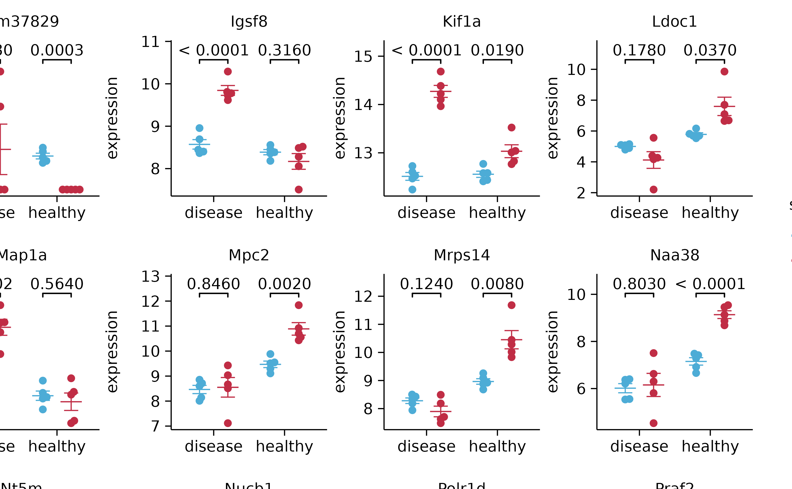
# stats with split_plot
gene_expression %>%
tidyplot(x = condition, y = expression, color = sample_type) %>%
add_mean_dash() %>%
add_error_bar() %>%
add_data_points_beeswarm() %>%
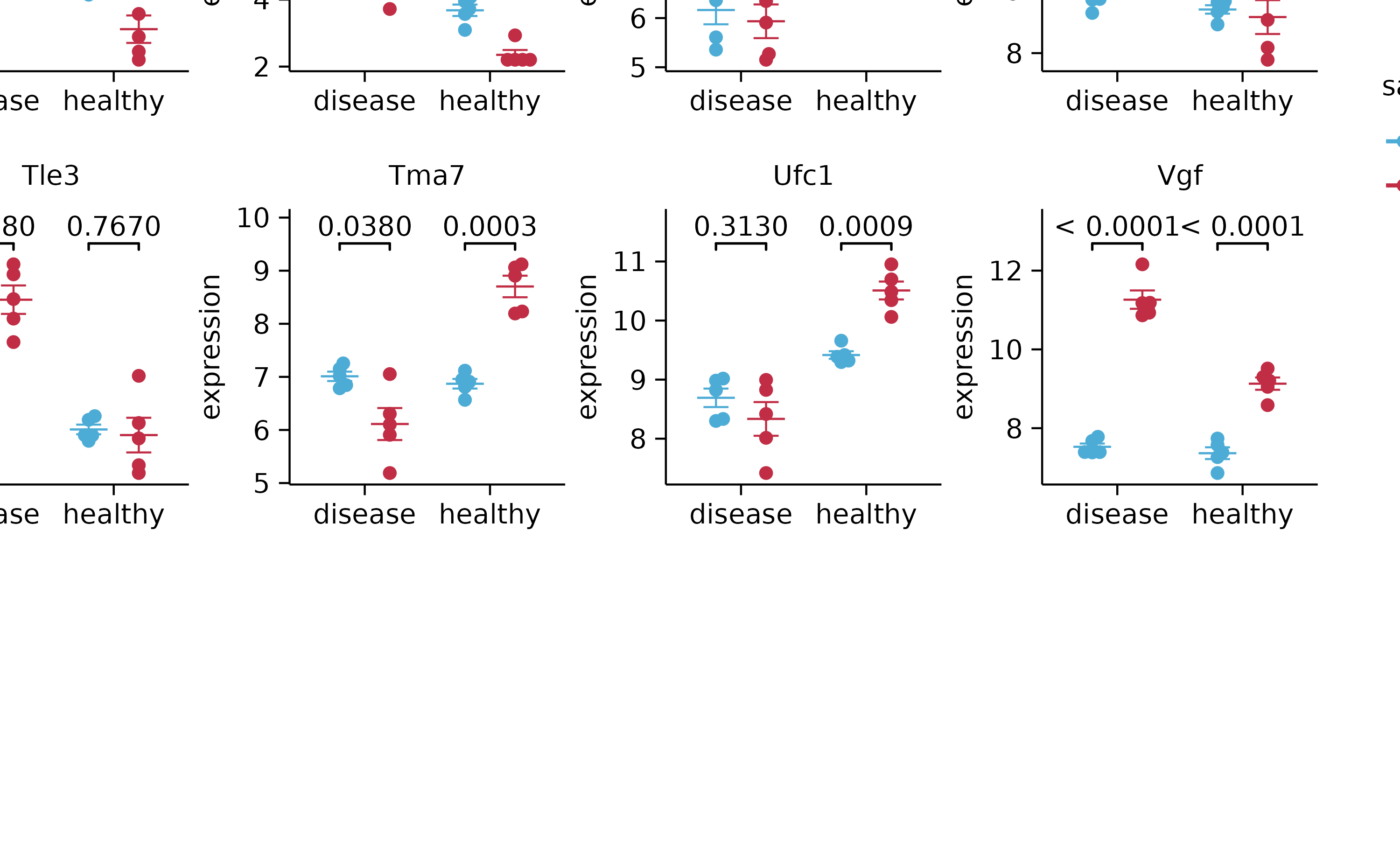
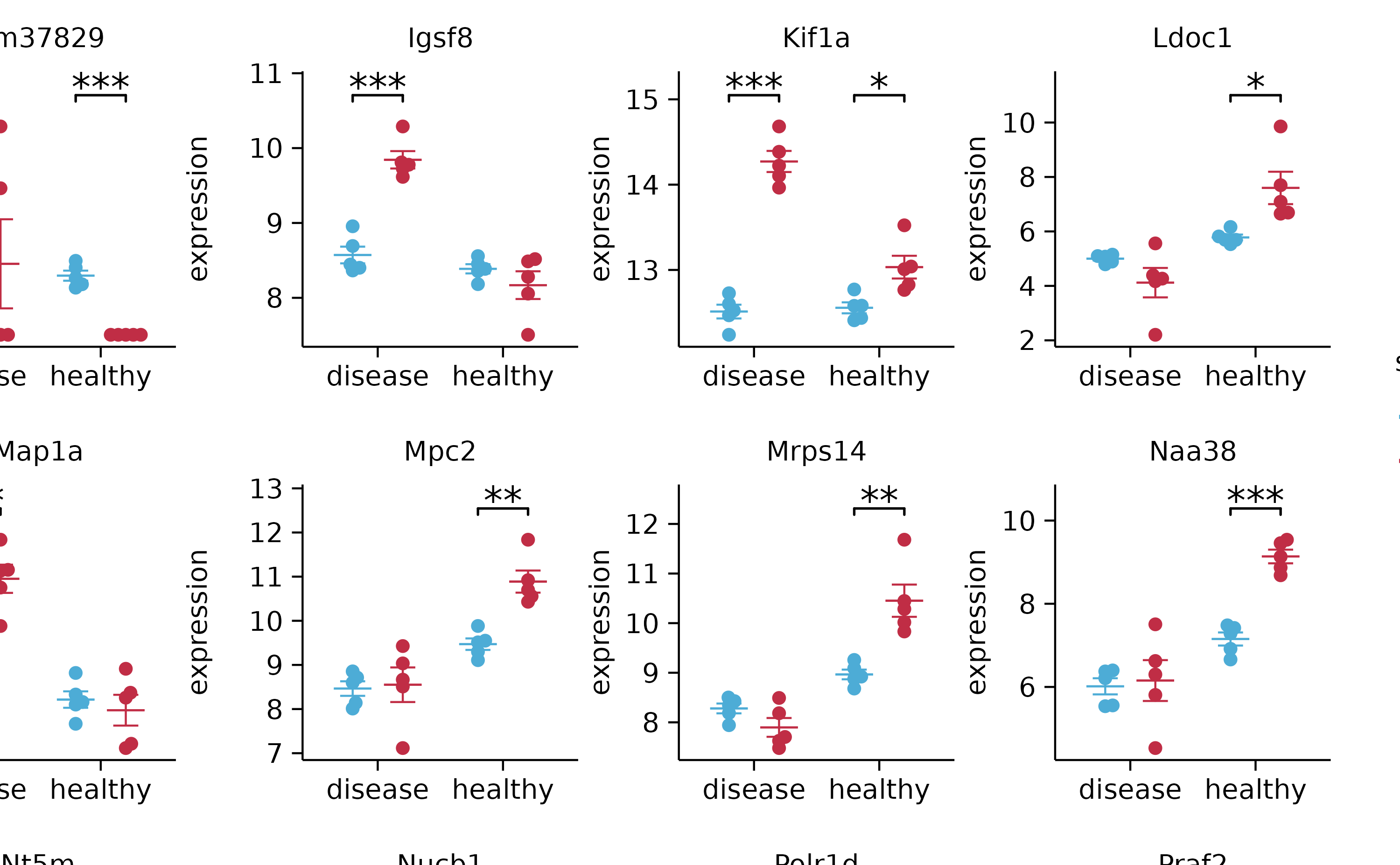
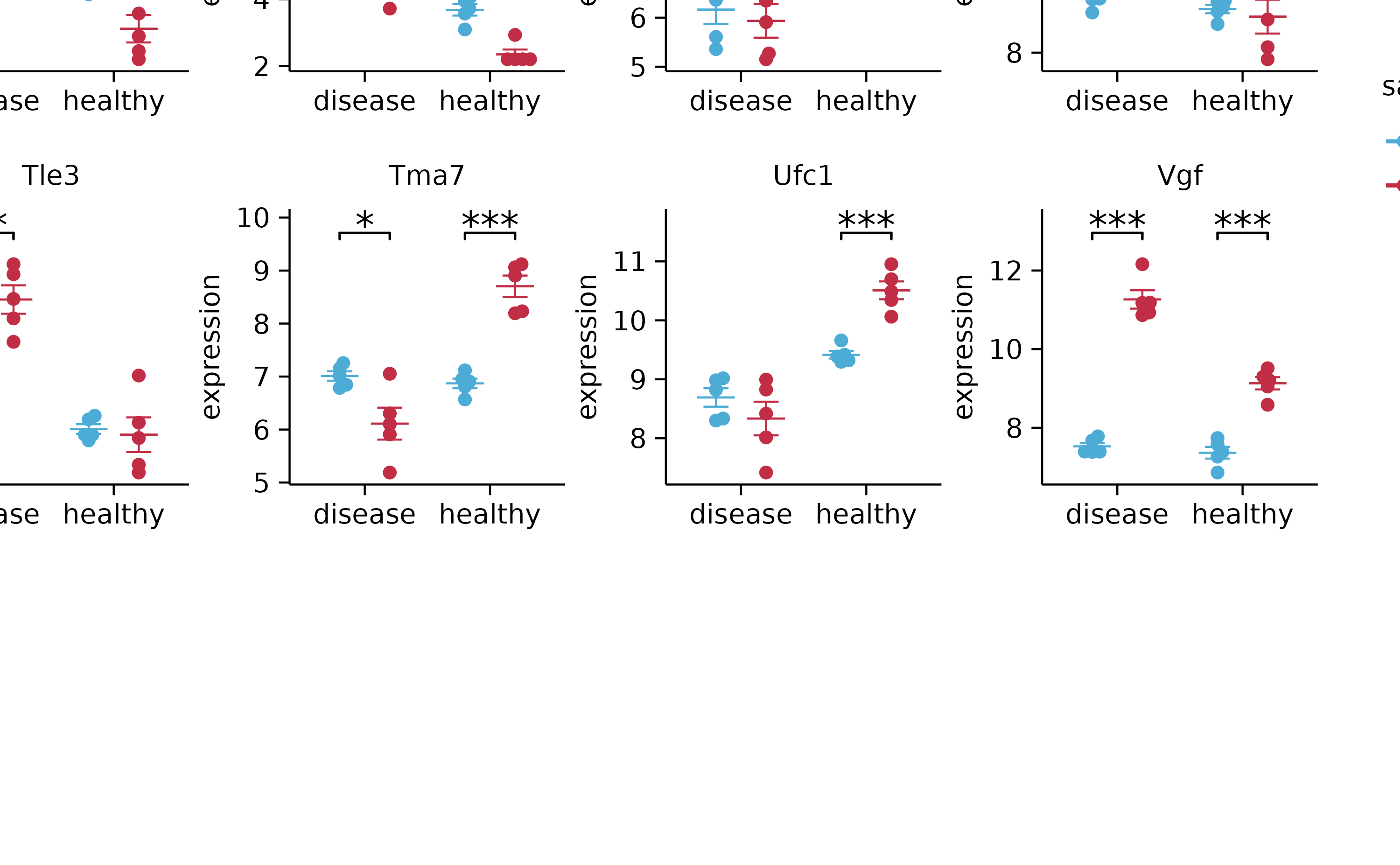
add_stats_pvalue(include_info = FALSE) %>%
adjust_x_axis(title = "") %>%
split_plot(by = external_gene_name, ncol = 4, nrow = 4, widths = 25, heights = 25)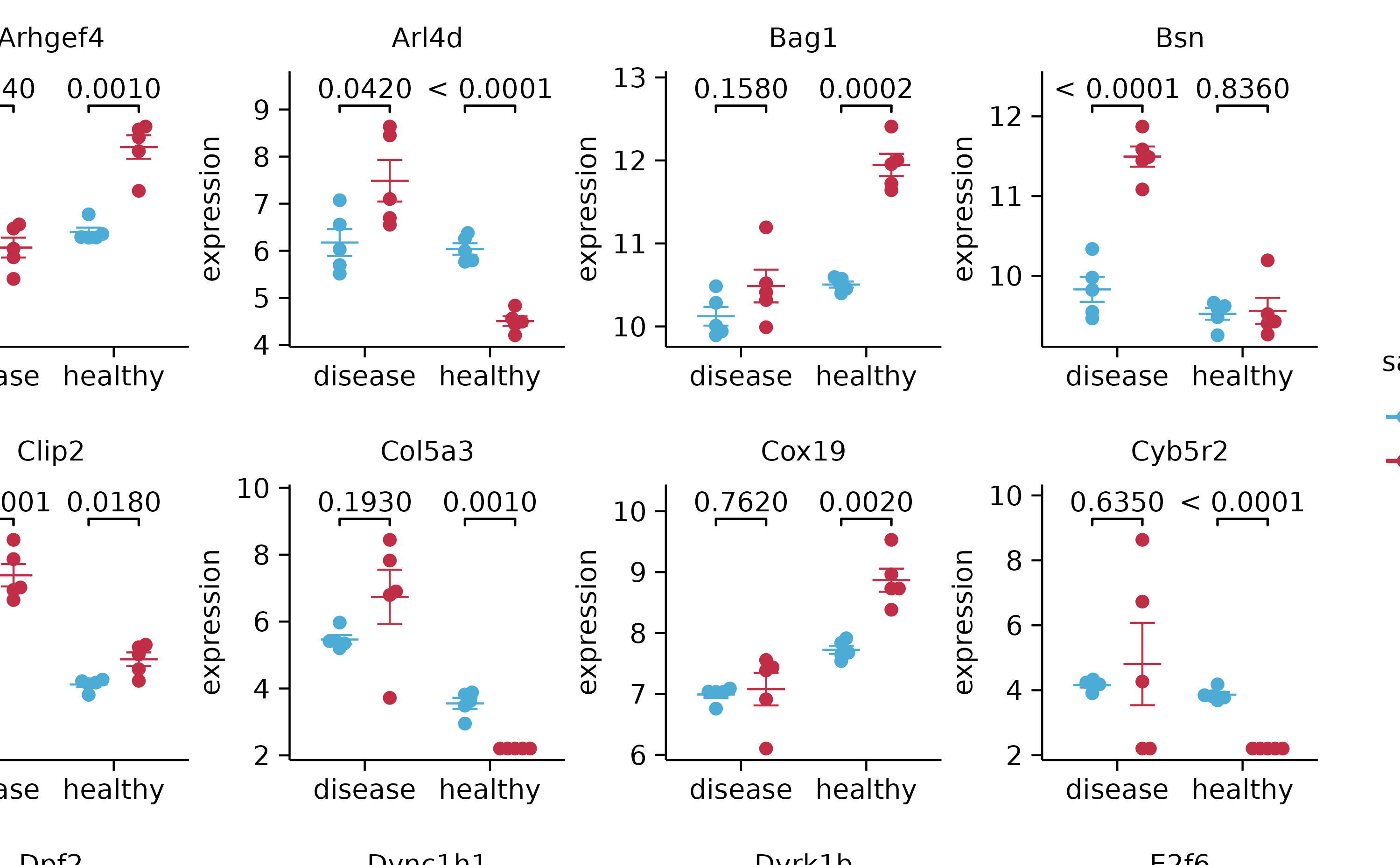
gene_expression %>%
  tidyplot(x = condition, y = expression, color = sample_type) %>%
  add_mean_dash() %>%
  add_error_bar() %>%
  add_data_points_beeswarm() %>%
  add_stats_asterisks(include_info = FALSE) %>%
  adjust_x_axis(title = "") %>%
  split_plot(by = external_gene_name, ncol = 4, nrow = 4, widths = 25, heights = 25)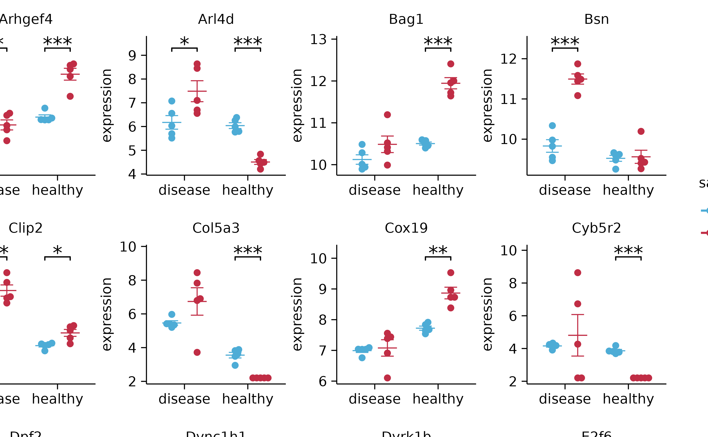
# save_plot

gene_expression %>%
  tidyplot(x = condition, y = expression, color = sample_type) %>%
  add_mean_dash() %>%
  add_error_bar() %>%
  add_data_points_beeswarm() %>%
  adjust_x_axis(title = "") %>%
  split_plot(by = external_gene_name, ncol = 4, nrow = 4) %>%
  save_plot(filename = "test_multipage.pdf")

# save intermediate plots

study %>%
  tidyplot(x = treatment, y = score, color = treatment) %>%
  add_mean_dash() %>%
  save_plot(filename = "test1.pdf") %>%
  add_error_bar() %>%
  save_plot(filename = "test2.pdf") %>%
  add_data_points_beeswarm() %>%
  save_plot(filename = "test3.pdf")