Adjust colors
Usage
adjust_colors(
  plot,
  new_colors = NULL,
  saturation = NULL,
  labels = tidyplot_parse_labels(),
  downsample = c("evenly", "first", "last", "middle"),
  ...
)
Arguments
- plot
A
tidyplotgenerated with the functiontidyplot().- new_colors
A character vector of new hex colors to use. Can be a named character vector of hex colors to assign certain data labels to specific colors.
- saturation
A
numberbetween0and1for the color saturation of an object. A value of0is completely desaturated (white),1is the original color.- labels
One of the options below. Please note that when
labelsis a vector, it is highly recommended to also set thebreaksargument as a vector to protect against unintended mismatches.NULLfor no labelswaiver()for the default labels computed by the transformation objectA character vector giving labels (must be same length as
breaks)An expression vector (must be the same length as breaks). See ?plotmath for details.
A function that takes the breaks as input and returns labels as output. Also accepts rlang lambda function notation.
- downsample
If too many colors are provided, whether to downsample
evenly, or use thefirst, thelastor themiddlecolors of the color vector. Defaults toevenly.- ...
Arguments passed on to the ggplot2
scalefunction.
Examples
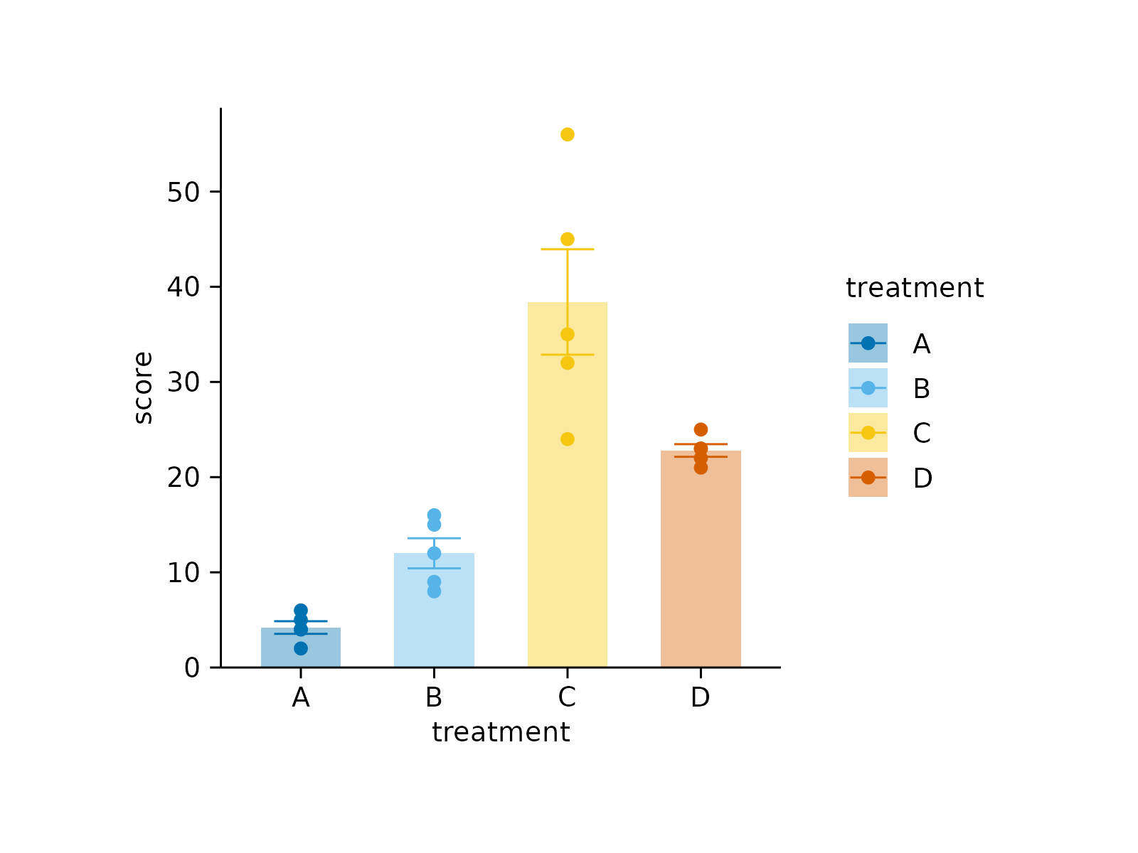
# Plot without adjustments
study |>
tidyplot(x = treatment, y = score, color = treatment) |>
add_data_points() |>
add_mean_bar(alpha = 0.4) |>
add_sem_errorbar()
 # Provide hex colors
study |>
tidyplot(x = treatment, y = score, color = treatment) |>
add_data_points() |>
add_mean_bar(alpha = 0.4) |>
add_sem_errorbar() |>
adjust_colors(new_colors = c("#644296","#F08533","#3B78B0", "#D1352C"))
# Provide hex colors
study |>
tidyplot(x = treatment, y = score, color = treatment) |>
add_data_points() |>
add_mean_bar(alpha = 0.4) |>
add_sem_errorbar() |>
adjust_colors(new_colors = c("#644296","#F08533","#3B78B0", "#D1352C"))
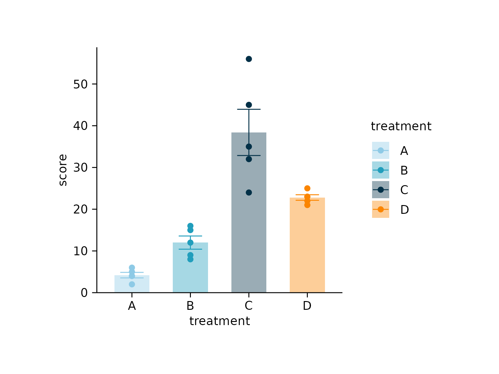
 # Provide discrete color scheme
study |>
tidyplot(x = treatment, y = score, color = treatment) |>
add_data_points() |>
add_mean_bar(alpha = 0.4) |>
add_sem_errorbar() |>
adjust_colors(new_colors = colors_discrete_seaside)
# Provide discrete color scheme
study |>
tidyplot(x = treatment, y = score, color = treatment) |>
add_data_points() |>
add_mean_bar(alpha = 0.4) |>
add_sem_errorbar() |>
adjust_colors(new_colors = colors_discrete_seaside)
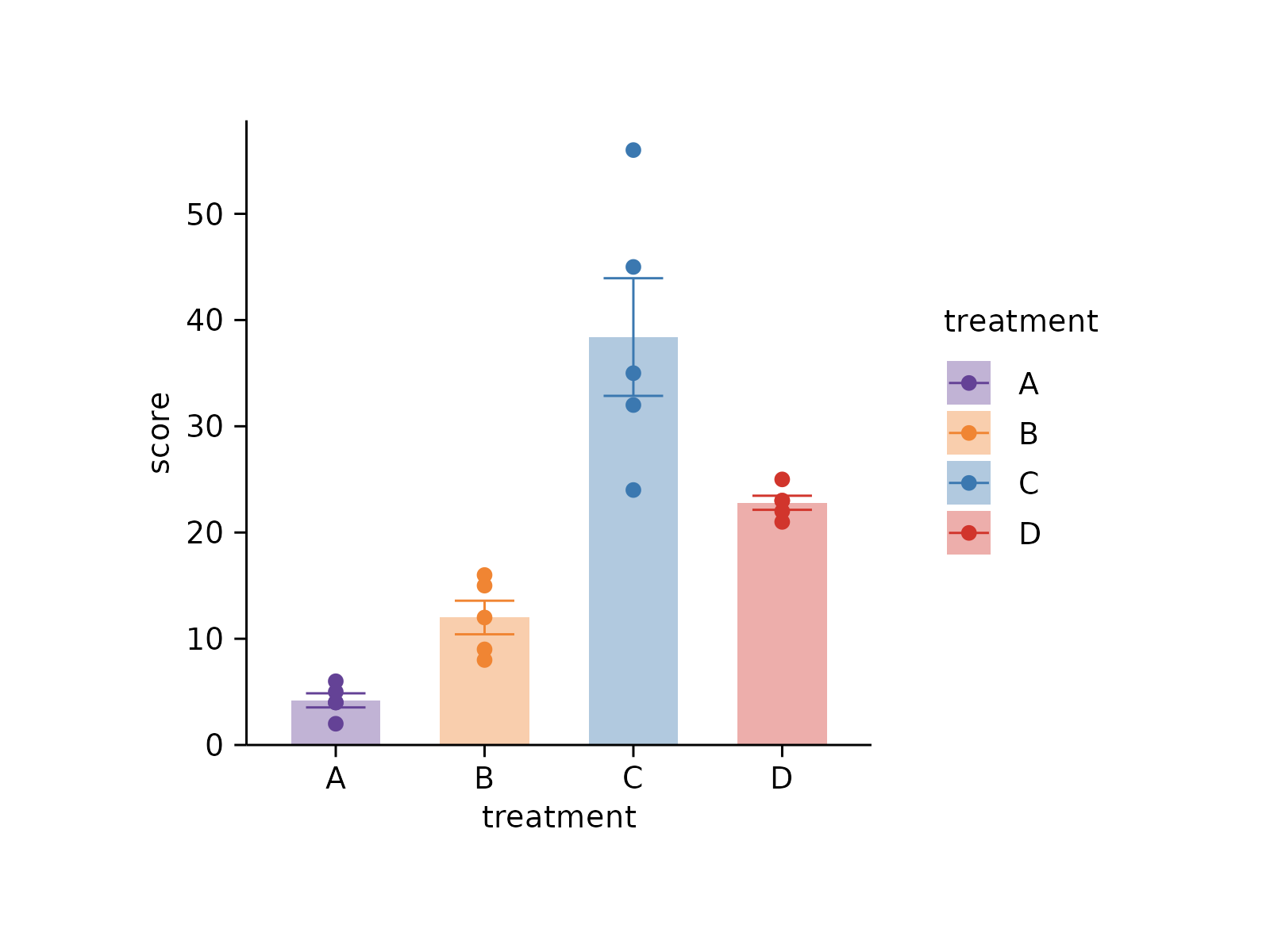
 # Provide named vector
study |>
tidyplot(x = treatment, y = score, color = treatment) |>
add_data_points() |>
add_mean_bar(alpha = 0.4) |>
add_sem_errorbar() |>
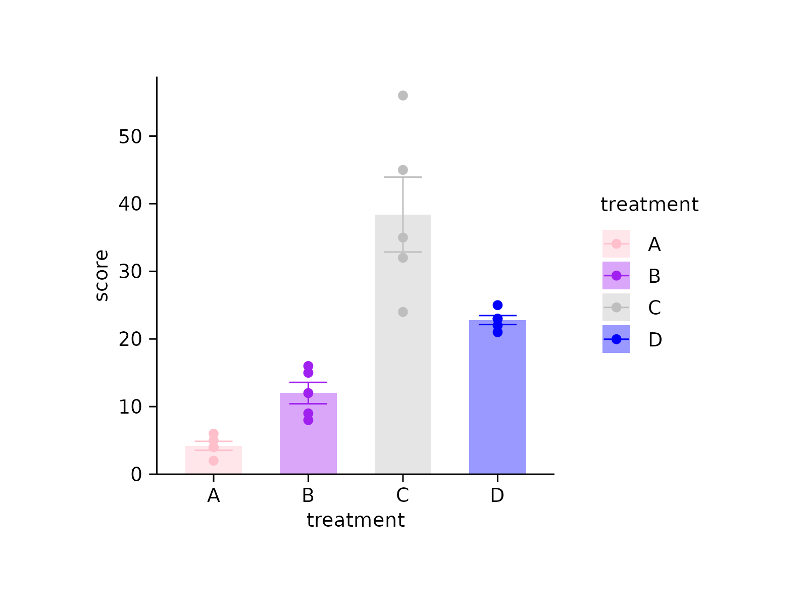
adjust_colors(new_colors = c(
"A" = "pink",
"B" = "purple",
"C" = "grey",
"D" = "blue"))
# Provide named vector
study |>
tidyplot(x = treatment, y = score, color = treatment) |>
add_data_points() |>
add_mean_bar(alpha = 0.4) |>
add_sem_errorbar() |>
adjust_colors(new_colors = c(
"A" = "pink",
"B" = "purple",
"C" = "grey",
"D" = "blue"))
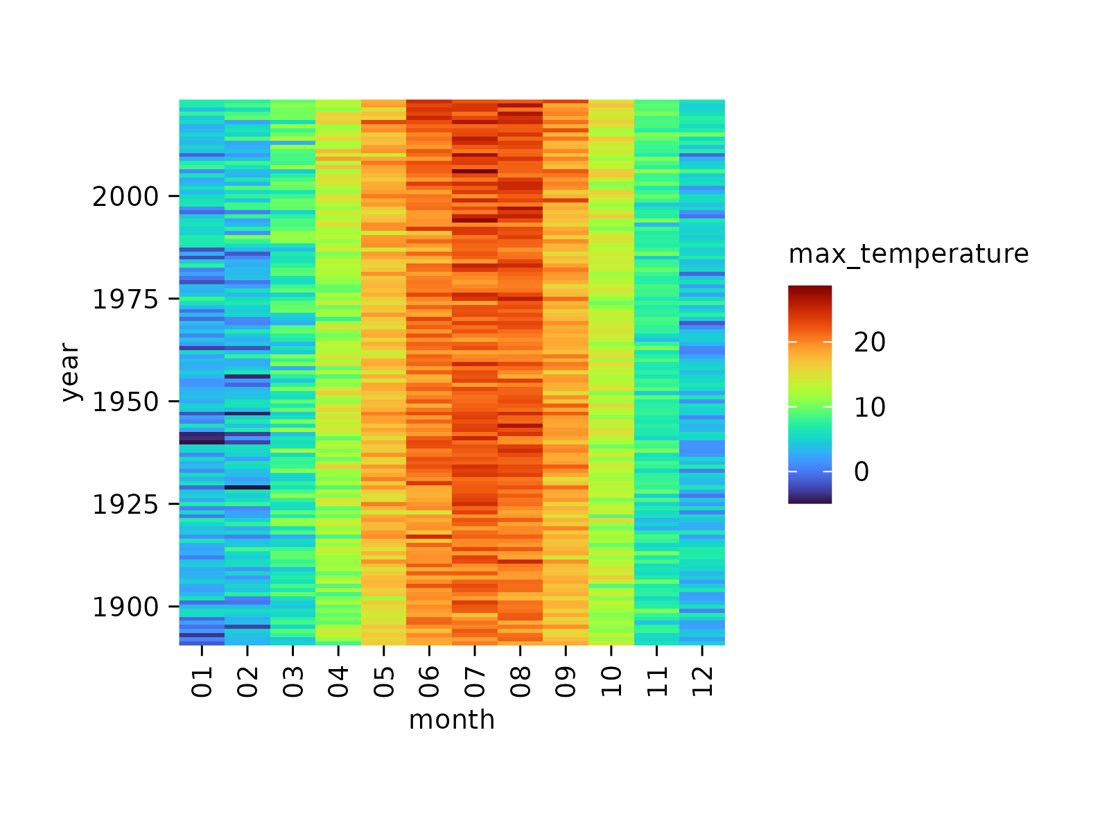
 # Provide continuous color scheme
climate |>
tidyplot(x = month, y = year, color = max_temperature) |>
add_heatmap() |>
adjust_colors(new_colors = colors_continuous_turbo)
# Provide continuous color scheme
climate |>
tidyplot(x = month, y = year, color = max_temperature) |>
add_heatmap() |>
adjust_colors(new_colors = colors_continuous_turbo)