Add mean
Usage
add_mean_bar(
  plot,
  dodge_width = NULL,
  width = 0.6,
  saturation = 1,
  preserve = "total",
  ...
)

add_mean_dash(
  plot,
  dodge_width = NULL,
  width = 0.6,
  linewidth = 0.25,
  preserve = "total",
  ...
)

add_mean_dot(plot, dodge_width = NULL, size = 2, preserve = "total", ...)

add_mean_value(
  plot,
  dodge_width = NULL,
  accuracy = 0.1,
  scale_cut = NULL,
  fontsize = 7,
  extra_padding = 0.15,
  vjust = NULL,
  hjust = NULL,
  preserve = "total",
  ...
)

add_mean_line(
  plot,
  group,
  dodge_width = NULL,
  linewidth = 0.25,
  preserve = "total",
  ...
)

add_mean_area(
  plot,
  group,
  dodge_width = NULL,
  linewidth = 0.25,
  preserve = "total",
  ...
)
Arguments
- plot
A
tidyplotgenerated with the functiontidyplot().- dodge_width
For adjusting the distance between grouped objects. Defaults to
0.8for plots with at least one discrete axis and0for plots with two continuous axes.- width
Horizontal width of the plotted object (bar, error bar, boxplot, violin plot, etc). Typical values range between
0and1.- saturation
A
numberbetween0and1for the color saturation of an object. A value of0is completely desaturated (white),1is the original color.- preserve
Should dodging preserve the
"total"width of all elements at a position, or the width of a"single"element?- ...
Arguments passed on to the
geomfunction.- linewidth
Thickness of the line in points (pt). Typical values range between
0.25and1.- size
A
numberrepresenting the size of the plot symbol. Typical values range between1and3.- accuracy
A number to round to. Use (e.g.)
0.01to show 2 decimal places of precision. IfNULL, the default, uses a heuristic that should ensure breaks have the minimum number of digits needed to show the difference between adjacent values.Applied to rescaled data.
- scale_cut
Scale cut function to be applied. See
scales::cut_short_scale()and friends.- fontsize
Font size in points. Defaults to
7.- extra_padding
Extra padding to create space for the value label.
- vjust
Vertical position adjustment of the value label.
- hjust
Horizontal position adjustment of the value label.
- group
Variable in the dataset to be used for grouping.
Examples
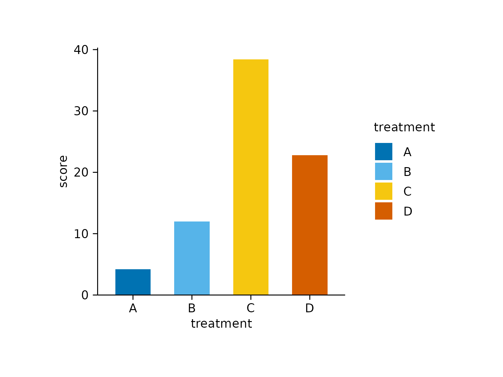
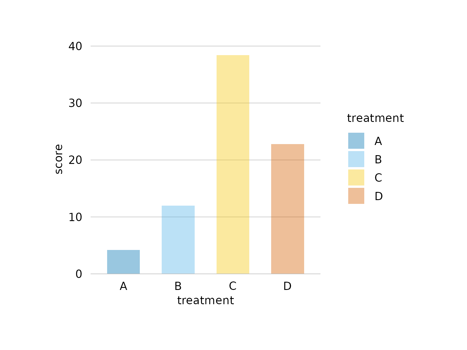
study |>
tidyplot(x = treatment, y = score, color = treatment) |>
add_mean_bar()
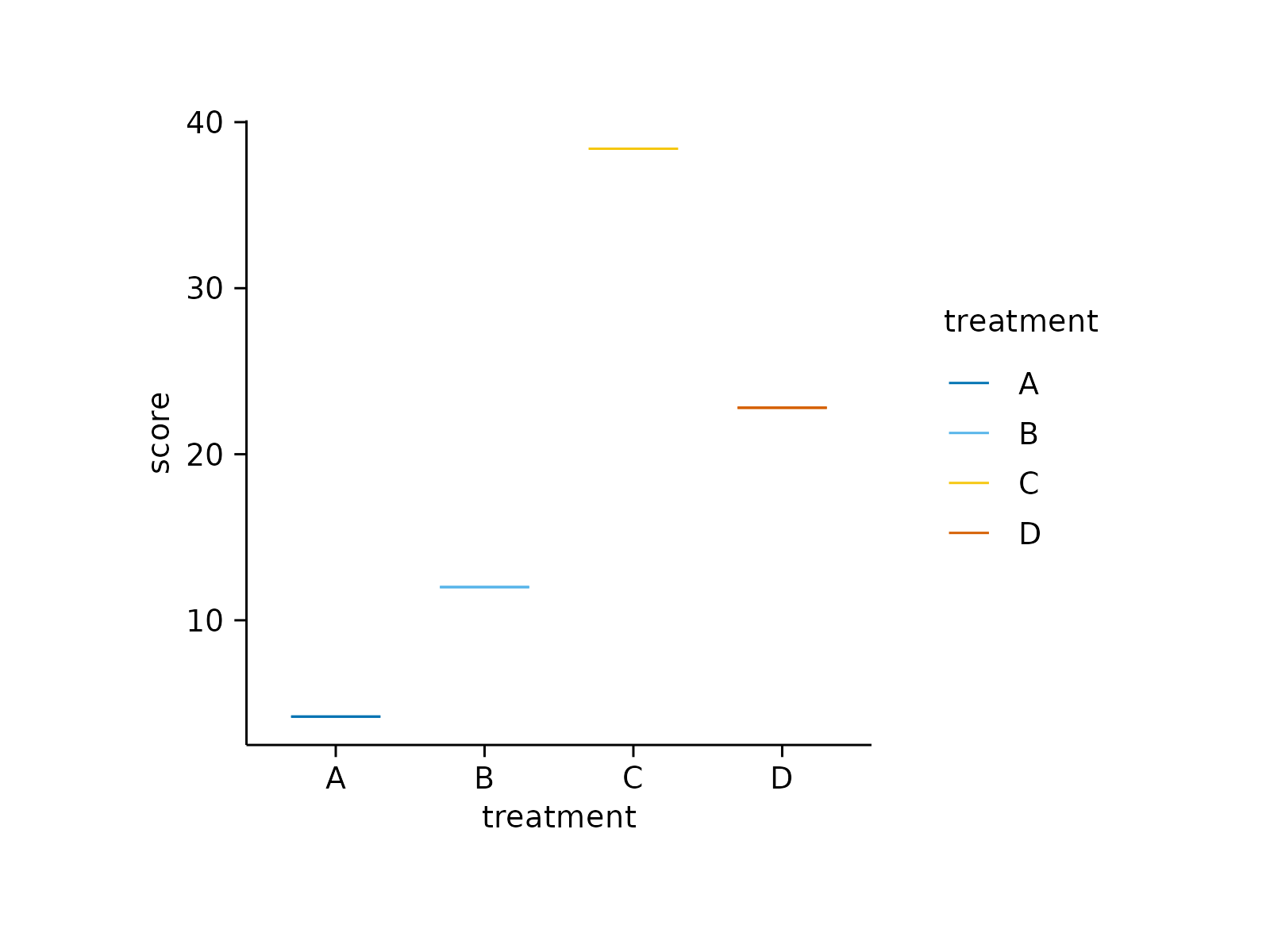
 study |>
tidyplot(x = treatment, y = score, color = treatment) |>
add_mean_dash()
study |>
tidyplot(x = treatment, y = score, color = treatment) |>
add_mean_dash()
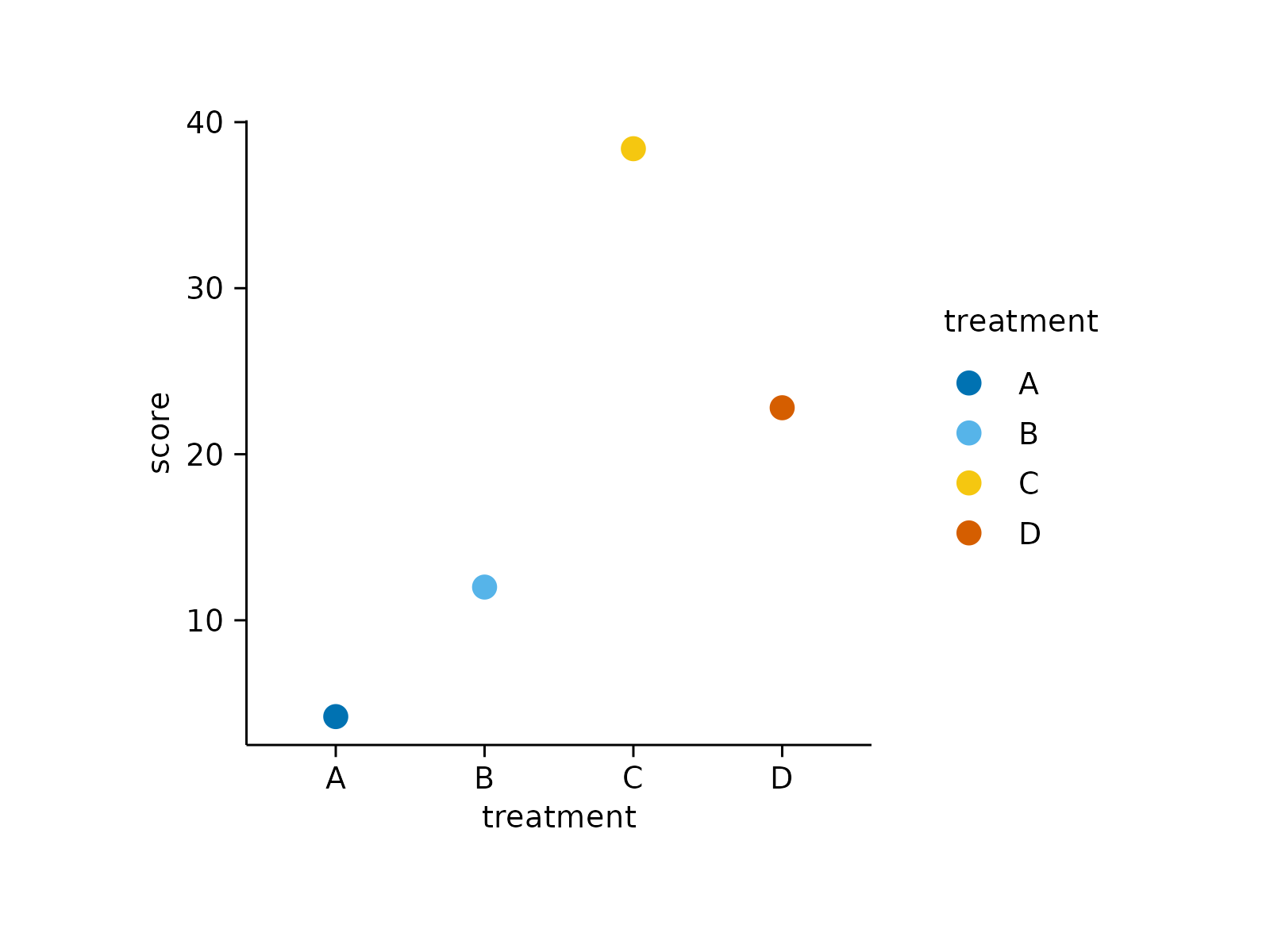
 study |>
tidyplot(x = treatment, y = score, color = treatment) |>
add_mean_dot()
study |>
tidyplot(x = treatment, y = score, color = treatment) |>
add_mean_dot()
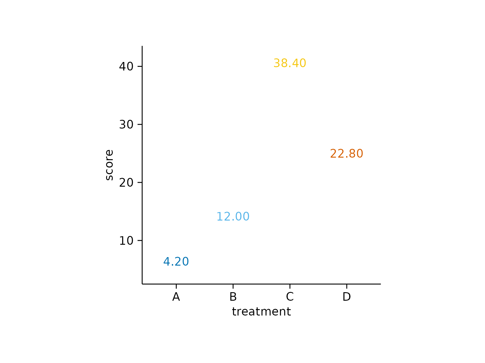
 study |>
tidyplot(x = treatment, y = score, color = treatment) |>
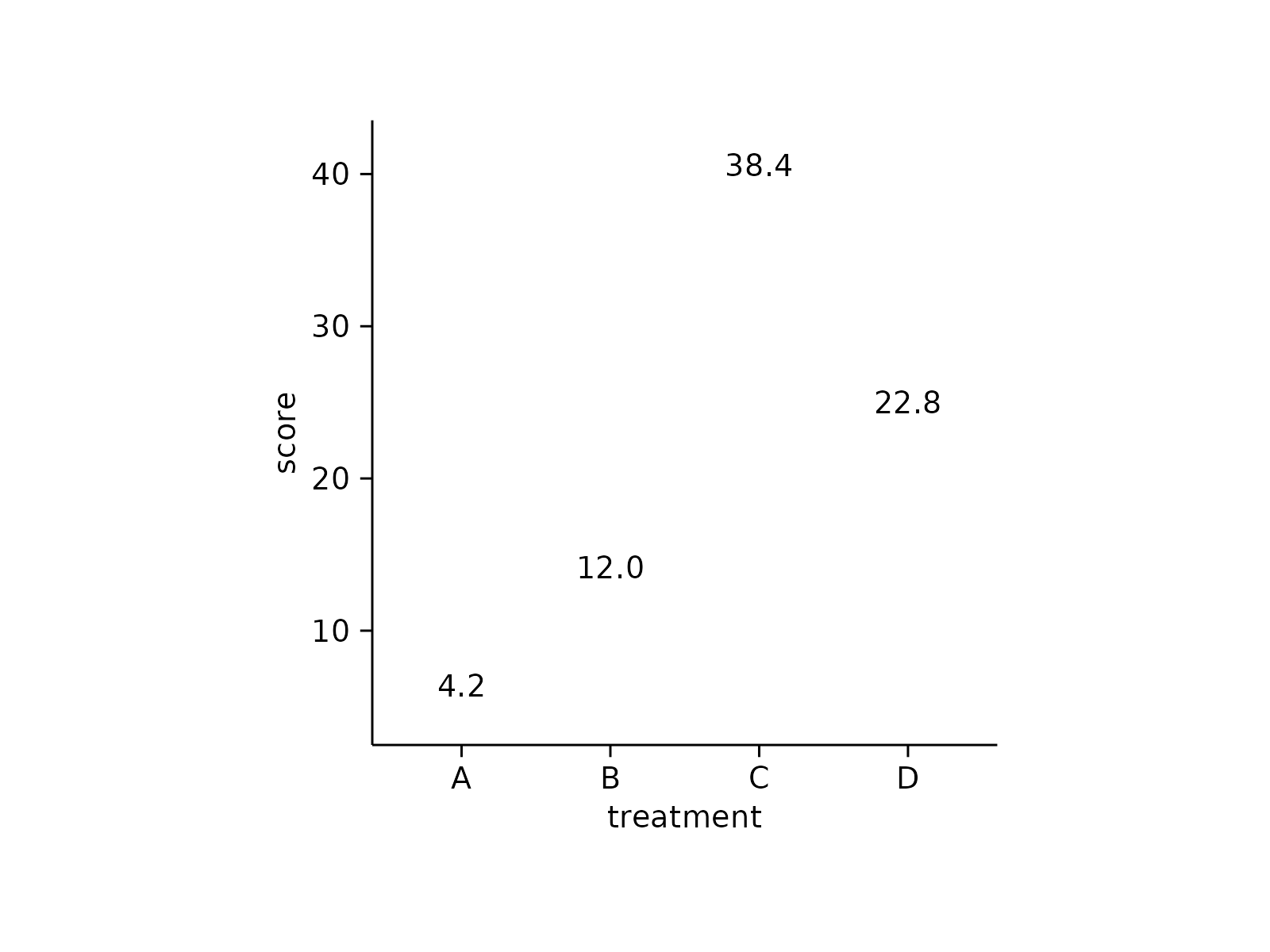
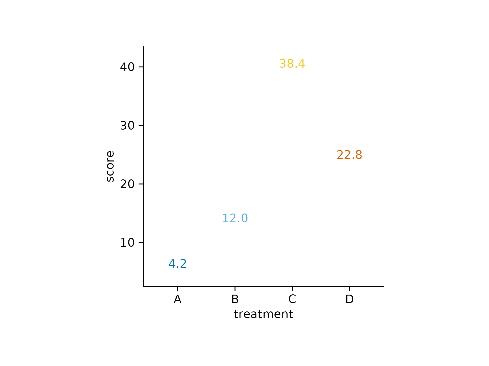
add_mean_value()
study |>
tidyplot(x = treatment, y = score, color = treatment) |>
add_mean_value()
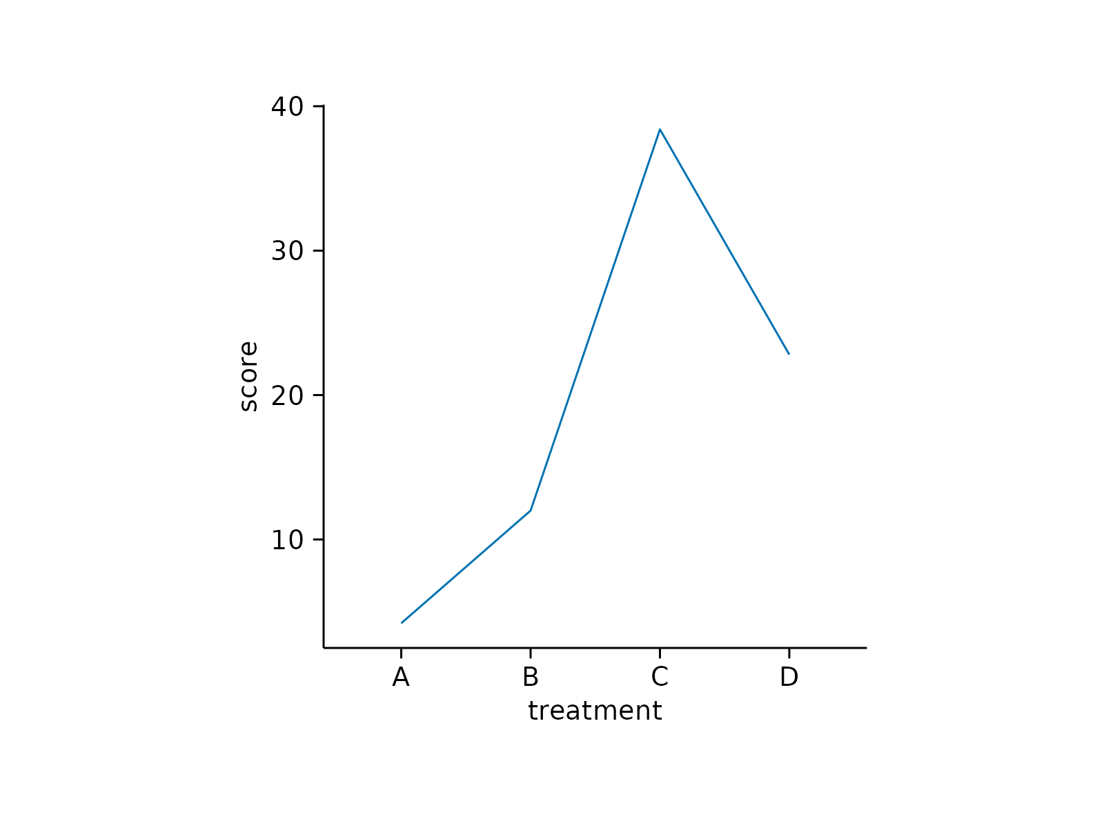
 study |>
tidyplot(x = treatment, y = score) |>
add_mean_line()
study |>
tidyplot(x = treatment, y = score) |>
add_mean_line()
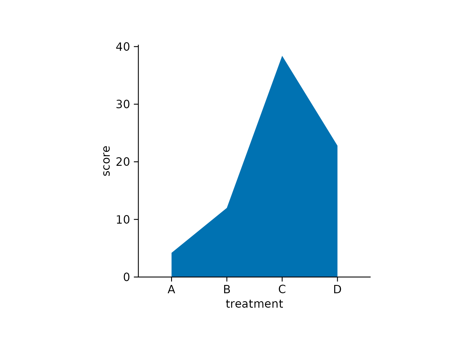
 study |>
tidyplot(x = treatment, y = score) |>
add_mean_area()
study |>
tidyplot(x = treatment, y = score) |>
add_mean_area()
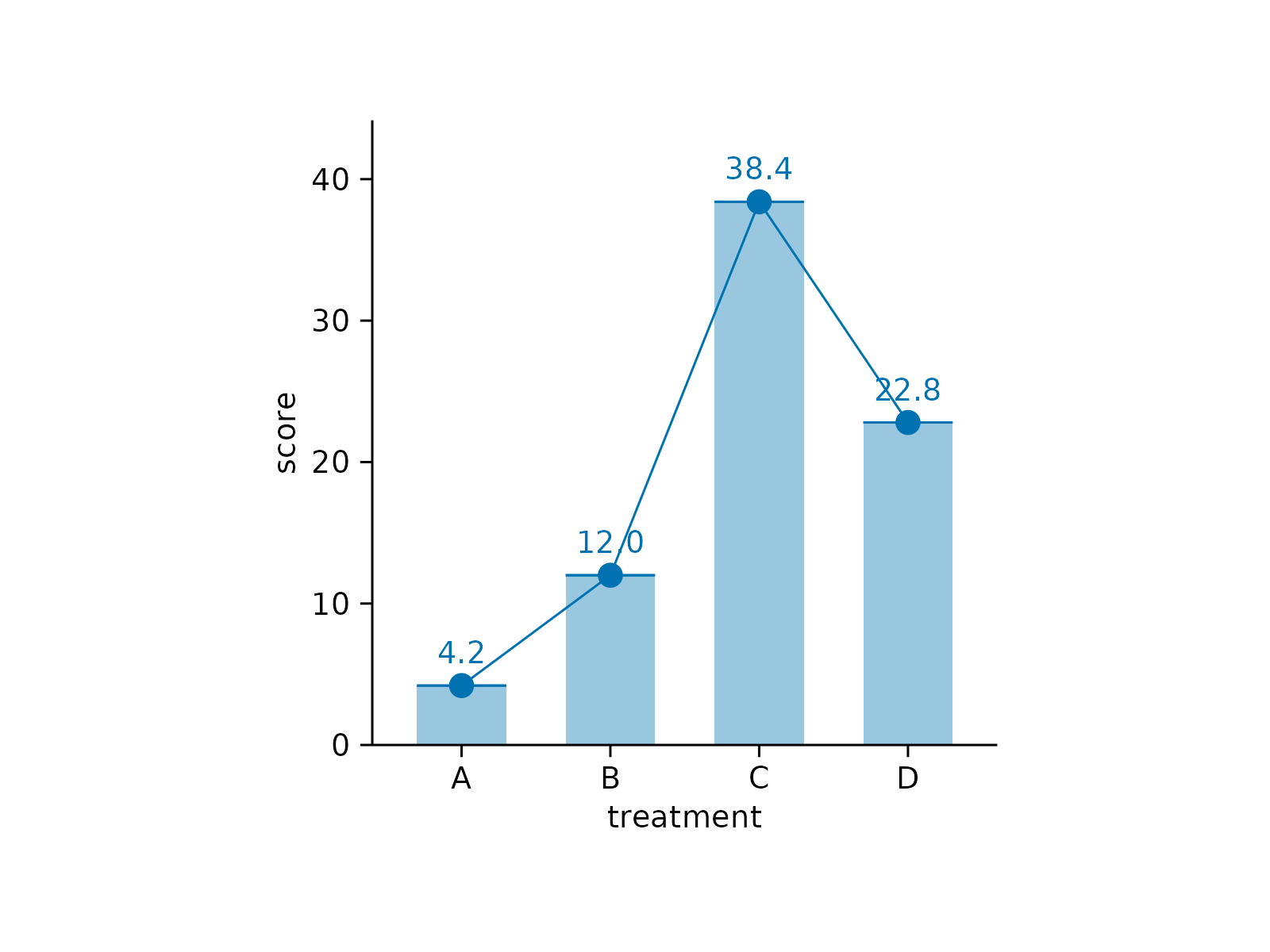
 # Combination
study |>
tidyplot(x = treatment, y = score) |>
add_mean_bar(alpha = 0.4) |>
add_mean_dash() |>
add_mean_dot() |>
add_mean_value() |>
add_mean_line()
# Combination
study |>
tidyplot(x = treatment, y = score) |>
add_mean_bar(alpha = 0.4) |>
add_mean_dash() |>
add_mean_dot() |>
add_mean_value() |>
add_mean_line()
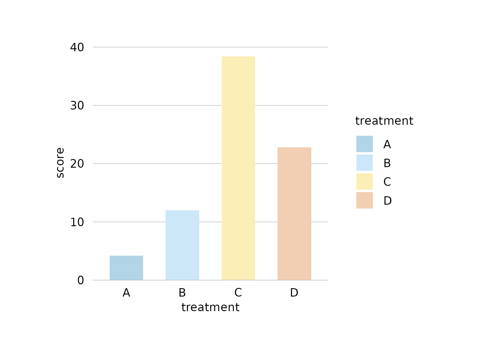
 # Changing arguments: alpha
# Makes objects transparent
study |>
tidyplot(x = treatment, y = score, color = treatment) |>
theme_minimal_y() |>
add_mean_bar(alpha = 0.4)
# Changing arguments: alpha
# Makes objects transparent
study |>
tidyplot(x = treatment, y = score, color = treatment) |>
theme_minimal_y() |>
add_mean_bar(alpha = 0.4)
 # Changing arguments: saturation
# Reduces fill color saturation without making the object transparent
study |>
tidyplot(x = treatment, y = score, color = treatment) |>
theme_minimal_y() |>
add_mean_bar(saturation = 0.3)
# Changing arguments: saturation
# Reduces fill color saturation without making the object transparent
study |>
tidyplot(x = treatment, y = score, color = treatment) |>
theme_minimal_y() |>
add_mean_bar(saturation = 0.3)
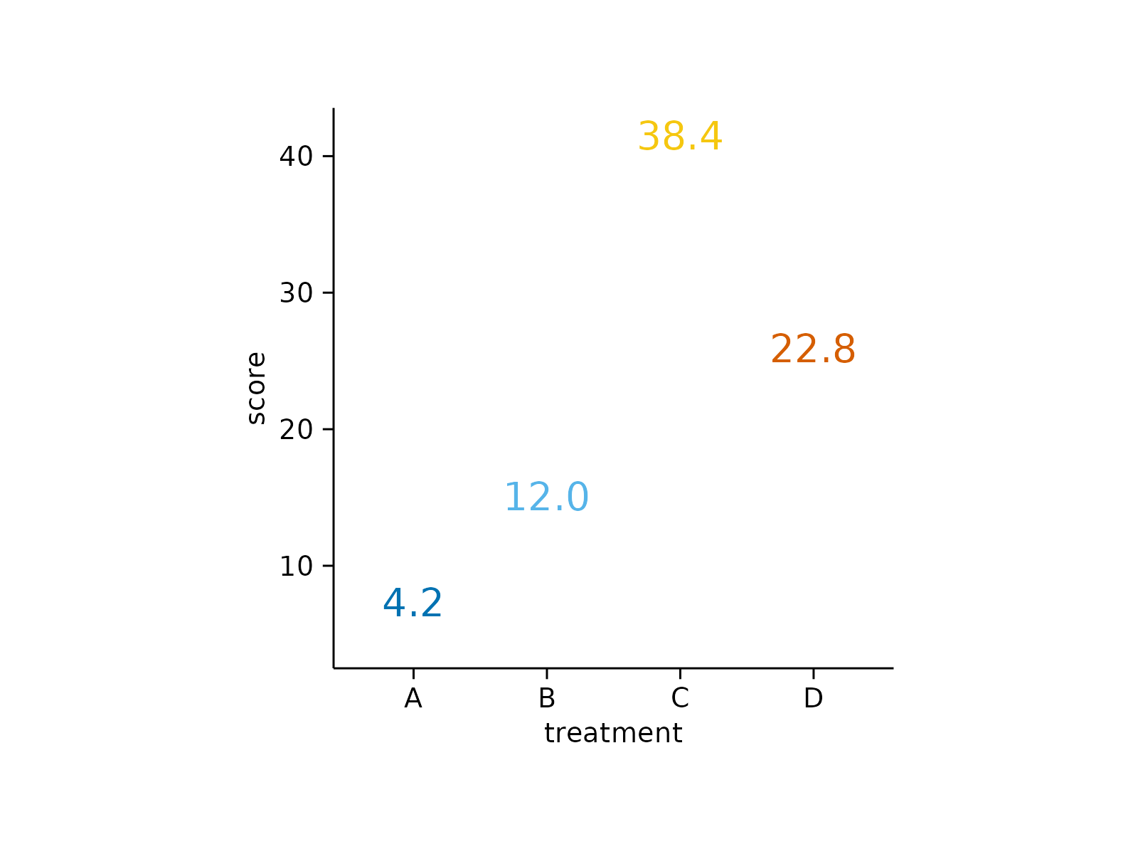
 # Changing arguments: accuracy
study |>
tidyplot(x = treatment, y = score, color = treatment) |>
add_mean_value(accuracy = 0.01)
# Changing arguments: accuracy
study |>
tidyplot(x = treatment, y = score, color = treatment) |>
add_mean_value(accuracy = 0.01)
 # Changing arguments: fontsize
study |>
tidyplot(x = treatment, y = score, color = treatment) |>
add_mean_value(fontsize = 10)
# Changing arguments: fontsize
study |>
tidyplot(x = treatment, y = score, color = treatment) |>
add_mean_value(fontsize = 10)
 # Changing arguments: color
study |>
tidyplot(x = treatment, y = score, color = treatment) |>
add_mean_value(color = "black")
# Changing arguments: color
study |>
tidyplot(x = treatment, y = score, color = treatment) |>
add_mean_value(color = "black")